Product grid blocks
Product grid blocks in Local: the Title, Price, Vendor, Rating, Quick buy, Local availability, Icons list and Dynamic text blocks of product cards.
Applies to: Local 4.2.1 and later. Added in: Local 1.0.0. Last checked: 2026-10-13 against Local 4.2.1.
Every product grid in Local builds its product cards from blocks. You choose which blocks a grid shows and in which order, so a grid on the home page can show less than the collection page. The look of the cards (image ratio, colors, badges, buttons) comes from Theme settings → Product card and is the same everywhere.
Where to find it: Online Store → Themes → Customize → open a page with a product grid → select the grid section → Add block
How product grids use blocks
Each block is one line of the product card, under the product image. The order of the blocks in the sidebar is the order in the card: drag a block to move it. Most blocks can be added once per grid; Dynamic text and Empty space can be added several times.
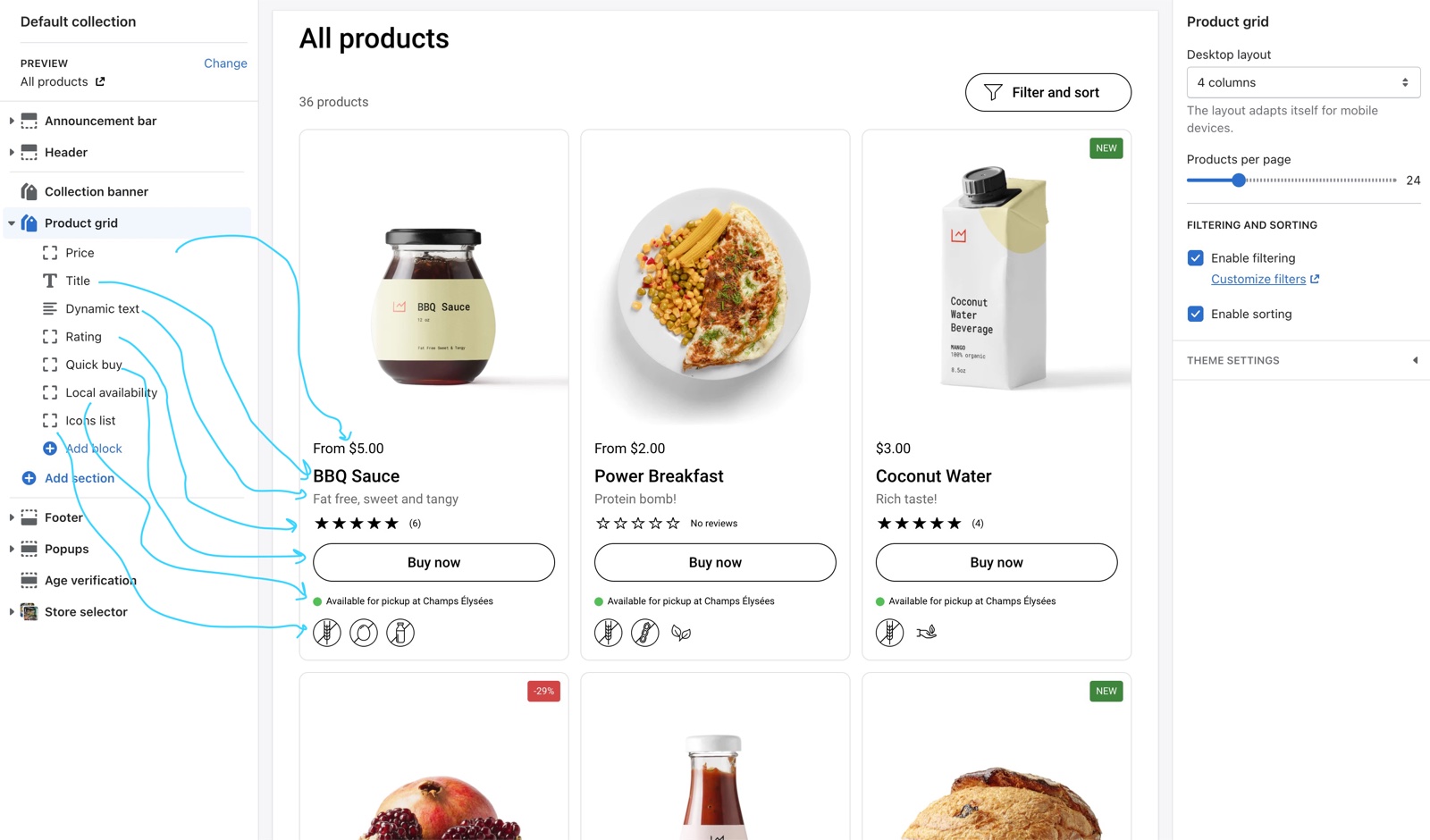
Some blocks work as soon as you add them. Others need data first:
- Rating needs a product reviews app.
- Local availability needs the store selector and local pickup.
- Icons list needs the icon metafields in Theme settings.
- Dynamic text needs a product metafield.
Price, title and vendor
- Price shows the product price, with the compare-at price when the product is on sale and the unit price when the product has one. When the variants have different prices, it shows the lowest one as "From …". Its size is Theme settings → Product card → Price size.
- Title shows the product title, linked to the product page. Its font and size are Theme settings → Product card → Title font family and Title size.
- Vendor shows the product vendor in a lighter color.
None of these blocks has settings of its own.
Quick buy
Quick buy adds a buy button to the card.
- A product with one variant goes straight to the cart.
- A product with several variants opens the Quick view popup, where the customer picks the options. See Quick view popup.
- A sold out product shows no button, unless you turn off Theme settings → Product card → Hide quick buy button when product is out of stock; then it shows a disabled "Sold out" button.
The button style, its label for products with options and Always open quick buy modal are in Theme settings → Product card → Buy buttons. Align buy button to the bottom of the card lines up the buttons of a row; it works best when Quick buy is the last block.
Rating
Rating shows the product's star rating from your reviews app. Choose the app in Theme settings → Product card → Product rating → Rating app (Judge.me by default). Products without reviews show "No reviews" on desktop and nothing on mobile. See Recommended rating apps.
Local availability
Local availability shows whether the product can be picked up at the store the customer chose in the store selector: "Available for pickup at …", "Out of stock at …", or a "Choose a store to see local availability" link that opens the store selector. It checks the product's first available variant and loads when the card scrolls into view.
It needs local pickup on your Shopify locations and the Store selector set up: see "Setting up the Local availability block" on this page.
The block has no settings. It is available in every product grid except Product recommendations.
Icons list
Icons list shows up to six small icons per product (for example "Vegan" or "Gluten free"), with the label as a tooltip. The icons and labels come from product metafields that you connect in Theme settings → Product card → Dynamic icons list. A product with no values shows nothing. See Dynamic icons list theme settings for the setup.
Dynamic text
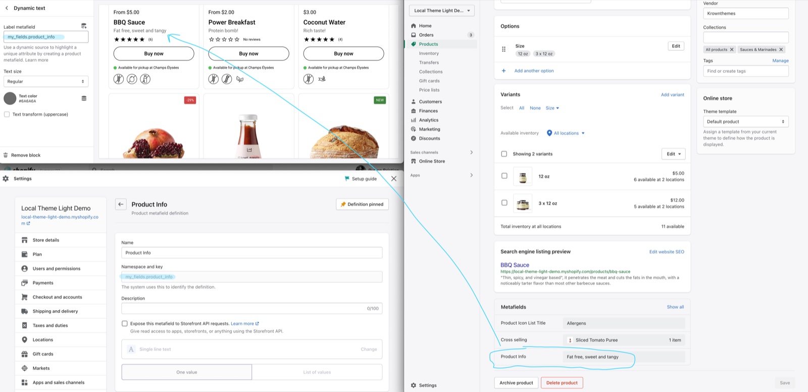
Dynamic text shows the text of a product metafield in the card, for example a short tagline or the weight. You can add several Dynamic text blocks, one per metafield.
- Label metafield is the metafield to show, typed as
namespace.key. - Text size sets Small, Regular or Large text.
- Text color sets its color (grey by default).
- Text transform (uppercase) shows the text in capitals.
A product with an empty metafield shows nothing in that line.
Product link
Product link adds a button that opens the product page. Button label sets its text (default "View product"). Use it instead of Quick buy when you want customers to see the product page first.
Empty space
Empty space adds one more step of vertical space between the blocks above and below it. It has no settings; add two for more space.
Where product grids appear
| Section | Blocks it accepts |
|---|---|
| Collection page → Product grid | All ten |
| Featured collection | All ten |
| Products list | All ten |
| Shop the look | All ten |
| Search page → Search results | All except Empty space |
| Product recommendations | All except Local availability |
| Product comparison | Its own row blocks: Price, Vendor, Rating, Quick buy, Local availability, Icons list, Dynamic text, Product link and more |
Setting up the Dynamic text block
Create the metafield
In Shopify admin, open Settings → Metafields and metaobjects → Products and select Add definition. Give it a name (for example "Product info") and choose the type Single line text or Multi-line text.
Copy the namespace and key
After you save, copy the value shown under the name, in the form namespace.key, for example custom.product_info.
Fill the metafield on your products
Open each product in Shopify admin → Products and type the text in the new metafield, in the Metafields area at the bottom of the page.
Add the block to the grid
In the theme editor, open the page with the grid, select the grid section and select Add block → Dynamic text. Drag it to its place in the card.
Paste the metafield reference
Paste namespace.key into Label metafield, then set Text size and Text color. Repeat the block in every grid where the text should show.
Type the metafield reference as text. Product grids show many products at once, so the theme reads the metafield of each card itself from the namespace.key you type; there is no dynamic source to connect here.
Setting up the Local availability block
Turn on local pickup
In Shopify admin → Settings → Shipping and delivery → Local pickup, turn on pickup for each store location, and make sure the products have stock at those locations.
Set up the store selector
Add one Store block per location in the Store selector section, with the same name as the Shopify location, and add the Store selector block to the header. The full steps are in Store selector section.
Add the block to your grids
Select the grid section, select Add block → Local availability and drag it to its place. Repeat for each grid.
Why does a block not show in my product cards?
Because it has no data for that product. Rating needs reviews from the app chosen in Rating app, Icons list needs values in the icon metafields, Dynamic text needs a value in its metafield, and Quick buy is hidden for sold out products by default. Check also that the block was added to that grid: every grid has its own blocks.
Can each product grid show different blocks?
Yes. Every grid section has its own blocks, so the collection page can show Vendor, Rating and Quick buy while a home page Featured collection shows only Title and Price. The design of the card (Theme settings → Product card) stays the same everywhere.
Why does Local availability say "Out of stock" for every product?
Because the store the customer picked does not match a Shopify location with local pickup. Check that the Store block's Name has the same words as the Shopify location name, that local pickup is on for that location, and that the product has stock there. See Troubleshoot the store selector and maps.
Related pages
General section styling
General section styling in Local: the section heading, Section design, Custom card design, SEO heading tag and Visibility settings most sections share.
Flex sections
Flex sections in Local: Flex slideshow, Flex grid, Flex cards and Flex columns, built from theme blocks you can arrange freely.