Testimonials section
The Testimonials section of Local shows customer quotes with the author name, title and avatar, in cards.
Applies to: Local 4.2.1 and later. Added in: Local 1.0.0. Last checked: 2026-10-13 against Local 4.2.1.
The Testimonials section shows customer quotes one at a time in a slider, each with the author's name, title and photo. Use it for reviews, endorsements or press quotes.
Where to find it: Online Store → Themes → Customize → Add section → Testimonials
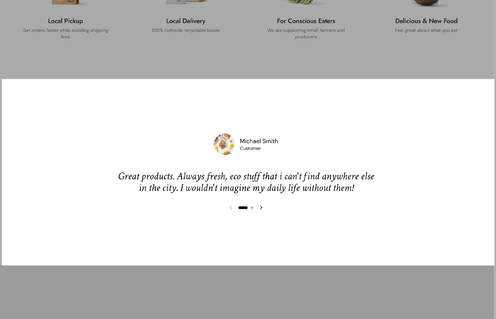
Quote typography
The quotes have their own font, separate from Theme settings → Typography:
- Font family is the quote font (a serif font by default). Pick any font from the Shopify font library.
- Base size sets the quote size, 24 to 60 px (default 32 px).
- Line height sets the space between lines, 1 to 2 (default 1.1).
- Text alignment places the quote, author and slider controls on the Left (default) or in the Center.
Custom card design
Background, Text, Border and Shadow override the card colors for this section. Hide border and Hide shadow remove the border or shadow of the card.
The heading, section design and SEO settings are the standard ones, see General section styling.
Testimonial blocks
Add one Testimonial block per quote. With more than one, the section becomes a slider with arrows.
- Quote is the testimonial text. It supports bold, italic and links.
- Author name is the name of the customer or reviewer.
- Author title is their role, for example "Customer", "Verified buyer" or the name of a magazine.
- Author avatar is a small round photo or logo next to the name.
Use real quotes with a name and an author title. Short, specific quotes (what was bought, what was liked) read better in the slider than long reviews.
Can the Testimonials section show reviews from my reviews app?
No. The quotes are typed by hand in the blocks. To show reviews collected by an app, use the app's own block or widget, for example in an Apps section.
All Testimonials settings
Every setting, with its type and default.
Accepts these blocks: Testimonial.
Testimonials section: Heading
Where to find it: Testimonials → Heading
The Testimonials section uses the standard Heading settings, listed in General section styling.
Heading (text field, default: "Testimonials").
Subheading (text field, default: "Show your clients' thoughts").
Text alignment (dropdown, default: Left). Options: Left, Center.
Show section link (checkbox, default: off): Adds a text link next to the section heading. Fill Link text and Link too.
Link text (text field). Shown only when Show section link is on.
Link (link). Shown only when Show section link is on and Link text is set.
Open link in a new window (checkbox, default: off). Shown only when Link is set and Show section link is on and Link text is set.
These settings differ from the standard ones or exist only here:
Heading (text field, default: "Testimonials").
Subheading (text field, default: "Show your clients' thoughts").
Testimonials section: Quote typography
Where to find it: Testimonials → Quote typography
Font family (font, default: serif): Sets the font of the quotes, separate from Theme settings → Typography.
Base size (slider 24 to 60 px, default: 32 px).
Line height (slider 1 to 2, step 0.1, default: 1.1).
Text alignment (dropdown, default: Left): Places the quote, author and slider controls on the left or in the center. Options: Left, Center.
Testimonials section: Custom card design
Where to find it: Testimonials → Custom card design
The Testimonials section uses the standard Custom card design settings, listed in General section styling.
Background (color, default: transparent).
Text (color, default: transparent).
Border (color, default: transparent).
Shadow (color, default: transparent).
Hide border (checkbox, default: off).
Hide shadow (checkbox, default: off).
Testimonials section: Section design
Where to find it: Testimonials → Section design
The Testimonials section uses the standard Section design settings, listed in General section styling. Not available in this section: Descrease top margin.
Background color (color, default: transparent).
Background gradient (gradient).
Heading text color (color, default: transparent): Sets the color of the text outside the cards, mostly the section heading.
Remove top margin (checkbox, default: off): Removes the space above the section, so it touches the section before it.
Testimonials section: SEO
Where to find it: Testimonials → SEO
The Testimonials section uses the standard SEO settings, listed in General section styling.
Heading tag (dropdown, default: H2): Sets the HTML tag of the heading for search engines. It does not change how the heading looks. Options: H1, H2, H3, H4, span.
Testimonial block
Where to find it: Testimonials → Add block → Testimonial
Author name (text field, default: "Author").
Author title (text field, default: "Customer").
Quote (rich text, default: "Add customer reviews and testimonials to showcase your store's happy customers.").
Author avatar (image): Shows a small round photo or logo next to the author name.