Image section
The Image section of Local shows an image uncropped, with a separate mobile image, a link and a desktop width.
Applies to: Local 4.2.1 and later. Added in: Local 1.0.0. Last checked: 2026-10-13 against Local 4.2.1.
The Image section shows one image at its own proportions, without cropping. Use it for a banner that already has text in it, a product picture or a graphic. You can upload a separate image for phones.
Where to find it: Online Store → Themes → Customize → Add section → Image
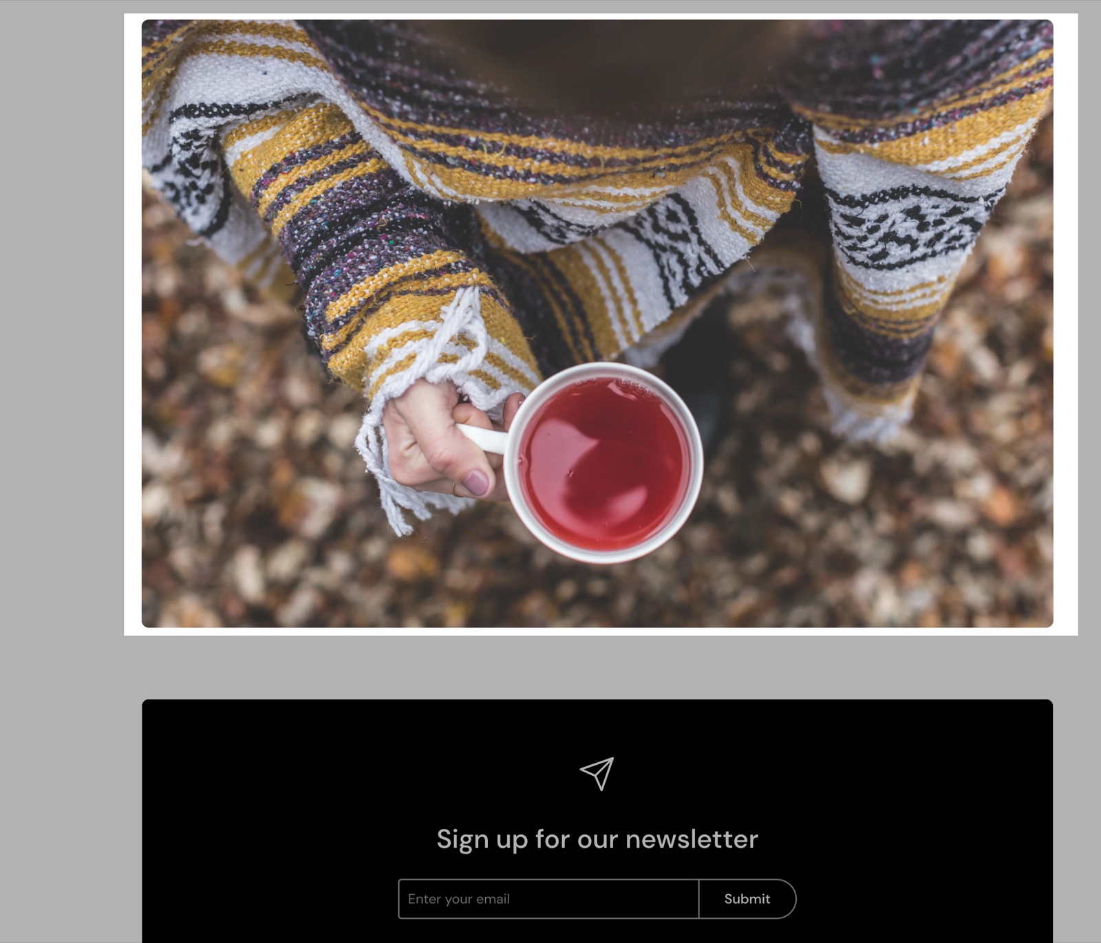
Image and link
- Image is the picture, shown whole at its own aspect ratio.
- Mobile image (optional) replaces it on phones. Use it for a banner with text, so the text stays readable on a small screen. Without it, the main image is used.
- Link makes the image clickable, for example to a collection or a promotion.
- Open link in a new window opens the link in a new browser tab.
Desktop width
Desktop width (under Section design) sets how much of the page width the image takes on desktop: Small, Medium, Large (default) or Full width (edge to edge). Smaller widths center the image.
On mobile, the image will always be full-width for better responsiveness.
Descrease top margin, Remove top margin and Section visibility work as in every section, see General section styling.
Can I show a different image on phones?
Yes. Upload it in Mobile image (optional). Phones show that image instead of the main one, still uncropped, so a portrait version of a wide banner keeps its text readable.
Why is my image not cropped like in other sections?
Because the Image section never crops. It shows the whole picture at its own proportions, so a tall image makes a tall section. To crop to a fixed height, use the Flex slideshow with one slide or the Fullwidth media with text preset of the Flex grid.
All Image settings
Every setting, with its type and default.
Image (image): Sets the picture. It is shown whole, at its own proportions.
Mobile image (optional) (image): Replaces the picture on screens narrower than 768 px.
Link (link).
Open link in a new window (checkbox, default: off). Shown only when Link is set.
Image section: Section design
Where to find it: Image → Section design
The Image section uses the standard Section design settings, listed in General section styling. Not available in this section: Background color, Background gradient and Heading text color.
Desktop width (dropdown, default: Large): Sets how much of the page width the image takes on desktop. On phones it is always full width. Options: Small, Medium, Large, Full width.
Descrease top margin (checkbox, default: off): Sets the space above the section to the grid gap of Theme settings → Layout → Horizontal space, instead of the full space between sections. Shown only when Remove top margin is off.
Remove top margin (checkbox, default: off): Removes the space above the section, so it touches the section before it. Shown only when Descrease top margin is off.
These settings differ from the standard ones or exist only here:
Desktop width (dropdown, default: Large): Sets how much of the page width the image takes on desktop. On phones it is always full width. Options: Small, Medium, Large, Full width.
Image section: Visibility
Where to find it: Image → Visibility
The Image section uses the standard Visibility settings, listed in General section styling.
Section visibility (dropdown, default: Show always): Shows the section on every screen, only below 768 px (mobile) or only from 768 px (desktop, tablets included). A hidden section is still in the page. Options: Show always, Show only on mobile, Show only on desktop.