Image block
The Image block of Local shows an image with a set height and optional link inside Flex sections, alone or as a logo in a content group.
Applies to: Local 4.2.1 and later. Added in: Local 2.7.0. Last checked: 2026-10-13 against Local 4.2.1.
The Image block shows an image at a fixed height inside a Flex section card, slide or column, for example an icon above a heading or a logo. Inside a content group, several Image blocks make a row of logos. It is a theme block.
Where to find it: Online Store → Themes → Customize → select a Flex section card, slide or column → Add block → Image
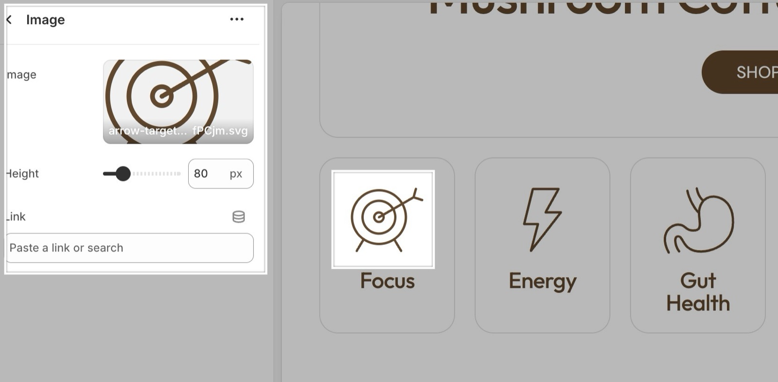
Image and height
- Image is the picture. It keeps its proportions: the width follows from the height.
- Height sets the height on desktop, from 40 to 240 px (default 80 px). On screens narrower than 768 px the image is 75 percent of that height (at least 60 px), and below 475 px it is half (at least 40 px).
- Link makes the image open a page. Open link in a new window opens it in a new browser tab.
The theme loads the image at one, two and three times the height, so it stays sharp on high-resolution screens. Upload images at least three times as tall as the Height you set.
Is this the same as the media of a card?
No. The card, slide or column media is the large background or top image of the card itself. The Image block is a small image among the text blocks, such as an icon or a logo.
How do I show several logos in a row?
Add a Content group block and add one Image block per logo inside it. Give them the same Height so the row is even.
All Image block settings
Every setting, with its type and default.
Image (image).
Height (slider 40 to 240 px, step 2, default: 80 px): Sets the height on desktop; the width follows the image proportions. Below 768 px it is 75 percent of it, below 475 px half.
Link (link).
Open link in a new window (checkbox, default: off). Shown only when Link is set.