Caption block
The Caption block of Local adds a short line of small text, or a badge when it has a background color, inside Flex sections.
Applies to: Local 4.2.1 and later. Added in: Local 2.7.0. Last checked: 2026-10-13 against Local 4.2.1.
The Caption block adds a short line of small text, such as "New collection" above a heading. With a background color it turns into a badge. It is a theme block: you add it inside Flex sections, their cards and slides, Flex columns and content groups.
Where to find it: Online Store → Themes → Customize → select a Flex section card, slide or column → Add block → Caption
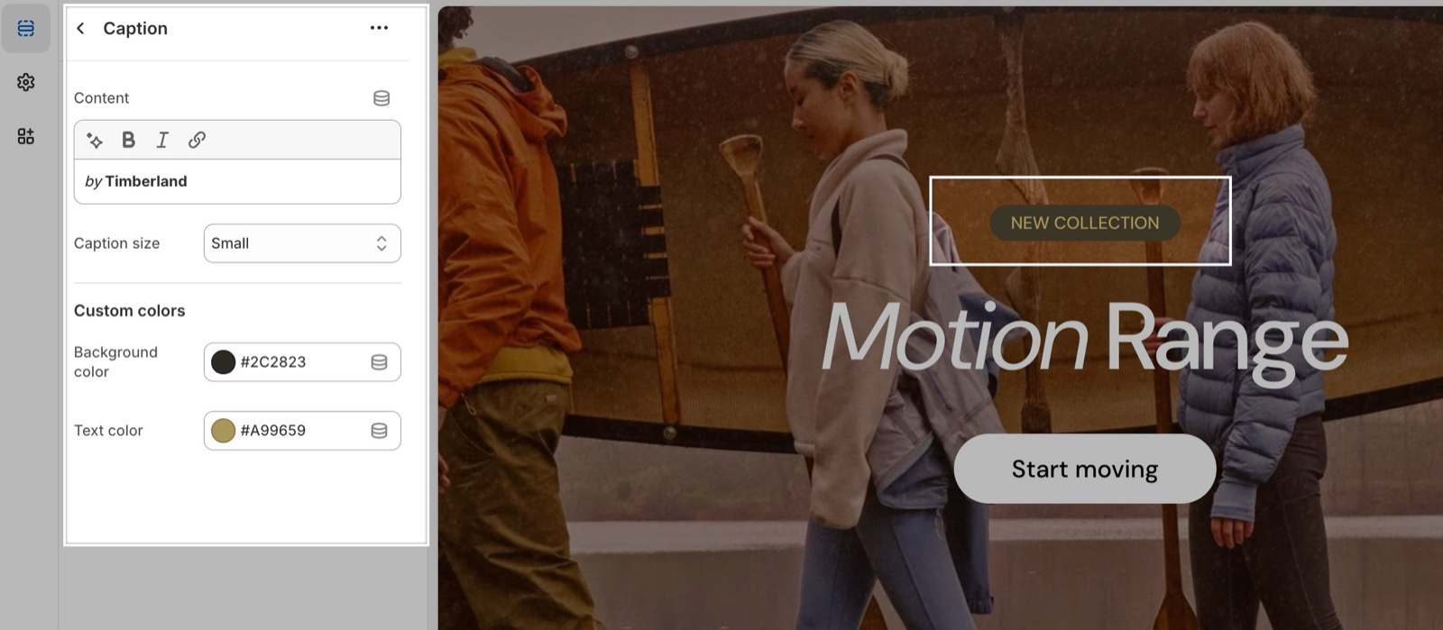
Content and size
- Content is the text. It accepts bold, italic and links. An empty caption is not shown.
- Caption size sets the text size, from Extra small to Extra large (default Regular).
Custom colors
- Text color changes the caption color.
- Background color puts the caption on a colored pill, so it looks like a badge. The pill uses the button corner radius from Theme settings → Borders.
Several captions with a background inside a Content group block make a row of badges, for example "Vegan", "Organic", "Local".
What is the difference between a caption and a heading?
A caption is small supporting text with no heading tag, so it does not count in your page structure. Use the Heading block for titles and the Caption block for the short line above or below them.
All Caption block settings
Every setting, with its type and default.
Content (formatted text, default: "Caption").
Caption size (dropdown, default: Regular). Options: Extra small, Small, Regular, Large, Extra large.
Caption block: Custom colors
Where to find it: Caption → Custom colors
Background color (color, default: transparent): Puts the caption on a colored pill, so it looks like a badge.
Text color (color, default: transparent).