Button block
The Button block of Local adds a solid or outline button with a label and link inside Flex sections and content groups.
Applies to: Local 4.2.1 and later. Added in: Local 2.7.0. Last checked: 2026-10-13 against Local 4.2.1.
The Button block adds a button with a label and a link, for example "Shop now" on a slide or two buttons side by side in a content group. It is a theme block: you add it inside Flex sections, their cards and slides, Flex columns, the Table section and content groups.
Where to find it: Online Store → Themes → Customize → select a Flex section card, slide or column → Add block → Button
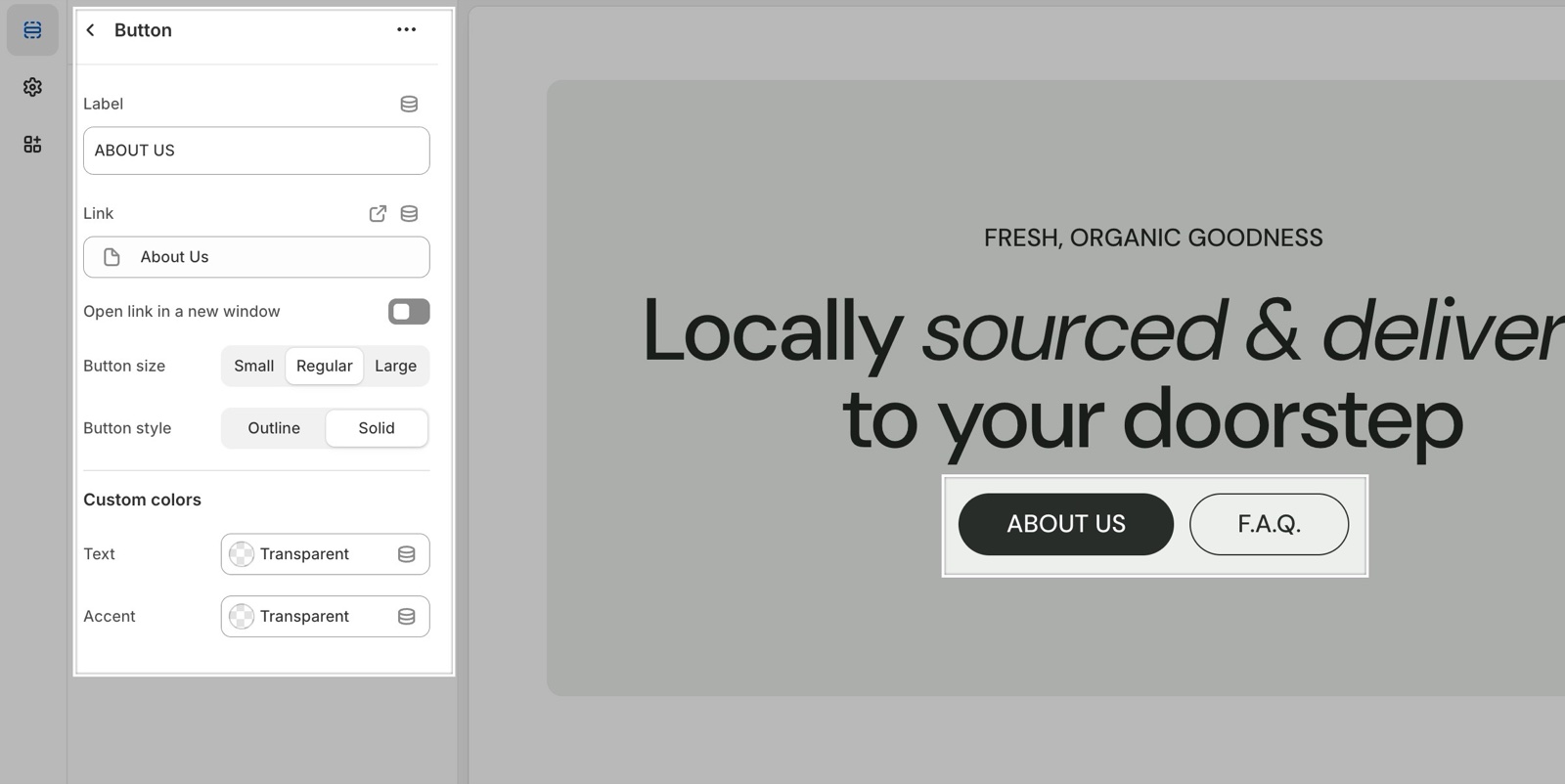
Label, link and style
- Label is the button text. A button with an empty label is not shown.
- Link is the page the button opens. Open link in a new window opens it in a new browser tab.
- Button size sets Small, Regular or Large.
- Button style sets Outline (a border, no fill) or Solid (a filled button).
The corner radius and border width of all buttons come from Theme settings → Borders.
Custom colors
By default the button uses the colors of the card or section it sits in. The two custom colors override them for this button only:
- Text is the button color: the fill of a solid button, or the border and label of an outline button. The label of a solid button switches to light or dark text automatically, so it stays readable.
- Accent is the color the button takes when the customer hovers over it.
How do I put two buttons side by side?
Add a Content group block and add two Button blocks inside it. The group places them in one row and wraps them onto a new line when there is not enough room.
Why does my button not open its link?
Because the card or slide around it has its own Link. When a whole card or slide is a link, the links inside it do not work. Remove the card's link, or remove the button and let the card link do the job.
All Button block settings
Every setting, with its type and default.
Label (text field, default: "Button label"): Sets the button text. An empty label hides the button.
Link (link).
Open link in a new window (checkbox, default: off). Shown only when Link is set.
Button size (dropdown, default: Regular). Options: Small, Regular, Large.
Button style (dropdown, default: Outline). Options: Outline, Solid.
Button block: Custom colors
Where to find it: Button → Custom colors
Text (color, default: transparent): Sets the button color: the fill of a solid button, the border and label of an outline button.
Accent (color, default: transparent): Sets the color the button takes on hover.