Flex grid section
The Flex grid section of Local builds grids and collages of media cards and text cards, in four presets.
Applies to: Local 4.2.1 and later. Added in: Local 2.7.0. Last checked: 2026-10-13 against Local 4.2.1.
The Flex grid section builds grids and collages from two kinds of cards: media cards (an image or a video) and text cards (theme blocks over an optional image). You set the width and height of every card yourself, on a 12-column grid.
Where to find it: Online Store → Themes → Customize → Add section → Flex grid (or one of its other presets: Fullwidth media with text, Media collage, Text cards collage)
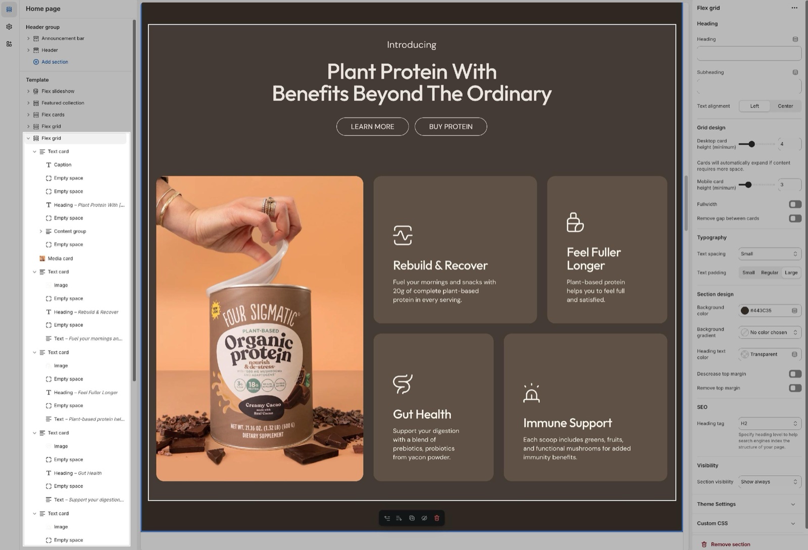
Presets
The four presets are the same section with different starting cards. After you add one, you can change everything.
- Flex grid: a mixed grid of media cards and text cards in different sizes.
- Fullwidth media with text: one text card across the whole screen, with the text centered over its image. Use it as a hero banner.
- Media collage: a full width collage of media cards with no gaps, plus one dark text card.
- Text cards collage: light grey text cards around one tall media card.
How the grid works
On desktop the grid has 12 columns. Each card has:
- Desktop columns (2 to 12): how many of the 12 columns the card covers. Two cards of 6 fill a row; three cards of 4 fill a row.
- Desktop rows (1 to 4): how many rows the card is tall.
On phones the grid has 2 columns. Mobile columns sets 1 column (half the width) or 2 columns (the full width), and Mobile rows sets 1 or 2 rows. Hide on mobile hides the card on screens narrower than 768 px.
The cards fill the grid in the order of the blocks in the sidebar. Drag a card to move it.
Grid design
- Desktop card height (minimum) and Mobile card height (minimum) (1 to 10, default 3) set the height of one grid row, relative to the page width. At 3, a desktop row is as tall as two of the twelve columns are wide; every step adds or removes a quarter of that. Cards grow taller when their content needs more space.
- Fullwidth stretches the grid to the edges of the screen.
- Remove gap between cards puts the cards edge to edge, for a collage.
With Fullwidth or Remove gap between cards on, the cards have square corners. Otherwise the corners follow Theme settings → Borders → Cards.
Typography
- Text spacing sets the space between the blocks inside the text cards: Small (default), Medium, Large or Extra large.
- Text padding sets the space between the text and the edge of the card: Small, Regular (default) or Large.
Media card
A Media card shows an image or a video and nothing else.
- Image fills the card; Mobile image (optional) replaces it on phones.
- Video file plays a Shopify-hosted video, muted and looping; the Image shows while it loads. Use different media on mobile plays Mobile video file on phones, at its own Mobile video aspect ratio.
- Link makes the card clickable. Open link in a new window opens it in a new tab.
- Hide border and Hide shadow remove the card border and shadow.
Text card
A Text card holds theme blocks (heading, text, buttons and more) and app blocks, with optional media behind them. See Blocks.
- Image, Mobile image (optional), Video file and the mobile video settings work as in the media card and sit behind the blocks.
- Text alignment places the blocks in one of nine positions (default Left bottom).
- Text container width sets Medium or Large (default) text width.
- Overlay tints the media so the text stays readable; Text sets the text color; Hide border and Hide shadow remove the border and shadow.
- Link makes the whole card clickable.
When a text card has its own Link, the links inside it (buttons, text links) do not work. Leave Link empty when the card has buttons.
Setting up a Flex grid
Add the section
Select Add section and choose one of the presets: Flex grid, Fullwidth media with text, Media collage or Text cards collage.
Set the row height
In Grid design, set Desktop card height (minimum) and Mobile card height (minimum). Turn on Fullwidth or Remove gap between cards for a collage.
Add the cards
Select Add block in the section and choose Media card or Text card. Drag the cards into the order you want.
Size each card
Select a card and set Desktop columns and Desktop rows. Make the columns of each row add up to 12, so the rows have no holes. Then set Mobile columns and Mobile rows.
Fill the cards
Add the media to each card. In text cards, add blocks with Add block inside the card and set Text alignment.
Why does my grid have empty spaces?
Because the columns of a row do not add up to 12. A row with cards of 4 and 6 columns leaves 2 columns empty. Change Desktop columns so each row adds up to 12, or move a smaller card into the gap.
Can I round the corners of the cards?
Yes, with Theme settings → Borders → Cards. The Flex grid has no corner setting of its own, and the corners are square when Fullwidth or Remove gap between cards is on.
All Flex grid settings
Every setting, with its type and default.
Accepts these blocks: Text card and Media card.
Flex grid section: Heading
Where to find it: Flex grid → Heading
The Flex grid section uses the standard Heading settings, listed in General section styling.
Heading (text field, default: "Promotion cards").
Subheading (text field, default: "Share your best offers").
Text alignment (dropdown, default: Left). Options: Left, Center.
Show section link (checkbox, default: off): Adds a text link next to the section heading. Fill Link text and Link too.
Link text (text field). Shown only when Show section link is on.
Link (link). Shown only when Show section link is on and Link text is set.
Open link in a new window (checkbox, default: off). Shown only when Link is set and Show section link is on and Link text is set.
These settings differ from the standard ones or exist only here:
Heading (text field, default: "Promotion cards").
Subheading (text field, default: "Share your best offers").
Flex grid section: Grid design
Where to find it: Flex grid → Grid design
Desktop card height (minimum) (slider 1 to 10, default: 3): Sets the minimum height of one grid row, relative to the page width. At 3 a row is as tall as two of the 12 columns are wide; each step adds or removes a quarter.
Cards will automatically expand if content requires more space.
Mobile card height (minimum) (slider 1 to 10, default: 3): Sets the minimum height of one grid row on phones, relative to the screen width.
Fullwidth (checkbox, default: off): Stretches the grid to the edges of the screen, with square card corners.
Remove gap between cards (checkbox, default: off): Puts the cards edge to edge, with square corners.
Flex grid section: Typography
Where to find it: Flex grid → Typography
Text spacing (dropdown, default: Small). Options: Small, Medium, Large, Extra large.
Text padding (dropdown, default: Regular): Sets the space between the text and the edge of the text cards. Options: Small, Regular, Large.
Flex grid section: Section design
Where to find it: Flex grid → Section design
The Flex grid section uses the standard Section design settings, listed in General section styling.
Background color (color, default: transparent).
Background gradient (gradient).
Heading text color (color, default: transparent): Sets the color of the text outside the cards, mostly the section heading.
Descrease top margin (checkbox, default: off): Sets the space above the section to the grid gap of Theme settings → Layout → Horizontal space, instead of the full space between sections. Shown only when Remove top margin is off.
Remove top margin (checkbox, default: off): Removes the space above the section, so it touches the section before it. Shown only when Descrease top margin is off.
Flex grid section: SEO
Where to find it: Flex grid → SEO
The Flex grid section uses the standard SEO settings, listed in General section styling.
Heading tag (dropdown, default: H2): Sets the HTML tag of the heading for search engines. It does not change how the heading looks. Options: H1, H2, H3, H4, H5, H6, span.
Flex grid section: Visibility
Where to find it: Flex grid → Visibility
The Flex grid section uses the standard Visibility settings, listed in General section styling.
Section visibility (dropdown, default: Show always): Shows the section on every screen, only below 768 px (mobile) or only from 768 px (desktop, tablets included). A hidden section is still in the page. Options: Show always, Show only on mobile, Show only on desktop.
Where to find it: Flex grid → Media card.
Image (image).
Mobile image (optional) (image).
Video file (video): The image above will show if this video cannot be played.
Use different media on mobile (checkbox, default: off). Shown only when Video file is set.
Mobile video file (video). Shown only when Use different media on mobile is on.
Mobile video aspect ratio (dropdown, default: Natural). Options: Natural, Wide (16:9), Short (4:3), Square (1:1), Tall (5:6), Taller (2:3), Tallest (9:16). Shown only when Use different media on mobile is on and Mobile video file is set.
Link (link): Makes the card clickable.
Open link in a new window (checkbox, default: off). Shown only when Link is set.
Media card: Grid design
Where to find it: Flex grid → Media card → Grid design
Desktop columns (slider 2 to 12, default: 2): Sets how many of the 12 grid columns the card covers on desktop.
Desktop rows (slider 1 to 4, default: 1): Sets how many grid rows the card is tall on desktop.
Hide on mobile (checkbox, default: off): Hides the card on screens narrower than 768 px.
Mobile columns (dropdown, default: 1 column): 1 column is half the width on phones, 2 columns the full width. Options: 1 column, 2 columns. Shown only when Hide on mobile is off.
Mobile rows (dropdown, default: 1 row): Sets how many grid rows the card is tall on phones. Options: 1 row, 2 rows. Shown only when Hide on mobile is off and Mobile video aspect ratio is Natural.
Media card: Custom card design
Where to find it: Flex grid → Media card → Custom card design
Hide border (checkbox, default: off).
Hide shadow (checkbox, default: off).
Where to find it: Flex grid → Text card.
Accepts these blocks: app blocks and any theme block.
Image (image).
Mobile image (optional) (image).
Video file (video): The image above will show if this video cannot be played.
Use different media on mobile (checkbox, default: off). Shown only when Video file is set.
Mobile video file (video). Shown only when Use different media on mobile is on.
Mobile video aspect ratio (dropdown, default: Natural). Options: Natural, Wide (16:9), Short (4:3), Square (1:1), Tall (5:6), Taller (2:3), Tallest (9:16). Shown only when Use different media on mobile is on and Mobile video file is set.
Link (link): If entire card has a link, the inner links will not work.
Open link in a new window (checkbox, default: off). Shown only when Link is set.
Text card: Text style
Where to find it: Flex grid → Text card → Text style
Text alignment (dropdown, default: Left bottom): Places the blocks in the card, in one of nine positions. Options: Left top, Center top, Right top, Left middle, Center middle, Right middle, Left bottom, Center bottom, Right bottom.
Text container width (dropdown, default: Large). Options: Medium, Large.
Text card: Grid design
Where to find it: Flex grid → Text card → Grid design
Desktop columns (slider 2 to 12, default: 4): Sets how many of the 12 grid columns the card covers on desktop.
Desktop rows (slider 1 to 4, default: 1): Sets how many grid rows the card is tall on desktop.
Hide on mobile (checkbox, default: off): Hides the card on screens narrower than 768 px.
Mobile columns (dropdown, default: 1 column): 1 column is half the width on phones, 2 columns the full width. Options: 1 column, 2 columns. Shown only when Hide on mobile is off.
Mobile rows (dropdown, default: 1 row): Sets how many grid rows the card is tall on phones. Options: 1 row, 2 rows. Shown only when Hide on mobile is off and Mobile video aspect ratio is Natural.
Text card: Custom card design
Where to find it: Flex grid → Text card → Custom card design
Overlay (color, default: transparent): Tints the media behind the text so it stays readable.
Text (color, default: transparent).
Hide border (checkbox, default: off).
Hide shadow (checkbox, default: off).