Rich text section
The Rich text section of Local combines text blocks with an optional image left, right or on top, in two presets.
Applies to: Local 4.2.1 and later. Added in: Local 1.0.0. Last checked: 2026-10-13 against Local 4.2.1.
The Rich text section is a card that combines text blocks (headings, text, buttons, ratings, images) with an optional large image on the left, on the right or on top. With its height, width, alignment and color options you can build most of a landing page with it.
Where to find it: Online Store → Themes → Customize → Add section → Rich text with image (or Fullwidth text banner)
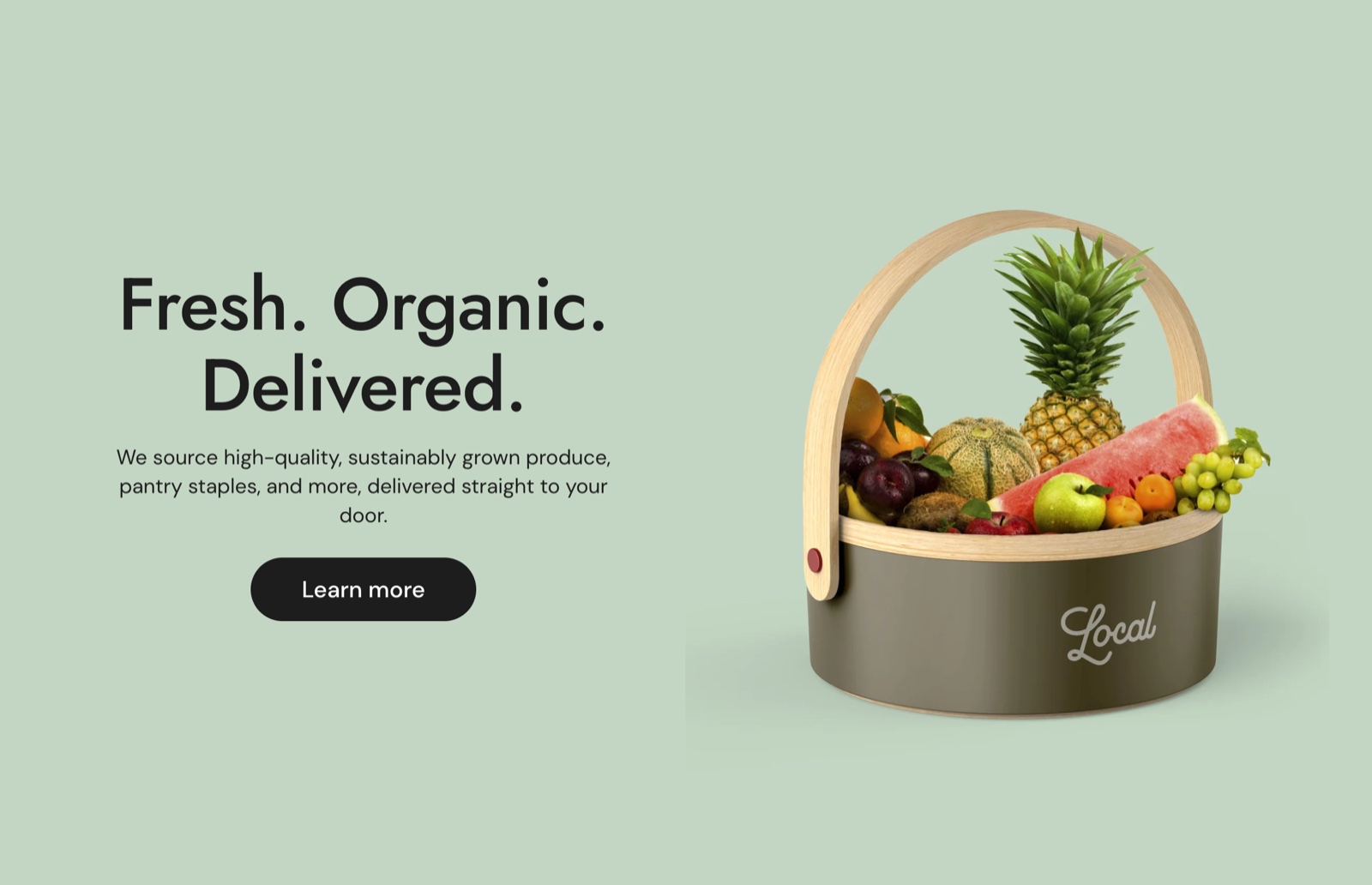
Presets
- Rich text with image starts with a heading, a text and a button next to an image on the right.
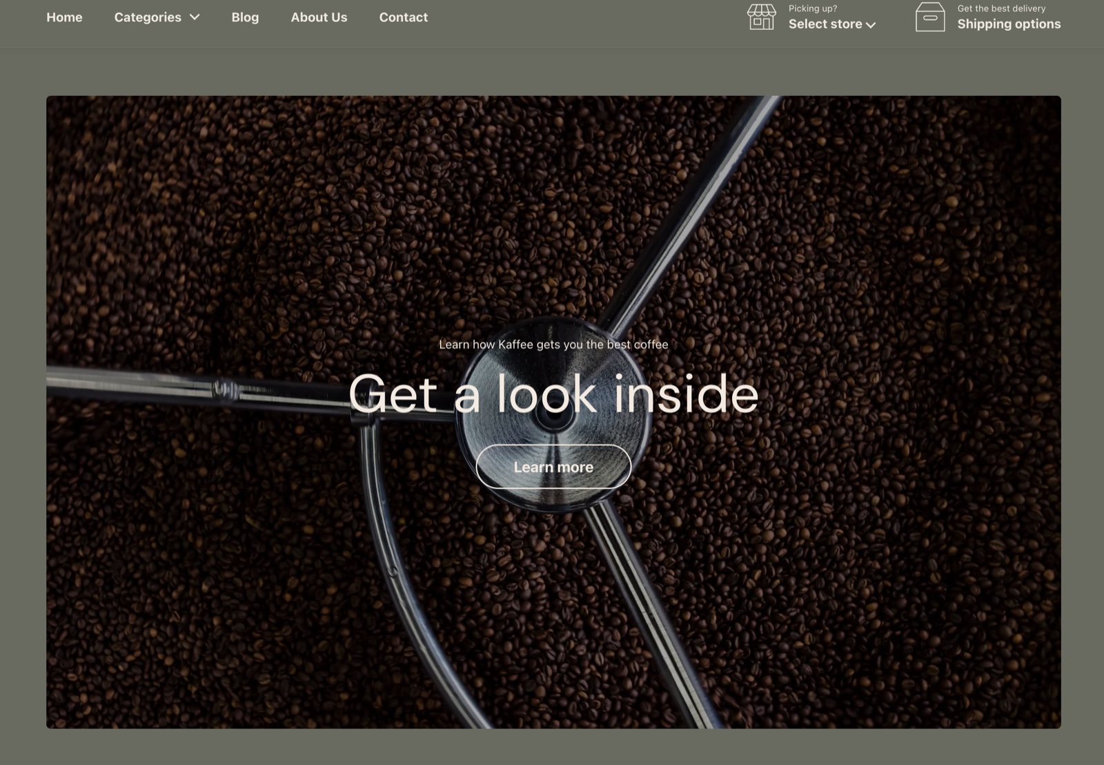
- Fullwidth text banner starts with no image, a dark full width card with white text: a text, a heading and a button.
Both are the same section; every setting is available after you add either one.
Card height
Card height sets the minimum height of the card on desktop, as a share of the screen height: Small (40 percent), Medium (60 percent, default) or Large (80 percent). On phones the card is as tall as its content.
Image
- Image is the large picture of the card.
- Image position puts it On the left, Above the text, On the right (default), or hides it (No image: Don't show image).
- Fill image area (on by default) crops the image to fill the full height of the card on desktop. Turn it off to show the whole image. On phones the image is always shown whole.
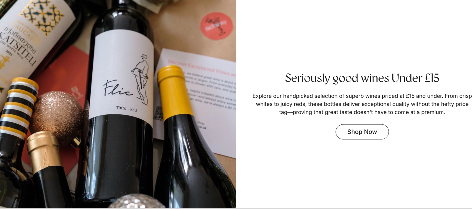
Typography
- Text container width sets how wide the text area is: Medium, Large or Full (default).
- Text horizontal alignment aligns the blocks Left, Center (default) or Right.
- Text vertical alignment places the text at the Top, Middle (default) or Bottom of the card, on desktop, when the image is on the left or right.
- Text spacing sets the space between the blocks: Small, Medium (default), Large or Extra large.
Design
- Fullwidth (under Section design) stretches the card to the edges of the screen, with square corners. Background color and Background gradient color the area around the card, so they show when the section is not full width.
- Custom card design colors the card itself: Background (it covers the section background), Text, Accent (links and button hover), Border and Shadow, with Hide border and Hide shadow.
- Descrease top margin, Remove top margin and Section visibility work as in every section, see General section styling.
Blocks
Add up to nine blocks and drag them into order.
Heading
Heading is the title text, with Heading size (Regular, Large, Extra large) and its Heading tag under SEO (H2 by default).
Text
Text is a paragraph with formatting and links, with Text size Regular or Large.
Button
Button label, Button link and Open link in a new window set the button; Button size (Regular, Large) and Button style (Outline, Solid) set its look.
Custom HTML / Liquid
Custom Liquid adds your own HTML or Liquid code between the other blocks. Krown support does not help with custom code, see Custom CSS and code.
Star rating
A row of five stars with Rating (0 to 100 percent, 20 percent per star), Caption and Star color. The rating is typed by hand, not read from a reviews app.
Image
A small image among the blocks, such as an icon or a logo, with Height 40 to 240 px. It is not the large card image.
Empty space
Adds space between two blocks: Height Small (no extra height), Medium (20 px, default) or Large (40 px), on top of the Text spacing.
How do I show a full width banner with text only?
Add the Fullwidth text banner preset, or set Image position to No image: Don't show image and turn on Fullwidth. Set the card colors in Custom card design → Background and Text.
Why is my image cropped?
Because Fill image area is on: the image fills the full height of the card and its edges are cut. Turn it off to show the whole image, or lower Card height.
All Rich text settings
Every setting, with its type and default.
Accepts these blocks: Heading, Text, Button, Custom HTML / Liquid, Star rating, Image and Empty space (up to 9 blocks in the section).
Card height (dropdown, default: Medium): Sets the minimum height of the card on desktop as a share of the screen height: Small 40, Medium 60, Large 80 percent. Options: Small, Medium, Large.
Rich text section: Image
Where to find it: Rich text → Image
Image (image).
Image position (dropdown, default: On the right): Puts the large image left, above or right of the text, or hides it. Options: On the left, Above the text, On the right, No image: Don't show image.
Fill image area (checkbox, default: on): Crops the image to fill the full height of the card on desktop. Off shows the whole image.
Rich text section: Typography
Where to find it: Rich text → Typography
Text container width (dropdown, default: Full). Options: Medium, Large, Full.
Text horizontal alignment (dropdown, default: Center). Options: Left, Center, Right.
Text vertical alignment (dropdown, default: Middle): Places the text at the top, middle or bottom of the card on desktop, when the image is on the left or right. Options: Top, Middle, Bottom.
Text spacing (dropdown, default: Medium). Options: Small, Medium, Large, Extra large.
Rich text section: Section design
Where to find it: Rich text → Section design
The Rich text section uses the standard Section design settings, listed in General section styling. Not available in this section: Heading text color.
Fullwidth (checkbox, default: off): Stretches the card to the edges of the screen, with square corners.
Background color (color, default: transparent).
Background gradient (gradient).
Descrease top margin (checkbox, default: off): Sets the space above the section to the grid gap of Theme settings → Layout → Horizontal space, instead of the full space between sections. Shown only when Remove top margin is off.
Remove top margin (checkbox, default: off): Removes the space above the section, so it touches the section before it. Shown only when Descrease top margin is off.
These settings differ from the standard ones or exist only here:
Fullwidth (checkbox, default: off): Stretches the card to the edges of the screen, with square corners.
Rich text section: Custom card design
Where to find it: Rich text → Custom card design
The Rich text section uses the standard Custom card design settings, listed in General section styling.
Background (color, default: transparent): Sets the card background. It covers the section background.
Text (color, default: transparent).
Accent (color, default: transparent): Sets the color of links and the button hover in the card.
Border (color, default: transparent).
Shadow (color, default: transparent).
Hide border (checkbox, default: off).
Hide shadow (checkbox, default: off).
These settings differ from the standard ones or exist only here:
Accent (color, default: transparent): Sets the color of links and the button hover in the card.
Rich text section: Visibility
Where to find it: Rich text → Visibility
The Rich text section uses the standard Visibility settings, listed in General section styling.
Section visibility (dropdown, default: Show always): Shows the section on every screen, only below 768 px (mobile) or only from 768 px (desktop, tablets included). A hidden section is still in the page. Options: Show always, Show only on mobile, Show only on desktop.
Heading block
Where to find it: Rich text → Add block → Heading
Heading (formatted text, default: "Talk about your brand").
Heading size (dropdown, default: Large). Options: Regular, Large, Extra large.
Heading block: SEO
Where to find it: Rich text → Add block → Heading → SEO
Heading tag (dropdown, default: H2): Specify heading level to help search engines index the structure of your page. Options: H1, H2, H3, H4, span.
Text block
Where to find it: Rich text → Add block → Text
Text (rich text, default: "Use this text to share information about your brand with your customers. Describe a product, share…").
Text size (dropdown, default: Regular). Options: Regular, Large.
Button block
Where to find it: Rich text → Add block → Button
Button label (text field, default: "Show more").
Button link (link).
Open link in a new window (checkbox, default: off). Shown only when Button link is set.
Button size (dropdown, default: Large). Options: Regular, Large.
Button style (dropdown, default: Outline). Options: Outline, Solid.
Custom HTML / Liquid block
Where to find it: Rich text → Add block → Custom HTML / Liquid
Custom Liquid (Liquid): Adds your own HTML or Liquid between the blocks. Krown support does not help with custom code.
Star rating block
Where to find it: Rich text → Add block → Star rating
Rating (slider 0 to 100 %, step 10, default: 80 %): Sets how many of the five stars are filled; each star is 20 percent. The rating is typed, not read from an app.
Caption (text field).
Star color (color, default: #FFCC00).
Image block
Where to find it: Rich text → Add block → Image
Image (image).
Height (slider 40 to 240 px, step 2, default: 80 px): Sets the height of this small image, such as an icon or logo. It is not the large card image.
Empty space block
Where to find it: Rich text → Add block → Empty space
Height (dropdown, default: Medium): Adds space between two blocks: Small adds no height of its own, Medium 20 px, Large 40 px, on top of Text spacing. Options: Small, Medium, Large.