Slideshow (legacy) section
The Slideshow (legacy) section of Local is the older slideshow kept for existing stores; new stores use the Flex slideshow section.
Applies to: Local 4.2.1 and later. Added in: Local 1.0.0. Last checked: 2026-10-13 against Local 4.2.1.
The Slideshow (legacy) section is the original Local slideshow: image or video slides with a caption, a title and a button. It is kept so that stores that already use it keep working. It cannot be added any more; new slideshows use the Flex slideshow section, which holds free theme blocks.
Where to find it: Online Store → Themes → Customize → select an existing Slideshow (legacy) section (it is not in Add section)
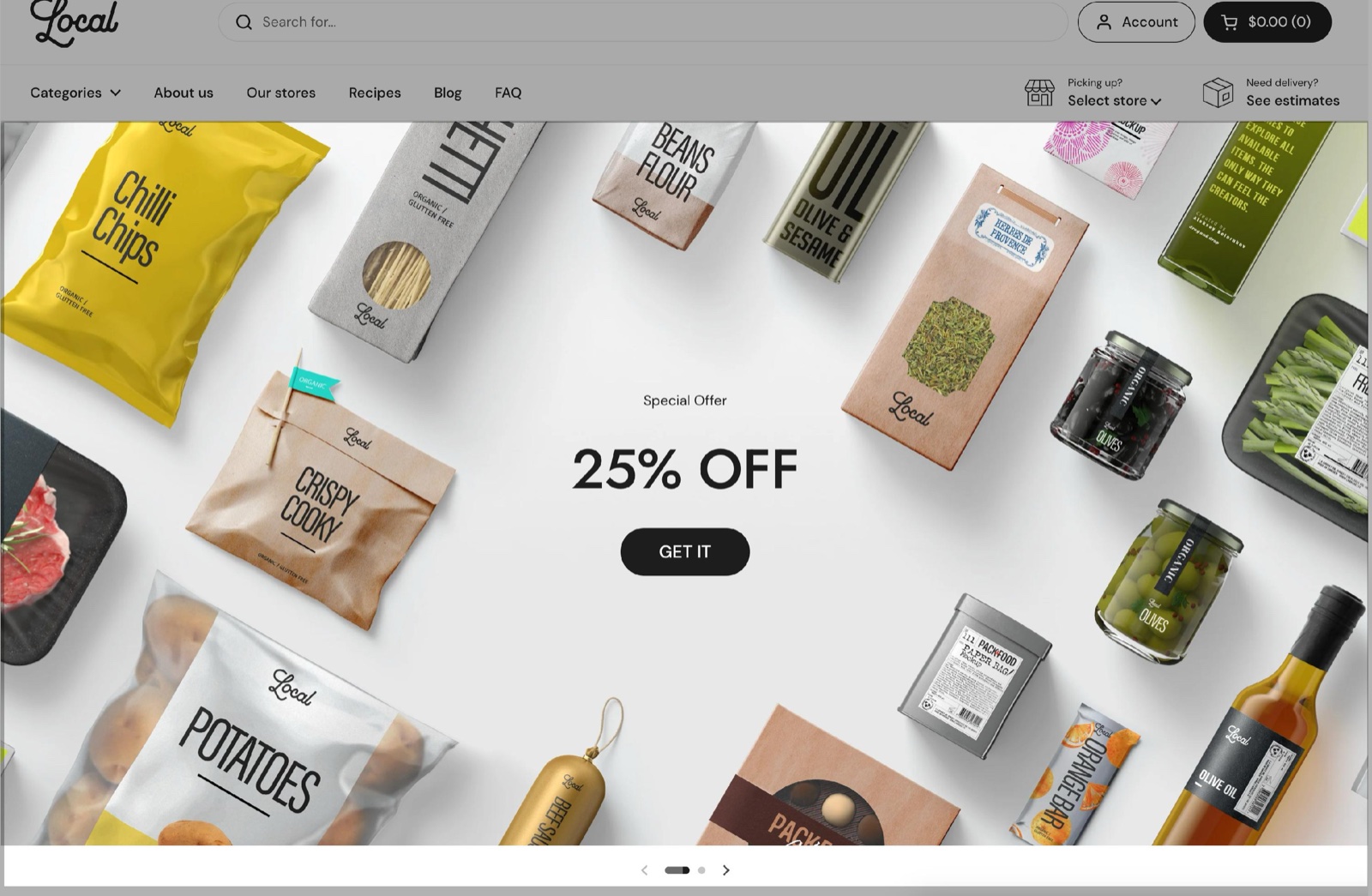
Slideshow height
- Desktop height and Mobile height set the height as a share of the screen height: Small 40 percent, Regular 50 percent, Medium 60 percent, Large 80 percent. The defaults are Large on desktop and Medium on mobile, and a slide is never shorter than 450 px. Mobile height applies to screens narrower than 1024 px.
- Auto height ignores both heights: each slide takes the height of its own image.
Autorotate
Enable autorotate moves to the next slide by itself, every Interval seconds (3 to 10, default 5).
Typography
- Text alignment places the text in one of nine positions (default Left bottom).
- Text container width sets Medium, Large or Full (default).
- Text spacing sets the space between caption, title and button: Small, Medium, Large (default) or Extra large.
- Caption size (Regular, Large, Extra large), Heading size (Regular, Large, Extra large), Button size (Regular, Large) and Button style (Outline, Solid) set the look of the text and button.
Design
- Fullwidth stretches the slides to the edges of the screen.
- Background color, Background gradient and Navigation elements color (arrows and dots) are under Section design, with Descrease top margin and Remove top margin.
- Hide border and Hide shadow (on by default) remove the border and shadow of the slides.
Accessibility
Disable parallax effect stops the slide images from shifting while customers swipe between slides.
Slide blocks
The section takes up to 6 slides.
- An Image slide has Image, Mobile image (optional) and Video file (a Shopify-hosted video that plays in the background, with the image as fallback), then Caption, Title, Link, Open link in a new window and Button label. The Link goes on the button, or on the title when there is no button, or on the whole slide when both are empty. Overlay and Text set the colors; Heading tag is under SEO.
- A Video slide plays a Video URL (YouTube or Vimeo) or a Video file (hosted by Shopify, replaces the URL), with a Background image as poster, Enable video autoplay (muted, no controls) and Enable video looping. Text sets the color of the play button.
Why can I not add the Slideshow section?
Because Slideshow (legacy) has no preset any more, so it is not listed in Add section. Sections that were added before keep working and can still be edited. For a new slideshow, add the Flex slideshow section, which has the same heights, autorotate and design options and lets you arrange the slide content with theme blocks.
What image size should I use for slides?
Landscape images at least 1920 px wide, for a full width slideshow.
- A slideshow that is not full width needs images as wide as Theme settings → Layout → Maximum page width (1360 px by default).
- Twice that width gives sharp results on high-resolution screens.
- The slide height is a share of the screen, so the image is cropped to fit.
- Upload a portrait Mobile image (optional) for phones.
See What image sizes should I use in Local?.
All Slideshow (legacy) settings
Every setting, with its type and default.
Accepts these blocks: Image and Video (up to 6 blocks in the section).
Desktop height (dropdown, default: Cropped: Large): Sets the slide height as a share of the screen height: Small 40, Regular 50, Medium 60, Large 80 percent, never below 450 px. Options: Cropped: Small, Cropped: Regular, Cropped: Medium, Cropped: Large. Shown only when Auto height is off.
Mobile height (dropdown, default: Cropped: Medium): Sets the slide height on screens narrower than 1024 px, as a share of the screen height. Options: Cropped: Small, Cropped: Regular, Cropped: Medium, Cropped: Large. Shown only when Auto height is off.
Auto height (checkbox): Checking this option will overwrite the height settings above and make the slideshow's height responsive to the image inside each slide.
Slideshow (legacy) section: Autorotate
Where to find it: Slideshow (legacy) → Autorotate
Enable autorotate (checkbox, default: off).
Interval (slider 3 to 10 s, default: 5 s). Shown only when Enable autorotate is on.
Slideshow (legacy) section: Typography
Where to find it: Slideshow (legacy) → Typography
Text alignment (dropdown, default: Left bottom). Options: Left top, Center top, Right top, Left middle, Center middle, Right middle, Left bottom, Center bottom, Right bottom.
Text container width (dropdown, default: Full). Options: Medium, Large, Full.
Text spacing (dropdown, default: Large). Options: Small, Medium, Large, Extra large.
Caption size (dropdown, default: Regular). Options: Regular, Large, Extra large.
Heading size (dropdown, default: Large). Options: Regular, Large, Extra large.
Button size (dropdown, default: Large). Options: Regular, Large.
Button style (dropdown, default: Solid). Options: Outline, Solid.
Slideshow (legacy) section: Section design
Where to find it: Slideshow (legacy) → Section design
The Slideshow (legacy) section uses the standard Section design settings, listed in General section styling.
Fullwidth (checkbox, default: off): Extend the background of this section to fill the screen.
Background color (color, default: transparent).
Background gradient (gradient).
Navigation elements color (color, default: transparent): Sets the color of the slider arrows and dots.
Descrease top margin (checkbox, default: off): Sets the space above the section to the grid gap of Theme settings → Layout → Horizontal space, instead of the full space between sections. Shown only when Remove top margin is off.
Remove top margin (checkbox, default: off): Removes the space above the section, so it touches the section before it. Shown only when Descrease top margin is off.
These settings differ from the standard ones or exist only here:
Fullwidth (checkbox, default: off): Extend the background of this section to fill the screen.
Navigation elements color (color, default: transparent): Sets the color of the slider arrows and dots.
Slideshow (legacy) section: Custom card design
Where to find it: Slideshow (legacy) → Custom card design
The Slideshow (legacy) section uses the standard Custom card design settings, listed in General section styling. In this section the group has only Hide border and Hide shadow.
Hide border (checkbox, default: off).
Hide shadow (checkbox, default: on).
Slideshow (legacy) section: Accessibility
Where to find it: Slideshow (legacy) → Accessibility
Disable parallax effect (checkbox, default: off): Stops the slide images from shifting while customers swipe between slides.
Slideshow (legacy) section: Visibility
Where to find it: Slideshow (legacy) → Visibility
The Slideshow (legacy) section uses the standard Visibility settings, listed in General section styling.
Section visibility (dropdown, default: Show always): Shows the section on every screen, only below 768 px (mobile) or only from 768 px (desktop, tablets included). A hidden section is still in the page. Options: Show always, Show only on mobile, Show only on desktop.
Image block
Where to find it: Slideshow (legacy) → Add block → Image
Image (image).
Mobile image (optional) (image).
Video file (video): Plays a Shopify-hosted video behind the slide text, with the image as fallback.
Image block: Text content
Where to find it: Slideshow (legacy) → Add block → Image → Text content
Caption (text field, default: "Introducing").
Title (text field, default: "Your best promotion yet").
Link (link): Goes on the button. Without a button, on the title. Without both, on the whole slide.
Open link in a new window (checkbox, default: off). Shown only when Link is set.
Button label (text field, default: "Show more").
Image block: Custom card design
Where to find it: Slideshow (legacy) → Add block → Image → Custom card design
Overlay (color, default: transparent): Tints the slide image so the text stays readable.
Text (color, default: transparent).
Image block: SEO
Where to find it: Slideshow (legacy) → Add block → Image → SEO
Heading tag (dropdown, default: H3): Specify heading level to help search engines index the structure of your page. Options: H1, H2, H3, H4, span.
Video block
Where to find it: Slideshow (legacy) → Add block → Video
Video URL (video URL, default: https://www.youtube.com/watch?v=_9VUPq3SxOc).
Video file (video): Hosted by Shopify. Replaces video URL.
Background image (image): Used as a poster or a fallback image.
Enable video autoplay (checkbox, default: off): The video will be muted and without controls.
Enable video looping (checkbox, default: off).
Video block: Custom card design
Where to find it: Slideshow (legacy) → Add block → Video → Custom card design
Text (color, default: #000000): Sets the color of the play button.