Flex slideshow section
The Flex slideshow section of Local is a hero slideshow whose image and video slides hold theme blocks such as headings, buttons and ratings.
Applies to: Local 4.2.1 and later. Added in: Local 2.7.0. Last checked: 2026-10-13 against Local 4.2.1.
The Flex slideshow section is a large slideshow for the top of a page. Each slide is an image or a video, and image slides hold theme blocks you arrange freely: a caption, a heading, a star rating, buttons. It replaces the older Slideshow (legacy) section.
Where to find it: Online Store → Themes → Customize → Add section → Flex slideshow
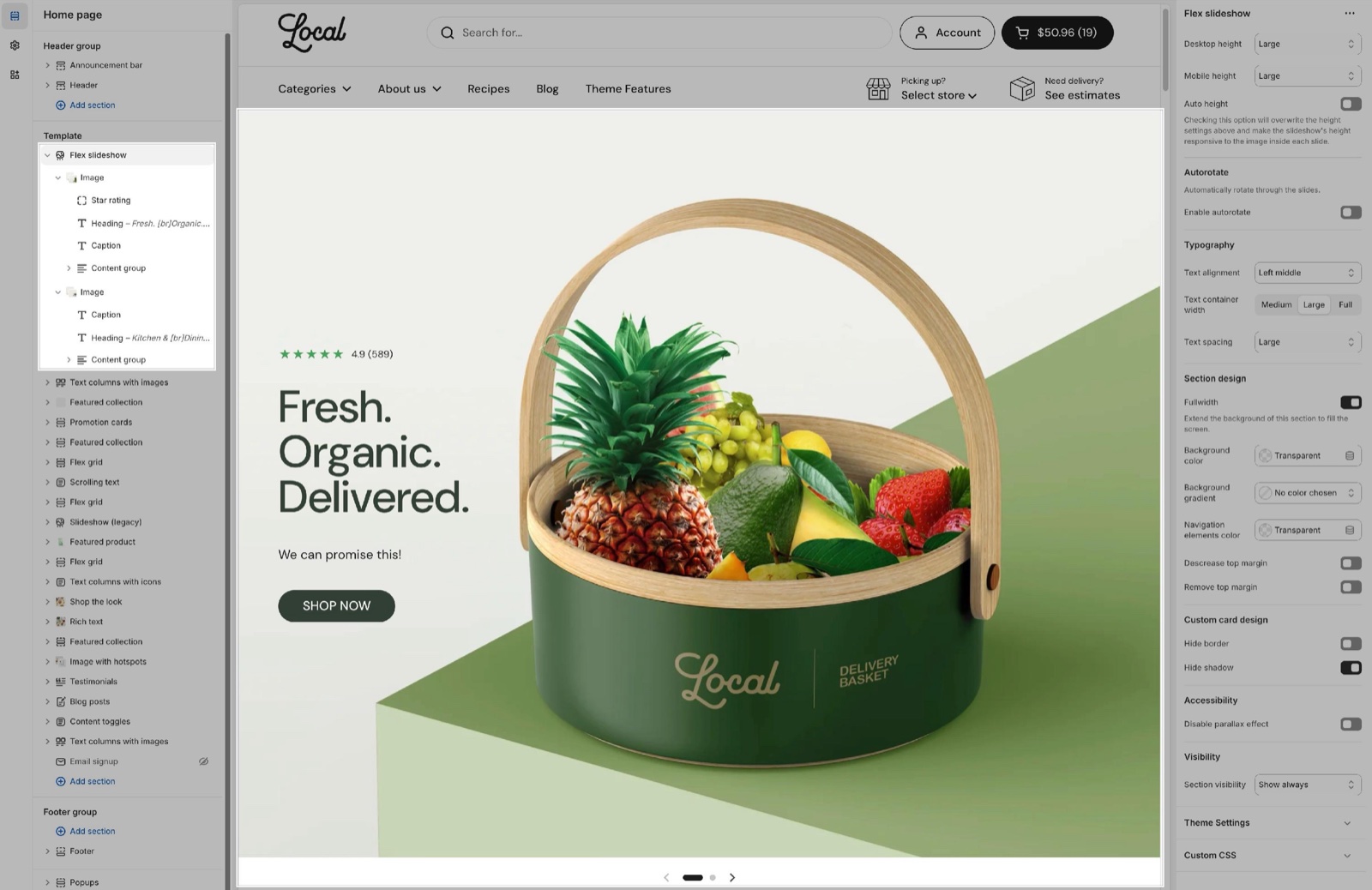
Slideshow height
- Desktop height and Mobile height set the height of the slides as a share of the screen height: Small 40 percent, Regular 50 percent, Medium 60 percent (default), Large 80 percent, Extra large 100 percent. A slide is never shorter than 450 px.
- Mobile height applies to screens narrower than 1024 px, tablets included.
- Auto height ignores both heights: each slide takes the height of its own image, so nothing is cropped. Slides with different image shapes then have different heights.
With a fixed height, the image fills the slide and is cropped at the edges. Set the focal point of the image in Shopify's image editor to keep the important part visible. See What image sizes should I use in Local?.
A slideshow with one slide shows no arrows or dots.
Autorotate
- Enable autorotate moves to the next slide by itself.
- Interval sets the time per slide, 3 to 10 seconds (default 5). With autorotate on, the dots are replaced by a counter ("1 / 3") with a progress line.
Typography
These settings place the blocks inside every slide of the section:
- Text alignment places the content in one of nine positions, from Left top to Right bottom (default Left bottom).
- Text container width sets how wide the content area can be: Medium (half the slide), Large (70 percent) or Full (default).
- Text spacing sets the space between the blocks: Small, Medium (default), Large or Extra large.
The look of each block (heading size, button style and so on) is set in the block itself.
Section design
- Fullwidth stretches the slides to the edges of the screen, with square corners and no border or shadow. When it is off, the slides sit inside the page width with the card corner radius from Theme settings → Borders.
- Background color and Background gradient color the section behind the slides, which shows when the slideshow is not full width.
- Navigation elements color sets the color of the arrows, dots and counter.
- Descrease top margin and Remove top margin bring the slideshow closer to the section above, see General section styling.
Under Custom card design, Hide border and Hide shadow (on by default) remove the card border and shadow of the slides.
Accessibility
Disable parallax effect stops the slide images from shifting while customers swipe between slides. Turn it on for a calmer slideshow.
Image slide
The Image slide is the main slide type. It holds any theme block and app blocks. See Blocks.
- Image is the slide picture. Mobile image (optional) replaces it on phones, for example a portrait crop with the text area free.
- Video background plays a Shopify-hosted video behind the blocks, muted and looping. The Image shows while the video loads and when it cannot play.
- Use different media on mobile and Mobile video background play another video on phones.
- Link makes the whole slide clickable. Open link in a new window opens the link in a new tab.
- Under Custom card design, Overlay darkens or tints the media so the text stays readable, and Text sets the text color of the slide.
When a slide has its own Link, the links inside it (buttons, text links) do not work: the whole slide opens the slide link. Leave Link empty when the slide has buttons.
Video slide
The Video slide plays a video in the slide, with no blocks on top.
- Video URL is a YouTube or Vimeo link. Video file is a video uploaded to Shopify and replaces the URL.
- Video poster image shows before the video plays and when it cannot load.
- Enable video autoplay starts the video by itself, muted and without controls. Enable video looping replays it.
- Use different media on mobile shows another video (Mobile video (URL) or Mobile video file) and Mobile poster image on phones.
- Text (Custom card design) sets the color of the play button.
Setting up a Flex slideshow
Add the section
In the theme editor, open the page, select Add section and choose Flex slideshow. It starts with two Image slides, each with a caption, a heading and two buttons in a content group.
Set the height
Choose Desktop height and Mobile height, or turn on Auto height to show the images uncropped.
Add the slide media
Select each Image slide and pick its Image, plus a Mobile image (optional) if the picture should be cropped differently on phones.
Edit the slide content
Select the blocks inside the slide and change their text. Add blocks with Add block inside the slide (Heading, Text, Button, Star rating and so on) and drag them into order.
Place the content
In the section's Typography group, choose Text alignment, Text container width and Text spacing. They apply to every slide.
Add more slides
Select Add block in the section and choose Image or Video. Turn on Enable autorotate if the slides should move by themselves.
What image size should I use for slides?
Landscape images at least 1920 px wide, for a full width slideshow.
- A slideshow that is not full width needs images as wide as Theme settings → Layout → Maximum page width (1360 px by default).
- Twice that width gives sharp results on high-resolution screens.
- The slide height is a share of the screen, so the image is cropped to fit. Keep the subject in the middle or set its focal point.
- On phones, a separate Mobile image (optional) in portrait format works best.
See What image sizes should I use in Local?.
Why do my buttons on a slide not work?
Because the slide has a Link. A linked slide sends every click to that link. Remove the slide's Link to make the buttons work.
All Flex slideshow settings
Every setting, with its type and default.
Accepts these blocks: Image and Video.
Desktop height (dropdown, default: Cropped: Medium): Sets the slide height as a share of the screen height: Small 40, Regular 50, Medium 60, Large 80, Extra large 100 percent, never below 450 px. Options: Cropped: Small, Cropped: Regular, Cropped: Medium, Cropped: Large, Cropped: Extra large. Shown only when Auto height is off.
Mobile height (dropdown, default: Cropped: Medium): Sets the slide height on screens narrower than 1024 px, as a share of the screen height. Options: Cropped: Small, Cropped: Regular, Cropped: Medium, Cropped: Large, Cropped: Extra large. Shown only when Auto height is off.
Auto height (checkbox): Checking this option will overwrite the height settings above and make the slideshow's height responsive to the image inside each slide.
Flex slideshow section: Autorotate
Where to find it: Flex slideshow → Autorotate
Enable autorotate (checkbox, default: off).
Interval (slider 3 to 10 s, default: 5 s): Sets the time each slide shows. With autorotate on, the dots become a counter with a progress line. Shown only when Enable autorotate is on.
Flex slideshow section: Typography
Where to find it: Flex slideshow → Typography
Text alignment (dropdown, default: Left bottom): Places the blocks inside every slide, in one of nine positions. Options: Left top, Center top, Right top, Left middle, Center middle, Right middle, Left bottom, Center bottom, Right bottom.
Text container width (dropdown, default: Full): Sets the width of the content area: Medium is half the slide, Large 70 percent, Full the whole slide. Options: Medium, Large, Full.
Text spacing (dropdown, default: Medium): Sets the space between the blocks of the slides. Options: Small, Medium, Large, Extra large.
Flex slideshow section: Section design
Where to find it: Flex slideshow → Section design
The Flex slideshow section uses the standard Section design settings, listed in General section styling.
Fullwidth (checkbox, default: off): Stretches the slides to the edges of the screen, with square corners and no border or shadow.
Background color (color, default: transparent).
Background gradient (gradient).
Navigation elements color (color, default: transparent): Sets the color of the arrows, dots and counter.
Descrease top margin (checkbox, default: off): Sets the space above the section to the grid gap of Theme settings → Layout → Horizontal space, instead of the full space between sections. Shown only when Remove top margin is off.
Remove top margin (checkbox, default: off): Removes the space above the section, so it touches the section before it. Shown only when Descrease top margin is off.
These settings differ from the standard ones or exist only here:
Fullwidth (checkbox, default: off): Stretches the slides to the edges of the screen, with square corners and no border or shadow.
Navigation elements color (color, default: transparent): Sets the color of the arrows, dots and counter.
Flex slideshow section: Custom card design
Where to find it: Flex slideshow → Custom card design
The Flex slideshow section uses the standard Custom card design settings, listed in General section styling. In this section the group has only Hide border and Hide shadow.
Hide border (checkbox, default: off).
Hide shadow (checkbox, default: on).
Flex slideshow section: Accessibility
Where to find it: Flex slideshow → Accessibility
Disable parallax effect (checkbox, default: off): Stops the slide images from shifting while customers swipe between slides.
Flex slideshow section: Visibility
Where to find it: Flex slideshow → Visibility
The Flex slideshow section uses the standard Visibility settings, listed in General section styling.
Section visibility (dropdown, default: Show always): Shows the section on every screen, only below 768 px (mobile) or only from 768 px (desktop, tablets included). A hidden section is still in the page. Options: Show always, Show only on mobile, Show only on desktop.
Where to find it: Flex slideshow → Image.
Accepts these blocks: app blocks and any theme block.
Image (image).
Mobile image (optional) (image): Replaces the image on screens narrower than 1024 px.
Video background (video): Plays a Shopify-hosted video behind the blocks, muted and looping.
Use different media on mobile (checkbox, default: off). Shown only when Video background is set.
Mobile video background (video). Shown only when Use different media on mobile is on.
Link (link): Makes the whole slide clickable. Buttons and links inside the slide then do not work.
Open link in a new window (checkbox, default: off). Shown only when Link is set.
Image block: Custom card design
Where to find it: Flex slideshow → Image → Custom card design
Overlay (color, default: transparent): Tints the media so the text stays readable.
Text (color, default: transparent): Sets the color of the text blocks on the slide.
Where to find it: Flex slideshow → Video.
Video URL (video URL, default: https://www.youtube.com/watch?v=_9VUPq3SxOc): Sets a YouTube or Vimeo video.
Video file (video): Hosted by Shopify. Replaces video URL.
Video poster image (image): Shows before the video plays and when it cannot load.
Enable video autoplay (checkbox, default: off): The video will be muted and without controls.
Enable video looping (checkbox, default: off).
Use different media on mobile (checkbox, default: off). Shown only when Video file is set, or Video URL is set.
Mobile video (URL) (video URL). Shown only when Use different media on mobile is on.
Mobile video file (video): Replaces mobile video URL. Shown only when Use different media on mobile is on.
Mobile poster image (image). Shown only when Use different media on mobile is on.
Video block: Custom card design
Where to find it: Flex slideshow → Video → Custom card design
Text (color, default: #000000): Sets the color of the play button.