Text columns with icons section
The Text columns with icons section of Local shows icons with a title, caption and link, as a grid or slider, for store policies or features.
Applies to: Local 4.2.1 and later. Added in: Local 1.0.0. Last checked: 2026-10-13 against Local 4.2.1.
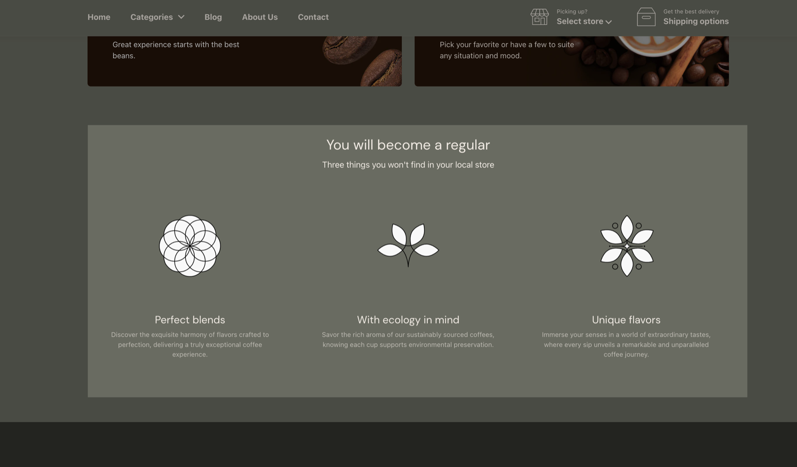
The Text columns with icons section shows a row of icons, each with a title, a caption and an optional link, as a slider or a grid. Use it for store policies, services or product features, such as free delivery, local pickup or organic products. You can change the color of each icon.
Where to find it: Online Store → Themes → Customize → Add section → Text columns with icons
Content
- Layout shows the items as a Slider (default) or a Grid.
- Desktop layout sets 3, 4 (default), 5 or 6 items per row on desktop. The layout adapts on smaller screens.
- Border radius rounds the icon background, 0 to 200 px. The default 200 px makes it a circle; 0 px keeps square corners.
Text color under Section design sets the color of the heading and the item texts. The other settings are the standard ones, see General section styling.
Text with icon blocks
Add one Text with icon block per item.
- Select an icon picks one of the built-in icons (business, commerce, food and drinks, eco). See them all in the Krown icon library.
- Custom icon uploads your own icon instead, at 256 x 256 px.
- Title and Caption are the text of the item. The title's tag is under SEO → Heading tag.
- Link makes the item clickable. Open link in a new window opens it in a new tab.
- Under Custom card design, Background colors the circle behind the icon and Icon colors the icon. Icon only works for the built-in icons, not for a custom icon image.
Where can I get more icons?
From the free Krown icon tool, or use your own. Download an icon, then upload it in Custom icon at 256 x 256 px.
We've included a small pack of icons in the theme, but you can also upload your own and of course, download any icon from our free icon's tool: resources.krownthemes.com/local
Why does my icon color not change?
Because the item uses a Custom icon image. Icon colors only the built-in icons from Select an icon. Upload a custom icon in the color you want, or pick a built-in icon.
All Text columns with icons settings
Every setting, with its type and default.
Accepts these blocks: Text with icon.
Text columns with icons section: Heading
Where to find it: Text columns with icons → Heading
The Text columns with icons section uses the standard Heading settings, listed in General section styling.
Heading (text field, default: "Text columns with icon").
Subheading (text field, default: "Share your best offers").
Text alignment (dropdown, default: Left). Options: Left, Center.
Show section link (checkbox, default: off): Adds a text link next to the section heading. Fill Link text and Link too.
Link text (text field). Shown only when Show section link is on.
Link (link). Shown only when Show section link is on and Link text is set.
Open link in a new window (checkbox, default: off). Shown only when Link is set and Show section link is on and Link text is set.
These settings differ from the standard ones or exist only here:
Heading (text field, default: "Text columns with icon").
Subheading (text field, default: "Share your best offers").
Text columns with icons section: Content
Where to find it: Text columns with icons → Content
Layout (dropdown, default: Slider). Options: Slider, Grid.
Desktop layout (dropdown, default: 4 columns): The layout adapts itself for mobile devices. Options: 3 columns, 4 columns, 5 columns, 6 columns.
Border radius (slider 0 to 200 px, step 2, default: 200 px): Rounds the background behind each icon. 200 px makes it a circle; 0 px keeps square corners.
Text columns with icons section: Section design
Where to find it: Text columns with icons → Section design
The Text columns with icons section uses the standard Section design settings, listed in General section styling.
Background color (color, default: transparent).
Background gradient (gradient).
Text color (color, default: transparent): Sets the color of the heading and the item texts.
Descrease top margin (checkbox, default: off): Sets the space above the section to the grid gap of Theme settings → Layout → Horizontal space, instead of the full space between sections. Shown only when Remove top margin is off.
Remove top margin (checkbox, default: off): Removes the space above the section, so it touches the section before it. Shown only when Descrease top margin is off.
These settings differ from the standard ones or exist only here:
Text color (color, default: transparent): Sets the color of the heading and the item texts.
Text columns with icons section: SEO
Where to find it: Text columns with icons → SEO
The Text columns with icons section uses the standard SEO settings, listed in General section styling.
Heading tag (dropdown, default: H2): Sets the HTML tag of the heading for search engines. It does not change how the heading looks. Options: H1, H2, H3, H4, span.
Text columns with icons section: Visibility
Where to find it: Text columns with icons → Visibility
The Text columns with icons section uses the standard Visibility settings, listed in General section styling.
Section visibility (dropdown, default: Show always): Shows the section on every screen, only below 768 px (mobile) or only from 768 px (desktop, tablets included). A hidden section is still in the page. Options: Show always, Show only on mobile, Show only on desktop.
Text with icon block
Where to find it: Text columns with icons → Add block → Text with icon
Select an icon (dropdown): To see all icons, visit the Krown icon library. Options: Business: Earth globe, Business: Favorite, Business: Flag, Business: Helpline, Business: Like hand, Business: Map marker, Business: Security shield, Business: Star, Commerce: Appointment, Commerce: Archive box, Commerce: Box, Commerce: Checkout cart, Commerce: Currency, Commerce: Delivery, Commerce: Delivery time, Commerce: Giftbox, Commerce: Label, Commerce: Open 24 hours, Commerce: Open box, Commerce: Paper bag, Commerce: Shipping truck, Commerce: Store, Commerce: Time, Commerce: Time limit, Commerce: Wallet, Food & Drinks: Alcohol bottle, Food & Drinks: Apple, Food & Drinks: Asian cuisine, Food & Drinks: Beer bottle, Food & Drinks: Birthday, Food & Drinks: Brewed coffee, Food & Drinks: Can, Food & Drinks: Cheese, Food & Drinks: Coffee beans, Food & Drinks: Dinner, Food & Drinks: Dome plate, Food & Drinks: French bread, Food & Drinks: Ice pop, Food & Drinks: Margarita, Food & Drinks: Microwave, Food & Drinks: Milk carton, Food & Drinks: Orange slice, Food & Drinks: Pizza slice, Food & Drinks: Spirit glass, Food & Drinks: Sushi roll, Food & Drinks: Bake-out box, Food & Drinks: Wine glass, Eco: Ecological, Eco: Leaf, Eco: Organic, Eco: Tree.
Custom icon (image): Replaces the built-in icon with your own image, at 256 x 256 px.
Text with icon block: Text content
Where to find it: Text columns with icons → Add block → Text with icon → Text content
Title (text field, default: "Text with icon").
Caption (text field, default: "Introduce your brand").
Link (link).
Open link in a new window (checkbox, default: off). Shown only when Link is set.
Text with icon block: Custom card design
Where to find it: Text columns with icons → Add block → Text with icon → Custom card design
Background (color, default: transparent): Colors the shape behind the icon.
Icon (color, default: transparent): Colors the built-in icon. It has no effect on a custom icon image.
Text with icon block: SEO
Where to find it: Text columns with icons → Add block → Text with icon → SEO
Heading tag (dropdown, default: H3): Sets the HTML tag of the heading for search engines. It does not change how the heading looks. Options: H1, H2, H3, H4, span.