Promotion cards section
The Promotion cards section of Local shows cards with an image above a caption, title, subtitle and button, for promotions and collections.
Applies to: Local 4.2.1 and later. Added in: Local 1.0.0. Last checked: 2026-10-13 against Local 4.2.1.
The Promotion cards section shows cards with an image on top and text below: a caption, a title, a subtitle and a button. It looks like Media with text overlay but the image sits above the text, in a card, and it has no video backgrounds.
Where to find it: Online Store → Themes → Customize → Add section → Promotion cards
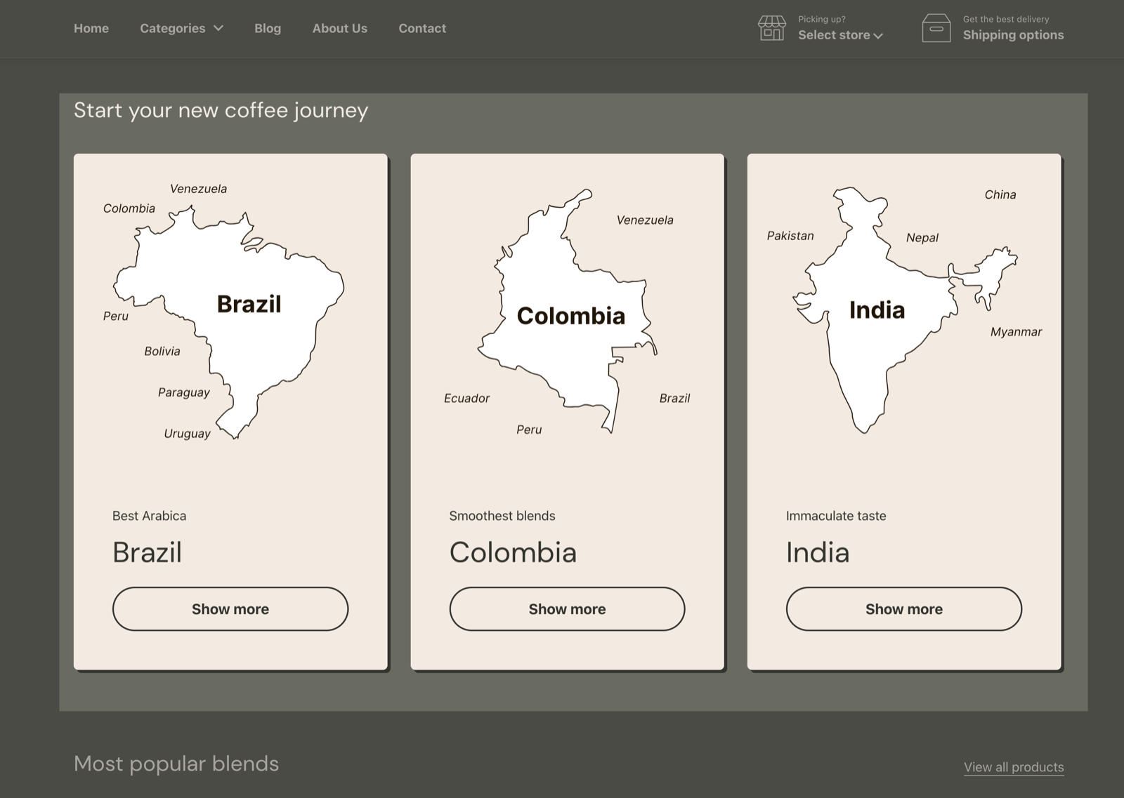
Content
- Desktop layout sets 2, 3 (default) or 4 cards per row on desktop. The layout adapts on smaller screens.
- Media aspect ratio crops every card image to the same shape: Short (4:3), Square (1:1, default), Tall (5:6) or Taller (2:3).
Text style
- Text alignment aligns the text in the cards: Left, Center (default) or Right.
- Caption size (Small, Regular, Large), Title size (Small to Extra large) and Subtitle size (Regular, Large) set the size of each line.
- Button size (Regular, Large) and Button style (Outline, Solid) set the button.
- Button width makes the button Fullwidth (default; across the card) or Contained (as wide as its label). It has no effect when Desktop layout is 2 columns.
The section background and margins are the standard Section design settings, see General section styling.
Card blocks
Add up to 12 Card blocks.
- Image is the card picture, cropped to Media aspect ratio.
- Caption, Title and Subtitle are the text lines; empty lines are hidden. The title's tag is under SEO → Heading tag.
- Button label and Link add a button. Open link in a new window opens the link in a new tab.
- Custom card design overrides the card colors: Background, Text, Accent (button hover), Border, Shadow, with Hide border and Hide shadow.
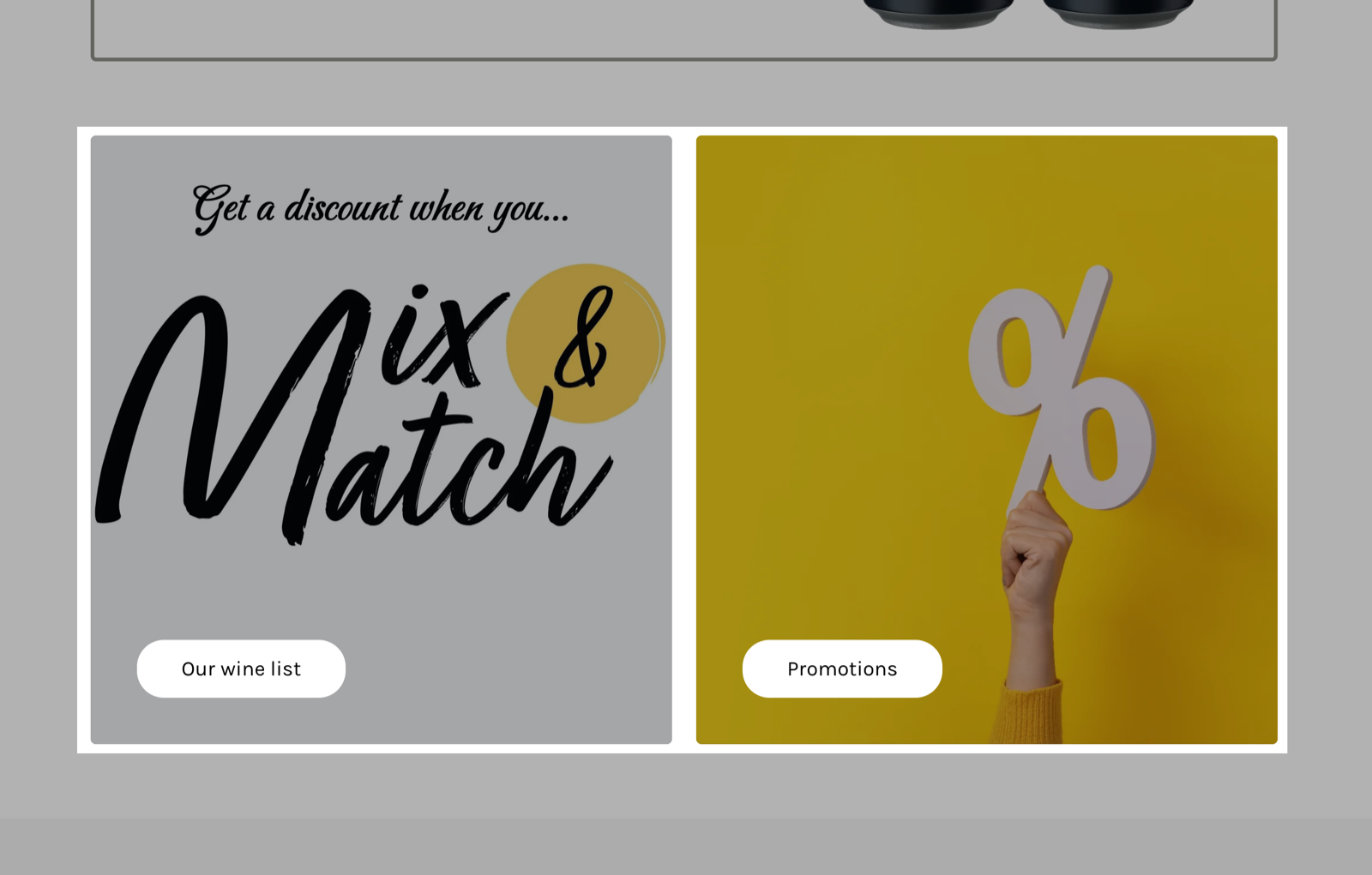
How do I make the whole card a link?
Fill Link and leave Button label empty. Without a button, the whole card becomes the link. With a button label, only the button opens the link.
Why are my card images cut off?
Because every image is cropped to Media aspect ratio. Choose the ratio closest to your images, or upload images in that shape. See What image sizes should I use in Local?.
All Promotion cards settings
Every setting, with its type and default.
Accepts these blocks: Card (up to 12 blocks in the section).
Promotion cards section: Heading
Where to find it: Promotion cards → Heading
The Promotion cards section uses the standard Heading settings, listed in General section styling.
Heading (text field, default: "Promotion cards").
Subheading (text field, default: "Share your best offers").
Text alignment (dropdown, default: Left). Options: Left, Center.
Show section link (checkbox, default: off): Adds a text link next to the section heading. Fill Link text and Link too.
Link text (text field). Shown only when Show section link is on.
Link (link). Shown only when Show section link is on and Link text is set.
Open link in a new window (checkbox, default: off). Shown only when Link is set and Show section link is on and Link text is set.
These settings differ from the standard ones or exist only here:
Heading (text field, default: "Promotion cards").
Subheading (text field, default: "Share your best offers").
Promotion cards section: Content
Where to find it: Promotion cards → Content
Desktop layout (dropdown, default: 3 columns): The layout adapts itself for mobile devices. Options: 2 columns, 3 columns, 4 columns.
Media aspect ratio (dropdown, default: Square (1:1)): Crops every card image to this shape. Options: Short (4:3), Square (1:1), Tall (5:6), Taller (2:3).
Promotion cards section: Text style
Where to find it: Promotion cards → Text style
Text alignment (dropdown, default: Center). Options: Left, Center, Right.
Caption size (dropdown, default: Regular). Options: Small, Regular, Large.
Title size (dropdown, default: Regular). Options: Small, Regular, Large, Extra large.
Subtitle size (dropdown, default: Regular). Options: Regular, Large.
Button size (dropdown, default: Large). Options: Regular, Large.
Button style (dropdown, default: Outline). Options: Outline, Solid.
Button width (dropdown, default: Fullwidth): Fullwidth stretches the button across the card; Contained fits it to its label. No effect with 2 columns. Options: Fullwidth, Contained.
Promotion cards section: Section design
Where to find it: Promotion cards → Section design
The Promotion cards section uses the standard Section design settings, listed in General section styling.
Background color (color, default: transparent).
Background gradient (gradient).
Heading text color (color, default: transparent): Sets the color of the text outside the cards, mostly the section heading.
Descrease top margin (checkbox, default: off): Sets the space above the section to the grid gap of Theme settings → Layout → Horizontal space, instead of the full space between sections. Shown only when Remove top margin is off.
Remove top margin (checkbox, default: off): Removes the space above the section, so it touches the section before it. Shown only when Descrease top margin is off.
Promotion cards section: SEO
Where to find it: Promotion cards → SEO
The Promotion cards section uses the standard SEO settings, listed in General section styling.
Heading tag (dropdown, default: H2): Sets the HTML tag of the heading for search engines. It does not change how the heading looks. Options: H1, H2, H3, H4, span.
Promotion cards section: Visibility
Where to find it: Promotion cards → Visibility
The Promotion cards section uses the standard Visibility settings, listed in General section styling.
Section visibility (dropdown, default: Show always): Shows the section on every screen, only below 768 px (mobile) or only from 768 px (desktop, tablets included). A hidden section is still in the page. Options: Show always, Show only on mobile, Show only on desktop.
Card block
Where to find it: Promotion cards → Add block → Card
Image (image).
Card block: Text content
Where to find it: Promotion cards → Add block → Card → Text content
Caption (text field, default: "Introducing").
Title (text field, default: "Your best promotion yet").
Subtitle (text field, default: "Write about it").
Link (link): Without a Button label, the whole card becomes this link. With a label, only the button uses it.
Open link in a new window (checkbox, default: off). Shown only when Link is set.
Button label (text field, default: "Show more").
Card block: Custom card design
Where to find it: Promotion cards → Add block → Card → Custom card design
Background (color, default: transparent).
Text (color, default: transparent).
Accent (color, default: transparent): Sets the hover color of the card button.
Border (color, default: transparent).
Shadow (color, default: transparent).
Hide border (checkbox, default: off).
Hide shadow (checkbox, default: off).
Card block: SEO
Where to find it: Promotion cards → Add block → Card → SEO
Heading tag (dropdown, default: H3): Sets the HTML tag of the heading for search engines. It does not change how the heading looks. Options: H1, H2, H3, H4, span.