Content toggles section
The Content toggles section of Local shows collapsible content, for an FAQ or store details, with an optional image and contact form.
Applies to: Local 4.2.1 and later. Added in: Local 1.0.0. Last checked: 2026-10-13 against Local 4.2.1.
The Content toggles section shows a list of collapsible items. Each item has a title, a subtitle with an optional icon, a button, and content that opens on click. Use it for an FAQ, shipping details, store information or a list of events. A contact form and an image can sit next to the list.
Where to find it: Online Store → Themes → Customize → Add section → FAQ (or Events calendar)
Presets
The section has two presets with different starting items:
- FAQ: question items, for a help or support page.
- Events calendar: items with an event name, a place and time line and a "Register" button.
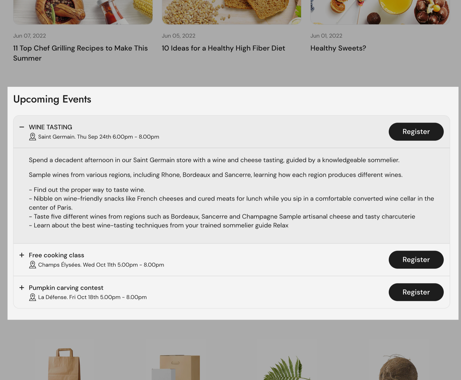
The Events calendar preset is a list you write by hand. It is not connected to your events blog or to event dates. For events from blog posts, use the Events list section, see Events calendar.
Content
- Have the first toggle opened by default opens the first item when the page loads.
- Title size sets Small or Large item titles.
- Enable structured data adds FAQ structured data (schema.org FAQPage) for search engines, with each item title as the question and its text as the answer.
Contact form
Show form adds a contact form next to the list, with Form title above it. The form has name, email and message fields and works like the Contact form section: messages go to your store email.
Image
Show image adds an image next to the list. Link makes it clickable, and Open link in a new window opens the link in a new tab. With both the form and the image on, the section shows three columns on desktop.
Content blocks
Add one Content block per item.
- Title is the item heading, always visible.
- Subtitle is a short line under the title, for example a date and place. Select an icon puts one of the built-in icons (delivery, store, time, giftbox and more) in front of it; the icon shows only when there is a subtitle.
- Button label and Button link add a solid button next to the title, for example "Register" or "Read our shipping policy".
- Text is the content that opens. It supports bold, italic, links and lists.
- Image adds a picture under the text. Constrain image width with Maximum width (50 to 300 px) keeps a small image, such as a diagram or logo, at its size.
- Hide block if dynamic content is not present hides the item when both its Text and Image are empty, for example when they are connected to a metafield that has no value.
Does the FAQ preset add FAQ structured data?
Only when you turn on Enable structured data; it is off by default. The section then outputs FAQPage data with every visible item. Google decides whether to show it in search results. Use it on one FAQ section per page, and only for real questions and answers.
Can I fill the items from a metafield?
Yes, per item. Connect the block's Text (or Image) to a metafield with the dynamic source button, on a product or page template, and turn on Hide block if dynamic content is not present so empty items disappear.
All Content toggles settings
Every setting, with its type and default.
Accepts these blocks: Content.
Content toggles section: Heading
Where to find it: Content toggles → Heading
The Content toggles section uses the standard Heading settings, listed in General section styling.
Heading (text field, default: "Frequently asked question").
Subheading (text field).
Text alignment (dropdown, default: Left). Options: Left, Center.
Show section link (checkbox, default: off): Adds a text link next to the section heading. Fill Link text and Link too.
Link text (text field). Shown only when Show section link is on.
Link (link). Shown only when Show section link is on and Link text is set.
Open link in a new window (checkbox, default: off). Shown only when Link is set and Show section link is on and Link text is set.
These settings differ from the standard ones or exist only here:
Heading (text field, default: "Frequently asked question").
Subheading (text field).
Content toggles section: Content
Where to find it: Content toggles → Content
Have the first toggle opened by default (checkbox, default: off): Opens the first item when the page loads.
Title size (dropdown, default: Small). Options: Small, Large.
Enable structured data (checkbox, default: off): Adds FAQPage structured data for search engines, with each item title as the question and its text as the answer. Hidden items are left out.
Content toggles section: Contact form
Where to find it: Content toggles → Contact form
Show form (checkbox, default: off): Adds a contact form next to the items. Messages go to your store email.
Form title (text field, default: "Contact form"). Shown only when Show form is on.
Content toggles section: Image
Where to find it: Content toggles → Image
Show image (checkbox, default: off): Adds an image next to the items. With the form also on, the section has three columns on desktop.
Image (image). Shown only when Show image is on.
Link (link). Shown only when Show image is on.
Open link in a new window (checkbox, default: off). Shown only when Link is set and Show image is on.
Content toggles section: SEO
Where to find it: Content toggles → SEO
The Content toggles section uses the standard SEO settings, listed in General section styling.
Heading tag (dropdown, default: H2): Sets the HTML tag of the heading for search engines. It does not change how the heading looks. Options: H1, H2, H3, H4, span.
Content block
Where to find it: Content toggles → Add block → Content
Content block: Header
Where to find it: Content toggles → Add block → Content → Header
Title (text field, default: "Question title").
Subtitle (text field, default: "Question subtitle").
Select an icon (dropdown, default: No icon): Puts a built-in icon in front of the subtitle. It shows only when the item has a subtitle. Options: No icon, Business: Earth globe, Business: Favorite, Business: Flag, Business: Helpline, Business: Like hand, Business: Map marker, Business: Security shield, Business: Star, Commerce: Appointment, Commerce: Archive box, Commerce: Box, Commerce: Checkout cart, Commerce: Currency, Commerce: Delivery, Commerce: Delivery time, Commerce: Giftbox, Commerce: Label, Commerce: Open 24 hours, Commerce: Open box, Commerce: Paper bag, Commerce: Shipping truck, Commerce: Store, Commerce: Time, Commerce: Time limit, Commerce: Wallet.
Button label (text field): Adds a solid button next to the item title. Fill Button link too.
Button link (link).
Content block: Content
Where to find it: Content toggles → Add block → Content → Content
Text (rich text, default: "Write a complete answer to the most frequent questions that your customers might have, such as impo…").
Image (image).
Constrain image width (checkbox, default: off): Keeps the image at Maximum width instead of the full width of the item. Shown only when Image is set.
Maximum width (slider 50 to 300 px, step 5, default: 300 px). Shown only when Constrain image width is on and Image is set.
Content block: Dynamic content
Where to find it: Content toggles → Add block → Content → Dynamic content
Hide block if dynamic content is not present (checkbox, default: off): Hides the item when both its Text and Image are empty, for example when they are connected to a metafield with no value.