Featured collection section
The Featured collection section of Local shows products from up to four collections as a grid or slider, with tabs between them.
Applies to: Local 4.2.1 and later. Added in: Local 1.0.0. Last checked: 2026-10-13 against Local 4.2.1.
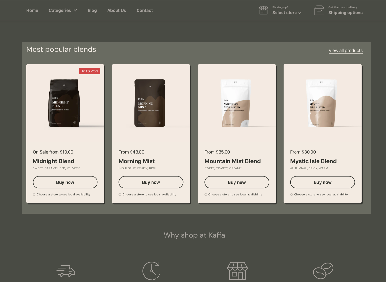
The Featured collection section shows products from a collection as a grid or a slider of product cards. Pick up to four collections and customers switch between them with tabs, for example "New", "Best sellers" and "On sale".
Where to find it: Online Store → Themes → Customize → Add section → Featured collection
Heading
Show link to collection page (on by default) adds a "View all products" link next to the heading. It opens the collection of the active tab. See General section styling for the other heading settings.
Content
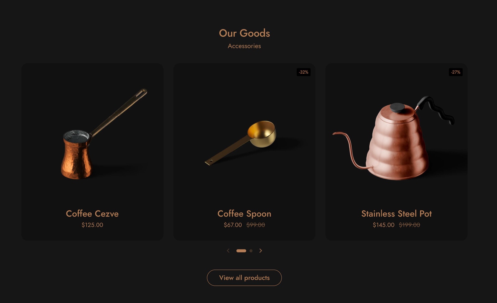
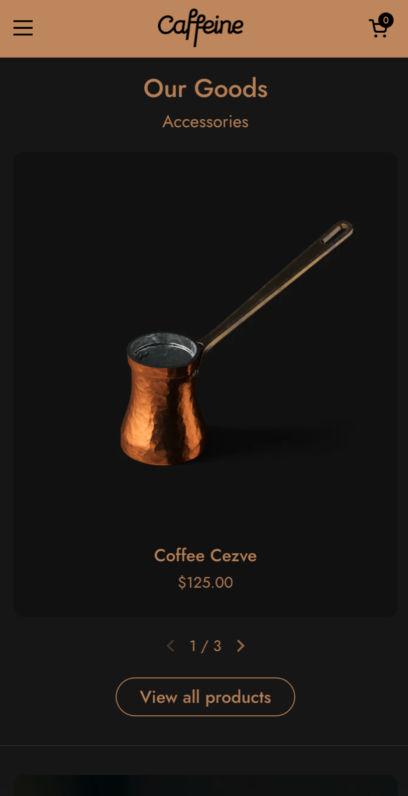
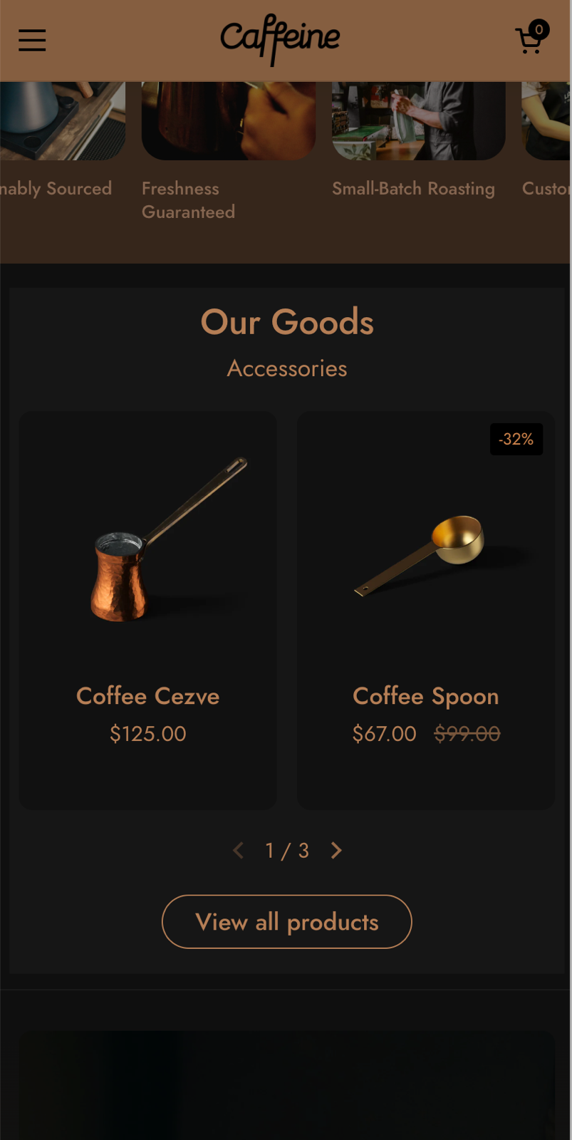
- Layout shows the products as a Grid (default) or a Slider that customers swipe.
- Desktop layout sets 3, 4 (default) or 5 products per row on desktop.
- Mobile layout sets 1 (default) or 2 products per row on phones.
- Maximum number of products shown limits how many products of each collection appear, from 4 to 96 (default 12).
Collections
The Collections group has four Collection pickers. With one collection, the section shows its products. With two or more, a row of tabs with the collection titles appears above the products, and customers click a tab to load that collection.
Custom card design
Background, Text, Buttons, Border and Shadow override the product card colors from Theme settings → Product card for this section. Buttons colors the Quick buy and Product link buttons. Hide border and Hide shadow remove them.
Product card blocks
The product cards are built from blocks: Price, Title, Quick buy, Vendor, Rating, Local availability, Icons list, Dynamic text, Product link and Empty space. Add the ones you need and drag them into order. Each block is explained in Product grid blocks.
How do I show several collections in tabs?
Pick a collection in two or more of the Collection settings. The section then shows one tab per collection, in the order of the pickers, with the first one open. Each tab shows up to Maximum number of products shown products of its collection.
Why does the section show placeholder products?
Because no collection is selected, or the selected collection has no products available on the Online Store. Pick a collection in Collection and check that its products are active and published to the Online Store sales channel.
All Featured collection settings
Every setting, with its type and default.
Accepts these blocks: Price, Title, Quick buy, Vendor, Rating, Local availability, Icons list, Dynamic text, Product link and Empty space.
Featured collection section: Heading
Where to find it: Featured collection → Heading
The Featured collection section uses the standard Heading settings, listed in General section styling. Not available in this section: Show section link, Link text, Link and Open link in a new window.
Heading (text field, default: "Featured collection").
Subheading (text field, default: "Showcase your best products").
Show link to collection page (checkbox, default: on): Adds a View all products link next to the heading. It opens the collection of the active tab.
Text alignment (dropdown, default: Left). Options: Left, Center.
These settings differ from the standard ones or exist only here:
Heading (text field, default: "Featured collection").
Show link to collection page (checkbox, default: on): Adds a View all products link next to the heading. It opens the collection of the active tab.
Featured collection section: Content
Where to find it: Featured collection → Content
Layout (dropdown, default: Grid). Options: Slider, Grid.
Desktop layout (dropdown, default: 4 columns). Options: 3 columns, 4 columns, 5 columns.
Mobile layout (dropdown, default: 1 column). Options: 1 column, 2 columns.
Maximum number of products shown (slider 4 to 96, default: 12): Sets how many products of each collection show, 4 to 96.
Featured collection section: Collections
Where to find it: Featured collection → Collections
Collection (collection picker): Sets the first collection. With two or more collections, the section shows one tab per collection.
Collection (collection picker): Adds a second collection as a tab.
Collection (collection picker): Adds a third collection as a tab.
Collection (collection picker): Adds a fourth collection as a tab.
Featured collection section: Custom card design
Where to find it: Featured collection → Custom card design
The Featured collection section uses the standard Custom card design settings, listed in General section styling.
Background (color, default: transparent).
Text (color, default: transparent).
Buttons (color, default: transparent): Sets the color of the Quick buy and Product link buttons in the cards.
Border (color, default: transparent).
Shadow (color, default: transparent).
Hide border (checkbox, default: off).
Hide shadow (checkbox, default: off).
These settings differ from the standard ones or exist only here:
Buttons (color, default: transparent): Sets the color of the Quick buy and Product link buttons in the cards.
Featured collection section: Section design
Where to find it: Featured collection → Section design
The Featured collection section uses the standard Section design settings, listed in General section styling.
Background color (color, default: transparent).
Background gradient (gradient).
Heading text color (color, default: transparent): Sets the color of the text outside the cards, mostly the section heading.
Descrease top margin (checkbox, default: off): Sets the space above the section to the grid gap of Theme settings → Layout → Horizontal space, instead of the full space between sections. Shown only when Remove top margin is off.
Remove top margin (checkbox, default: off): Removes the space above the section, so it touches the section before it. Shown only when Descrease top margin is off.
Featured collection section: SEO
Where to find it: Featured collection → SEO
The Featured collection section uses the standard SEO settings, listed in General section styling.
Heading tag (dropdown, default: H2): Sets the HTML tag of the heading for search engines. It does not change how the heading looks. Options: H1, H2, H3, H4, span.
Featured collection section: Visibility
Where to find it: Featured collection → Visibility
The Featured collection section uses the standard Visibility settings, listed in General section styling.
Section visibility (dropdown, default: Show always): Shows the section on every screen, only below 768 px (mobile) or only from 768 px (desktop, tablets included). A hidden section is still in the page. Options: Show always, Show only on mobile, Show only on desktop.
Price block
Where to find it: Featured collection → Add block → Price
One Price block per section.
The Price block has no settings in Local 4.2.1.
Title block
Where to find it: Featured collection → Add block → Title
One Title block per section.
The Title block has no settings in Local 4.2.1.
Quick buy block
Where to find it: Featured collection → Add block → Quick buy
One Quick buy block per section.
The Quick buy block has no settings in Local 4.2.1.
Vendor block
Where to find it: Featured collection → Add block → Vendor
One Vendor block per section.
The Vendor block has no settings in Local 4.2.1.
Rating block
Where to find it: Featured collection → Add block → Rating
One Rating block per section.
The Rating block has no settings in Local 4.2.1.
Local availability block
Where to find it: Featured collection → Add block → Local availability
One Local availability block per section.
This theme shows local availability for products. See Collection page.
Icons list block
Where to find it: Featured collection → Add block → Icons list
One Icons list block per section.
This theme allows you to add custom product icons through dynamic content. See Dynamic icons list theme settings.
Dynamic text block
Where to find it: Featured collection → Add block → Dynamic text
Label metafield (text field): Type the product metafield to show, as namespace.key (for example custom.product_info). The theme reads it for every product card; products without a value show nothing in this line.
Text size (dropdown, default: Regular): Sets the size of the metafield text in the card. Options: Small, Regular, Large.
Text color (color, default: #6A6A6A): Sets the color of the metafield text (grey by default).
Text transform (uppercase) (checkbox, default: off): Shows the metafield text in capital letters.
Product link block
Where to find it: Featured collection → Add block → Product link
One Product link block per section.
Button label (text field, default: "View product"): Sets the text of the button that opens the product page.
Empty space block
Where to find it: Featured collection → Add block → Empty space
The Empty space block has no settings in Local 4.2.1.