Product card theme settings
The Product card theme settings set the media, caption, buy buttons, colors and rating app of every product card in Local.
Applies to: Local 4.2.1 and later. Added in: Local 1.0.0. Last checked: 2026-10-13 against Local 4.2.1.
Product cards are the product boxes in collection pages, search results, featured collections, product recommendations and every other product grid. These settings set how all of them look. What each card shows (title, price, vendor, quick buy and so on) is chosen per section with blocks, see Product grid blocks.
Where to find it: Theme settings → Product card
The same group also holds the badge and icon settings, documented on Product badges theme settings and Dynamic icons list theme settings.
Product thumbnail
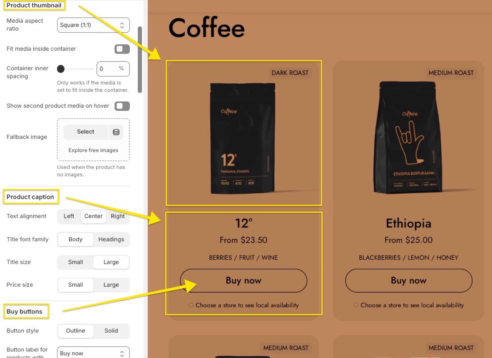
- Media aspect ratio sets the shape every product image is cropped to: Short (4:3), Square (1:1), Tall (5:6) or Taller (2:3). The default, Natural, does not crop: each image keeps its own shape. Choose the ratio closest to your product photos to reduce cropping.
- Fit media inside container resizes the image to fit inside the chosen ratio instead of cropping it. It works well with very tall images, or when your product photos do not all have the same size. It has no effect with Natural.
- Container inner spacing adds space between the fitted image and the card edges, from 0 to 15 percent. It works only when Fit media inside container is on.
- Show second product media on hover shows the product's second image when the customer moves the mouse over the card. Products with one image keep the first one.
- Fallback image is shown on cards of products that have no images.
There isn't any specific resolution, just make sure that you test various combinations of these options to see which one fits better to your product photos.
Product caption
- Text alignment aligns the caption text left, center or right. The editor may show this label as a code key instead of "Text alignment" in Local 4.2.1.
- Title font family uses the body font or the headings font for product titles.
- Title size and Price size each have a Small and a Large option.
Buy buttons
These settings change the Quick buy button, which you add to product cards with the Quick buy block.
- Button style sets the button to Outline (border only) or Solid.
- Button label for products with options sets the label of products with several variants: "Buy now" or "Choose options". Products with one variant always show "Buy now".
- Align buy button to the bottom of the card keeps the buttons of all cards in a row on one line, even when titles have different lengths. It works best when the Quick buy block is the last block of the card.
- Hide quick buy button when product is out of stock removes the button from sold out products. Turn it off to show a disabled "Sold out" button instead.
- Always open quick buy modal opens the Quick view popup for every product. By default, products with one variant go straight to the cart and only products with several variants open the popup.
One note about the buy button position: in Local the product grids are flexible and all the content inside the card is aligned from top to bottom. If you have variable content (like longer titles, custom icons or text), turn on Align buy button to the bottom of the card to stick the buy buttons at the bottom of the product card, so they are all aligned in the same way.
Custom card design
- Background, Text, Buttons, Border and Shadow give product cards their own colors. A transparent value keeps the card colors from Theme settings → Colors → Cards.
- Hide border and Hide shadow remove the card border or shadow from product cards only.
Product rating
To show star ratings on product cards and product pages, install a product reviews app first, then choose it here.
- Rating app tells Local which app your ratings come from: Okendo, Loox, Judge.me (default), Stamped, Klaviyo, Yotpo, Ali Reviews, Rapid Reviews or Air Reviews.
- Add the Rating block to the product grids where the stars should show. See Product grid blocks.
For app suggestions, see Product review apps.
Please note that third-party apps may require additional steps for proper integration.
Which aspect ratio should I use for product images?
Use the ratio of most of your product photos, so Local crops as little as possible. If your photos have mixed shapes, keep Natural, or choose a ratio and turn on Fit media inside container. The image sizes for each ratio are on What image sizes should I use in Local?.
Why does the quick buy button open a popup?
Because the product has several variants: the customer has to pick one first, so Local opens the Quick view popup. Products with a single variant are added to the cart directly, unless Always open quick buy modal is on. The popup's content is set in the quick view product template, see Quick view popup.
Why do my product ratings not show?
Usually because the app, the block or the reviews are missing.
- Rating app must name the app you use.
- The Rating block must be in the product grid section.
- The product must have at least one review.
Judge.me and Okendo use Shopify's product rating metafield. Loox, Rapid Reviews and Air Reviews use their own metafields. Stamped, Klaviyo, Yotpo and Ali Reviews show the app's own widget, which may need setup in the app.
All Product card settings
Every setting, with its type and default.
Product card theme settings: Product thumbnail
Where to find it: Theme settings → Product card → Product thumbnail
Media aspect ratio (dropdown, default: Uncropped: Natural): Sets the shape every product card image is cropped to. Natural (default) keeps each image's own shape and crops nothing. Options: Uncropped: Natural, Cropped: Short (4:3), Cropped: Square (1:1), Cropped: Tall (5:6), Cropped: Taller (2:3).
Fit media inside container (checkbox, default: off): Resizes the image to fit inside the chosen aspect ratio instead of cropping it. Has no visible effect with Natural.
Container inner spacing (slider 0 to 15 %, default: 10 %): Adds space between a fitted image and the card edges, in percent. Works only when Fit media inside container is on. Shown only when Fit media inside container is on.
Show second product media on hover (checkbox): Shows the product's second image when the customer moves the mouse over the card. Products with one image keep the first one.
Fallback image (image): Sets the image shown on cards of products that have no images. Without it, Local shows a placeholder.
Product card theme settings: Product caption
Where to find it: Theme settings → Product card → Product caption
[unresolved sections.rich-text.settings.text_alignment.label.] (dropdown, default: Left): Aligns the product card caption (title, price and the other blocks) left, center or right. Local 4.2.1 shows this label as a code key in the editor. Options: Left, Center, Right.
Title font family (dropdown, default: Body): Sets product titles in the body font or the headings font. Options: Body, Headings.
Title size (dropdown, default: Large): Sets the size of product titles. Options: Small, Large.
Price size (dropdown, default: Small): Sets the size of product prices. Options: Small, Large.
Product card theme settings: Buy buttons
Where to find it: Theme settings → Product card → Buy buttons
Button style (dropdown, default: Outline): Sets the Quick buy button to Outline (border only) or Solid. Options: Outline, Solid.
Button label for products with options (dropdown, default: Buy now): Sets the Quick buy label of products with several variants: Buy now or Choose options. Products with one variant always show Buy now. Options: Buy now, Choose options.
Align buy button to the bottom of the card (checkbox, default: on): Lines up the Quick buy buttons of a row at the bottom of the cards, even when titles have different lengths. Works best when Quick buy is the last block of the card.
Hide quick buy button when product is out of stock (checkbox, default: on): Removes the Quick buy button from sold out products. When off, sold out products show a disabled Sold Out button.
Always open quick buy modal (checkbox, default: off): Opens the Quick view popup for every product. When off, products with one variant go straight to the cart and only products with several variants open the popup.
Product card theme settings: Custom card design
Where to find it: Theme settings → Product card → Custom card design
Background (color, default: transparent): Sets the background of product cards. Transparent keeps Theme settings → Colors → Cards → Background.
Text (color, default: transparent): Sets the text color of product cards. Transparent keeps the card text color from Theme settings → Colors.
Buttons (color, default: transparent): Sets the Quick buy button color of product cards. Transparent keeps the default button colors.
Border (color, default: transparent): Sets the border color of product cards. Transparent keeps Theme settings → Colors → Cards → Border.
Shadow (color, default: transparent): Sets the shadow color of product cards. Transparent keeps Theme settings → Colors → Cards → Shadow.
Hide border (checkbox, default: off): Removes the border from product cards only.
Hide shadow (checkbox, default: off): Removes the shadow from product cards only.
Product card theme settings: Product rating
Where to find it: Theme settings → Product card → Product rating
To display ratings, add a product rating app. Learn more.
Rating app (dropdown, default: Judge.me): Sets the reviews app that the Rating block and the Product rating block read stars from. Install the app first. Judge.me and Okendo use Shopify's product rating metafield; Loox, Rapid Reviews and Air Reviews their own metafields; Stamped, Klaviyo, Yotpo and Ali Reviews show the app's own widget. Options: Okendo, Loox, Judge.me, Stamped, Klaviyo, Yotpo, Ali Reviews, Rapid Reviews, Air Reviews.
Related pages
- Product badges theme settings: sold out, discount and custom badges.
- Dynamic icons list theme settings: feature icons from product metafields.
- Product grid blocks: what each product card shows.
- What image sizes should I use in Local?: image resolutions per aspect ratio.
Shadows theme settings
The Shadows theme settings add a shadow to cards and buttons in Local, with horizontal offset, vertical offset and blur.
Product badges theme settings
The Product badges theme settings in Local show sold out and discount badges and up to three custom badges chosen by product tag.