Colors theme settings
The Colors theme settings set the header, body, card, button and footer colors of Local, and how section and card colors override them.
Applies to: Local 4.2.1 and later. Added in: Local 1.0.0. Last checked: 2026-10-13 against Local 4.2.1.
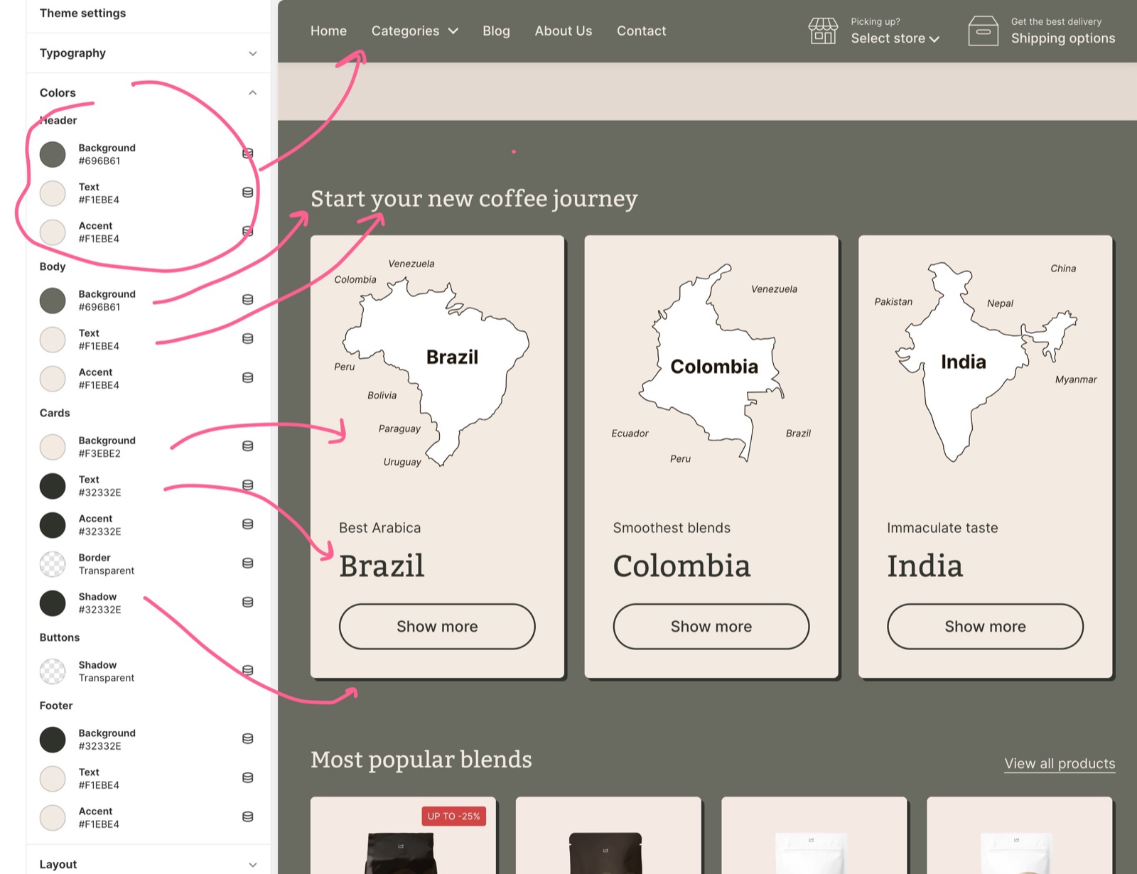
The Colors settings hold the default colors of your store, in five groups: Header, Body, Cards, Buttons and Footer. Most sections can override them with their own colors.
Where to find it: Theme settings → Colors
Header
- Background, Text and Accent color the top part of the store: the header with its menu, search and info blocks.
- The transparent header uses its own text color and logo, set in the Header section. See Header section.
Body
- Background, Text and Accent color everything in the page body: regular page content, drawers and popups.
- Solid buttons take the Text color as their background. The Accent color is the hover color of buttons and text links.
Cards
Cards are the content holders inside sections: product cards in grids, promotion cards, rich text cards and similar.
- Background, Text and Accent color the cards.
- Border sets the card border color. The border width is in Borders theme settings.
- Shadow sets the card shadow color. It is transparent by default, so cards have no shadow until you pick a color and set the offsets in Shadows theme settings.
Buttons
- Shadow sets the button shadow color, transparent by default.
- Dark background foreground is the text color Local puts on dark backgrounds, for example the label of a solid button when your Text color is dark.
- Light background foreground is the text color Local puts on light backgrounds.
Local picks one of the two automatically: when a background or accent color is light, its text uses Light background foreground; when it is dark, Dark background foreground.
Footer
- Background, Text and Accent color the Footer section at the bottom of every page.
Custom colors in sections and cards
To make one section stand out, use its own color settings. Your Theme settings colors stay the default everywhere else.
- Section design (most sections) has Background color, Background gradient and Heading text color. It also has Remove top margin and Descrease top margin (editor spelling) for a more compact layout; only one of the two can be on at a time.
- Custom card design (sections with cards) has Background, Text, Accent, Border and Shadow colors for the cards of that section, plus Hide border and Hide shadow.
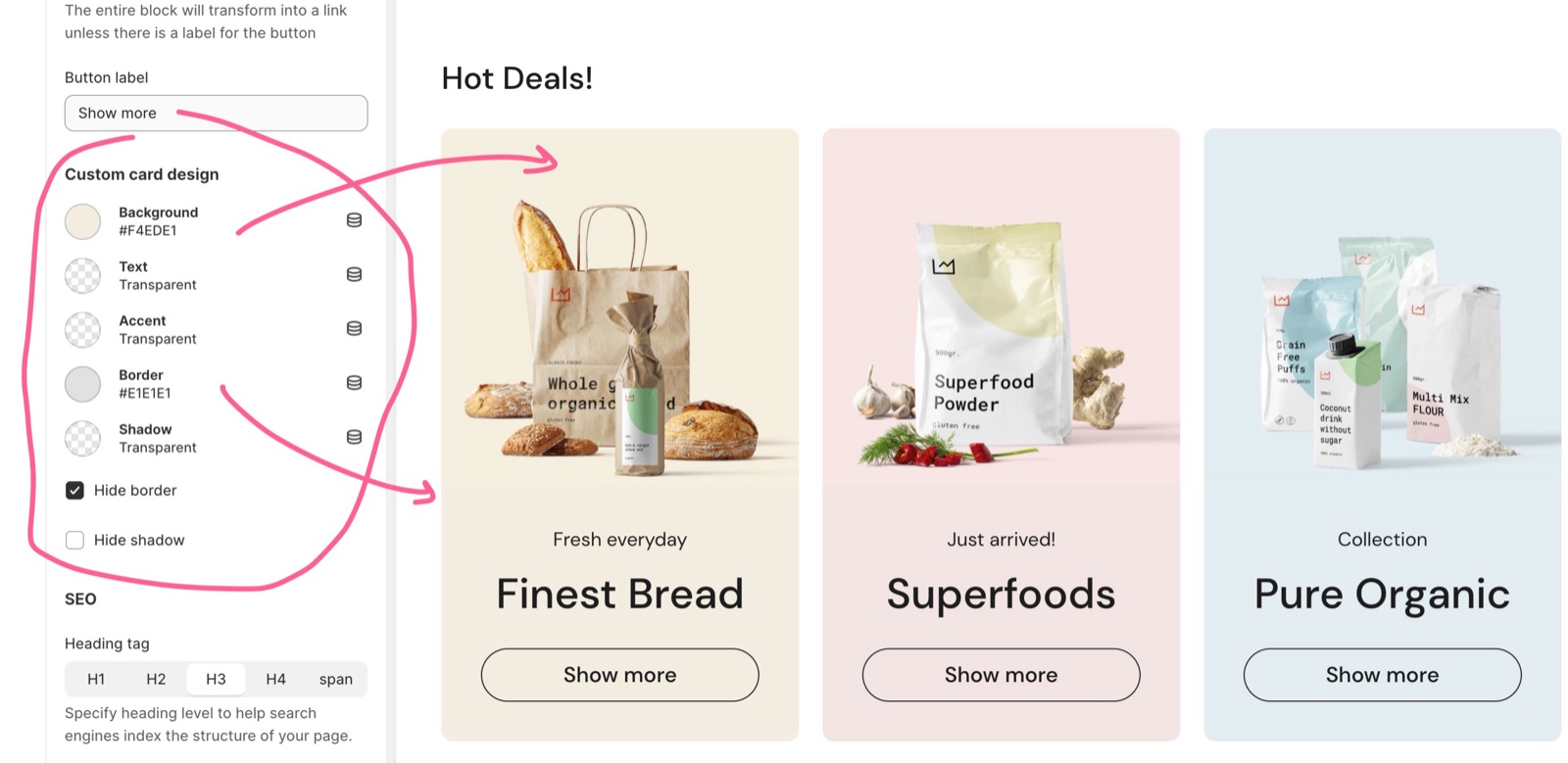
These are custom colors, so if nothing is set (transparent), the default color will be shown (the one you set in the general Theme settings). You can't make invisible colors.
See General section styling for every Section design and Custom card design setting.
Why does my custom section color not show?
Because a fully transparent color means "use the default". Local treats a transparent custom color as not set and shows the Theme settings color instead. Pick a color with some opacity in the color picker.
Why is the text on my buttons hard to read?
Because the button label color comes from Dark background foreground or Light background foreground, and Local picks one by the brightness of the button color: the Text color for solid buttons, the Accent color on hover. With a mid-tone color, Local may pick the one you did not expect. Adjust the two foreground colors, or make the color clearly lighter or darker.
All Colors settings
Every setting, with its type and default.
Colors theme settings: Header
Where to find it: Theme settings → Colors → Header
Background (color, default: #ffffff): Sets the background of the header.
Text (color, default: #000000): Sets the text and icon color of the header.
Accent (color, default: #3ab877): Sets the hover color of header links and buttons.
Colors theme settings: Body
Where to find it: Theme settings → Colors → Body
Background (color, default: #ffffff): Sets the background of the page body, drawers and popups.
Text (color, default: #000000): Sets the body text color. Solid buttons use it as their background.
Accent (color, default: #3ab877): Sets the hover color of buttons and text links in the page body.
Colors theme settings: Cards
Where to find it: Theme settings → Colors → Cards
Background (color, default: #ffffff): Sets the default background of cards, such as product cards and promotion cards.
Text (color, default: #000000): Sets the default text color of cards.
Accent (color, default: #3ab877): Sets the default accent (hover) color inside cards.
Border (color, default: #e7e7e7): Sets the card border color. The border width is in Theme settings → Borders.
Shadow (color, default: transparent): Sets the card shadow color. Transparent by default, so cards show no shadow until you pick a color and set the offsets in Theme settings → Shadows.
Colors theme settings: Buttons
Where to find it: Theme settings → Colors → Buttons
Shadow (color, default: transparent): Sets the button shadow color. Transparent by default, so buttons show no shadow until you pick a color and set the offsets in Theme settings → Shadows.
Dark background foreground (color, default: #ffffff): Sets the text color Local puts on dark backgrounds, such as a solid button with a dark color. Local picks it automatically when the background color is dark.
Light background foreground (color, default: #000000): Sets the text color Local puts on light backgrounds, such as a solid button with a light color. Local picks it automatically when the background color is light.
Colors theme settings: Footer
Where to find it: Theme settings → Colors → Footer
Background (color, default: #ffffff): Sets the background of the Footer section.
Text (color, default: #000000): Sets the text color of the Footer section.
Accent (color, default: #3ab877): Sets the hover color of footer links.
Related pages
- General section styling: Section design and Custom card design colors of each section.
- Product card theme settings: the colors of product cards.
- Borders theme settings: border width and radius.
- Shadows theme settings: shadow offsets and blur.