Shadows theme settings
The Shadows theme settings add a shadow to cards and buttons in Local, with horizontal offset, vertical offset and blur.
Applies to: Local 4.2.1 and later. Added in: Local 2.0.0. Last checked: 2026-10-13 against Local 4.2.1.
The Shadows settings add a shadow under cards and under buttons, on top of the borders. The shadow position and blur are set here; the shadow color is set in Theme settings → Colors.
Where to find it: Theme settings → Shadows
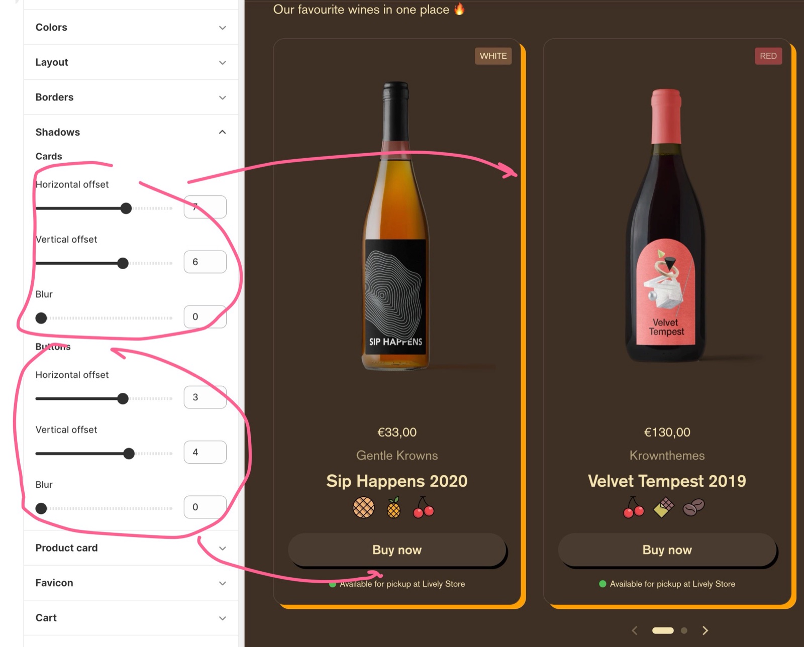
Cards
- Horizontal offset moves the shadow left (negative values) or right (positive values), from -20 to 20 px.
- Vertical offset moves it up (negative) or down (positive), from -20 to 20 px.
- Blur softens the shadow edge, from 0 (a hard shadow) to 10 px.
The color is Theme settings → Colors → Cards → Shadow.
Buttons
- Horizontal offset and Vertical offset move the button shadow, from -10 to 10 px.
- Blur softens it, from 0 to 5 px.
The color is Theme settings → Colors → Buttons → Shadow.
You can turn the card shadow off for one section with Hide shadow in its Custom card design group. See General section styling.
Why do I not see the shadow?
Because the shadow color is transparent by default. Set Theme settings → Colors → Cards → Shadow or Colors → Buttons → Shadow to a visible color, then set an offset or a blur. With all three sliders at 0 the shadow sits exactly under the element and does not show either.
All Shadows settings
Every setting, with its type and default.
Shadows theme settings: Cards
Where to find it: Theme settings → Shadows → Cards
Horizontal offset (slider -20 to 20, default: 0): Moves the card shadow left (negative values) or right (positive values), in px. The shadow color is Theme settings → Colors → Cards → Shadow.
Vertical offset (slider -20 to 20, default: 0): Moves the card shadow up (negative values) or down (positive values), in px.
Blur (slider 0 to 10, default: 0): Softens the card shadow edge, in px. 0 gives a hard shadow.
Shadows theme settings: Buttons
Where to find it: Theme settings → Shadows → Buttons
Horizontal offset (slider -10 to 10, default: 0): Moves the button shadow left (negative values) or right (positive values), in px. The shadow color is Theme settings → Colors → Buttons → Shadow.
Vertical offset (slider -10 to 10, default: 0): Moves the button shadow up (negative values) or down (positive values), in px.
Blur (slider 0 to 5, default: 0): Softens the button shadow edge, in px. 0 gives a hard shadow.
Related pages
- Colors theme settings: the shadow colors.
- Borders theme settings: border width and corner radius.
- General section styling: Hide shadow in one section.