Layout theme settings
The Layout theme settings set the maximum page width of Local, the vertical space between sections and the horizontal space of grids.
Applies to: Local 4.2.1 and later. Added in: Local 1.0.0. Last checked: 2026-10-13 against Local 4.2.1.
The Layout settings set how wide your store gets on large screens and how much space Local leaves between sections and between grid items. They apply to every page.
Where to find it: Theme settings → Layout
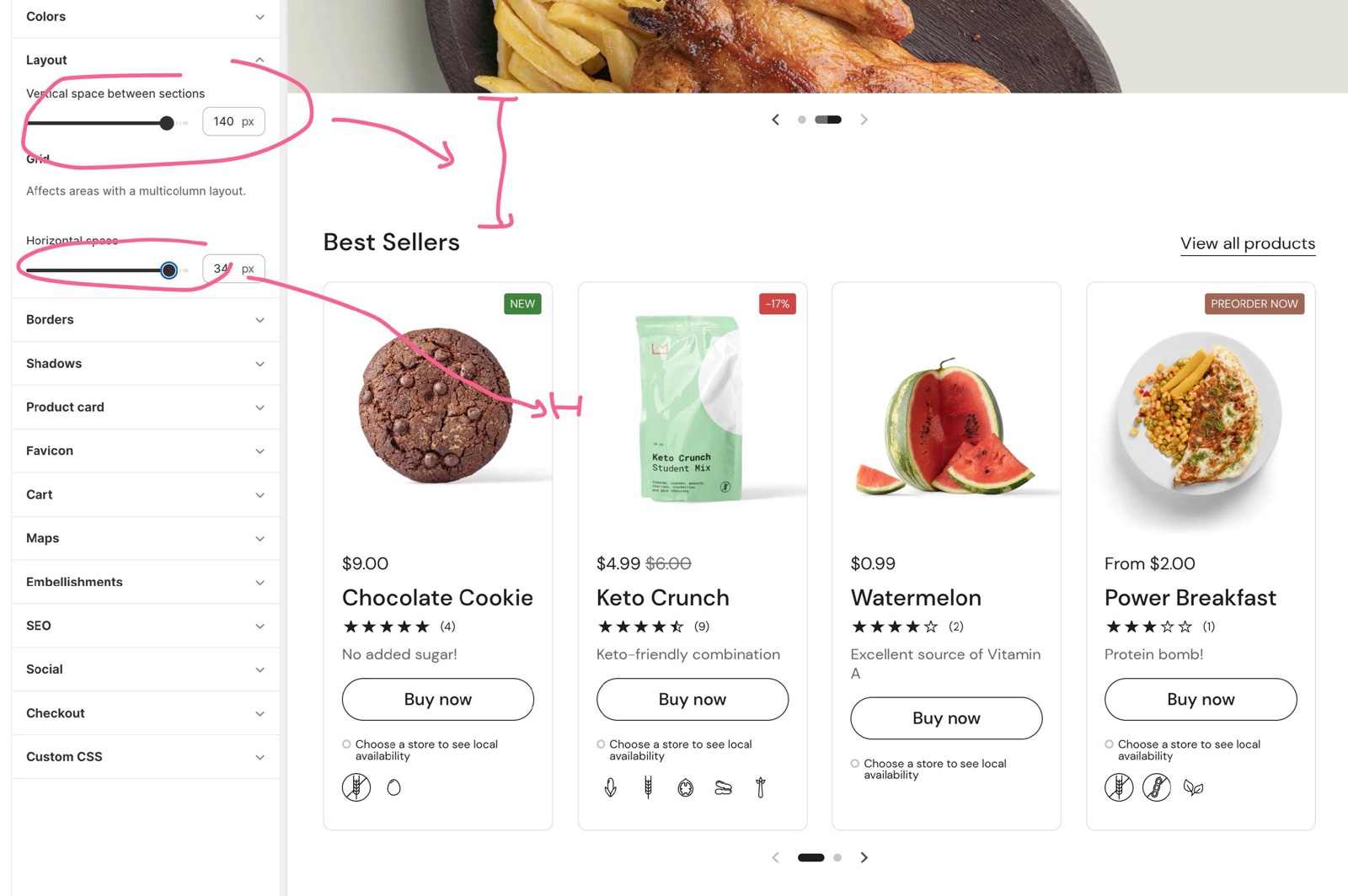
Page width and section spacing
- Maximum page width sets the widest the page content gets, from 1360 to 2260 px. On wider screens the content stays centered at this width.
- Vertical space between sections sets the gap above and below sections, from 50 to 150 px. Local uses 80 percent of it on screens up to 1280 px wide and 60 percent on screens up to 1023 px wide.
Some sections have their own Remove top margin setting under Section design, for a more compact look where you need it. See General section styling.
Grid
- Horizontal space sets the gap between the items of a grid, such as product cards or promotion cards, from 12 to 36 px. Local uses 80 percent of it on screens up to 1280 px wide and half of it on screens up to 1023 px wide.
How do I make the store wider on large screens?
Raise Maximum page width. The default 1360 px keeps the content centered with white space on both sides of large monitors; 1680 px or more fills most desktop screens. The Local, Soleway, Thrive and Lively presets use 1680 px, Caffeine uses 1440 px.
Why is the space between sections smaller on my phone?
Local scales Vertical space between sections and Horizontal space down on smaller screens, so the same value does not waste room on a phone. On screens up to 1023 px wide the section spacing is 60 percent of the value you set, and the grid gap is half of it.
All Layout settings
Every setting, with its type and default.
Maximum page width (slider 1360 to 2260 px, step 10, default: 1360 px): Sets the widest the page content gets, from 1360 to 2260 px. On wider screens the content stays centered at this width.
Vertical space between sections (slider 50 to 150 px, step 10, default: 100 px): Sets the space between sections. Local uses 80 percent of it on screens up to 1280 px wide and 60 percent on screens up to 1023 px wide.
Layout theme settings: Grid
Where to find it: Theme settings → Layout → Grid
Horizontal space (slider 12 to 36 px, step 2, default: 26 px): Sets the gap between the items of grids, such as product cards. Local uses 80 percent of it on screens up to 1280 px wide and half of it on screens up to 1023 px wide.
Related pages
- Borders theme settings: card, button and form field borders.
- Shadows theme settings: shadows under cards and buttons.
- General section styling: the Section design settings of each section.