General section styling
General section styling in Combine: the section heading, section design colors, gutter margins and SEO heading tag that most sections share.
Applies to: Combine 4.2.0 and later. Added in: Combine 1.0.0. Last checked: 2026-10-13 against Combine 4.2.0.
Most Combine sections share four groups of settings: a Section heading above the content, Section design colors, Gutter margins and an SEO heading tag. This page explains them once; each section page lists only what differs.
Where to find it: select a section in the theme editor; the groups are at the end of the section's settings, under the headers Section heading, Section design, Gutter and SEO.
Section heading
The section heading is the optional title area at the top of a section.
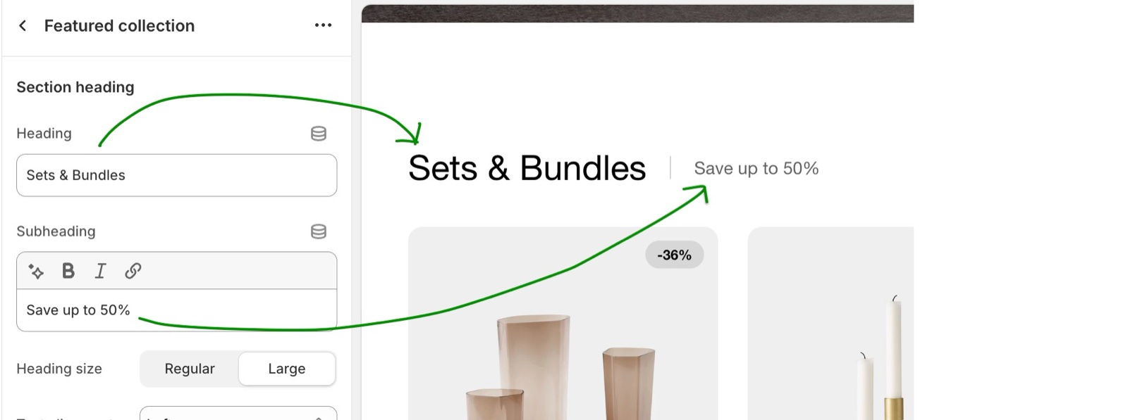
- Heading and Subheading are both optional. Leave both empty, with no button, and the heading area disappears.
- The heading uses the Section titles font of Typography theme settings. The subheading is smaller and lighter.
- Heading size is Regular or Large.
- Text alignment places the heading area:
- One row: Left: the heading and the subheading side by side on one line, separated by a thin line, with the button on the right.
- Two rows: Left: the subheading under the heading, with the button on the right.
- Two rows: Center: everything centered, with the button under the subheading.
- Button label and Button link add a "view all" style button. On desktop it sits in the heading area; on screens narrower than 768 px it moves under the section as a full-width button.
Section design
- Background color fills the whole section, edge to edge.
- Background gradient replaces the background color when it is set.
- Heading text color colors the section heading, the subheading, the mobile button under the section and the slider arrows. In some sections the label is Text color and it also colors the content.
- Leave the colors transparent to use the Body colors of Colors theme settings. Combine has no color schemes: each section sets its own colors here.
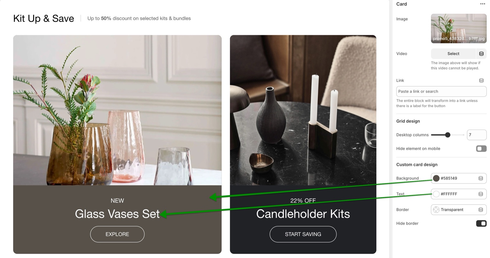
Many sections also have a Custom card design group for the cards inside them: Background, Text, Border and Hide border, and sometimes Border radius.
Gutter
The space between two sections comes from Theme settings → Layout → Vertical space between sections (see Layout theme settings). The Gutter group changes it for one section:
- Decrease top margin makes the space above the section smaller: at most 70 px on desktop and 40 px on mobile.
- Remove top margin removes the space above the section, so it touches the section before it.
- Remove bottom margin pulls the next section up, so the two sections touch.
Not every section has all three. Each section page lists the ones it has.
Section SEO options
Heading tag under SEO sets the HTML level of the section heading for search engines. It does not change how the heading looks; Heading size does.
- Most sections offer H1, H2, H3, H4 and span. The default is H2.
- The Heading block of flex sections also offers H5. Flex grid offers H1 to H6, p and span.
- Some sections set the tag for the whole section, others for each block, and a few have more than one tag in the same place.
A heading structure that works
Keep the headings of a page in order: one H1, then H2, then H3. For example:
- Home page: H1 for the title of the first slide, as the introduction of the page. H2 for the headings of the sections. H3 for headings inside a section and for block titles. H4 for minor headings, for example in the footer.
- Every other page: the page title is already the H1, so use H2 to H4 in the sections.
Why does my section heading button disappear on mobile?
It moves. On screens narrower than 768 px, the button leaves the heading area and shows under the section as a full-width button, so it does not crowd the heading.
How do I remove the space between two sections?
Turn on Remove bottom margin in the first section, or Remove top margin in the second, if it has one. To change the space between every section of the store, set Theme settings → Layout → Vertical space between sections.
Should every section heading be an H2?
On most pages, yes. The page title, or the first slide of the home page, is the H1, and section headings are H2. Use span for a decorative heading that should not count as a heading at all.
All General section styling settings
Every setting of this section, with its type and default.
Standard section settings: Section heading
Where to find it: Flex cards → Section heading
Heading (text field, default: "Promotion cards"): Sets the section title. Leave Heading, Subheading and Button label empty to hide the heading area.
Subheading (formatted text, default: "Share your best offers"): Sets a short line next to or under the heading, in smaller, lighter text.
Heading size (dropdown, default: Regular): Sets the size of the section heading, in the Section titles font of Theme settings → Typography. Options: Regular, Large.
Text alignment (dropdown, default: One row: Left): One row: Left puts the heading and subheading side by side with the button on the right; Two rows puts the subheading under the heading; Center centers everything. Options: One row: Left, Two rows: Left, Two rows: Center.
Button label (text field): Adds a button to the heading area on desktop; below 768 px it shows under the section as a full-width button.
Button link (link). Shown only when Button label is set.
Standard section settings: Section design
Where to find it: Flex cards → Section design
Background color (color, default: transparent): Fills the whole section, edge to edge. Leave it transparent to use the body background.
Background gradient (gradient): Fills the section with a gradient instead of the background color.
Heading text color (color, default: transparent): Sets the color of the section heading, the subheading, the mobile button and the slider arrows.
Standard section settings: Gutter
Where to find it: Flex cards → Gutter
Decrease top margin (checkbox, default: off): Makes the space above the section smaller: at most 70 px on desktop, 40 px on mobile.
Remove bottom margin (checkbox, default: off): Pulls the next section up, so the two sections touch.
Standard section settings: SEO
Where to find it: Flex cards → SEO
Heading tag (dropdown, default: H2): Sets the HTML level of the section heading for search engines; span gives it no level. It does not change the size. Options: H1, H2, H3, H4, span.
Related pages
- Flex cards section: the section these standard settings are taken from.
- How Combine is built: sections, section blocks and theme blocks.
- Layout theme settings: the space between all sections.
- Colors theme settings: the colors sections use when their own are transparent.
- Heading block: headings inside flex sections.
Exit intent popup
The Exit intent popup section of Combine shows a message when a desktop visitor moves the mouse to the top of the window to leave.
Flex sections
Flex sections in Combine: Flex slideshow, Flex grid, Flex cards and Flex columns build layouts from theme blocks such as heading, button and image.