Flex slideshow section
The Flex slideshow section of Combine is a full-width or boxed carousel of image and video slides built from theme blocks.
Applies to: Combine 4.2.0 and later. Added in: Combine 3.1.0. Last checked: 2026-10-13 against Combine 4.2.0.
The Flex slideshow section is a carousel of large slides with text, buttons and ratings over an image or a video. You build the text of each slide from theme blocks.
Where to find it: in the theme editor, select Add section and choose Flex slideshow. It replaces the old Slideshow (legacy) section.
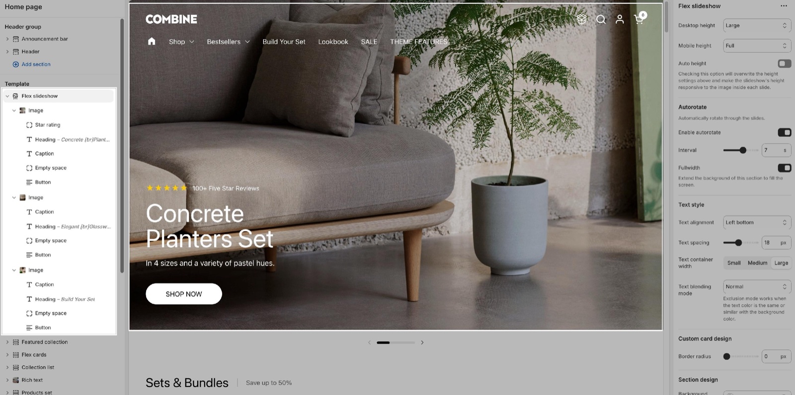
Height
- Desktop height and Mobile height set how tall the slides are, as a share of the screen height: Small (40 percent), Regular (50 percent), Medium (60 percent, the default), Large (80 percent) or Full (the whole screen). Slides are never shorter than 450 px.
- Mobile height applies on screens narrower than 1024 px, so tablets use it too.
- Auto height ignores both settings and makes each slide as tall as its image, so nothing is cropped. With Auto height on, the text sits over the image.
- Without Auto height, images fill the slide and are cropped at the edges. Set a focal point on the image in Shopify admin → Content → Files to choose what stays visible.
Autorotate and width
- Enable autorotate moves to the next slide on its own. Interval sets the time per slide, 3 to 10 seconds (default 5).
- With one slide only, the section shows no arrows, no dots and does not rotate.
- Fullwidth stretches the slideshow to the edges of the screen. Without it, the slideshow keeps the page width and can have rounded corners.
Text style
- Text alignment places the blocks of every slide in one of nine positions, from Left top to Right bottom (default Left bottom).
- Text spacing sets the gap between the blocks of a slide, from -12 to 60 px (default 18 px).
- Text container width limits how wide the text can get on screens 640 px and wider: Small (60 percent of the slide), Medium (80 percent) or Large (the full slide, the default).
- Text blending mode blends the text with the image under it. Exclusion inverts the text color against the image, which keeps it readable on light and dark parts; it works when the text color is close to the background color.
Custom card design
Border radius rounds the corners of the slides, 0 to 30 px. It shows only when Fullwidth is off.
Section design, gutter and accessibility
- Background color and Background gradient fill the space around the slides, which shows when the slideshow is not full width or the images are transparent.
- Navigation elements color colors the arrows and the dots.
- Remove top margin removes the space above the section, for example to place the slideshow right under the header.
- Disable parallax effect turns off the movement of the image while the slides change. With the effect on, the image moves more slowly than the slide when a customer swipes or a slide changes.
The section heading, the other colors and the margins work as described in General section styling.
Slides: image and video blocks
Inside the section, select Add block and choose Image or Video. Each slide then takes theme blocks: select Add block inside the slide and add a Heading, Text, Button, Star rating or any other theme block. A new Image slide holds a Heading, a Caption and a Content group with buttons.
Image slide
- Image is the slide background. Mobile image (optional) replaces it on screens narrower than 768 px; use a portrait image there.
- Link makes the whole slide clickable. The buttons and links inside the slide then stop working, so use either a slide link or buttons.
- Overlay under Design puts a color over the image to make the text easier to read. Use a color with transparency.
- Text under Design sets the color of the blocks on this slide.
Video slide
- Video file plays muted, in a loop, as the slide background. Upload it in the video picker.
- Image is the poster shown while the video loads, and the fallback when it cannot play.
- Use different media on mobile shows Mobile video file and Mobile poster image on small screens.
- Overlay and Text under Design work as on the Image slide.
Why are my slide images cropped?
Because the slide height is a share of the screen height, and the image fills it. An image with other proportions is cropped at the edges. Turn on Auto height to show the whole image, upload a Mobile image (optional) for phones, or set a focal point on the image so the important part stays visible.
Why don't the buttons on my slide work?
Because the slide has a Link. A slide link covers the whole slide, so the links inside it, including buttons, cannot be selected. Remove the slide's Link and keep the buttons, or remove the buttons.
What image size should I upload?
A full-width slide spans the whole screen, so upload images at least 1920 px wide, or twice that for sharp high-density screens. A Mobile image (optional) shows at about 750 px wide, so 1500 px is enough. See Image size recommendations.
All Flex slideshow settings
Every setting of this page, with its type and default.
Accepts these blocks: Image and Video.
Desktop height (dropdown, default: Cropped: Medium): Sets the slide height on screens 1024 px and wider, as a share of the screen height: Small 40 percent, Regular 50, Medium 60, Large 80, Full 100. Slides are at least 450 px tall. Options: Cropped: Small, Cropped: Regular, Cropped: Medium, Cropped: Large, Full. Shown only when Auto height is off.
Mobile height (dropdown, default: Cropped: Medium): Sets the slide height on screens narrower than 1024 px, as a share of the screen height. Options: Cropped: Small, Cropped: Regular, Cropped: Medium, Cropped: Large, Full. Shown only when Auto height is off.
Auto height (checkbox): Makes each slide as tall as its image, so nothing is cropped, and ignores the height settings.
Flex slideshow section: Autorotate
Where to find it: Flex slideshow → Autorotate
Enable autorotate (checkbox, default: off): Moves to the next slide on its own.
Interval (slider 3 to 10 s, default: 5 s): Sets the time each slide shows before the next one. Shown only when Enable autorotate is on.
Fullwidth (checkbox, default: off): Stretches the slideshow to the edges of the screen.
Flex slideshow section: Text style
Where to find it: Flex slideshow → Text style
Text alignment (dropdown, default: Left bottom): Places the blocks of every slide in one of nine positions. Options: Left top, Center top, Right top, Left middle, Center middle, Right middle, Left bottom, Center bottom, Right bottom.
Text spacing (slider -12 to 60 px, default: 18 px): Sets the gap between the blocks of each slide.
Text container width (dropdown, default: Large): Limits the width of the text on screens 640 px and wider: Small 60 percent of the slide, Medium 80, Large 100. Options: Small, Medium, Large.
Text blending mode (dropdown, default: Normal): Blends the text with the image under it. Exclusion inverts the text against the image and works when the text color is close to the background color. Options: Normal, Exclusion, Soft light, Overlay.
Flex slideshow section: Custom card design
Where to find it: Flex slideshow → Custom card design
Border radius (slider 0 to 30 px, default: 0 px): Rounds the corners of the slides. Shown only when Fullwidth is off.
Flex slideshow section: Section design
Where to find it: Flex slideshow → Section design
The Flex slideshow section uses the standard Section design settings, listed in General section styling.
Background color (color, default: transparent): Fills the space around the slides.
Background gradient (gradient): Fills the space around the slides with a gradient instead of the background color.
Navigation elements color (color, default: transparent): Sets the color of the arrows and the dots.
These settings differ from the standard ones or exist only here:
Navigation elements color (color, default: transparent): Sets the color of the arrows and the dots.
Flex slideshow section: Gutter
Where to find it: Flex slideshow → Gutter
The Flex slideshow section uses the standard Gutter settings, listed in General section styling. In this section the group has only Remove top margin.
Remove top margin (checkbox, default: off): Removes the space above the section, for example right under the header.
Flex slideshow section: Accessibility
Where to find it: Flex slideshow → Accessibility
Disable parallax effect (checkbox, default: off): Stops the image from moving more slowly than the slide while slides change.
Where to find it: Flex slideshow → Image.
Accepts these blocks: app blocks and any theme block.
Image (image): Sets the slide background. It fills the slide and is cropped to its height unless Auto height is on.
Mobile image (optional) (image): Replaces the image on screens narrower than 768 px.
Link (link): Makes the whole slide a link. The buttons and links inside the slide then stop working.
Open link in a new window (checkbox, default: off). Shown only when Link is set.
Image block: Design
Where to find it: Flex slideshow → Image → Design
Overlay (color with transparency, default: transparent): Puts a color over the image to make the text easier to read. Use a color with transparency.
Text (color, default: transparent): Sets the color of the slide's blocks.
Where to find it: Flex slideshow → Video.
Accepts these blocks: app blocks and any theme block.
Video file (video): Plays a muted, looping video as the slide background.
Image (image): Sets the poster shown while the video loads, and the fallback when it cannot play.
Use different media on mobile (checkbox, default: off): Shows a different video and poster on screens narrower than 768 px. Shown only when Video file is set.
Mobile video file (video). Shown only when Use different media on mobile is on and Video file is set.
Mobile poster image (image). Shown only when Use different media on mobile is on and Video file is set.
Video block: Design
Where to find it: Flex slideshow → Video → Design
Overlay (color with transparency, default: transparent): Puts a color over the video to make the text easier to read. Use a color with transparency.
Text (color, default: transparent): Sets the color of the slide's blocks.
Related pages
- Flex sections: how flex sections, slides and theme blocks fit together.
- Theme blocks: the blocks you add inside a slide.
- Slideshow (legacy) section: the older slideshow that Flex slideshow replaces.
- General section styling: the standard section settings.
- Header section: the transparent header over a slideshow.