Featured collection section
The Featured collection section of Combine shows products from one collection as a grid or slider, built from product grid blocks.
Applies to: Combine 4.2.0 and later. Added in: Combine 1.0.0. Last checked: 2026-10-13 against Combine 4.2.0.
The Featured collection section shows products from one collection as a grid or a slider. The section sets the layout and the number of products; blocks choose what each product card shows.
Where to find it: in the theme editor, select Add section and choose Featured collection.
Layout
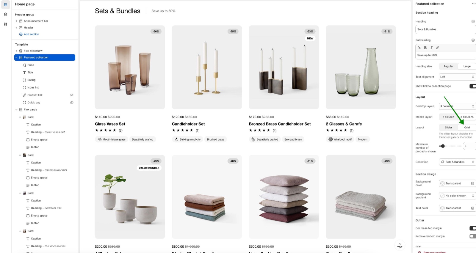
- Collection picks the collection. The products follow the collection's sort order from Shopify admin.
- Maximum number of products shown sets how many products appear, 3 to 48 (default 8).
- Layout is Grid (the default) or Slider, which scrolls sideways. The slider turns off the image gallery of the product cards, if it is on in Product card theme settings.
- Desktop layout sets the products per row: 3 columns, 4 columns (the default) or 5 columns. Combine reduces it on tablets.
- Mobile layout sets the products per row on phones: 1 column or 2 columns (the default).
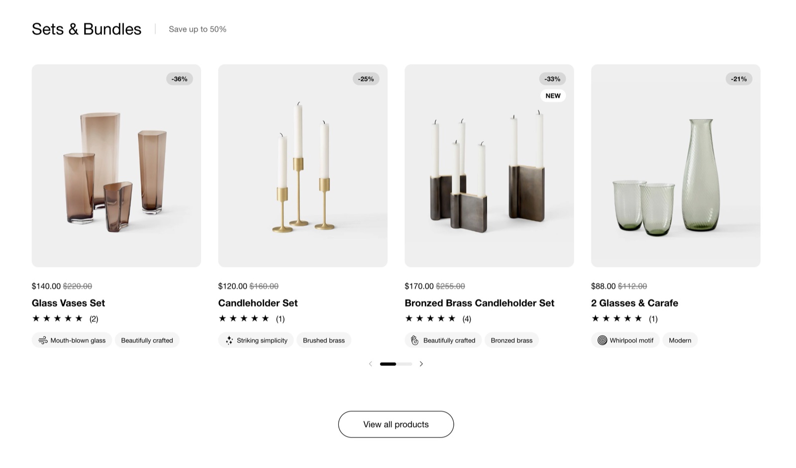
- Show link to collection page (on by default) adds a "View all products" button under the products, on every screen size.
The section heading, colors, margins and heading tag work as described in General section styling. The color under Section design is called Text color.
Blocks
The product card is built from product grid blocks, each added once, in the order of the sidebar. A new section starts with Price, Title and Quick buy. Every block is documented in Product grid blocks:
- Price: the price and the compare-at price.
- Title: the product name.
- Description: the first words of the description, with Number of words and an optional link.
- Vendor: the brand.
- Rating: the stars from your reviews app.
- Icons list: product feature icons from metafields; see Dynamic icons list.
- Dynamic text: a line of text from a product metafield.
- Quick buy: variant options and an add to cart button in the card, or a button that opens the quick view popup.
- Product link: a button to the product page.
How do I show more than 4 products per row?
Set Desktop layout to 5 columns. That is the most per row in this section. For more products in total, raise Maximum number of products shown or use Layout Slider, so the extra products scroll sideways.
Why are the products in a different order than on my collection page?
They are not, unless a customer sorted the collection page. The section uses the collection's default sort order, set in Shopify admin → Products → Collections → the collection → Sort. Change it there to reorder the section.
All Featured collection settings
Every setting of this section, with its type and default.
Accepts these blocks: Price, Title, Description, Vendor, Rating, Icons list, Dynamic text, Quick buy and Product link.
Featured collection section: Section heading
Where to find it: Featured collection → Section heading
The Featured collection section uses the standard Section heading settings, listed in General section styling. Not available in this section: Button label and Button link.
Heading (text field, default: "Featured collection"): Sets the section title. Leave Heading, Subheading and Button label empty to hide the heading area.
Subheading (formatted text, default: "Share your best offers").
Heading size (dropdown, default: Regular). Options: Regular, Large.
Text alignment (dropdown, default: One row: Left). Options: One row: Left, Two rows: Left, Two rows: Center.
Show link to collection page (checkbox, default: on): Adds a View all products button under the section, linking to the collection.
These settings differ from the standard ones or exist only here:
Heading (text field, default: "Featured collection"): Sets the section title. Leave Heading, Subheading and Button label empty to hide the heading area.
Show link to collection page (checkbox, default: on): Adds a View all products button under the section, linking to the collection.
Featured collection section: Layout
Where to find it: Featured collection → Layout
Desktop layout (dropdown, default: 4 columns): Sets the products per row on desktop. Combine reduces it on tablets and small laptops. Options: 3 columns, 4 columns, 5 columns.
Mobile layout (dropdown, default: 2 columns): Sets the products per row on phones. Options: 1 column, 2 columns.
Layout (dropdown, default: Grid): Shows the products as a grid or as a slider that scrolls sideways. The slider turns off the image gallery of the product cards. Options: Slider, Grid.
Maximum number of products shown (slider 3 to 48, default: 8): Sets how many products of the collection show, in the collection's sort order.
Collection (collection picker): Sets the collection whose products show.
Featured collection section: Section design
Where to find it: Featured collection → Section design
The Featured collection section uses the standard Section design settings, listed in General section styling.
Background color (color, default: transparent).
Background gradient (gradient).
Text color (color, default: transparent): Sets the color of the section heading, the subheading and the text of the section.
These settings differ from the standard ones or exist only here:
Text color (color, default: transparent): Sets the color of the section heading, the subheading and the text of the section.
Featured collection section: Gutter
Where to find it: Featured collection → Gutter
The Featured collection section uses the standard Gutter settings, listed in General section styling.
Decrease top margin (checkbox, default: off): Makes the space above the section smaller.
Remove bottom margin (checkbox, default: off): Pulls the next section up, so the two sections touch.
Featured collection section: SEO
Where to find it: Featured collection → SEO
The Featured collection section uses the standard SEO settings, listed in General section styling.
Heading tag (dropdown, default: H2): Sets the HTML level of the section heading for search engines; span gives it no level. It does not change the size. Options: H1, H2, H3, H4, span.
Price block
Where to find it: Featured collection → Add block → Price
One Price block per section.
The Price block has no settings in Combine 4.2.0.
Title block
Where to find it: Featured collection → Add block → Title
One Title block per section.
The Title block has no settings in Combine 4.2.0.
Description block
Where to find it: Featured collection → Add block → Description
One Description block per section.
Number of words (slider 5 to 40, default: 15): Sets how many words of the product description the card shows.
Show link to product page (checkbox, default: on): Adds a link to the product page after the description.
Vendor block
Where to find it: Featured collection → Add block → Vendor
One Vendor block per section.
The Vendor block has no settings in Combine 4.2.0.
Rating block
Where to find it: Featured collection → Add block → Rating
The Rating block has no settings in Combine 4.2.0.
Icons list block
Where to find it: Featured collection → Add block → Icons list
One Icons list block per section.
This theme allows you to add custom product icons through dynamic content. See Dynamic icons list.
Dynamic text block
Where to find it: Featured collection → Add block → Dynamic text
One Dynamic text block per section.
Label metafield (text field, default: "custom.product_text"): Sets the product metafield to show, as namespace.key (for example custom.product_text). Type the reference; it is not a dynamic source picker. See Product grid blocks.
Text color (dropdown, default: Secondary): Shows the text in the main text color (Primary) or in a lighter shade (Secondary) Options: Primary, Secondary.
Text transform (uppercase) (checkbox, default: off).
Quick buy block
Where to find it: Featured collection → Add block → Quick buy
One Quick buy block per section.
Options display type (dropdown, default: Inline (in the product grid)): Inline shows the variant options and the add to cart button in the card; Modal shows one button that opens the quick view popup. Options: Inline (in the product grid), Modal (on click).
Don't show quick buy if product is out of stock (checkbox, default: off): Hides the quick buy button on sold out products.
Show price inside "add to cart" button (checkbox, default: on): Adds the price to the add to cart button label.
Quick buy block: Inline display settings
Where to find it: Featured collection → Add block → Quick buy → Inline display settings
Select the first available variant by default (checkbox, default: off): Selects the first available variant, so customers can add to cart in one click. Off, customers pick a variant first. Shown only when Options display type is Inline (in the product grid).
Handle unavailable variants (dropdown, default: Hide): Sets how sold out variant options show: Disable greys them out, Hide removes them, Show keeps them selectable. Options: Disable, Hide, Show. Shown only when Options display type is Inline (in the product grid).
Product link block
Where to find it: Featured collection → Add block → Product link
One Product link block per section.
Button label (text field, default: "View product"): Sets the text of the button to the product page.
Related pages
- Product grid blocks: every block of the product cards.
- Product card theme settings: the card image, quick buy popup and rating app.
- Collection page: the full collection with filters.
- General section styling: the standard section settings.