Product grid blocks
Product grid blocks in Combine: price, title, description, vendor, rating, icons list, dynamic text, quick buy and product link, used in every product grid.
Applies to: Combine 4.2.0 and later. Added in: Combine 1.0.0. Last checked: 2026-10-13 against Combine 4.2.0.
Product grid blocks set what each product card of a grid shows: price, title, rating, a quick buy button and more. Every grid has its own blocks, so a collection page and a home page carousel can show different details on the same product cards. The card design (image shape, badges, hover) stays the same everywhere.
Where to find it: in the theme editor, select a product grid section (for example Collections → Default collection → Product grid), then Add block.
Where product grid blocks are used
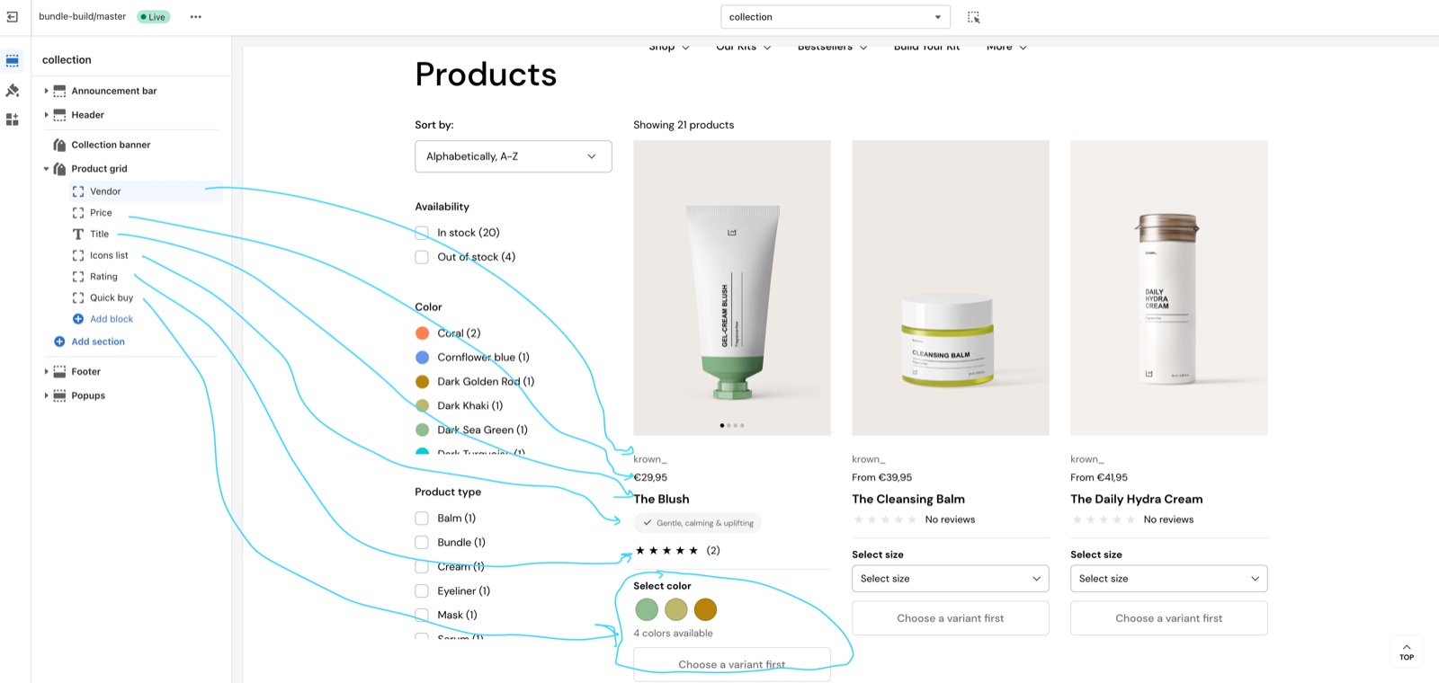
These sections use the product grid blocks. Each block can be added once per section, and the cards show them in the order of the blocks.
| Section | Blocks |
|---|---|
| Product grid (collection page), Featured collection, Search results (Search page), Product recommendations, cart recommendations (Cart page), Shop the look | All nine |
| Products set | All except Quick buy (the set has its own variant picker) |
| Products bundle | All except Quick buy and Product link (the bundle has its own variant picker and Add to bundle button) |
Some blocks work on their own; others need data: Rating needs a reviews app, Icons list and Dynamic text need product metafields.
Price, title, vendor and description
- Price shows the price, with the compare-at price when the product is on sale and "From" when the variants have different prices.
- Title shows the product title, linked to the product page.
- Vendor shows the product vendor.
- Description shows the start of the product description, without formatting. Number of words sets the length (5 to 40, default 15). Show link to product page adds a "View product details" link.
Rating
- Shows the product's star rating when a reviews app has rated it. Products without reviews show no stars.
- Choose your app in Theme settings → Product card → Product rating → Rating app. See Product review apps.
Icons list
- Shows up to three icons with labels ("pills"), from the product metafields you name in Theme settings → Product card → Dynamic icons list.
- The block has no settings of its own. Set up the metafields first: see Dynamic icons list.
You can watch a tutorial about custom badges and icons in our Local tutorial: Local theme tutorial, at 5:43. Local is another Krown theme, so some labels and paths differ in Combine.
Dynamic text
- Shows the value of one product metafield, for example "Vegan", "Best seller" or "Rich color".
- Label metafield is the metafield, typed as
namespace.key(defaultcustom.product_text). Type it: this field is not connected as a dynamic source. - Text color is Primary (the text color) or Secondary (a lighter shade). Text transform (uppercase) writes the text in capitals.
Setting up a dynamic text metafield
Create the metafield
In Shopify admin, open Settings → Metafields and metaobjects → Products → Add definition. Name it, for example "Product info", and choose the type Single line text. Note its namespace.key, for example custom.product_info.
Fill it on your products
Open each product and type the text in the new metafield, for example "Rich color".
Add the block
In the theme editor, select the product grid section, select Add block → Dynamic text, and type custom.product_info into Label metafield.
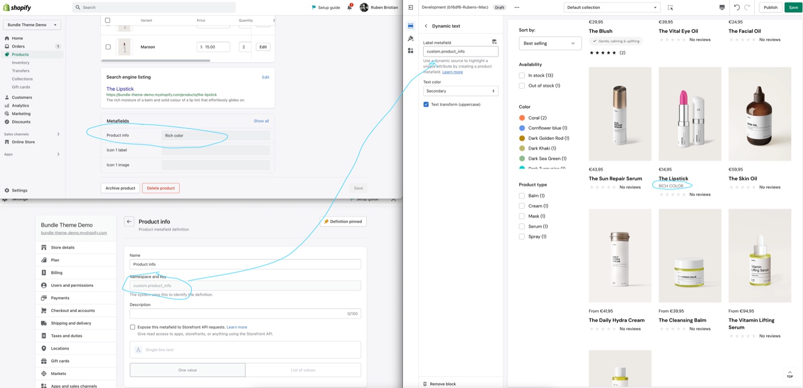
Repeat step 3 in every grid that should show the text: each section has its own blocks.
Quick buy
The Quick buy block lets customers buy from the grid.
- Options display type Inline (in the product grid) shows the variant options and an add to cart button in the card. Modal (on click) shows one Choose options button that opens the Quick view window (since Combine 2.5.0).
- Products without variants get an add to cart button in both types.
- Don't show quick buy if product is out of stock hides the block on sold out products. When it is off, they show a disabled "Sold out" button.
- Show price inside "add to cart" button adds the price to the button.
- Inline only: Select the first available variant by default selects a variant in advance; when it is off, the button reads "Choose a variant" until the customer chooses. Handle unavailable variants disables, hides (default) or shows sold out variants.
The look of the options (blocks or dropdown, color swatches) comes from Theme settings → Product card → Product variants. See Color swatches. The Modal display settings header of the block is empty: the modal is built in the Quick view template.
Product link
- Adds an outline button to the product page under the card details. Button label sets its text (default "View product").
Why does the quick buy button not show for some products?
Because those products are sold out and Don't show quick buy if product is out of stock is on, or the block is missing in that section. With the setting off, sold out products show a disabled "Sold out" button instead. Each grid section needs its own Quick buy block.
Why is my dynamic text empty?
Because the product has no value in that metafield, or Label metafield does not match the metafield. Check the namespace.key in Shopify admin → Settings → Metafields and metaobjects → Products and type it exactly. Products with an empty metafield show nothing.
Why do the icons not show in my product cards?
Because the Icons list block is not in that grid, or Theme settings → Product card → Dynamic icons list has no metafields named, or the products have no values. See Dynamic icons list for the setup.
Related pages
- Collection page: the main product grid of the store.
- Featured collection section: a product grid or slider on any page.
- Product card theme settings: the card image, thumbnails and quick buy popup.
- Dynamic icons list: the metafields behind the Icons list block.
- Quick view template: the window that opens from the Quick buy block.