Product card theme settings
The Product card theme settings of Combine set product thumbnails, the quick buy popup and the rating app for every product grid.
Applies to: Combine 4.2.0 and later. Added in: Combine 1.0.0. Last checked: 2026-10-13 against Combine 4.2.0.
The Product card theme settings set how products look in every product grid of the store: collection pages, search results, Featured collection, product recommendations and the other product sections. This page covers the product image, the quick buy popup and the rating app.
Where to find it: Theme settings → Product card
The other parts of Theme settings → Product card have their own pages: Product badges theme settings, Color swatches (Product variants) and Dynamic icons list. The content under the image (title, price, quick buy and more) is built from blocks in each section, see Product grid blocks.
Product thumbnail
These settings change the product image at the top of each product card.
- Media aspect ratio crops every product image to the same shape: Short (4:3), Square (1:1), Tall (5:6) or Taller (2:3). Pick the shape closest to your product photos.
- Fit media inside container shows the whole image without cropping. Container inner spacing adds space around it, and Container background fills the empty area.
- Container border draws a 1 px border around the image. Leave it transparent for no border.
- Media border radius rounds the image corners, from 0 to 30 px.
- Link thumbnail to product page makes the image a link to the product.
- Fallback image shows for products that have no image.
Product images in the card
A product card shows one of four things in the image area. Combine uses the first one that applies:
- Show product video: the product's first video, playing silently in a loop. Only videos uploaded to the product count, not YouTube or Vimeo links.
- Show second product media on hover: the second product image appears when the customer moves the mouse over the card. The product needs at least two images.
- Slide through product images: a small slider with arrows through the first images of the product, up to Maximum number of images (3 to 14).
- The first product image only.
Turning on Show product video or Show second product media on hover therefore turns off the sliding gallery. Keep Maximum number of images low: every image in the slider is loaded with the page.
Quick buy popup
The quick buy popup is a short "added to cart" message in the corner of the screen. With it on, customers who add a product from a product grid stay on the page and keep shopping, instead of seeing the cart drawer or the cart page.
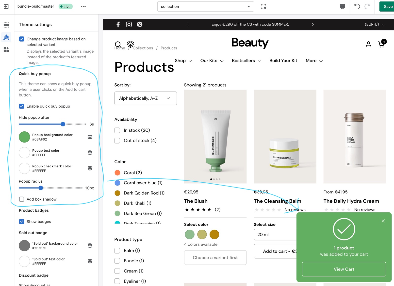
- Enable quick buy popup turns the popup on (default on).
- Hide popup after closes it after 0, 3, 6 or 9 seconds.
- Popup background color, Popup text color and Popup checkmark color set its colors; Popup radius rounds its corners and Add box shadow adds a shadow.
The quick buy popup appears for products added with the quick buy controls of product grids. The add to cart button on the product page always opens the cart drawer or the cart page, as set in Cart theme settings.
Product rating
- Rating app tells Combine which review app you use, so the rating blocks show its stars in product cards, on the product page and in Featured product.
- Supported apps: Okendo, Loox, Judge.me (default), Stamped, Klaviyo, Yotpo, Ali Reviews, Rapid Reviews and Air Reviews.
- Okendo, Loox, Judge.me, Rapid Reviews and Air Reviews: Combine draws the stars from the rating the app saves on each product.
- Stamped, Klaviyo, Yotpo and Ali Reviews: Combine places the app's own star widget, which the app fills in.
Setting up review stars
Install a supported app
Install one of the nine apps supported by Rating app from the Shopify App Store and let it collect or import your reviews. See Product review apps.
Select the app
Open Theme settings → Product card → Product rating and select your app in Rating app.
Add the rating blocks
The stars show only where a rating block is. In each product grid section, select Add block → Rating. On the product page and in Featured product, add the Product rating block.
Why does the second image not show on hover?
One of the settings or the product rules it out. Check these:
- The product has at least two images.
- Show product video is off, or the product has no uploaded video. A video always wins over the second image.
- The customer uses a mouse. Phones and tablets have no hover, so they show the first image only.
Which review apps show ratings in product cards?
The nine apps in Rating app: Okendo, Loox, Judge.me, Stamped, Klaviyo, Yotpo, Ali Reviews, Rapid Reviews and Air Reviews. Another app needs its own app block or custom code: Combine cannot read its ratings.
All Product card settings
Every setting in this group, with its type and default.
Product card theme settings: Product thumbnail
Where to find it: Theme settings → Product card → Product thumbnail
Media aspect ratio (dropdown, default: Cropped: Square (1:1)): Crops every product image in product cards to the same shape. Options: Cropped: Short (4:3), Cropped: Square (1:1), Cropped: Tall (5:6), Cropped: Taller (2:3).
Fit media inside container (checkbox, default: off): Shows the whole product image in the card without cropping, inside a container of the chosen aspect ratio.
Container inner spacing (slider 0 to 15 %, default: 10 %): Adds space around the product image inside the container, in percent of its size. Shown only when Fit media inside container is on.
Container background (color, default: transparent): Fills the empty area of the container around a product image that fits inside it. Shown only when Fit media inside container is on.
Container border (color, default: transparent): Draws a 1 px border around the product image. Transparent means no border.
Media border radius (slider 0 to 30 px, default: 0 px): Sets the corner radius of the product image in product cards.
Slide through product images (checkbox, default: on): Shows a small slider with arrows through the product images in each product card. Turned off by Show product video and Show second product media on hover.
Maximum number of images (slider 3 to 14, default: 6): Sets how many product images the card slider shows. Every image is loaded with the page, so keep it low. Shown only when Slide through product images is on.
Show second product media on hover (checkbox, default: off): Shows the second product image when the mouse is over the card, for products with at least two images. It replaces the sliding gallery.
Show product video (checkbox, default: off): Plays the product's first uploaded video in the card, silently and in a loop. It replaces the second image and the sliding gallery for products that have a video.
Link thumbnail to product page (checkbox, default: on): Makes the product image a link to the product page.
Fallback image (image): Sets the image shown in product cards for products without images.
Product card theme settings: Quick buy popup
Where to find it: Theme settings → Product card → Quick buy popup
This theme can show a quick buy popup when a user clicks on the Add to cart button.
Enable quick buy popup (checkbox, default: on): Shows a short added to cart message, instead of the cart drawer or page, when a customer adds a product from a product grid. The product page add to cart button is not affected.
Hide popup after (slider 0 to 9 s, step 3, default: 6 s): Sets how long the quick buy popup stays on screen before it closes. Shown only when Enable quick buy popup is on.
Popup background color (color, default: #63AF62): Sets the background color of the quick buy popup. Shown only when Enable quick buy popup is on.
Popup text color (color, default: #ffffff): Sets the text and button color of the quick buy popup. Shown only when Enable quick buy popup is on.
Popup checkmark color (color, default: #ffffff): Sets the color of the animated checkmark in the quick buy popup. Shown only when Enable quick buy popup is on.
Popup radius (slider 0 to 30 px, default: 10 px): Sets the corner radius of the quick buy popup. Shown only when Enable quick buy popup is on.
Add box shadow (checkbox, default: off): Adds a shadow under the quick buy popup. Shown only when Enable quick buy popup is on.
Product card theme settings: Product rating
Where to find it: Theme settings → Product card → Product rating
To display ratings, add a product rating app. Learn more.
Rating app (dropdown, default: Judge.me): Sets the review app that rating blocks read. Okendo, Loox, Judge.me, Rapid Reviews and Air Reviews: Combine draws stars from the app's product rating; Stamped, Klaviyo, Yotpo and Ali Reviews: Combine places the app's own star widget. Options: Okendo, Loox, Judge.me, Stamped, Klaviyo, Yotpo, Ali Reviews, Rapid Reviews, Air Reviews.
Related pages
- Product grid blocks: the title, price, quick buy, rating and other blocks of product cards.
- Color swatches: the Product variants settings of the same group.
- Product badges theme settings: sold out, discount and custom badges.
- Dynamic icons list: feature icons in product cards.
- Quick view template: the popup opened by the quick buy button.
Forms and buttons theme settings
The Forms & buttons theme settings of Combine set the border width and corner radius of form fields and buttons across the store.
Product badges theme settings
The Product badges theme settings of Combine set the sold out and discount badges and three custom badges shown by product tag.