Typography theme settings
The Typography theme settings of Combine set the fonts, base sizes and line heights of headings, body text and section titles.
Applies to: Combine 4.2.0 and later. Added in: Combine 1.0.0. Last checked: 2026-10-13 against Combine 4.2.0.
The Typography theme settings choose the three fonts of your store and their base sizes: one for headings, one for body text and one for section titles. The fonts come from Shopify's font library.
Where to find it: Theme settings → Typography
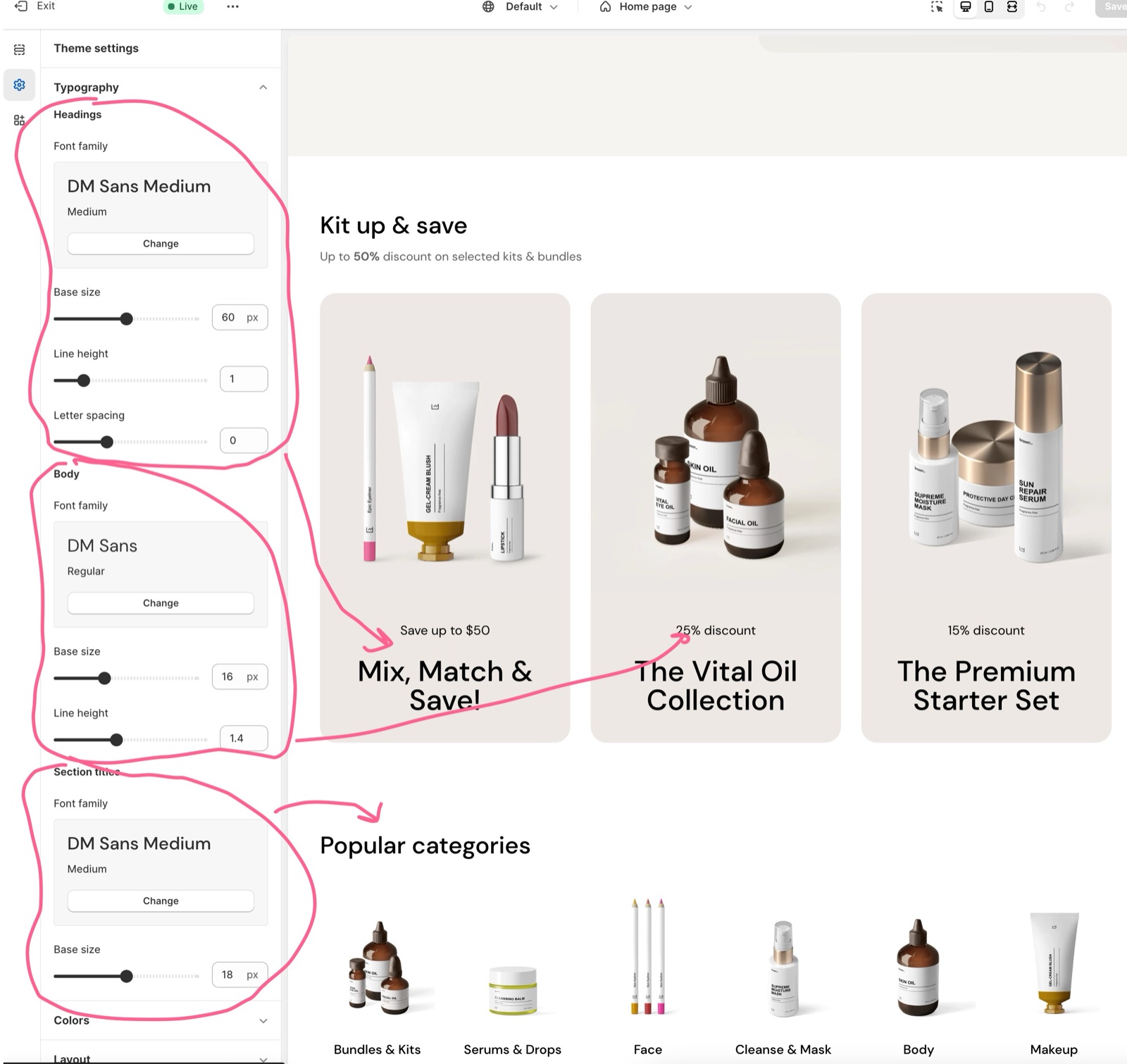
Headings
The Headings font is used for page titles (H1 to H6), the product title and the Heading blocks of flex sections.
- Font family picks the heading font.
- Base size is the size of the largest heading (H1) on desktop, from 24 to 96 px. Every other heading size is a share of it.
- Line height sets the space between the lines of a heading.
- Letter spacing adds or removes space between letters, from -10 to 20 (hundredths of the font size, so 10 adds 0.1 em). Only headings have it.
Body
The Body font is used for all other text: paragraphs, menus, buttons, prices and form fields.
- Font family picks the body font. Combine loads its medium and bold weights too, for menus, buttons and bold text.
- Base size is the regular text size, from 12 to 24 px. Small and large text sizes are a share of it.
- Line height sets the space between lines of body text.
Section titles
The Section titles font is used for the heading at the top of a section (the section heading) and for block titles on the product page.
- Font family picks the section title font. It can be the same as the body font.
- Base size is the regular section title size, from 12 to 24 px. Sections with a large heading size use a larger share of it.
How responsive font sizes work
Combine sizes text by screen width, always as a share of the base size you set:
| Text | Desktop (1024 px and wider) | Tablet (475 to 1023 px) | Mobile (below 475 px) |
|---|---|---|---|
| H1 with the default Base size 60 px | 60 px | 46 px | 34 px |
| Large section title with the default Base size 18 px | 30 px | 28 px | 22 px |
Raise or lower a Base size and every size on every screen moves with it.
Can I use my own font?
Not with theme settings. Combine offers the fonts in Shopify's font library only. A font of your own, or a Google font that Shopify does not offer, needs code in the theme files. See Custom CSS and code; Krown support does not provide help with custom code.
All Typography settings
Every setting in this group, with its type and default.
Typography theme settings: Headings
Where to find it: Theme settings → Typography → Headings
Font family (font, default: Dm Sans (weight 500)): Sets the font of page titles, product titles and the Heading blocks.
Base size (slider 24 to 96 px, default: 60 px): Sets the desktop size of H1 headings. Every other heading size, and the tablet and mobile sizes, are a share of it.
Line height (slider 0.8 to 2, step 0.1, default: 1): Sets the line height of headings.
Letter spacing (slider -10 to 20, default: 0): Sets the letter spacing of headings, in hundredths of the font size (10 = 0.1 em)
Typography theme settings: Body
Where to find it: Theme settings → Typography → Body
Font family (font, default: Dm Sans (weight 400)): Sets the font of body text, menus, buttons, prices and form fields.
Base size (slider 12 to 24 px, default: 16 px): Sets the regular body text size. Small and large text sizes are a share of it.
Line height (slider 1 to 2, step 0.1, default: 1.4): Sets the line height of body text.
Typography theme settings: Section titles
Where to find it: Theme settings → Typography → Section titles
Font family (font, default: Dm Sans (weight 500)): Sets the font of section headings and of block titles on the product page.
Base size (slider 12 to 24 px, default: 18 px): Sets the regular section heading size. Large section headings and the tablet and mobile sizes are a share of it.
Related pages
- Custom CSS and code: how a developer adds a custom or Google font.
- Colors theme settings: the text colors.
- Combine presets: the fonts each theme style uses.
- Heading block: heading sizes inside flex sections.
Layout theme settings
The Layout theme settings of Combine set the maximum page width, the space between sections and grid items, and the widget corner radius.
Colors theme settings
The Colors theme settings of Combine set the header, body and footer colors; sections can override them with their own design colors.