Layout theme settings
The Layout theme settings of Combine set the maximum page width, the space between sections and grid items, and the widget corner radius.
Applies to: Combine 4.2.0 and later. Added in: Combine 1.0.0. Last checked: 2026-10-13 against Combine 4.2.0.
The Layout theme settings set how wide your pages get and how much space Combine leaves between sections and between items in a grid. They apply to every page of the store.
Where to find it: Theme settings → Layout
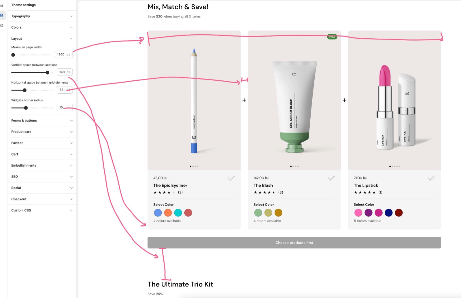
Page width and spacing
- Maximum page width sets how wide page content gets on large screens, from 1360 to 2260 px. Narrower content areas, such as text pages, grow in proportion. Full-width sections ignore it.
- Vertical space between sections sets the space above and below sections, from 50 to 150 px.
- Horizontal space between grid elements sets the gap between items in grids and sliders, such as product cards and cards in flex sections.
Combine reduces both spaces on smaller screens, so the values you set are the desktop values:
| Screen width | Vertical space between sections | Horizontal space between grid elements |
|---|---|---|
| Wider than 1280 px | 100 % | 100 % |
| 1024 to 1280 px | 80 % | 80 % |
| 768 to 1023 px | 60 % | 50 % |
| 475 to 767 px | 50 % | 50 % |
| Narrower than 475 px | 40 % | 15 px |
Widgets border radius
- Widgets border radius rounds the corners of the boxed elements that are not cards or buttons: the cart summary on the cart page, toggles, the image lightbox, hotspot tooltips, the customer account boxes and the panels of the Products set and Products bundle sections.
- Buttons and form fields have their own corner radius in Forms and buttons theme settings. Sections with cards have their own Border radius in their card design settings.
Why did the space between my sections not change on mobile?
It did, but by a share of the value. Combine scales Vertical space between sections down to between 80 and 40 percent of the desktop value on smaller screens (see the table in "Page width and spacing"). Combine has no separate mobile spacing setting. Some sections also have Remove top margin or Remove bottom margin settings of their own.
All Layout settings
Every setting in this group, with its type and default.
Maximum page width (slider 1360 to 2260 px, step 10, default: 1360 px): Sets the widest the page content gets on large screens. Narrower content areas grow in proportion; full-width sections ignore it.
Vertical space between sections (slider 50 to 150 px, step 10, default: 120 px): Sets the space above and below sections on desktop. Combine uses 80 percent of it below 1281 px, 60 percent below 1024 px, 50 percent below 768 px and 40 percent below 475 px.
Horizontal space between grid elements (slider 20 to 60 px, step 2, default: 32 px): Sets the gap between items in grids and sliders, such as product cards. Combine uses 80 percent of it below 1281 px, 50 percent below 1024 px and 15 px below 475 px.
Widgets border radius (slider 0 to 30 px, default: 10 px): Sets the corner radius of boxed elements that are not cards or buttons: the cart summary, toggles, the lightbox, hotspot tooltips, account boxes and the Products set and Products bundle panels.
Related pages
- Forms and buttons theme settings: the corner radius of buttons and form fields.
- Colors theme settings: the header, body and footer colors.
- Typography theme settings: fonts and text sizes.
- General section styling: the design settings each section has.