Collection page
The Collection page template of Combine: the collection banner, the product grid with filters, sorting and comparing, and the collection description.
Applies to: Combine 4.2.0 and later. Added in: Combine 1.0.0. Last checked: 2026-10-13 against Combine 4.2.0.
The Collection page template shows one collection: its title in the Collection banner, then its products in the Product grid with filters, sorting and comparing. Every collection uses the Default collection template unless you assign another one.
Where to find it: Online Store → Themes → Customize → template picker → Collections → Default collection.
The template starts with two sections, Collection banner and Product grid. You can add a third, Collection description, to show the description further down the page.
Collection banner
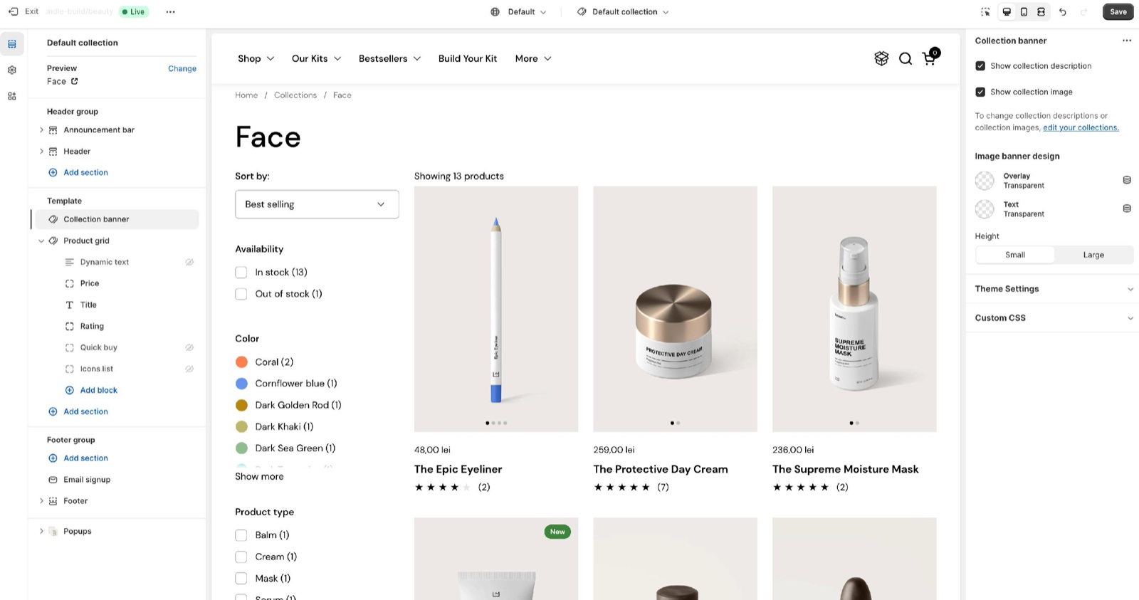
The Collection banner shows the breadcrumb and the collection title.
- Show collection description adds the collection description under the title (off by default).
- Show collection image shows the collection image behind the title, as a banner (off by default). Set the image on the collection in Shopify admin → Products → Collections.
The Image banner design settings style that banner:
- Overlay darkens or tints the image so the title stays readable.
- Text sets the title color over the image.
- Height is Small or Large.
Product grid
- Products per page sets how many products show before the pagination, from 12 to 248 (default 48).
To configure the filters on your store you will need to install Shopify Search & Discovery app.
Filtering and sorting
- Enable filtering shows the filters you set up in Shopify's Search & Discovery app.
- Enable sorting shows the sort menu (best selling, price, date and the other Shopify sort orders).
- Enable comparing (since Combine 4.0.0) adds a Compare switch to the bar. With it on, customers select up to 4 products and open them side by side. See Product comparison page.
- Image filter layout shows filters with swatches or images in 1 or 2 columns.
Setting up filters
Install Search & Discovery
In Shopify admin, install Shopify's free Search & Discovery app.
Add the filters
In the app, open Filters → Add filter and choose the filters you want, for example Availability, Price, Product type or an option such as Size or Color. Save.
Turn on filtering
In the theme editor, open Collections → Default collection → Product grid and turn on Enable filtering.
Check a collection
Open a collection on the storefront. The filters show in the sidebar or in the list above the products.
Filters are a Shopify feature: which filters exist, their order and their names are set in the Search & Discovery app, not in Combine. See Shopify's help page Search & Discovery filters.
Layout
- Show filters as puts the filters in a Sidebar next to the products (with an "Apply filters" button since Combine 3.2.0), or in a List of dropdowns above them.
- Desktop layout sets 3, 4 or 5 product columns (5 since Combine 3.1.0). Mobile layout sets 1 or 2 columns.
Blocks
The blocks of the Product grid set what each product card shows, in their order. The template starts with Price, Title and Quick buy. They are the same blocks in every product grid of Combine, described on Product grid blocks:
- Price, Title, Vendor and Description show the product details.
- Rating shows the stars of your reviews app.
- Icons list shows the icons set in Theme settings → Product card → Dynamic icons list.
- Dynamic text shows one product metafield, typed as
namespace.key. - Quick buy adds the variant options and an add to cart button (Inline), or a button that opens the quick view (Modal).
- Product link adds a button to the product page.
The image, badges and hover effects of the cards are set in Product card theme settings.
Collection description
The Collection description section shows the collection description as its own section, with a section heading. Use it to move a long description below the product grid instead of the banner. Add it with Add section → Collection description in the collection template. The heading, design, gutter and SEO settings are the standard ones, described on General section styling.
Why do my filters not show?
Because Enable filtering is off, or no filters are set up in the Search & Discovery app. Install the app, add filters, then turn on Enable filtering in the Product grid.
Can I show more than 48 products per page?
Yes. Set Products per page in the Product grid section, up to 248. More products per page make the page slower to load; the pagination shows the rest.
Why does the collection image not show?
Because Show collection image is off (the default), or the collection has no image. Turn on Show collection image in the Collection banner and add an image to the collection in Shopify admin.
All Collection page settings
Every setting of this page, with its type and default.
Where to find it: Collections → Default collection → Collection banner.
Show collection description (checkbox, default: off): Shows the collection description under the title.
Show collection image (checkbox, default: off): Shows the collection image behind the title as a banner. The image is set on the collection in Shopify admin.
To change collection descriptions or collection images, edit your collections in Shopify admin.
Collection banner section: Image banner design
Where to find it: Collections → Default collection → Collection banner → Image banner design
Overlay (color, default: transparent): Sets the overlay color over the collection image, so that the title stays readable. Used only when the image shows.
Text (color, default: transparent): Sets the title and breadcrumb color over the collection image.
Height (dropdown, default: Small): Sets the height of the image banner. Options: Small, Large.
Where to find it: Collections → Default collection → Product grid.
Accepts these blocks: Price, Title, Description, Vendor, Rating, Icons list, Dynamic text, Quick buy and Product link.
Products per page (slider 12 to 248, step 4, default: 48): Sets how many products show on each page of the collection before the pagination.
Product grid section: Filtering and sorting
Where to find it: Collections → Default collection → Product grid → Filtering and sorting
Enable filtering (checkbox, default: on): Shows the filters set up in Shopify's Search & Discovery app.
Enable sorting (checkbox, default: on): Shows the sort menu with Shopify's sort orders.
Enable comparing (checkbox, default: off): Adds a Compare switch to the filtering bar. With it on, customers select up to 4 products and open them side by side in the compare product template.
Image filter layout (dropdown, default: 1 column): Sets whether filters with swatches or images show in 1 or 2 columns. Options: 1 column, 2 columns.
Product grid section: Layout
Where to find it: Collections → Default collection → Product grid → Layout
Show filters as (dropdown, default: Sidebar): Shows the filters in a sidebar next to the products, or as a list of dropdowns above them. Options: Sidebar, List.
Desktop layout (dropdown, default: 4 columns): Sets the number of product columns on desktop. Options: 3 columns, 4 columns, 5 columns.
Mobile layout (dropdown, default: 2 columns): Sets the number of product columns on mobile. Options: 1 column, 2 columns.
Price block
Where to find it: Collections → Default collection → Product grid → Add block → Price
One Price block per section.
The Price block has no settings in Combine 4.2.0.
Title block
Where to find it: Collections → Default collection → Product grid → Add block → Title
One Title block per section.
The Title block has no settings in Combine 4.2.0.
Description block
Where to find it: Collections → Default collection → Product grid → Add block → Description
One Description block per section.
Number of words (slider 5 to 40, default: 15): Sets how many words of the product description the Description block shows, without formatting.
Show link to product page (checkbox, default: on): Adds a "View product details" link to the product page under the description.
Vendor block
Where to find it: Collections → Default collection → Product grid → Add block → Vendor
One Vendor block per section.
The Vendor block has no settings in Combine 4.2.0.
Rating block
Where to find it: Collections → Default collection → Product grid → Add block → Rating
One Rating block per section.
The Rating block has no settings in Combine 4.2.0.
Icons list block
Where to find it: Collections → Default collection → Product grid → Add block → Icons list
One Icons list block per section.
This theme allows you to add custom product icons through dynamic content. See Dynamic icons list.
Dynamic text block
Where to find it: Collections → Default collection → Product grid → Add block → Dynamic text
One Dynamic text block per section.
Label metafield (text field, default: "custom.product_text"): The product metafield the Dynamic text block shows, typed as namespace.key (for example custom.product_text). Products without a value show nothing.
Text color (dropdown, default: Secondary): Sets the Dynamic text color: Primary uses the text color, Secondary a lighter shade. Options: Primary, Secondary.
Text transform (uppercase) (checkbox, default: off): Writes the Dynamic text in capitals.
Quick buy block
Where to find it: Collections → Default collection → Product grid → Add block → Quick buy
One Quick buy block per section.
Options display type (dropdown, default: Inline (in the product grid)): Sets how quick buy works: Inline shows the variant options in the product card, Modal opens the quick view window when the button is selected. Options: Inline (in the product grid), Modal (on click).
Don't show quick buy if product is out of stock (checkbox, default: off): Hides the quick buy button on sold out products.
Show price inside "add to cart" button (checkbox, default: on): Adds the price to the add to cart button.
Quick buy block: Inline display settings
Where to find it: Collections → Default collection → Product grid → Add block → Quick buy → Inline display settings
Select the first available variant by default (checkbox, default: off): Selects the first available variant in the card. When off, customers choose a variant before the button works. Shown only when Options display type is Inline (in the product grid).
Handle unavailable variants (dropdown, default: Hide): Sets what sold out variants do in the card: Disable greys them out, Hide removes them, Show keeps them selectable. Options: Disable, Hide, Show. Shown only when Options display type is Inline (in the product grid).
Product link block
Where to find it: Collections → Default collection → Product grid → Add block → Product link
One Product link block per section.
Button label (text field, default: "View product"): Sets the text of the Product link button, which opens the product page.
Where to find it: Collections → Default collection → Add section → Collection description, then select the Collection description section.
Collection description section: Section heading
Where to find it: Collection description → Section heading
The Collection description section uses the standard Section heading settings, listed in General section styling. Not available in this section: Button label and Button link.
Heading (text field, default: "Collection description").
Subheading (formatted text).
Heading size (dropdown, default: Regular). Options: Regular, Large.
Text alignment (dropdown, default: One row: Left). Options: One row: Left, Two rows: Left, Two rows: Center.
These settings differ from the standard ones or exist only here:
Heading (text field, default: "Collection description").
Subheading (formatted text).
Collection description section: Content
Where to find it: Collection description → Content
To change collection descriptions or collection images, edit your collections in Shopify admin.
Collection description section: Section design
Where to find it: Collection description → Section design
The Collection description section uses the standard Section design settings, listed in General section styling.
Background color (color, default: transparent).
Background gradient (gradient).
Text color (color, default: transparent).
These settings differ from the standard ones or exist only here:
Text color (color, default: transparent).
Collection description section: Gutter
Where to find it: Collection description → Gutter
The Collection description section uses the standard Gutter settings, listed in General section styling.
Decrease top margin (checkbox, default: off).
Remove bottom margin (checkbox, default: off).
Collection description section: SEO
Where to find it: Collection description → SEO
The Collection description section uses the standard SEO settings, listed in General section styling.
Heading tag (dropdown, default: H2): Specify heading level to help search engines index the structure of your page. Options: H1, H2, H3, H4, span.
Related pages
- Product grid blocks: the blocks of the product cards.
- Product comparison page: what Enable comparing opens.
- Product card theme settings: the card image, thumbnails and quick buy popup.
- Troubleshoot product and collection pages: swatches, icons, filters and quick buy answers.
Product comparison page
The Product comparison page of Combine builds a side-by-side table of the products a customer ticks in the collection grid.
Product grid blocks
Product grid blocks in Combine: price, title, description, vendor, rating, icons list, dynamic text, quick buy and product link, used in every product grid.