Testimonials section
The Testimonials section of Combine shows customer quotes as cards in a slider or a grid, with their own colors.
Applies to: Combine 4.2.0 and later. Added in: Combine 1.0.0. Last checked: 2026-10-13 against Combine 4.2.0.
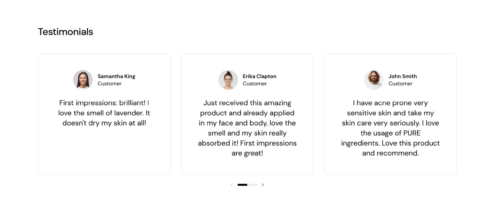
The Testimonials section shows customer quotes as cards, each with a name, a title and an optional round photo, in a slider or a grid.
Where to find it: in the theme editor, select Add section and choose Testimonials. Add one Testimonial block per quote. The Testimonials page template is built with the Slider (vertical) section, not with this section; see Alternate page templates.
Layout
- Layout is Slider (the default), which scrolls sideways with arrows, or Grid.
- Both show three cards per row on desktop, two below 1024 px and one on phones.
- Text alignment aligns the text of the cards and the slider arrows Left (the default) or Center.
Custom card design
- Background, Text and Border set the colors of every card. Leave them transparent to use the page colors.
- Border radius rounds the corners of the cards, 0 to 30 px.
- Hide border removes the line around the cards.
The section heading, background colors, margins and heading tag work as described in General section styling. Background color and Background gradient color the section around the cards; Heading text color colors only the section heading.
Blocks
Testimonial
- Author name shows in bold on the card (default "Author").
- Author title shows next to the name, for example "Customer" or "Verified buyer".
- Quote is the testimonial text. It takes bold, italic and links.
- Author avatar is a photo of the customer, cropped to a small circle. Leave it empty for a card without a photo.
Can the testimonials come from my reviews app?
No. Testimonial blocks show the text you type. Product reviews from an app show on the product page and in product grids through the app chosen in Product card theme settings. Many review apps also offer their own app block, which you can add with the Apps section.
How do I show all testimonials at once?
Set Layout to Grid. The cards then wrap into rows of three on desktop instead of scrolling sideways.
All Testimonials settings
Every setting of this section, with its type and default.
Accepts these blocks: Testimonial.
Testimonials section: Section heading
Where to find it: Testimonials → Section heading
The Testimonials section uses the standard Section heading settings, listed in General section styling.
Heading (text field, default: "Testimonials"): Sets the section title. Leave Heading, Subheading and Button label empty to hide the heading area.
Subheading (formatted text, default: "Show your clients' thoughts").
Heading size (dropdown, default: Regular). Options: Regular, Large.
Text alignment (dropdown, default: One row: Left). Options: One row: Left, Two rows: Left, Two rows: Center.
Button label (text field): Adds a button to the heading area on desktop; below 768 px it shows under the section as a full-width button.
Button link (link). Shown only when Button label is set.
These settings differ from the standard ones or exist only here:
Heading (text field, default: "Testimonials"): Sets the section title. Leave Heading, Subheading and Button label empty to hide the heading area.
Subheading (formatted text, default: "Show your clients' thoughts").
Testimonials section: Layout
Where to find it: Testimonials → Layout
Layout (dropdown, default: Slider): Shows the cards as a slider that scrolls sideways, or as a grid. Three cards per row on desktop, two below 1024 px, one on phones. Options: Slider, Grid.
Text alignment (dropdown, default: Left): Aligns the card text and the slider arrows. Options: Left, Center.
Testimonials section: Custom card design
Where to find it: Testimonials → Custom card design
Background (color, default: transparent): Sets the background of every card.
Text (color, default: transparent): Sets the text color of every card.
Border (color, default: transparent): Sets the color of the line around every card.
Border radius (slider 0 to 30 px, default: 0 px): Rounds the corners of the cards.
Hide border (checkbox, default: off).
Testimonials section: Section design
Where to find it: Testimonials → Section design
The Testimonials section uses the standard Section design settings, listed in General section styling.
Background color (color, default: transparent): Fills the section around the cards, not the cards.
Background gradient (gradient).
Heading text color (color, default: transparent): Sets the color of the section heading and subheading only.
Testimonials section: Gutter
Where to find it: Testimonials → Gutter
The Testimonials section uses the standard Gutter settings, listed in General section styling.
Decrease top margin (checkbox, default: off): Makes the space above the section smaller.
Remove bottom margin (checkbox, default: off): Pulls the next section up, so the two sections touch.
Testimonials section: SEO
Where to find it: Testimonials → SEO
The Testimonials section uses the standard SEO settings, listed in General section styling.
Heading tag (dropdown, default: H2): Sets the HTML level of the section heading for search engines; span gives it no level. It does not change the size. Options: H1, H2, H3, H4, span.
Testimonial block
Where to find it: Testimonials → Add block → Testimonial
Author name (text field, default: "Author").
Author title (text field, default: "Customer"): Sets the line next to the author name, for example Customer.
Quote (rich text, default: "Add customer reviews and testimonials to showcase your store's happy customers."): Sets the testimonial text. Supports bold, italic and links.
Author avatar (image): Sets a photo of the customer, cropped to a small circle.
Related pages
- Alternate page templates: the Testimonials page template.
- Slider (vertical) section: the layered slider of the Testimonials page template.
- Star rating block: stars with a caption in flex sections.
- General section styling: the standard section settings.