Flex cards section
The Flex cards section of Combine shows promotion cards with media, text and buttons, each card with its own width on the grid.
Applies to: Combine 4.2.0 and later. Added in: Combine 3.1.0. Last checked: 2026-10-13 against Combine 4.2.0.
The Flex cards section shows promotion cards with an image or a video on top and theme blocks below: a caption, a heading, a button. Each card sets its own width on a 12-column grid.
Where to find it: in the theme editor, select Add section and choose Flex promotion cards. The section starts with four cards.
Layout
- Desktop media height sets the height of the image or video of every card on screens 768 px and wider, 100 to 600 px (default 300 px). Images fill that height and are cropped at the edges.
- Preserve media height on mobile (on by default) shows the media at its own proportions on screens narrower than 768 px, so nothing is cropped there.
- Mobile media height appears when Preserve media height on mobile is off. It sets a fixed media height on mobile, 100 to 500 px (default 200 px).
- Don't show media hides the images and videos of all cards, for a grid of text cards.
- On mobile every card takes the full width, one card per row.
Text style
- Text alignment aligns the blocks of every card: Left, Center (the default) or Right.
- Text spacing sets the gap between the blocks of a card, from -12 to 60 px (default 12 px).
- Text padding sets the space around the blocks inside the card: Regular (the default) or Large.
Custom card design
Border radius rounds the corners of the cards, 0 to 30 px. The section heading, background colors, margins and heading tag work as described in General section styling; this section is the model for the standard settings listed there.
Card
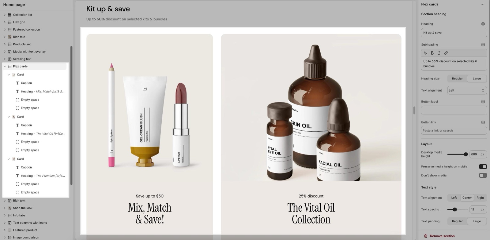
Inside the section, select Add block and choose Card. Then select Add block inside the card to add a Heading, Text, Button or any other theme block. A new card holds a Caption and a Heading.
Media and link
- Image is the card's picture. Video plays muted in a loop instead of it; the image shows while the video loads and when it cannot play.
- Use different media on mobile shows Mobile video file and Mobile poster image on small screens. Mobile video aspect ratio sets the shape of the mobile video, from Natural to Tallest (9:16).
- Link makes the whole card clickable. The buttons inside the card then stop working, even though the editor note says a button label keeps them. Use either a card link or buttons.
Grid design
- Desktop columns sets how many of the 12 grid columns the card spans, from 2 to 12 (default 2). Four cards at 3 fill one row; two cards at 6 fill one row; a card at 8 next to a card at 4 makes a wide and a narrow card.
- Hide element on mobile hides the card on screens narrower than 768 px.
Custom card design
- Background and Text set the card's own colors. Border draws a line around the card; Hide border removes it.
How do I make four cards in one row?
Set Desktop columns to 3 on each of the four cards. A row is full when the cards' columns add up to 12, so cards at 2 fit six in a row and cards at 4 fit three.
Why are my card images cut off?
Because every card shows its media at Desktop media height, and an image with other proportions is cropped to fit. Change the height, or use images with the same proportions as the cards. On mobile, Preserve media height on mobile shows the images uncropped.
Why don't the buttons in my card work?
Because the card has a Link. The card link covers the whole card, so the buttons inside it cannot be selected. Remove the card's Link to use the buttons.
All Flex cards settings
Every setting of this page, with its type and default.
Accepts these blocks: Card.
Flex cards section: Section heading
Where to find it: Flex cards → Section heading
Heading (text field, default: "Promotion cards"): Sets the section title. Leave Heading, Subheading and Button label empty to hide the heading area.
Subheading (formatted text, default: "Share your best offers"): Sets a short line next to or under the heading, in smaller, lighter text.
Heading size (dropdown, default: Regular): Sets the size of the section heading, in the Section titles font of Theme settings → Typography. Options: Regular, Large.
Text alignment (dropdown, default: One row: Left): One row: Left puts the heading and subheading side by side with the button on the right; Two rows puts the subheading under the heading; Center centers everything. Options: One row: Left, Two rows: Left, Two rows: Center.
Button label (text field): Adds a button to the heading area on desktop; below 768 px it shows under the section as a full-width button.
Button link (link). Shown only when Button label is set.
Flex cards section: Layout
Where to find it: Flex cards → Layout
Desktop media height (slider 100 to 600 px, step 10, default: 300 px): Sets the media height of every card on screens 768 px and wider. Images are cropped to fit. Shown only when Don't show media is off.
Preserve media height on mobile (checkbox, default: on): Shows the media at its own proportions on screens narrower than 768 px, uncropped. Shown only when Don't show media is off.
Mobile media height (slider 100 to 500 px, step 10, default: 200 px): Sets a fixed media height on screens narrower than 768 px. Shown only when Don't show media is off and Preserve media height on mobile is off.
Don't show media (checkbox, default: off): Hides the image and video of every card, for text-only cards.
Flex cards section: Text style
Where to find it: Flex cards → Text style
Text alignment (dropdown, default: Center). Options: Left, Center, Right.
Text spacing (slider -12 to 60 px, default: 12 px): Sets the gap between the blocks of each card.
Text padding (dropdown, default: Regular): Sets the space around the blocks inside each card. Options: Regular, Large.
Flex cards section: Custom card design
Where to find it: Flex cards → Custom card design
Border radius (slider 0 to 30 px, default: 0 px): Rounds the corners of the cards and the top corners of their media.
Flex cards section: Section design
Where to find it: Flex cards → Section design
Background color (color, default: transparent): Fills the whole section, edge to edge. Leave it transparent to use the body background.
Background gradient (gradient): Fills the section with a gradient instead of the background color.
Heading text color (color, default: transparent): Sets the color of the section heading, the subheading, the mobile button and the slider arrows.
Flex cards section: Gutter
Where to find it: Flex cards → Gutter
Decrease top margin (checkbox, default: off): Makes the space above the section smaller: at most 70 px on desktop, 40 px on mobile.
Remove bottom margin (checkbox, default: off): Pulls the next section up, so the two sections touch.
Flex cards section: SEO
Where to find it: Flex cards → SEO
Heading tag (dropdown, default: H2): Sets the HTML level of the section heading for search engines; span gives it no level. It does not change the size. Options: H1, H2, H3, H4, span.
Where to find it: Flex cards → Card.
Accepts these blocks: app blocks and any theme block.
Image (image): Sets the card image, shown at the section's media height.
Video (video): Plays a muted, looping video instead of the image. The image shows while the video loads and when it cannot play.
Use different media on mobile (checkbox, default: off): Shows a different video on screens narrower than 768 px. Shown only when Video is set.
Mobile video file (video). Shown only when Use different media on mobile is on and Video is set.
Mobile poster image (image). Shown only when Use different media on mobile is on and Video is set.
Mobile video aspect ratio (dropdown, default: Natural): Sets the shape of the mobile video. Natural keeps the video's own proportions. Options: Natural, Wide (16:9), Short (4:3), Square (1:1), Tall (5:6), Taller (2:3), Tallest (9:16). Shown only when Use different media on mobile is on and Mobile video file is set and Video is set.
Link (link): Makes the whole card a link. The buttons and links inside the card then stop working.
Open link in a new window (checkbox, default: off). Shown only when Link is set.
Card: Grid design
Where to find it: Flex cards → Card → Grid design
Desktop columns (slider 2 to 12, default: 2): Sets how many of the 12 grid columns the card spans on screens 768 px and wider.
Hide element on mobile (checkbox, default: off): Hides the card on screens narrower than 768 px.
Card: Custom card design
Where to find it: Flex cards → Card → Custom card design
Background (color with transparency, default: transparent): Sets the card background.
Text (color, default: transparent): Sets the color of the card's blocks.
Border (color, default: transparent): Sets the color of the line around the card.
Hide border (checkbox, default: off).
Related pages
- Flex sections: how flex sections, cards and theme blocks fit together.
- Flex grid section: a collage with text over the media.
- Theme blocks: the blocks you add inside a card.
- General section styling: the standard section settings, taken from this section.
- Promotion cards section: the older promotion cards with fixed blocks.