Image section
The Image section of Combine shows one image uncropped, with an optional mobile image and link, at full, large or medium width.
Applies to: Combine 4.2.0 and later. Added in: Combine 1.0.0. Last checked: 2026-10-13 against Combine 4.2.0.
The Image section shows one image in full, never cropped, with an optional link. Use it for a banner with text already in the image, a campaign visual or a product shot, with a separate image for phones.
Where to find it: in the theme editor, select Add section and choose Image.
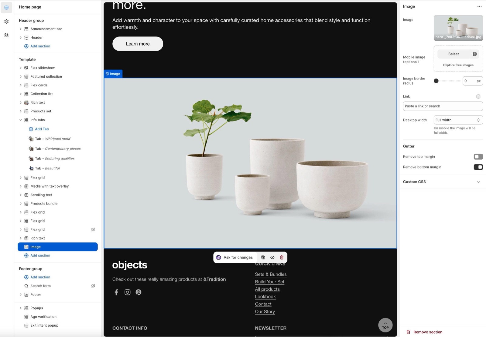
Content options
- Image is the picture. It shows at its own proportions, so nothing is cut off.
- Mobile image (optional) replaces it on screens narrower than 768 px. Use it for banners with text, so the text stays readable on phones. Without it, phones show the main image.
- Image border radius rounds the corners, 0 to 30 px.
- Link makes the whole image clickable, for example to a collection or a sale page. Open link in a new window appears once a link is set.
- Desktop width sets how wide the image is on desktop: Medium, Large (the default, the page width) or Full width (edge to edge).
On mobile, the image will always be full-width for better responsiveness.
Gutter
Remove top margin and Remove bottom margin remove the space above and below the image, so it touches the sections around it. See General section styling.
Can I put text or a button over the image?
Not in this section. The Image section shows the picture only. For text and buttons over an image, use the Flex slideshow section with one slide, or the Media with text overlay section.
What size should my image be?
As wide as it will show, twice that for sharp high-density screens. A Full width image spans the whole screen, so upload at least 1920 px wide; a phone image shows about 750 px wide. See Image size recommendations.
All Image settings
Every setting of this section, with its type and default.
Image (image): Sets the image. It shows at its own proportions, uncropped.
Mobile image (optional) (image): Replaces the image on screens narrower than 768 px.
Image border radius (slider 0 to 30 px, default: 0 px): Rounds the corners of the image.
Link (link): Makes the whole image a link.
Open link in a new window (checkbox, default: off). Shown only when Link is set.
Desktop width (dropdown, default: Large): Sets the width on desktop: Medium, Large (the page width) or Full width (edge to edge). On mobile the image is always full width. Options: Medium, Large, Full width.
Image section: Gutter
Where to find it: Image → Gutter
The Image section uses the standard Gutter settings, listed in General section styling. Not available in this section: Decrease top margin.
Remove top margin (checkbox, default: off): Removes the space above the image.
Remove bottom margin (checkbox, default: off): Removes the space below the image, so the next section touches it.
Related pages
- Image size recommendations: image sizes for Combine.
- Flex slideshow section: images with text and buttons over them.
- Video section: a video with a poster image.
- General section styling: the margin settings.