Text columns with icons section
The Text columns with icons section of Combine shows small icons with a title, caption and link, as a grid, slider or logo list.
Applies to: Combine 4.2.0 and later. Added in: Combine 1.0.0. Last checked: 2026-10-13 against Combine 4.2.0.
The Text columns with icons section shows small icons with a title, a caption and a link, as a grid or a slider. Use it for store policies, service benefits or product features. Its Logo list preset turns it into a row of brand logos.
Where to find it: in the theme editor, select Add section and choose Text columns with icons or Logo list.
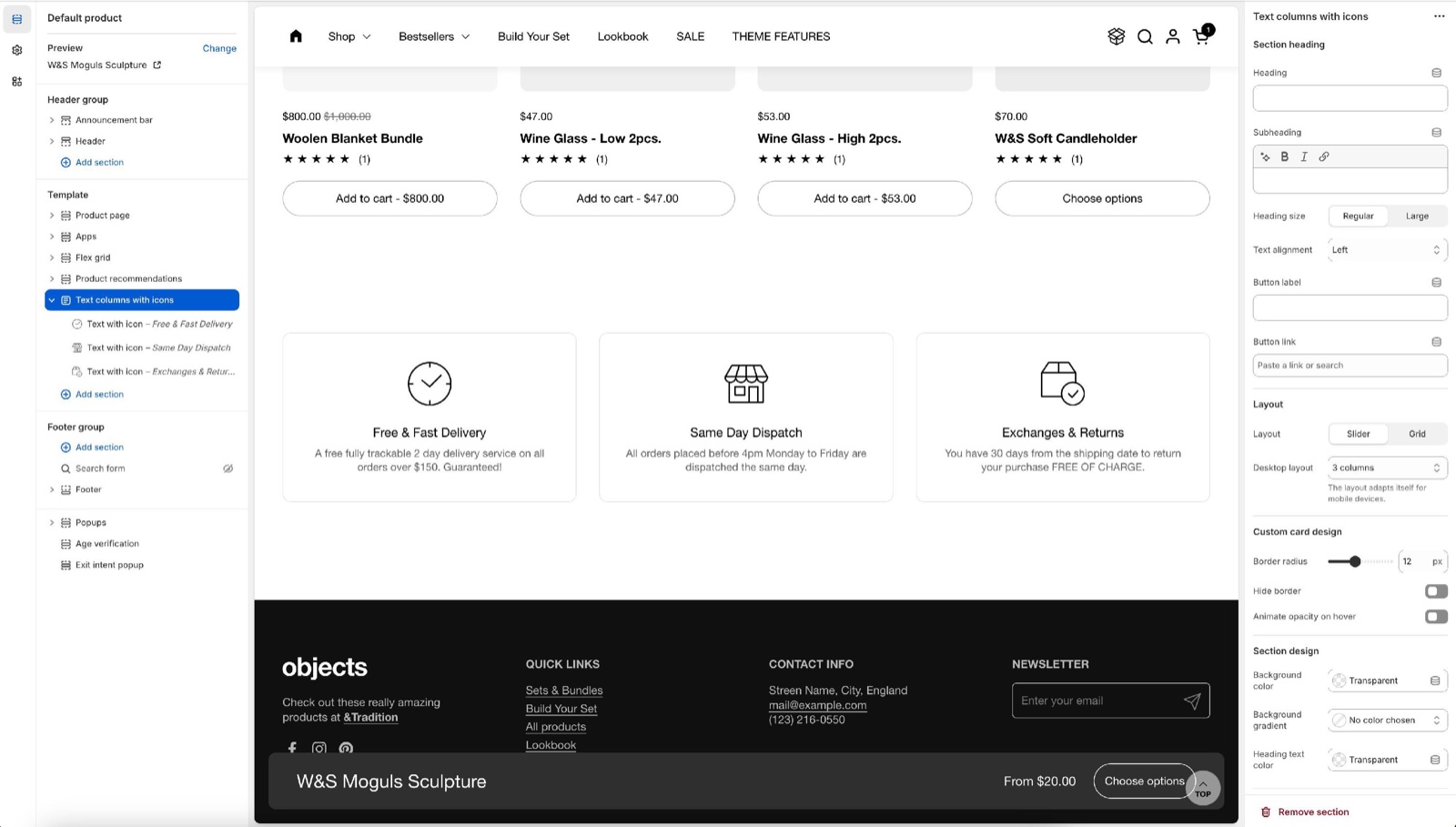
Layout
- Layout is Slider (the default), which scrolls sideways, or Grid.
- Desktop layout sets the columns per row: 3 columns, 4 columns (the default), 5 columns or 6 columns. Combine reduces it on smaller screens; phones show one column, or two with 5 and 6 columns.
Custom card design
- Hide border (on by default) shows the columns as plain icons and text. Turn it off to draw each column as a card with a border.
- Border radius rounds the corners of the cards, 0 to 30 px.
- Animate opacity on hover shows the columns faded, at 30 percent opacity.
The section heading, background colors, margins and heading tag work as described in General section styling.
Blocks
Text with icon
- Select an icon picks one of the 24 icons that come with Combine, such as Delivery, Security shield or Giftbox.
- Custom icon replaces it with your own image, 256 x 256 px. Crop icon into a square (on by default) crops it to a square; turn it off for logos that are wider than tall.
- Title and Caption are the two lines of text under the icon. Leave both empty for an icon or logo alone.
- Link makes the column clickable. Open link in a new window appears once a link is set.
- Background, Icon, Text and Border under Custom card design set this column's colors. Icon colors only the built-in icons, not a Custom icon.
- Heading tag under SEO sets the HTML level of the title (default H3).
We've included a small pack of icons in the theme, but you can also upload your own and of course, download any icon from our free icon's tool: https://resources.krownthemes.com/icons/
How do I make a row of brand logos?
Add the Logo list
Select Add section and choose Logo list. It starts with six columns without titles, in a slider.
Upload one logo per block
In each Text with icon block, upload the logo in Custom icon and turn off Crop icon into a square, so wide logos are not cut.
Link the logos
Set Link on each block to the brand's collection, if you have one.
Why does my icon color not change?
Because the icon is a Custom icon. The Icon color works only for the built-in icons from Select an icon. Upload your custom icon in the color you want, or download a colored one from the Krown icons tool.
All Text columns with icons settings
Every setting of this section, with its type and default.
Accepts these blocks: Text with icon.
Text columns with icons section: Section heading
Where to find it: Text columns with icons → Section heading
The Text columns with icons section uses the standard Section heading settings, listed in General section styling.
Heading (text field, default: "Text columns with icons"): Sets the section title. Leave Heading, Subheading and Button label empty to hide the heading area.
Subheading (formatted text, default: "Describe your company with great detail!").
Heading size (dropdown, default: Regular). Options: Regular, Large.
Text alignment (dropdown, default: One row: Left). Options: One row: Left, Two rows: Left, Two rows: Center.
Button label (text field): Adds a button to the heading area on desktop; below 768 px it shows under the section as a full-width button.
Button link (link). Shown only when Button label is set.
These settings differ from the standard ones or exist only here:
Heading (text field, default: "Text columns with icons"): Sets the section title. Leave Heading, Subheading and Button label empty to hide the heading area.
Subheading (formatted text, default: "Describe your company with great detail!").
Text columns with icons section: Layout
Where to find it: Text columns with icons → Layout
Layout (dropdown, default: Slider): Shows the columns as a slider that scrolls sideways, or as a grid. Options: Slider, Grid.
Desktop layout (dropdown, default: 4 columns): Sets the columns per row on desktop. Combine reduces it on smaller screens; phones show one column, or two with 5 and 6 columns. Options: 3 columns, 4 columns, 5 columns, 6 columns.
Text columns with icons section: Custom card design
Where to find it: Text columns with icons → Custom card design
Border radius (slider 0 to 30 px, default: 0 px): Rounds the corners of the columns when they have a border or a background.
Hide border (checkbox, default: on): Shows the columns as plain icons and text. Off, each column is a card with a border.
Animate opacity on hover (checkbox, default: off): Shows the columns at 30 percent opacity.
Text columns with icons section: Section design
Where to find it: Text columns with icons → Section design
The Text columns with icons section uses the standard Section design settings, listed in General section styling.
Background color (color, default: transparent): Fills the whole section, edge to edge.
Background gradient (gradient).
Heading text color (color, default: transparent): Sets the color of the section heading and subheading only.
Text columns with icons section: Gutter
Where to find it: Text columns with icons → Gutter
The Text columns with icons section uses the standard Gutter settings, listed in General section styling.
Decrease top margin (checkbox, default: off): Makes the space above the section smaller.
Remove bottom margin (checkbox, default: off): Pulls the next section up, so the two sections touch.
Text columns with icons section: SEO
Where to find it: Text columns with icons → SEO
The Text columns with icons section uses the standard SEO settings, listed in General section styling.
Heading tag (dropdown, default: H2): Sets the HTML level of the section heading for search engines; span gives it no level. It does not change the size. Options: H1, H2, H3, H4, span.
Text with icon block
Where to find it: Text columns with icons → Add block → Text with icon
Select an icon (dropdown): Sets one of the 24 icons that come with Combine. Options: Business: Earth globe, Business: Flag, Business: Helpline, Business: Like hand, Business: Map marker, Business: Security shield, Business: Star, Commerce: Appointment, Commerce: Archive box, Commerce: Box, Commerce: Checkout cart, Commerce: Currency, Commerce: Delivery, Commerce: Delivery time, Commerce: Giftbox, Commerce: Label, Commerce: Open 24 hours, Commerce: Open box, Commerce: Paper bag, Commerce: Shipping truck, Commerce: Store, Commerce: Time, Commerce: Time limit, Commerce: Wallet.
Custom icon (image): Replaces the built-in icon with your own image, 256 x 256 px.
Crop icon into a square (checkbox, default: on): Crops the custom icon to a square. Turn it off for wide logos.
Text with icon block: Text content
Where to find it: Text columns with icons → Add block → Text with icon → Text content
Title (text field, default: "Text with icon").
Caption (text field, default: "Introduce your brand").
Link (link): Makes the column a link.
Open link in a new window (checkbox, default: off). Shown only when Link is set.
Text with icon block: Custom card design
Where to find it: Text columns with icons → Add block → Text with icon → Custom card design
Background (color, default: transparent): Sets this column's background.
Icon (color, default: transparent): Sets the color of a built-in icon. It does not change a Custom icon.
Text (color, default: transparent): Sets this column's text color.
Border (color, default: transparent): Sets the color of the line around this column.
Text with icon block: SEO
Where to find it: Text columns with icons → Add block → Text with icon → SEO
Heading tag (dropdown, default: H3): Sets the HTML level of the column title for search engines. Options: H1, H2, H3, H4, span.
Related pages
- Text columns with images section: columns with larger images.
- Text columns section: columns of text only.
- Flex columns section: columns of any theme blocks.
- General section styling: the standard section settings.