Featured product section
The Featured product section of Combine shows one product with its gallery, variant picker and buy buttons on any page.
Applies to: Combine 4.2.0 and later. Added in: Combine 1.0.0. Last checked: 2026-10-13 against Combine 4.2.0.
The Featured product section shows one product on any page, with its gallery, variant picker and buy buttons, so customers can buy it without opening the product page. It is a shorter version of the Product page, built from the same blocks.
Where to find it: in the theme editor, select Add section and choose Featured product. It starts with the Vendor, Title, Price, Variant picker and Buy buttons blocks. The Sale page template (page.sale) already has one.
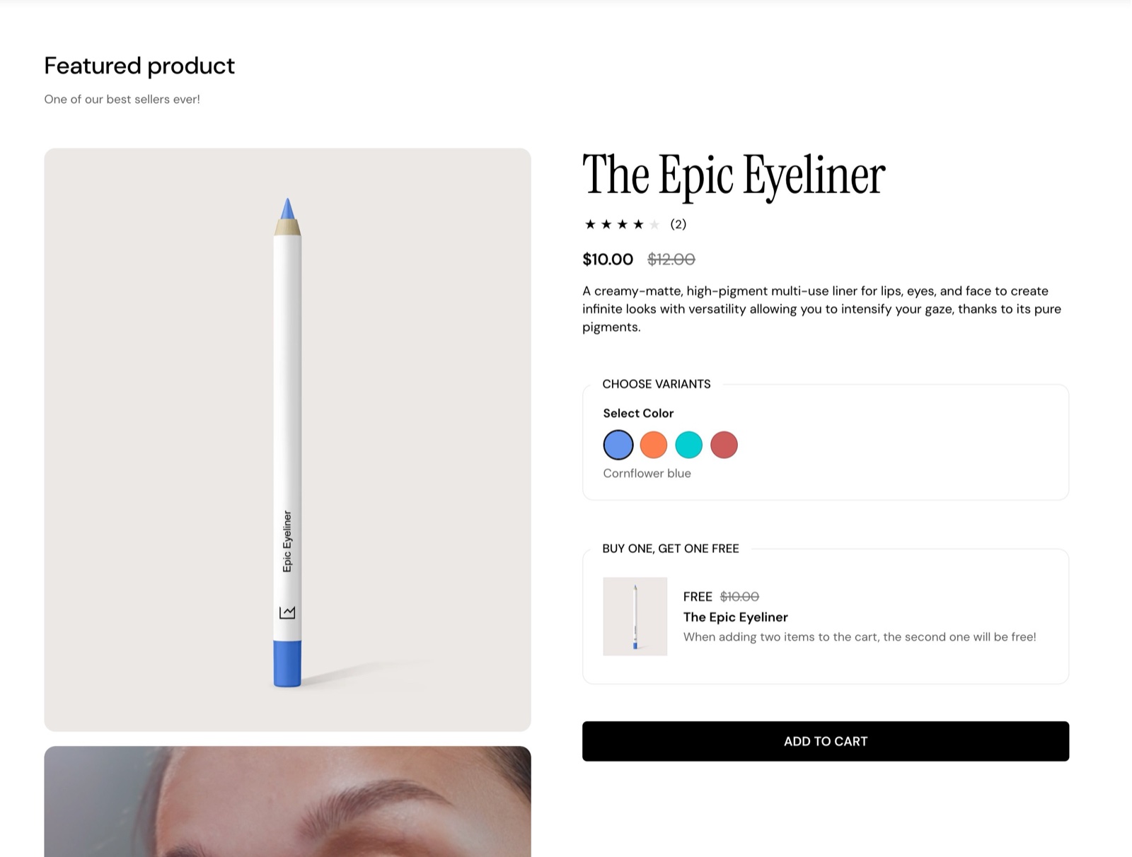
Most of the settings are the same as for the main product page.
Section heading and content
- Heading and Subheading show above the gallery. Heading size, Text alignment and Heading tag work as described in General section styling.
- Select product picks the product. The section shows its media, and the blocks show its title, price, options and description.
- Decrease top margin under Gutter makes the space above the section smaller.
Product gallery
The gallery settings are the same as on the Product page, with other defaults:
- Style & layout is Scroll: 1 column by default (the media stack under each other), or Slider: 1 column or Scroll: 2 columns. Mobile always shows a one-column slider.
- Desktop media width gives the gallery One half or Two thirds (the default) of the section.
- Mobile media width sets the width of the media on phones, 80 to 100 percent (default 90). Add padding to the gallery on mobile is on by default.
- Media aspect ratio, Fit images inside container, Gallery inner spacing, Gallery background, Gallery border and Media border radius shape the media.
- Show thumbnails, Enable image zoom (on by default), Enable video looping, Enable video autoplay and Fill videos to match the aspect ratio of the images work as on the Product page.
Featured product has no Enhance first image and no sticky add to cart.
Functionality
Select the first available variant by default (on by default) selects the first in-stock variant when the section loads, so customers can add to cart at once. Turn it off to make customers choose a variant first.
Color swatches in the Featured product
The Variant picker block of this section shows color swatches like the Product page, with its own settings.
Open the Variant picker block
In the Featured product section, select the Variant picker block.
Turn on the swatches
Set Variants style to Blocks and turn on Show color swatches. Options whose name is in Theme settings → Product card → Product variants → Color swatches labels show as round swatches.
Add metaobject swatches, if you use them
To show images or colors next to other options, such as materials, type the product metafield references in Metaobject swatch metafields, for example custom.materials.
Where each swatch color comes from, and how to set up swatch images, Shopify swatches and metaobject swatches, is on Color swatches.
Blocks
The blocks work as on the Product page; see Product page for their settings. Most can be added once.
Product information
- Vendor, Title (with its own Heading tag, default H3) and Price.
- Product badges, Tax information, SKU / barcode, Description, Product rating and Text.
- Divider, Image and Custom HTML / Liquid, as many as you need.
Variant and buy
- Variant picker: the options, with color swatches (see above).
- Buy buttons: quantity, add to cart, dynamic checkout buttons, pre-order label and the gift card recipient form, with its own Background color.
- Inventory level, Pickup availability and Back in stock alert.
- Custom property: a text field, checkbox or dropdown saved with the order.
- Product siblings and Variant metafield.
Information
- Collapsible tab, Size guide, Icons list (one per section here, two on the Product page), Coupon code and Disclosures.
Cross-selling
- Products list, Cross selling product (one per section here, up to five on the Product page), Product promotion (up to two) and Complementary products.
Product link
Only in Featured product: a View product details button that opens the product page. It has no settings.
What is the difference between Featured product and the product page?
Featured product shows one product you pick, anywhere. It has no Share block, no sticky add to cart and no Enhance first image, and it has a Product link block to the full product page. Everything else, including the swatches, works the same.
Why does my Featured product show no swatches?
Because the Variant picker of this section has its own Show color swatches, or its Variants style is Dropdown. Turning swatches on for the Product page does not turn them on here. Check both settings in the Featured product's Variant picker block.
All Featured product settings
Every setting of this section, with its type and default.
Accepts these blocks: Coupon code, Disclosures, Divider, Size guide, Text, Vendor, Product badges, Title, Price, Tax information, SKU / barcode, Variant picker, Back in stock alert, Product siblings, Custom property, Buy buttons, Inventory level, Description, Product rating, Collapsible tab, Pickup availability, Icons list, Custom HTML / Liquid, Image, Complementary products, Product promotion, Cross selling product, Products list, Product link, Variant metafield and app blocks.
Featured product section: Section heading
Where to find it: Featured product → Section heading
The Featured product section uses the standard Section heading settings, listed in General section styling. Not available in this section: Button label and Button link.
Heading (text field, default: "Featured product"): Sets the title above the product. Leave it and Subheading empty to hide the heading area.
Subheading (formatted text).
Heading size (dropdown, default: Regular). Options: Regular, Large.
Text alignment (dropdown, default: One row: Left). Options: One row: Left, Two rows: Left, Two rows: Center.
These settings differ from the standard ones or exist only here:
Heading (text field, default: "Featured product"): Sets the title above the product. Leave it and Subheading empty to hide the heading area.
Subheading (formatted text).
Featured product section: Content
Where to find it: Featured product → Content
Select product (product picker): Sets the product the section shows.
Featured product section: Product gallery
Where to find it: Featured product → Product gallery
Style & layout (dropdown, default: Scroll: 1 column): Stacks the media in one or two columns, or shows them as a slider. Mobile always shows a one-column slider. Options: Slider: 1 column, Scroll: 1 column, Scroll: 2 columns.
Desktop media width (dropdown, default: Two thirds): Sets the share of the section the gallery takes on desktop. Options: One half, Two thirds.
Mobile media width (slider 80 to 100, step 5, default: 90): Sets the width of the media on phones, in percent of the screen.
Add padding to the gallery on mobile (checkbox, default: on).
Media aspect ratio (dropdown, default: Cropped: Square (1:1)). Options: Cropped: Short (4:3), Cropped: Square (1:1), Cropped: Tall (5:6), Cropped: Taller (2:3).
Fit images inside container (checkbox, default: off): Shows the whole image inside the aspect ratio instead of cropping it.
Gallery inner spacing (slider 0 to 15 %, default: 0 %): Adds space around the media inside its frame.
Gallery background (color, default: transparent): Only visible if the images are set to fit inside the container.
Gallery border (color, default: transparent): Draws a line around the media.
Media border radius (slider 0 to 30 px, default: 0 px): Rounds the corners of the media.
Show thumbnails (checkbox, default: off): Shows small previews of the media under the gallery.
Enable image zoom (checkbox, default: on): Lets customers open the images larger.
Enable video looping (checkbox, default: off).
Enable video autoplay (checkbox, default: off): The video will be muted and without controls.
Fill videos to match the aspect ratio of the images (checkbox, default: off): Crops the videos to the Media aspect ratio of the images.
Featured product section: Functionality
Where to find it: Featured product → Functionality
Select the first available variant by default (checkbox, default: on): Selects the first available variant when the section loads. Off, customers choose a variant before they can buy.
Featured product section: Gutter
Where to find it: Featured product → Gutter
The Featured product section uses the standard Gutter settings, listed in General section styling. Not available in this section: Remove bottom margin.
Decrease top margin (checkbox, default: off): Makes the space above the section smaller.
Featured product section: SEO
Where to find it: Featured product → SEO
The Featured product section uses the standard SEO settings, listed in General section styling.
Heading tag (dropdown, default: H2): Sets the HTML level of the section heading for search engines; span gives it no level. Options: H1, H2, H3, H4, span.
Coupon code block
Where to find it: Featured product → Add block → Coupon code
Code (text field, default: "SAVE10").
Caption (text field).
Link label (text field).
Link (link). Shown only when Link label is set.
Open link in a new window (checkbox, default: off). Shown only when Link label is set.
Coupon code block: Custom colors
Where to find it: Featured product → Add block → Coupon code → Custom colors
Custom text color (color, default: transparent).
Custom background color (color, default: transparent).
Disclosures block
Where to find it: Featured product → Add block → Disclosures
Displays the disclosures attached to this product through Shopify's Product Disclosures. Shopify Help Center.
Title (text field, default: "Disclosures"): Sets the title above the product. Leave it and Subheading empty to hide the heading area.
Product disclosures can be configured with metafields at product level.
Divider block
Where to find it: Featured product → Add block → Divider
Height (slider 1 to 10 px, default: 1 px).
Divider block: Divider Design
Where to find it: Featured product → Add block → Divider → Divider Design
Color (color, default: rgba(0,0,0,1)).
Style (dropdown, default: Solid). Options: Solid, Dotted, Dashed, Double.
Size guide block
Where to find it: Featured product → Add block → Size guide
One Size guide block per section.
Text (text field, default: "View size chart").
Show icon (checkbox, default: on).
Size guide page (page picker).
Open options (dropdown, default: Popup). Options: Popup, Same window, New window.
Size guide block: Dynamic content
Where to find it: Featured product → Add block → Size guide → Dynamic content
Hide block if dynamic content is not present (checkbox, default: off).
Text block
Where to find it: Featured product → Add block → Text
Text (rich text, default: "Text block").
Text size (dropdown, default: Regular). Options: Small, Regular, Large.
Text color (dropdown, default: Primary). Options: Primary, Secondary.
Text transform (uppercase) (checkbox, default: off).
Vendor block
Where to find it: Featured product → Add block → Vendor
One Vendor block per section.
The Vendor block has no settings in Combine 4.2.0.
Product badges block
Where to find it: Featured product → Add block → Product badges
One Product badges block per section.
The Product badges block has no settings in Combine 4.2.0.
Title block
Where to find it: Featured product → Add block → Title
One Title block per section.
Title block: SEO
Where to find it: Featured product → Add block → Title → SEO
Heading tag (dropdown, default: H3): Sets the HTML level of the product title for search engines. Options: H1, H2, H3, H4, span.
Price block
Where to find it: Featured product → Add block → Price
One Price block per section.
The Price block has no settings in Combine 4.2.0.
Tax information block
Where to find it: Featured product → Add block → Tax information
One Tax information block per section.
Open links in (dropdown, default: Popup). Options: Popup, Same window, New window.
SKU / barcode block
Where to find it: Featured product → Add block → SKU / barcode
One SKU / barcode block per section.
The SKU / barcode block has no settings in Combine 4.2.0.
Variant picker block
Where to find it: Featured product → Add block → Variant picker
One Variant picker block per section.
Variant picker block: Design
Where to find it: Featured product → Add block → Variant picker → Design
Title (text field, default: "Choose variants"): Sets the title above the product. Leave it and Subheading empty to hide the heading area.
Variants style (radio buttons, default: Blocks): Shows the options as buttons (Blocks) or as dropdowns. Swatches and metaobject swatches need Blocks. Options: Blocks, Dropdown.
Show variant labels (checkbox, default: on).
Show color swatches (checkbox, default: on): Shows options named in Theme settings → Product card → Color swatches labels as round color swatches. See Color swatches.
This theme also offers support for color swatches created with category metafields. Shopify Help Center.
Metaobject swatch metafields (text field): Sets the product metafields, as namespace.key separated by commas, whose metaobject entries add an image or color next to matching option values. See Color swatches.
Container background (dropdown, default: Primary). Options: Primary, Secondary, No background.
Variant picker block: Functionality
Where to find it: Featured product → Add block → Variant picker → Functionality
Inventory notification (dropdown, default: Don't show inventory information): Variants need to have inventory tracking enabled in order for this feature to work. Shopify Help Center. Options: Don't show inventory information, Show a notice if inventory falls below 5, Always show inventory.
Handle unavailable variants (dropdown, default: Show): Sets how sold out options show: Disable greys them out, Hide removes them, Show keeps them selectable. Options: Disable, Hide, Show.
Back in stock alert block
Where to find it: Featured product → Add block → Back in stock alert
One Back in stock alert block per section.
This back in stock alert form will show up when the product is out of stock.
Store owner will receive an email when a customer fills in this form. Store owner must manually notify the customer once the product is back in stock.
Text (formatted text, default: "Enter your email address below to be notified when this product is back in stock.").
Button label (text field, default: "Notify me").
Success message (text field, default: "Thanks! We will notify you when this product becomes available!").
Email message (text field, default: "I would like to be notified when this product is back in stock.").
Product siblings block
Where to find it: Featured product → Add block → Product siblings
To assign a different list to each product, use a product reference list metafield as a dynamic source. See Product page.
Heading (text field, default: "Sibling products"): Sets the title above the product. Leave it and Subheading empty to hide the heading area.
Products (products picker): Sets the linked products shown as siblings. Connect a product list metafield to give each product its own list. See Product page.
Media aspect ratio (dropdown, default: Square (1:1)). Options: Short (4:3), Square (1:1), Tall (5:6), Taller (2:3).
Container background (dropdown, default: Primary). Options: Primary, Secondary, No background.
Reduce opacity for unavailable products (checkbox, default: off).
Custom property block
Where to find it: Featured product → Add block → Custom property
Line item properties allow you to gather customization details for a product added to the cart.
Label (text field, default: "Custom property").
Type (dropdown, default: Text). Options: Text, Checkbox, Dropdown.
Required (checkbox, default: off): Customers must fill out this field to add the product to the cart.
Hide at checkout (checkbox, default: off): If checked, the line item property will not be shown in the order summary.
Custom property block: Text property settings
Where to find it: Featured product → Add block → Custom property → Text property settings
Allow long text (checkbox, default: off).
Maximum characters (number).
Custom property block: Checkbox property settings
Where to find it: Featured product → Add block → Custom property → Checkbox property settings
Value (text field, default: "Yes"): Appears on the order summary.
Custom property block: Dropdown property settings
Where to find it: Featured product → Add block → Custom property → Dropdown property settings
Values (text field, default: "Value 1,Value 2,Value 3"): Separate values by a comma.
Default value (checkbox, default: on): If checked, none of the values will be selected by default.
Buy buttons block
Where to find it: Featured product → Add block → Buy buttons
One Buy buttons block per section.
Show quantity selector (checkbox, default: on).
Show "pre-order" button label (checkbox, default: off).
Show dynamic checkout buttons (checkbox, default: on): Using the payment methods available on your store, customers see their preferred option, like PayPal or Apple Pay. Shopify Help Center.
Show recipient information form for gift card products (checkbox, default: off): Gift card products can optionally be sent direct to a recipient along with a personal message.
Buy buttons block: Price
Where to find it: Featured product → Add block → Buy buttons → Price
Show price (checkbox, default: on).
Container background (dropdown, default: Primary). Options: Primary, Secondary, No background.
Buy buttons block: Custom colors
Where to find it: Featured product → Add block → Buy buttons → Custom colors
Background (color, default: transparent): Sets the color of the add to cart button.
Inventory level block
Where to find it: Featured product → Add block → Inventory level
One Inventory level block per section.
Inventory notification (dropdown, default: Display always): Variants need to have inventory tracking enabled in order for this feature to work. Shopify Help Center. Options: Display always, Display only when inventory falls below threshold.
Low inventory threshold (slider 1 to 20, default: 5).
Show progress bar (checkbox, default: on).
Description block
Where to find it: Featured product → Add block → Description
One Description block per section.
Truncate description (dropdown, default: Truncate: Show a small excerpt). Options: Don't truncate, Truncate: Show a small excerpt, Truncate: Show a medium excerpt, Truncate: Show a large excerpt. Shown only when Collapsible is off.
Collapsible (checkbox, default: off). Shown only when Truncate description is Don't truncate.
Title (text field, default: "Description"): Sets the title above the product. Leave it and Subheading empty to hide the heading area. Shown only when Collapsible is on.
Product rating block
Where to find it: Featured product → Add block → Product rating
One Product rating block per section.
To display ratings, add a product rating app. Learn more.
Collapsible tab block
Where to find it: Featured product → Add block → Collapsible tab
Heading (text field, default: "Collapsible tab"): Sets the title above the product. Leave it and Subheading empty to hide the heading area.
Tab content (rich text, default: "Write relevant information about your products here.").
Tab content from page (page picker).
Tab image (image).
Pickup availability block
Where to find it: Featured product → Add block → Pickup availability
One Pickup availability block per section.
The Pickup availability block has no settings in Combine 4.2.0.
Icons list block
Where to find it: Featured product → Add block → Icons list
One Icons list block per section.
Title (text field, default: "Icons list").
Use dynamic sources to highlight unique attributes by creating product metafields for the icon list.
Icons list block: Icon 1
Where to find it: Featured product → Add block → Icons list → Icon 1
Icon (image): 128 x 128px.
Label (text field).
Icons list block: Icon 2
Where to find it: Featured product → Add block → Icons list → Icon 2
Icon (image): 128 x 128px.
Label (text field).
Icons list block: Icon 3
Where to find it: Featured product → Add block → Icons list → Icon 3
Icon (image): 128 x 128px.
Label (text field).
Icons list block: Icon 4
Where to find it: Featured product → Add block → Icons list → Icon 4
Icon (image): 128 x 128px.
Label (text field).
Icons list block: Icon 5
Where to find it: Featured product → Add block → Icons list → Icon 5
Icon (image): 128 x 128px.
Label (text field).
Icons list block: Icon 6
Where to find it: Featured product → Add block → Icons list → Icon 6
Icon (image): 128 x 128px.
Label (text field).
Custom HTML / Liquid block
Where to find it: Featured product → Add block → Custom HTML / Liquid
Custom Liquid (Liquid).
Image block
Where to find it: Featured product → Add block → Image
Image (image).
Mobile image (optional) (image).
Link (link).
Open link in a new window (checkbox, default: off). Shown only when Link is set.
Complementary products block
Where to find it: Featured product → Add block → Complementary products
One Complementary products block per section.
To select complementary products, add the Search & Discovery app. Shopify Help Center.
Title (text field, default: "Complementary products"): Sets the title above the product. Leave it and Subheading empty to hide the heading area.
Show price (checkbox, default: on).
Show vendor (checkbox, default: off).
Show rating (checkbox, default: on).
Container background (dropdown, default: Primary). Options: Primary, Secondary.
Product promotion block
Where to find it: Featured product → Add block → Product promotion
Up to 2 Product promotion blocks per section.
Title (text field, default: "Product promotion"): Sets the title above the product. Leave it and Subheading empty to hide the heading area.
Select product (product picker): Sets the product the section shows.
Show free price label (checkbox, default: on).
Description (text field, default: "Add product promotions or upsell individual items.").
Container background (dropdown, default: Primary). Options: Primary, Secondary.
Cross selling product block
Where to find it: Featured product → Add block → Cross selling product
One Cross selling product block per section.
Title (text field, default: "Cross sell"): Sets the title above the product. Leave it and Subheading empty to hide the heading area.
Select product (product picker): Sets the product the section shows.
Container background (dropdown, default: Primary). Options: Primary, Secondary.
Products list block
Where to find it: Featured product → Add block → Products list
One Products list block per section.
Title (text field, default: "Products list"): Sets the title above the product. Leave it and Subheading empty to hide the heading area.
Select products (products picker, up to 8).
Show price (checkbox, default: on).
Show vendor (checkbox, default: off).
Show rating (checkbox, default: on).
Container background (dropdown, default: Primary). Options: Primary, Secondary.
Product link block
Where to find it: Featured product → Add block → Product link
One Product link block per section.
The Product link block has no settings in Combine 4.2.0.
Variant metafield block
Where to find it: Featured product → Add block → Variant metafield
This theme can show a variant metafield on the product page.
Variant metafield key (text field): Sets the variant metafield to show, as namespace.key, for example custom.variant_metafield.
Title (text field).
Related pages
- Product page: every block of this section in detail.
- Color swatches: swatch colors, images and metaobject swatches.
- Quick view template: the popup that opens from quick buy buttons.
- General section styling: the section heading settings.