Info tabs section
The Info tabs section of Combine shows tabs with a title, caption, icon and image, as icons, a list or plain text, with optional autoplay.
Applies to: Combine 4.2.0 and later. Added in: Combine 1.0.0. Last checked: 2026-10-13 against Combine 4.2.0.
The Info tabs section shows a list of tabs, each with a title, a caption and an image. Customers select a tab to read its caption and see its image. Use it for shipping details, how-to steps, product care or store information.
Where to find it: in the theme editor, select Add section and choose Info tabs. The section starts with three tabs.
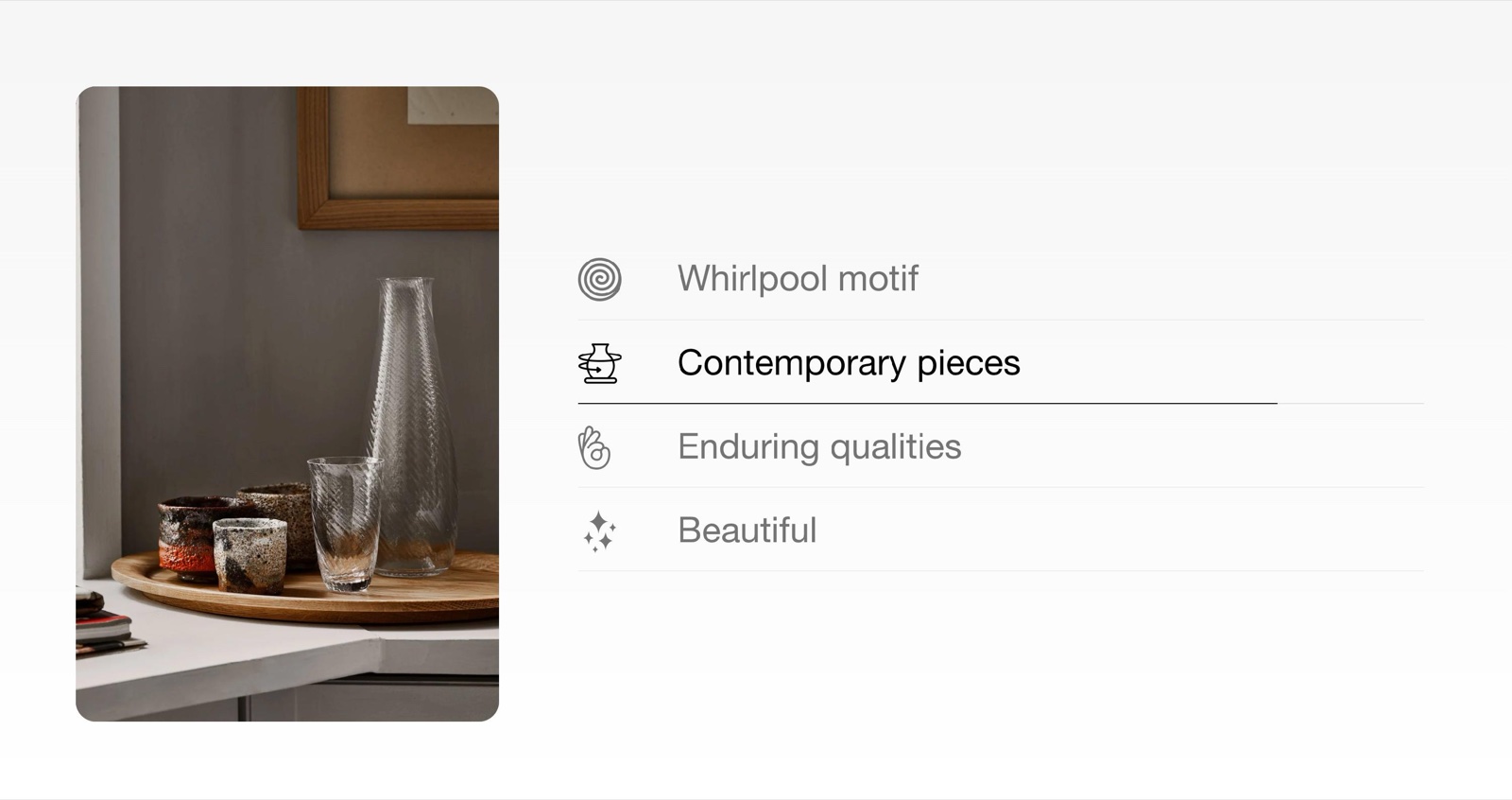
Set up info tabs
Add the section
Select Add section and choose Info tabs. Fill in Heading and Subheading under Section heading, or leave them empty.
Add a tab per topic or step
Select Add block inside the section and choose Tab. Type its Title and Caption, and upload the Image that shows while the tab is open.
Pick an icon
Choose an icon in Select an icon, or upload your own in Custom icon. Icons show only when the section's Style is Icons.
Choose the style
Set Style to Icons, List or Blank, and place the image with Image position and Desktop image width.
Turn on autoplay, if you want it
Turn on Enable autoplay and set Autoplay timer to move through the tabs on their own on desktop.
Layout
- Desktop image width sets how much of the section the image takes on desktop: One fourth, One third (the default) or One half.
- Image position puts the image On the left (the default) or On the right of the tabs, or hides it with Don't show image.
- Media aspect ratio crops the images to one shape: Square (1:1) (the default), Tall (5:6) or Taller (2:3).
- Image border radius rounds the image corners, 0 to 20 px.
The section heading, colors, margins and heading tag work as described in General section styling. The color under Section design is called Text color.
Tab style: icons, list or blank
Style sets what shows before each tab title:
- Icons: the icon of each tab, from Select an icon or Custom icon.
- List (the default): a number, 01., 02., 03. and so on.
- Blank: the titles alone.
Autoplay
- Enable autoplay moves to the next tab on its own, on desktop only. A line under the active tab shows the time left.
- Autoplay timer sets the time per tab, 5 to 15 seconds (default 5).
- Autoplay pauses while the mouse is over the tabs.
Blocks
Tab
- Title is the tab name in the list.
- Caption is the text shown when the tab is open. It takes bold, italic, links and lists.
- Image is the picture shown while the tab is open. Without one, the image area shows a placeholder.
- Select an icon picks one of the 24 icons that come with Combine (default Star).
- Custom icon replaces it with your own image, cropped to a small square.
How do the info tabs work on mobile?
With arrows and dots. On screens narrower than 768 px, customers move from one tab to the next with the arrows and dots under the section. Autoplay runs on desktop only.
Why does my tab icon not show?
Because Style is List or Blank. Icons show only with Style set to Icons. Set it there, then pick the icon in each Tab block.
All Info tabs settings
Every setting of this section, with its type and default.
Accepts these blocks: Tab.
Info tabs section: Section heading
Where to find it: Info tabs → Section heading
The Info tabs section uses the standard Section heading settings, listed in General section styling.
Heading (text field, default: "Info tabs"): Sets the section title. Leave Heading, Subheading and Button label empty to hide the heading area.
Subheading (formatted text, default: "Describe, promote , explain").
Heading size (dropdown, default: Regular). Options: Regular, Large.
Text alignment (dropdown, default: One row: Left). Options: One row: Left, Two rows: Left, Two rows: Center.
Button label (text field): Adds a button to the heading area on desktop; below 768 px it shows under the section as a full-width button.
Button link (link). Shown only when Button label is set.
These settings differ from the standard ones or exist only here:
Heading (text field, default: "Info tabs"): Sets the section title. Leave Heading, Subheading and Button label empty to hide the heading area.
Subheading (formatted text, default: "Describe, promote , explain").
Info tabs section: Layout
Where to find it: Info tabs → Layout
Desktop image width (dropdown, default: One third): Sets how much of the section width the image takes on desktop. Options: One fourth, One third, One half.
Image position (dropdown, default: On the left): Puts the image left or right of the tabs, or hides it. Options: On the left, On the right, Don't show image.
Media aspect ratio (dropdown, default: Square (1:1)): Crops every tab image to this shape. Options: Square (1:1), Tall (5:6), Taller (2:3).
Image border radius (slider 0 to 20 px, default: 0 px): Rounds the corners of the images.
Style (dropdown, default: List): Sets what shows before each tab title: the tab's icon (Icons), a number (List) or nothing (Blank) Options: Icons, List, Blank.
Info tabs section: Autoplay
Where to find it: Info tabs → Autoplay
Enable autoplay (checkbox, default: off): Moves to the next tab on its own, on desktop only. A line under the active tab shows the time left.
Autoplay timer (slider 5 to 15, default: 5): Sets the time per tab. Autoplay pauses while the mouse is over the tabs. Shown only when Enable autoplay is on.
Info tabs section: Section design
Where to find it: Info tabs → Section design
The Info tabs section uses the standard Section design settings, listed in General section styling.
Background color (color, default: transparent).
Background gradient (gradient).
Text color (color, default: transparent): Sets the color of the section heading, the subheading and the text of the section.
These settings differ from the standard ones or exist only here:
Text color (color, default: transparent): Sets the color of the section heading, the subheading and the text of the section.
Info tabs section: Gutter
Where to find it: Info tabs → Gutter
The Info tabs section uses the standard Gutter settings, listed in General section styling.
Decrease top margin (checkbox, default: off): Makes the space above the section smaller.
Remove bottom margin (checkbox, default: off): Pulls the next section up, so the two sections touch.
Info tabs section: SEO
Where to find it: Info tabs → SEO
The Info tabs section uses the standard SEO settings, listed in General section styling.
Heading tag (dropdown, default: H2): Sets the HTML level of the section heading for search engines; span gives it no level. It does not change the size. Options: H1, H2, H3, H4, span.
Tab block
Where to find it: Info tabs → Add block → Tab
Tab block: Text content
Where to find it: Info tabs → Add block → Tab → Text content
Title (text field, default: "Information tab").
Caption (rich text, default: "Write about various product information, store news or usage support."): Sets the text shown when the tab is open. Supports bold, italic, links and lists.
Image (image): Sets the picture shown while the tab is open.
Select an icon (dropdown, default: Business: Star): Sets one of the 24 icons that come with Combine. Shown only when Style is Icons. Options: Business: Earth globe, Business: Flag, Business: Helpline, Business: Like hand, Business: Map marker, Business: Security shield, Business: Star, Commerce: Appointment, Commerce: Archive box, Commerce: Box, Commerce: Checkout cart, Commerce: Currency, Commerce: Delivery, Commerce: Delivery time, Commerce: Giftbox, Commerce: Label, Commerce: Open 24 hours, Commerce: Open box, Commerce: Paper bag, Commerce: Shipping truck, Commerce: Store, Commerce: Time, Commerce: Time limit, Commerce: Wallet.
Custom icon (image): Replaces the built-in icon with your own image, cropped to a small square. Shown only when Style is Icons.
Related pages
- Content toggles section: questions and answers that open and close.
- Text columns with icons section: the same icons in columns.
- General section styling: the standard section settings.