Multicolumn section
The Multicolumn section in Seventh places columns or cards side by side, from 1 to 8 columns, for text columns, FAQs, logos, tables and forms.
Applies to: Seventh 4.0.0 and later. Added in: Seventh 1.0.0. Last checked: 2026-10-12 against Seventh 4.0.0.
The Multicolumn section places columns or cards side by side, from 1 to 8 columns, with equal or mixed widths. Use it for text columns, FAQs, contact forms, static logo rows and tables on any page.
Where to find it: select Add section in the theme editor, then choose Multicolumn blank or one of the Multicolumn presets listed below.
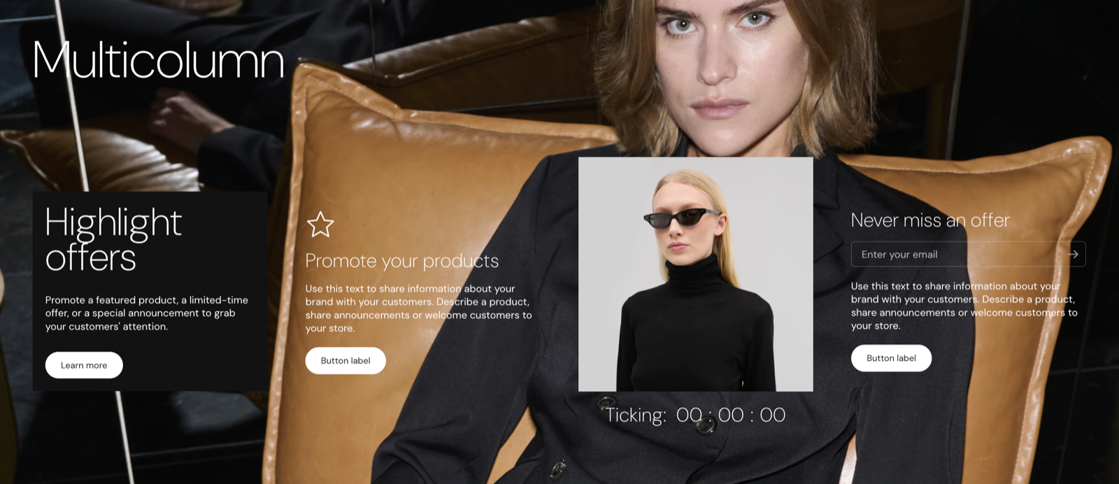
Presets
These Add section presets are Multicolumn sections with different starting content. After you add one, it has every setting on this page.
- Multicolumn blank: an empty section. Add your own columns or cards.
- FAQ: boxed and FAQ: classic: accordions next to a contact form. See FAQ section.
- Text columns and Text columns with images: four columns with an icon or image, a heading and text. See Text columns section.
- Logo list: static: six columns with one image each. See Logo list section.
- Contact form: a card with a contact form. See Contact form section.
- Table: features list (v1), Table: features list (v2), Table: complex (v1) and Table: complex (v2). See Table section.
The default Contact and FAQ page templates (page.contact and page.faq) also use the Multicolumn section. You can add it to the Footer group too.
Layout
- Desktop columns sets the number of columns, from 1 to 8, and their widths. Standard options give equal widths; the variations give mixed widths, such as 66% 34%.
- Mixed widths apply on desktop only. On smaller screens the columns have equal widths.
- Columns alignment lines up columns of different heights. Stretch makes every column as tall as the tallest one.
- Grid gap sets the space between columns.
- Container width narrows the content on screens 1024 px wide and larger. Container alignment then places it on the left, in the center or on the right.
- The section has no Extend section width to the edges of the screen setting. Its widest layout is the page container width.
Since Seventh 2.1.0, Desktop columns has 7 and 8 columns, and the section has Container width and Container alignment.
Tip: Read about general section styling here: Seventh section general styles.
Setting tablet and mobile columns
Tablet columns appears only when Mobile columns is 1 column, because a tablet never shows fewer columns than a phone.
Set the mobile layout first
Select the Multicolumn section and set Mobile columns to 1 column. Tablet columns now appears.
Set the tablet layout
Set Tablet columns to 2 columns or 1 column. With 1 column on tablet, phones also show 1 column, and Mobile columns is hidden.
On screens narrower than 375 px, the section always shows 1 column.
Columns and cards
Each column or card is one cell of the row. The section holds an optional section header and these blocks:
- Column: a plain container without its own background, for text, images, icons, accordions or forms. It has Text alignment and Inner blocks spacing.
- Card: a container with its own color scheme, padding and corner radius. See Blank card.
- Table: a table with rows and columns. See Table block.
- App blocks from installed apps.
Inside a Column or Card, select Add block to add Heading, Text, Image, Button, Accordion, Contact form and other blocks. Use a Card instead of a Column when the cell needs its own background or padding.
The section header uses the standard settings, listed in General section styling.
Read more about all types of cards: Seventh → Cards
Why are my columns different heights?
Because the columns hold different amounts of content. Set Columns alignment to Stretch to give every column in a row the height of the tallest one. Use Top, Center or Bottom to line up columns of different heights by that edge instead.
Why is the Multicolumn content narrower than the page?
Because Container width is set below Large. XSmall, Small and Medium use 55, 70 and 85 percent of the page width on screens 1024 px wide and larger. Set Container width to Large to use the full page width, or set Container alignment to place the narrower content on the left or right.
All Multicolumn settings
Every setting on this page, one list per section or block, with its type and default.
Accepts these blocks: Card, Column, Table and app blocks.
Multicolumn section: Layout
Where to find it: Multicolumn → Layout
Desktop columns (dropdown, default: Standard: 4 columns): Sets the number of columns on desktop and their widths. Standard options give equal widths; the variations give mixed widths, for example 66% 34%. Since Seventh 2.1.0, up to 8 columns. Options: Standard: 8 columns, Standard: 7 columns, Standard: 6 columns, Standard: 5 columns, Standard: 4 columns, Standard: 3 columns, Standard: 2 columns, Standard: 1 column, 2 columns variations: 75% 25%, 2 columns variations: 25% 75%, 2 columns variations: 34% 66%, 2 columns variations: 66% 34%, 3 columns variations: 50% 25% 25%, 3 columns variations: 25% 50% 25%, 3 columns variations: 25% 25% 50%, 4 columns variations: 40% 20% 20% 20%, 4 columns variations: 20% 20% 20% 40%, 4 columns variations: 20% 30% 30% 20%, 4 columns variations: 30% 20% 20% 30%.
On smaller screens, the columns will have equal widths. Shown only when Desktop columns is not Standard: 2 columns and Desktop columns is not Standard: 3 columns and Desktop columns is not Standard: 4 columns and Desktop columns is not Standard: 5 columns and Desktop columns is not Standard: 6 columns.
Mobile columns (dropdown, default: 2 columns): Sets the number of columns on mobile: 2 columns side by side or 1 column stacked. On screens narrower than 375 px there is always 1 column. Options: 2 columns, 1 column. Shown only when Tablet columns is not 1 column.
Tablet columns (dropdown, default: 2 columns): Sets the number of columns on tablet. Appears only after Mobile columns is set to 1 column; with 1 column on tablet, mobile also shows 1 column. Options: 2 columns, 1 column. Shown only when Mobile columns is not 2 columns.
Columns alignment (dropdown, default: Top): Sets how columns of different heights line up in a row. Stretch makes every column as tall as the tallest one. Options: Top, Center, Bottom, Stretch.
Grid gap (dropdown, default: Default): Sets the space between columns. Options: Default, XXSmall, XSmall, Small, Medium, Large, XLarge.
Container width (dropdown, default: Large): Sets the width of the section content on screens 1024 px wide and larger: XSmall 55, Small 70, Medium 85 and Large 100 percent of the page width. Since Seventh 2.1.0. Options: XSmall, Small, Medium, Large.
Container alignment (dropdown, default: Center): Places the narrower content on the left, in the center or on the right of the page. Options: Left, Center, Right. Shown only when Container width is not Large.
Multicolumn section: Section design
Where to find it: Multicolumn → Section design
The Multicolumn section uses the standard Section design settings, listed in General section styling. Not available in this section: Extend section width to the edges of the screen.
Color scheme (color scheme, default: Scheme 1).
Top padding (dropdown, default: Default). Options: Default, None, Smaller, Larger, Largest.
Bottom padding (dropdown, default: Default). Options: Default, None, Smaller, Larger, Largest.
Show media background (checkbox, default: off): Shows a background image or video behind the section content.
Background image (image). Shown only when Show media background is on.
Background image (mobile) (image): Replaces the background image on screens narrower than 768 px. Shown only when Show media background is on and Background image is set.
Background video (video): Plays a muted, looping video behind the section content. When both a video and an image are set, the video is shown. Shown only when Show media background is on.
Media overlay (dropdown, default: Color): Sets the layer over the background media: a flat color or a gradient. Options: Color, Gradient. Shown only when Show media background is on.
Overlay color (color with transparency). Shown only when Show media background is on and Media overlay is Color.
Overlay gradient (gradient, default: linear-gradient(0deg, rgba(0,0,0,0.5) 0%, rgba(0,0,0,0) 100%)). Shown only when Show media background is on and Media overlay is Gradient.
Parallax effect (dropdown, default: Medium): Moves the background media at a different speed than the page while customers scroll. Subtle, Medium and Strong move it by up to 5, 10 and 20 percent. Options: None, Subtle, Medium, Strong. Shown only when Show media background is on.
Push content down (checkbox, default: off): Replaces Top padding with a larger top space, so more of the background media shows above the content. Shown only when Show media background is on.
Make section full height (checkbox, default: off): Makes the section at least as tall as the screen and centers the content vertically.
Where to find it: Multicolumn → Column.
Accepts these blocks: any theme block, app blocks and Content group.
Text alignment (alignment, default: Left): Sets the horizontal alignment of the blocks inside the column.
Inner blocks spacing (dropdown, default: Small): Sets the vertical space between the blocks inside the column. Options: XXSmall, XSmall, Small, Regular, Large, XLarge.
Related pages
- General section styling: the Section design settings this section shares with others.
- Blank card: the Card block this section can hold.
- Table block: the table settings.
- Accordion block: question and answer blocks used in the FAQ presets.
- Contact form block: the form used in the Contact form and FAQ presets.