Flexible grid section
The Flexible grid section in Seventh places flex cards of different sizes in a free grid, for collages, flexible cards and media galleries.
Applies to: Seventh 4.0.0 and later. Added in: Seventh 1.0.0. Last checked: 2026-10-12 against Seventh 4.0.0.
The Flexible grid section places Flex cards on a 12-column grid. Each card spans the number of columns and rows you choose, for magazine-style layouts, image collages and feature grids.
Where to find it: select Add section in the theme editor, then choose Flexible grid blank, Flexible cards, Text cards collage or Media gallery: flex.
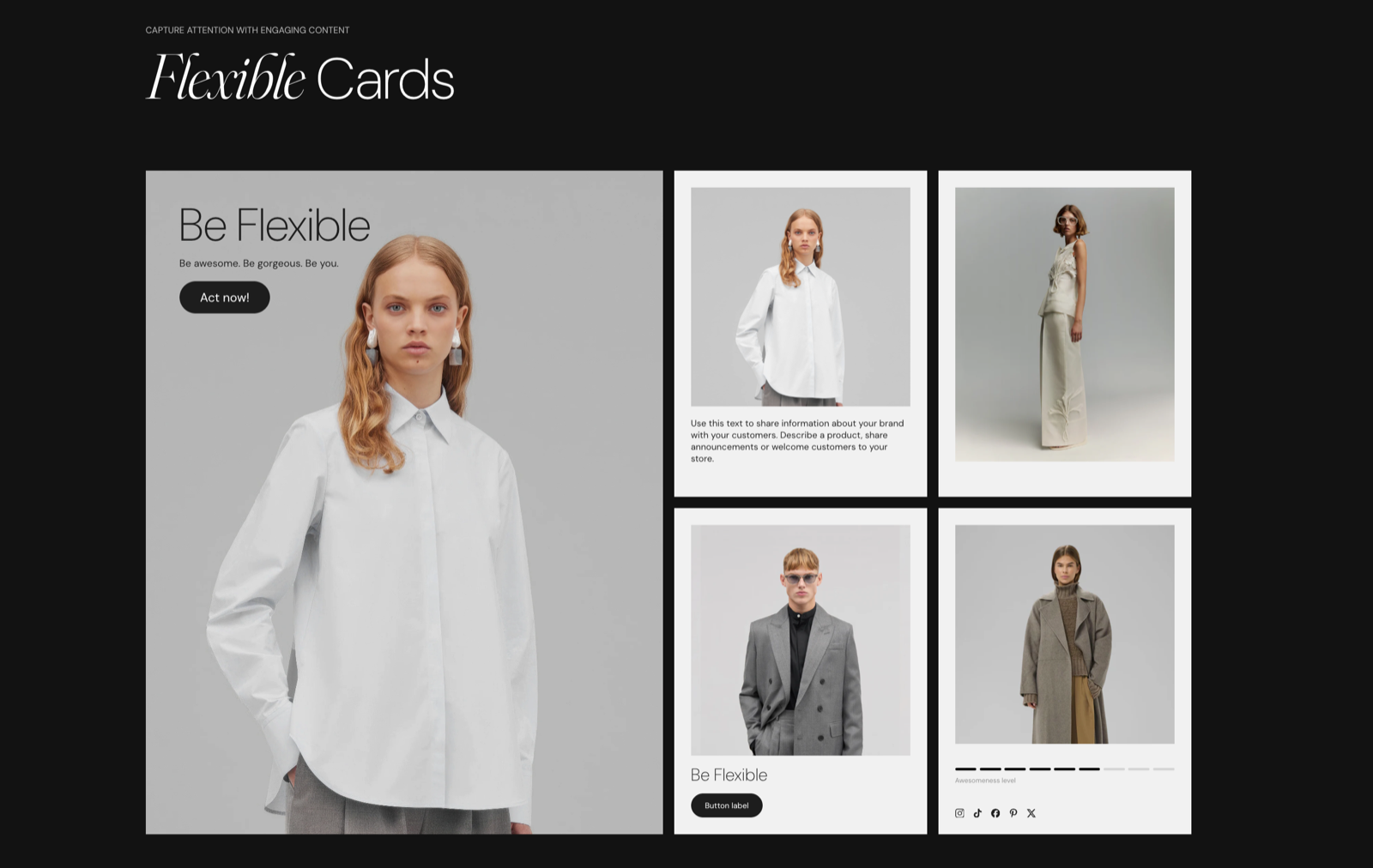
Presets and cards
The section holds an optional section header and Flex cards. A Flex card exists only in this section. It holds other blocks (Heading, Text, Button, Icon, Image and so on) and has its own size, style, link and background settings.
Four presets use the Flexible grid section. They differ only in their starting cards:
- Flexible grid blank: no cards.
- Flexible cards (Promotions): one large image card (6 columns, 2 rows), one wide text card with a Text, a Heading and a Button, and two smaller cards. Older Seventh docs called the whole section "Flexible cards".
- Text cards collage (Storytelling): five cards with an Icon, a Heading and a Text block, around one large image card.
- Media gallery: flex (Media & galleries): five image cards of different widths. See Media gallery section.
In all presets except Flexible grid blank, Desktop card height (minimum) is 5 and Mobile card height (minimum) is 3.
Row height
Desktop card height (minimum) and Mobile card height (minimum) set the height of one grid row.
- At the default value 3, one desktop row is as tall as two of the 12 columns are wide, so a 2-column, 1-row card is square.
- At 3 on mobile, one row is as tall as half the screen width.
- Each step of 1 changes the row height by a quarter of that.
- A card grows taller when its content needs more space.
Tip: Use height 3-5 for balanced layouts. Lower values work well for image-heavy cards.
Gap between cards
Gap sets the space between the cards. None places them edge to edge.
Tip: Use "Regular" or "Large" for clean, spacious layouts. "None" creates a seamless grid.
Section design
The section header, colors, padding and background use the standard Section design settings.
Tip: Read about general section styling here: Seventh section general styles.
Card size and position
On desktop (screens 768 px wide and larger), the grid has 12 columns. Cards fill it left to right, row by row, in the order of the blocks in the theme editor.
- Desktop columns (2 to 12) sets how many columns a Flex card spans.
- Desktop rows (1 to 4) sets how many rows it spans.
- Mobile columns (1 or 2) and Mobile rows (1 or 2) do the same on the 2-column mobile grid.
- Hide on mobile hides the card on screens narrower than 768 px. The two mobile settings are then hidden in the editor.
| Desktop columns | Share of the row |
|---|---|
| 12 | Full width |
| 6 | Half |
| 4 | One third |
| 3 | One quarter |
| 2 | One sixth |
Example: to place one large image next to two stacked text cards, add three Flex cards. Set the first to Desktop columns 8 and Desktop rows 2, and the other two to Desktop columns 4 and Desktop rows 1.
Tip: Read more about general card styling here: Seventh card general styles.
Card background
To show an image or video in a Flex card:
- Select the Flex card and turn on Show media background under Background.
- Select a Background image or Background video. The media fills the whole card, and the card's blocks sit on top of it.
- Set Media overlay to darken the media, so the text stays readable.
Why do my Flex cards not line up?
The column spans in a row do not add up to 12. A card that does not fit in the space left in a row moves to the next row, leaving a gap. Check that the Desktop columns of the cards meant for one row add up to 12, for example 6 + 3 + 3.
Why is one card taller than the others?
Its content needs more space than one row gives. Cards grow to fit their blocks. Raise Desktop card height (minimum) so every row is taller, or give the card more Desktop rows.
All Flexible grid settings
Every setting on this page, one list per section or block, with its type and default.
Accepts these blocks: Flex card.
Desktop card height (minimum) (slider 1 to 10, default: 3): Sets the minimum height of one grid row on desktop, from 1 to 10. At 3, one row is as tall as two of the 12 columns are wide; each step changes the height by a quarter of that.
Cards will automatically expand if content requires more space.
Mobile card height (minimum) (slider 1 to 10, default: 3): Sets the minimum height of one grid row on mobile, from 1 to 10. At 3, one row is as tall as half the screen width.
Gap (dropdown, default: Default): Sets the space between the cards. None places the cards edge to edge. Options: Default, None, XSmall, Small, Regular, Large, XLarge.
Flexible grid section: Section design
Where to find it: Flexible grid → Section design
The Flexible grid section uses the standard Section design settings, listed in General section styling.
Color scheme (color scheme, default: Scheme 1).
Top padding (dropdown, default: Default). Options: Default, None, Smaller, Larger, Largest.
Bottom padding (dropdown, default: Default). Options: Default, None, Smaller, Larger, Largest.
Extend section width to the edges of the screen (checkbox, default: off). Shown only when Desktop card height (minimum) is more than 1.
Show media background (checkbox, default: off): Shows a background image or video behind the section content.
Background image (image). Shown only when Show media background is on.
Background image (mobile) (image): Replaces the background image on screens narrower than 768 px. Shown only when Show media background is on and Background image is set.
Background video (video): Plays a muted, looping video behind the section content. When both a video and an image are set, the video is shown. Shown only when Show media background is on.
Media overlay (dropdown, default: Color): Sets the layer over the background media: a flat color or a gradient. Options: Color, Gradient. Shown only when Show media background is on.
Overlay color (color with transparency). Shown only when Show media background is on and Media overlay is Color.
Overlay gradient (gradient, default: linear-gradient(0deg, rgba(0,0,0,0.5) 0%, rgba(0,0,0,0) 100%)). Shown only when Show media background is on and Media overlay is Gradient.
Parallax effect (dropdown, default: Medium): Moves the background media at a different speed than the page while customers scroll. Subtle, Medium and Strong move it by up to 5, 10 and 20 percent. Options: None, Subtle, Medium, Strong. Shown only when Show media background is on.
Push content down (checkbox, default: off): Replaces Top padding with a larger top space, so more of the background media shows above the content. Shown only when Show media background is on.
Make section full height (checkbox, default: off): Makes the section at least as tall as the screen and centers the content vertically.
Where to find it: Flexible grid → Flex card.
Accepts these blocks: Content group, any theme block and app blocks.
Desktop columns (slider 2 to 12, default: 4): Sets how many of the 12 grid columns the card spans on desktop, from 2 to 12. 12 is full width, 6 is half, 4 is one third.
Desktop rows (slider 1 to 4, default: 1): Sets how many grid rows the card spans on desktop, from 1 to 4.
Hide on mobile (checkbox, default: off): Hides the card on screens narrower than 768 px.
Mobile columns (dropdown, default: 1 column): Sets how many of the 2 mobile grid columns the card spans: 1 column is half width, 2 columns is full width. Options: 1 column, 2 columns. Shown only when Hide on mobile is off.
Mobile rows (dropdown, default: 1 row): Sets how many grid rows the card spans on mobile. Options: 1 row, 2 rows. Shown only when Hide on mobile is off.
Flex card: Text content
Where to find it: Flexible grid → Flex card → Text content
Vertical position (dropdown, default: Top): Sets where the blocks sit inside the card: at the top, center or bottom. Stretch spreads them over the card height. Options: Top, Center, Bottom, Stretch.
Stretch type (dropdown, default: Space between): Sets how stretched blocks are spread: Space between pins the first block to the top and the last to the bottom; Space around also adds space above the first and below the last. Options: Space between, Space around. Shown only when Vertical position is Stretch.
Flex card: Card style
Where to find it: Flexible grid → Flex card → Card style
Text alignment (alignment, default: Left).
Inner blocks spacing (dropdown, default: Small): Sets the vertical space between the blocks inside the card. Options: XXSmall, XSmall, Small, Regular, Large, XLarge.
Padding (dropdown, default: Regular): Sets the space between the card edge and its content. Options: XSmall, Small, Regular, Large, XLarge, XXLarge. Shown only when Remove card background is off.
Add padding to media elements (checkbox, default: on): Applies the card padding to images and videos inside the card too. When off, media reaches the card edges. Shown only when Remove card background is off.
Remove card background (checkbox, default: off): Removes the card background, padding and corner radius, so the blocks sit directly on the section background.
Corner radius (dropdown, default: None). Options: None, Slighty rounded, Rounded, Fully rounded. Shown only when Remove card background is off.
Color scheme (color scheme, default: Scheme 2): Sets the background, text and button colors of the card.
Flex card: Card link
Where to find it: Flexible grid → Flex card → Card link
Link (link): Makes the whole card a link to this address.
Open link in a new window (checkbox, default: off). Shown only when Link is set.
Flex card: Background
Where to find it: Flexible grid → Flex card → Background
Show media background (checkbox, default: off): Shows an image or video that fills the whole card, behind its blocks. Shown only when Remove card background is off.
Background image (image). Shown only when Show media background is on and Remove card background is off.
Background video (video). Shown only when Show media background is on and Remove card background is off.
Media overlay (dropdown, default: Color). Options: Color, Gradient. Shown only when Show media background is on and Remove card background is off.
Overlay color (color with transparency, default: rgba(0,0,0,0.1)): Sets a color layer over the card media, so text on top stays readable. Shown only when Show media background is on and Remove card background is off and Media overlay is Color.
Overlay gradient (gradient, default: linear-gradient(0deg, rgba(0,0,0,0.5) 0%, rgba(0,0,0,0) 100%)): Sets a gradient layer over the card media. The default fades from 50 percent black at the bottom to transparent at the top. Shown only when Show media background is on and Remove card background is off and Media overlay is Gradient.
Related pages
- General section styling: the Section design settings this section shares with others.
- Media gallery section: the Media gallery: flex preset.
- Content group block: groups blocks inside a Flex card.
- Custom grid section: a grid of equal-size cards instead of spans.