Shop the look section
The Shop the look section in Seventh is a Custom grid preset with an image and product hotspots, editorial or as a slider.
Applies to: Seventh 4.0.0 and later. Added in: Seventh 1.0.0. Last checked: 2026-10-12 against Seventh 4.0.0.
The Shop the look section shows images with product and text hotspots, so customers can open a product straight from a styled photo. It is a preset of the Custom grid section, with Shop the look cards already filled in.
Where to find it: select Add section in the theme editor, then choose Shop the look: editorial (Products category) or Shop the look: slider (Media & galleries category).
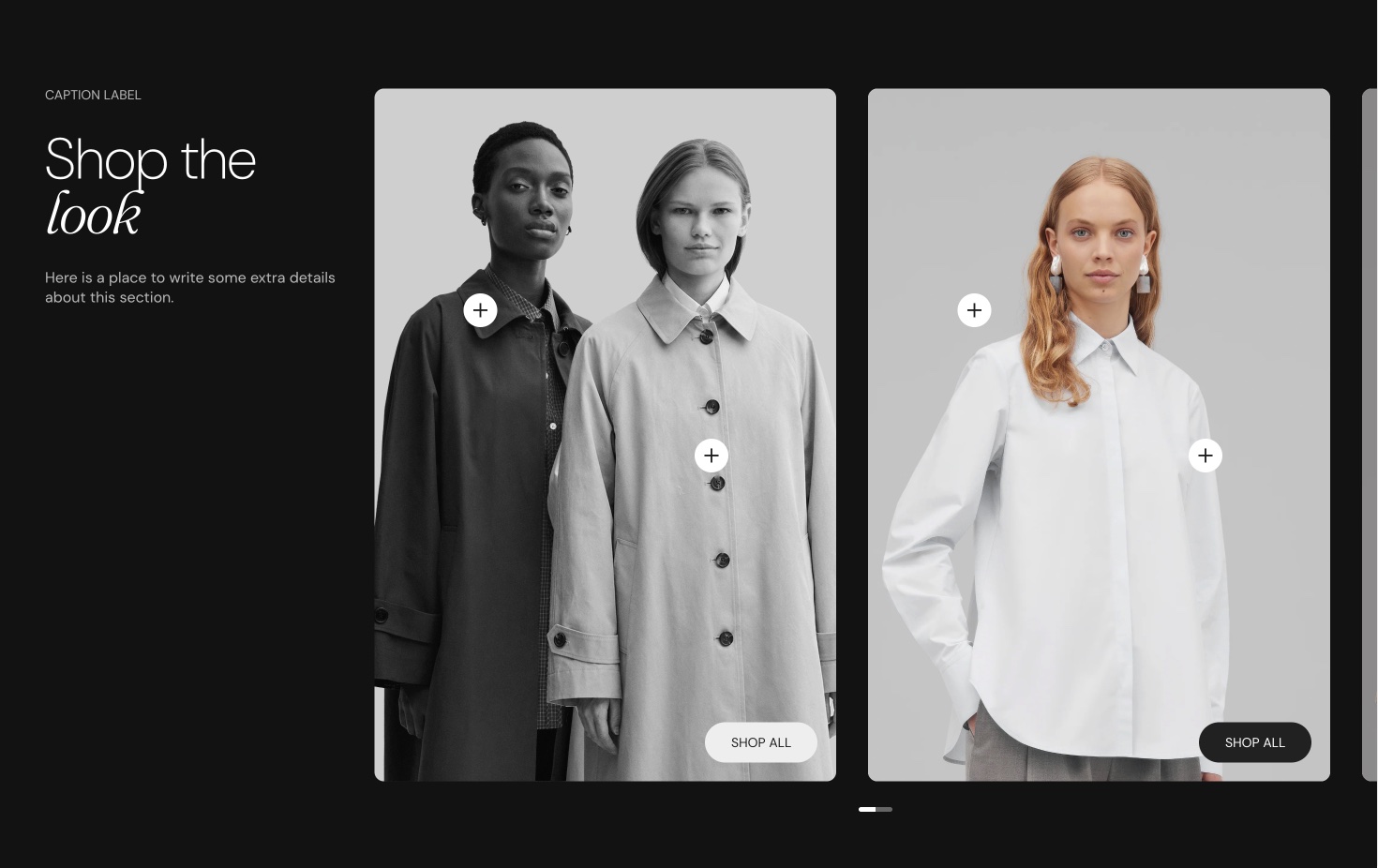
Seventh has three Shop the look sections. This page covers Shop the look: editorial and Shop the look: slider, which are Custom grid presets made of Shop the look cards. Shop the look: product slider section shows one image with hotspots next to a slider of product cards. Shop the look: product list section shows an image or video next to a list of product cards.
What it shows
Both presets add a section header and 4 Shop the look cards. Each card is an image (or video) that holds:
- A Product hotspot block: a dot on the image that opens the chosen product.
- A Text hotspot block: a dot that opens a tooltip with two Text blocks, a short heading and a description.
The Shop the look section has no settings of its own. After you add it, it is a Custom grid section:
- Layout settings: Custom grid section.
- Section design and Cards arrangement: General section styling.
- Image, hotspot and tooltip settings: Shop the look card.
Shop the look: editorial
- The section header sits on the left (Position Left).
- The 4 cards sit in a grid with Scatter cards on, so the images sit at different heights.
- Cards size is Medium. On mobile, one card shows per row.
Shop the look: slider
- The section header sits on top.
- The 4 cards sit in a slider (Layout Slider, Cards size Large) with Randomize card sizes on, so the images have different widths.
- On mobile, one card shows at a time.
Linking a hotspot to a product
Choose the image
Select a Shop the look card and choose an Image.
Choose the product
Select the Product hotspot block inside the card and choose the Product.
Place the hotspot
Set Vertical position and Horizontal position, in percent of the image, so the dot sits on the product in the photo.
To show several products on one image, select Add block inside the card and add more Product hotspot blocks.
Related pages
- Custom grid section: the section that holds the settings of this preset.
- Shop the look card: the card with the hotspots.
- Shop the look: product slider section: one image with hotspots next to a product slider.
- Shop the look: product list section: an image or video next to a list of product cards.
Scrolling text
The Scrolling text section in Seventh shows a moving band of text, images, icons, buttons or countdowns, for announcements and logo lists.
Shop the look: product slider
The Shop the look: product slider section in Seventh shows an image with hotspots next to a slider of the products they point to.