Image comparison section
The Image comparison section in Seventh shows a before and after image with a slider that customers drag to compare them.
Applies to: Seventh 4.0.0 and later. Added in: Seventh 1.0.0. Last checked: 2026-10-12 against Seventh 4.0.0.
The Image comparison section shows two images on top of each other with a handle that customers drag to compare them, for example a before and after photo. It is a preset of the Custom grid section that holds one Image comparison card.
Where to find it: select Add section in the theme editor, then choose Image comparison or Image comparison: split in the Media & galleries category.
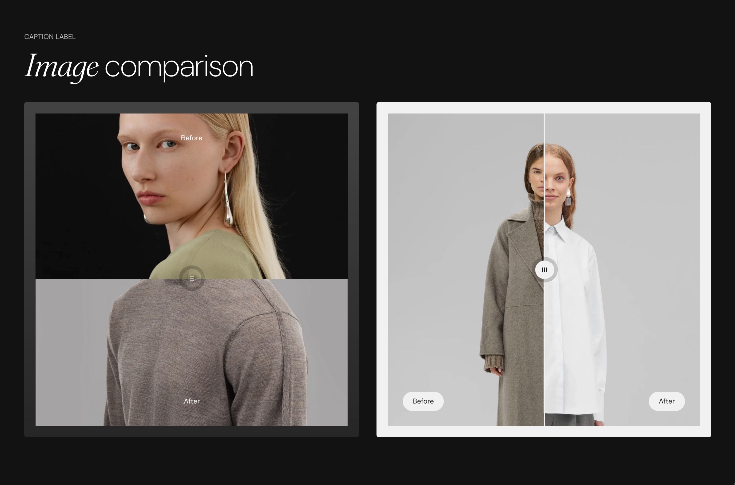
What the section shows
Both presets add a section header and one Image comparison card, which fills the full row (Cards size XLarge). The card always holds exactly two Before/After Image blocks, one per side, labeled Before and After.
- Image comparison: the section header (a Caption block and a Heading block) sits above the comparison.
- Image comparison: split: the section header (a Caption block, a Heading block and a Text block) sits on the left of the comparison (Position Left).
Both presets start with a Standard (3:2) Desktop aspect ratio. The section layout, Section design and section header settings are those of the Custom grid section. The Image comparison card exists only in the Custom grid section, so its settings are on this page.
Comparison layout
These settings are in the Image comparison card, not in the section:
- Layout sets the direction: Horizontal (drag left and right) or Vertical (drag up and down).
- Invert layout on mobile devices switches the direction on mobile, for example horizontal on desktop and vertical on mobile.
- Desktop aspect ratio and Mobile aspect ratio set the shape. Both images are cropped to it.
Tip: Choose images with similar framing for the clearest comparison.
Set up a before and after comparison
Add the section
Select Add section, then choose Image comparison.
Choose the two images
Select the first Before/After Image block and choose an Image. Then select the second block and choose the other image.
Set the labels
Change Label in each Before/After Image block, or leave it empty to hide the label.
Set the shape
Select the Image comparison card and set Desktop aspect ratio and Mobile aspect ratio to match your photos.
Use two photos with the same aspect ratio. Photos taken from the same position line up exactly when customers drag the handle.
Can I compare more than two images?
No. Seventh does not support more than two images in one Image comparison card. To compare several pairs, add more Image comparison cards to the same Custom grid section with Add block, and set Cards size to show them side by side.
Can I use other photos on mobile?
Yes. Each Before/After Image block has a Mobile image, which replaces its image on screens narrower than 768 px. It appears once Image is set.
All Image comparison settings
Every setting on this page, one list per section or block, with its type and default.
Where to find it: Custom grid → Image comparison.
Accepts these blocks: Before/After Image.
Image comparison block: Layout
Where to find it: Custom grid → Image comparison → Layout
Layout (dropdown, default: Horizontal): Sets the direction of the comparison: Horizontal splits the two images side by side and customers drag the handle left and right; Vertical stacks them and customers drag the handle up and down. Options: Horizontal, Vertical.
Invert layout on mobile devices (checkbox, default: off): Switches the direction on screens narrower than 768 px: a Horizontal comparison becomes Vertical on mobile, and a Vertical one becomes Horizontal.
Desktop aspect ratio (dropdown, default: Short (4:3)): Sets the shape of the comparison on screens 768 px wide and larger. Both images are cropped to this shape. Options: Wide (2:1), Landscape (16:9), Standard (3:2), Short (4:3), Square (1:1), Tall (5:6), Taller (2:3).
Mobile aspect ratio (dropdown, default: Tall (5:6)): Sets the shape of the comparison on screens narrower than 768 px. Both images are cropped to this shape. Options: Wide (2:1), Landscape (16:9), Standard (3:2), Short (4:3), Square (1:1), Tall (5:6), Taller (2:3), Ultra tall (1:2).
Image comparison block: Card style
Where to find it: Custom grid → Image comparison → Card style
Padding (dropdown, default: Regular): Sets the space between the card edge and the images. Options: XSmall, Small, Regular, Large, XLarge, XXLarge. Shown only when Add padding to media elements is on.
Add padding to media elements (checkbox, default: on): Adds space between the card edge and the images, filled with the card's color scheme. When off, the images fill the card edge to edge.
Corner radius (dropdown, default: None): Sets how rounded the card corners are. The option "Slighty rounded" is spelled this way in the editor. Options: None, Slighty rounded, Rounded, Fully rounded.
Color scheme (color scheme, default: Scheme 2): Sets the colors of the card around the images.
Where to find it: Custom grid → Image comparison → Before/After Image.
Image (image): Sets the image for this side of the comparison. The card holds two Before/After Image blocks, one per side; the preset labels them Before and After.
Mobile image (image): Replaces the image on screens narrower than 768 px. Shown only when Image is set.
Before/After Image block: Text content
Where to find it: Custom grid → Image comparison → Before/After Image → Text content
Label (text field): Sets the short text shown on the image, for example Before or After. Leave it empty to hide the label.
Related pages
- Custom grid section: the section that holds the layout settings of this preset.
- General section styling: the Section design and section header settings.
- Image block: a single image without a comparison handle.