Features viewer section
The Features viewer section in Seventh shows a large image with tabs that switch the image or zoom into hotspots on it.
Applies to: Seventh 4.0.0 and later. Added in: Seventh 2.0.0. Last checked: 2026-10-12 against Seventh 4.0.0.
The Features viewer section shows one large image with a row of tabs. Each tab shows its own image or zooms into one point of the main image, with a title and a short description.
Where to find it: select Add section in the theme editor, then choose Features viewer: image tabs or Features viewer: zoom tabs.
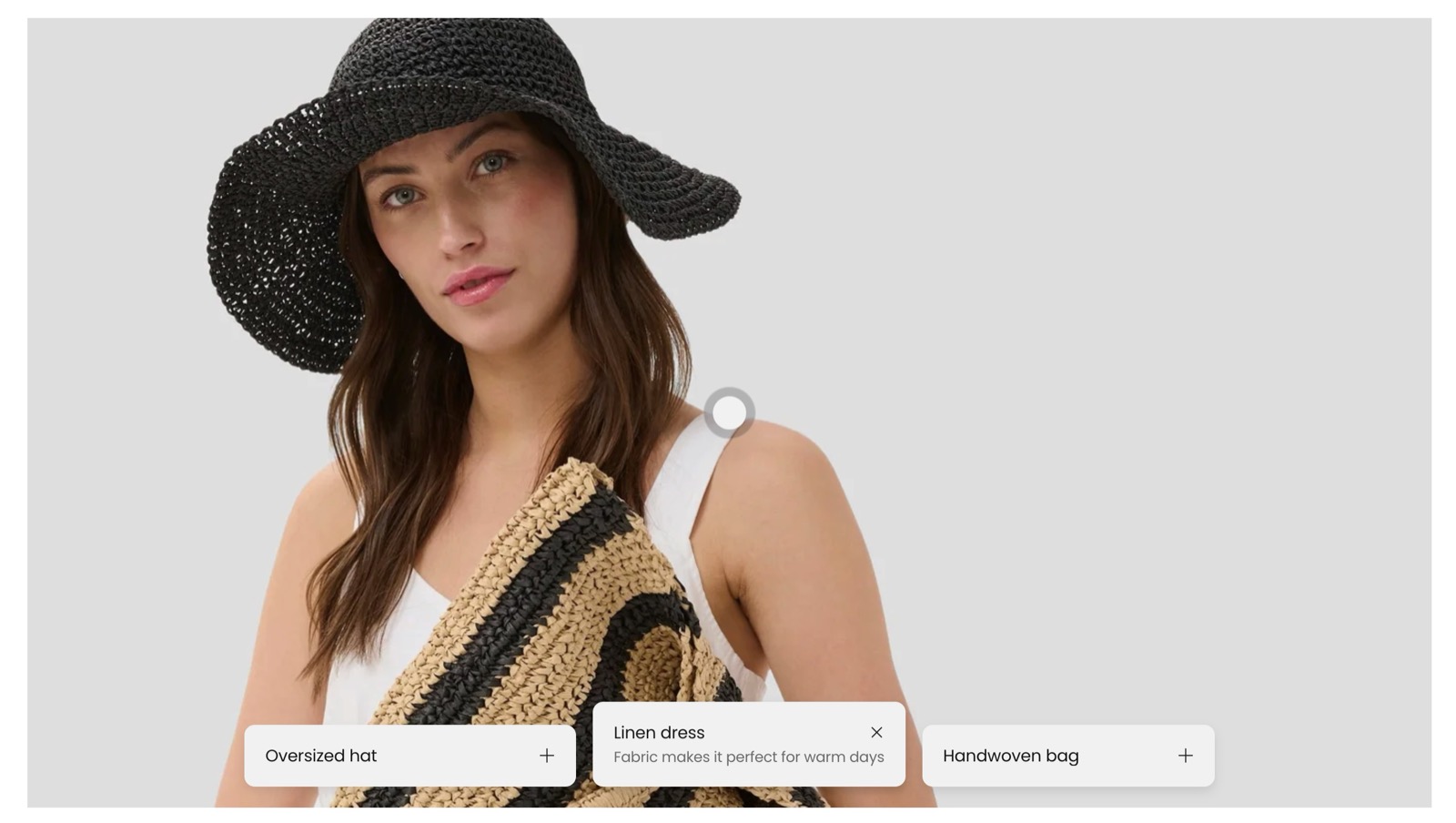
What the section shows
- An optional section header, for a heading and text.
- One Features viewer card. It holds the main image and the tabs.
- Image tab blocks, each with its own image, title, description and icon.
- Zoom tab blocks, each with a point on the main image, title, description and icon.
The two presets differ only in the tabs they start with: three Image tabs or three Zoom tabs. You can add both tab types to the same card.
Viewer size and section header
- Desktop height and Mobile height set the shape of the viewer as an aspect ratio.
- Position puts the section header at the top or on the left.
- Stick to top keeps the section header in view while customers scroll.
- The Section design settings are the standard ones, listed in General section styling.
Features viewer card
- Desktop image is the main image of the viewer. Zoom tabs zoom into this image.
- Mobile image replaces it on mobile.
- Without an image, the viewer shows a placeholder.
- The Card style settings set the overlay, padding, corners and colors of the card.
Image tab
An Image tab shows its own image in the viewer when a customer selects the tab. Use Image tabs when each feature needs a different picture, for example the inside, the back and the strap of a bag.
Zoom tab
A Zoom tab zooms the main image into one point when a customer selects the tab. Use Zoom tabs when all features are visible in one picture, for example the stitching, the buckle and the label of the same jacket.
To place the zoom point:
Set the main image
Select the Features viewer card and choose a Desktop image. Add a Mobile image if the mobile crop differs.
Set the desktop point
Select a Zoom tab. Under Desktop position, set Horizontal position (2 to 98 percent from the left edge) and Vertical position (2 to 98 percent from the top edge).
Set the mobile point
Under Mobile position, set the same two values for the mobile image. Preview the page on mobile in the theme editor to check the point.
Tips for success
- Keep tab titles short, so the tab row stays readable on mobile.
- Choose Desktop height and Mobile height values that keep the important part of the image in view.
Why does the viewer show a placeholder image?
The Features viewer card has no Desktop image and no Mobile image, or an Image tab has no image. Select an image in each of them.
Which icon can a tab show?
One icon next to its title. Choose one from Select an icon, or upload your own image in Custom icon (a transparent PNG of 72 x 72 px). When both are set, the custom icon is shown.
All Features viewer settings
Every setting on this page, one list per section or block, with its type and default.
Desktop height (dropdown, default: Standard (3:2)): Sets the shape of the viewer on desktop, as an aspect ratio. A wider ratio makes the viewer shorter. Options: Ultra-Wide (21:9), Wide (2:1), Landscape (16:9), Standard (3:2), Short (4:3), Square (1:1).
Mobile height (dropdown, default: Taller (2:3)): Sets the shape of the viewer on mobile, as an aspect ratio. A taller ratio makes the viewer taller. Options: Square (1:1), Tall (5:6), Taller (2:3), Ultra tall (9:16).
Features viewer section: Section header
Where to find it: Features viewer → Section header
Position (dropdown, default: Top): Sets where the section header sits: Top places it above the cards, Left places it in a column beside them. Options: Top, Left.
Stick to top (checkbox, default: off): Keeps the section header in view while customers scroll through the section, on screens 1024 px wide and larger.
Features viewer section: Section design
Where to find it: Features viewer → Section design
The Features viewer section uses the standard Section design settings, listed in General section styling.
Color scheme (color scheme, default: Scheme 1).
Top padding (dropdown, default: Default). Options: Default, None, Smaller, Larger, Largest.
Bottom padding (dropdown, default: Default). Options: Default, None, Smaller, Larger, Largest.
Extend section width to the edges of the screen (checkbox, default: off). Shown only when Position is Top.
Show media background (checkbox, default: off): Shows a background image or video behind the section content.
Background image (image). Shown only when Show media background is on.
Background image (mobile) (image): Replaces the background image on screens narrower than 768 px. Shown only when Show media background is on and Background image is set.
Background video (video): Plays a muted, looping video behind the section content. When both a video and an image are set, the video is shown. Shown only when Show media background is on.
Media overlay (dropdown, default: Color): Sets the layer over the background media: a flat color or a gradient. Options: Color, Gradient. Shown only when Show media background is on.
Overlay color (color with transparency). Shown only when Show media background is on and Media overlay is Color.
Overlay gradient (gradient, default: linear-gradient(0deg, rgba(0,0,0,0.5) 0%, rgba(0,0,0,0) 100%)). Shown only when Show media background is on and Media overlay is Gradient.
Parallax effect (dropdown, default: Medium): Moves the background media at a different speed than the page while customers scroll. Subtle, Medium and Strong move it by up to 5, 10 and 20 percent. Options: None, Subtle, Medium, Strong. Shown only when Show media background is on.
Push content down (checkbox, default: off): Replaces Top padding with a larger top space, so more of the background media shows above the content. Shown only when Show media background is on.
Make section full height (checkbox, default: off): Makes the section at least as tall as the screen and centers the content vertically.
Where to find it: Features viewer → Features viewer card.
Accepts these blocks: Image tab and Zoom tab.
Desktop image (image): Sets the main image of the viewer. Zoom tabs zoom into this image.
Mobile image (image): Replaces the main image on mobile. Set the Zoom tab mobile positions against this image.
Features viewer card: Card style
Where to find it: Features viewer → Features viewer card → Card style
Media overlay (dropdown, default: Color): Sets the layer over the main image: a flat color or a gradient. Options: Color, Gradient.
Overlay color (color with transparency, default: rgba(0,0,0,0.03)): Sets a color layer over the main image. Use the transparency slider to keep the image visible. Shown only when Media overlay is Color.
Overlay gradient (gradient, default: linear-gradient(0deg, rgba(0,0,0,0.5) 0%, rgba(0,0,0,0) 100%)). Shown only when Media overlay is Gradient.
Padding (dropdown, default: Regular): Sets the space between the edge of the card and the image. Options: XSmall, Small, Regular, Large, XLarge, XXLarge. Shown only when Add padding to media elements is on.
Add padding to media elements (checkbox, default: on): Adds space between the image and the edge of the card. When off, the image fills the card.
Corner radius (dropdown, default: None). Options: None, Slighty rounded, Rounded, Fully rounded.
Color scheme (color scheme, default: Scheme 2): Sets the colors of the card, including the tab titles and descriptions.
Where to find it: Features viewer → Features viewer card → Image tab.
Image (image): Sets the image shown in the viewer while this tab is selected.
Mobile image (image): Replaces the tab image on mobile.
Image tab block: Text content
Where to find it: Features viewer → Features viewer card → Image tab → Text content
Title (text field).
Description (rich text).
Select an icon (dropdown): Shows an icon from the theme icon set next to the tab title. Options: None, Business: Earth globe, Business: Flag, Business: Helpline, Business: Like hand, Business: Map marker, Business: Security shield, Business: Star, Commerce: Appointment, Commerce: Archive box, Commerce: Box, Commerce: Checkout cart, Commerce: Currency, Commerce: Delivery, Commerce: Delivery time, Commerce: Giftbox, Commerce: Label, Commerce: Open 24 hours, Commerce: Open box, Commerce: Paper bag, Commerce: Shipping truck, Commerce: Store, Commerce: Time, Commerce: Time limit, Commerce: Wallet.
Custom icon (image): Shows your own image as the tab icon, instead of Select an icon. Use a transparent PNG of 72 x 72 px.
Where to find it: Features viewer → Features viewer card → Zoom tab.
Zoom tab block: Desktop position
Where to find it: Features viewer → Features viewer card → Zoom tab → Desktop position
Horizontal position (slider 2 to 98 %, default: 50 %): Sets the zoom point on the desktop image, from 2 to 98 percent of the image width, measured from the left edge.
Vertical position (slider 2 to 98 %, default: 50 %): Sets the zoom point on the desktop image, from 2 to 98 percent of the image height, measured from the top edge.
Zoom tab block: Mobile position
Where to find it: Features viewer → Features viewer card → Zoom tab → Mobile position
Horizontal position (slider 2 to 98 %, default: 50 %): Sets the zoom point on the mobile image, from 2 to 98 percent of the image width, measured from the left edge.
Vertical position (slider 2 to 98 %, default: 50 %): Sets the zoom point on the mobile image, from 2 to 98 percent of the image height, measured from the top edge.
Zoom tab block: Text content
Where to find it: Features viewer → Features viewer card → Zoom tab → Text content
Title (text field).
Description (rich text).
Select an icon (dropdown): Shows an icon from the theme icon set next to the tab title. Options: None, Business: Earth globe, Business: Flag, Business: Helpline, Business: Like hand, Business: Map marker, Business: Security shield, Business: Star, Commerce: Appointment, Commerce: Archive box, Commerce: Box, Commerce: Checkout cart, Commerce: Currency, Commerce: Delivery, Commerce: Delivery time, Commerce: Giftbox, Commerce: Label, Commerce: Open 24 hours, Commerce: Open box, Commerce: Paper bag, Commerce: Shipping truck, Commerce: Store, Commerce: Time, Commerce: Time limit, Commerce: Wallet.
Custom icon (image): Shows your own image as the tab icon, instead of Select an icon. Use a transparent PNG of 72 x 72 px.
Related pages
- General section styling: the Section design and Cards arrangement settings this section shares with others.
- Shop the look: product slider section: hotspots on an image linked to products.
- Icon block: the same icon list as a separate block.
Featured products list
The Featured products list section shows one or more products with gallery, price, variants and buy buttons, like a product page, in Seventh.
Flexible grid
The Flexible grid section in Seventh places flex cards of different sizes in a free grid, for collages, flexible cards and media galleries.