Icon block
The Icon block in Seventh shows a built-in or custom icon, with its own size and an optional link, inside sections and cards.
Applies to: Seventh 4.0.0 and later. Added in: Seventh 1.0.0. Last checked: 2026-10-12 against Seventh 4.0.0.
The Icon block shows one icon, from the Seventh icon set or uploaded by you, with an optional link.
Where to find it: select Add block inside a section or card in the theme editor, then choose Icon.
Using your own icon
Upload an image in Custom icon. It replaces the icon selected in Select an icon.
- Use a square transparent PNG of 256 x 256 px.
- The preset sizes are square. For a wide or tall icon, set Icon size to Custom and type its width and height.
- To see the icons of the theme set, visit the Krown icon library.
Icon size
Icon size sets the size: XSmall 32 px, Small 48 px (default), Medium 72 px and Large 96 px. Select Custom to type your own Custom icon width (px) and Custom icon height (px).
Common use cases
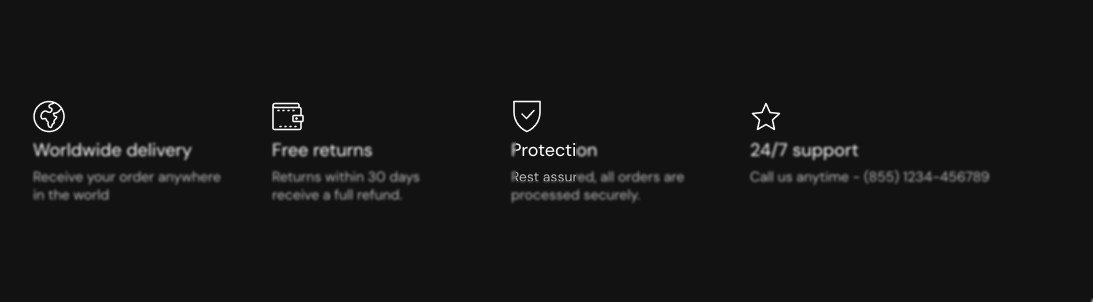
- Feature lists: add a Content group with Direction set to Horizontal, then an Icon block and a Text or Caption block inside it. Repeat the group for each item.
- Buttons and headings: for a short icon with text on one line, the Button and Caption blocks have their own icon setting.
Why does the Icon block link not open in a new window?
Because of an issue in Seventh 4.0.0: Open link in a new window has no effect in the Icon block, so its link always opens in the same window. To open a link in a new window, put the link on a Button block or on the card link of a Card instead. Open link in a new window works in both.
All Icon settings
Every setting in this group, with its type and default.
Select an icon (dropdown, default: Business: Star): Selects an icon from the theme icon set. To see all icons, visit the Krown icon library. Options: Business: Earth globe, Business: Flag, Business: Helpline, Business: Like hand, Business: Map marker, Business: Security shield, Business: Star, Commerce: Appointment, Commerce: Archive box, Commerce: Box, Commerce: Checkout cart, Commerce: Currency, Commerce: Delivery, Commerce: Delivery time, Commerce: Giftbox, Commerce: Label, Commerce: Open 24 hours, Commerce: Open box, Commerce: Paper bag, Commerce: Shipping truck, Commerce: Store, Commerce: Time, Commerce: Time limit, Commerce: Wallet.
Custom icon (image): Shows your own image in place of the selected icon. Use a square transparent PNG, 256 x 256 px recommended.
Icon size (dropdown, default: Small): Sets the icon size: XSmall 32 px, Small 48 px, Medium 72 px, Large 96 px, or Custom. Options: XSmall, Small, Medium, Large, Custom.
Custom icon width (px) (number, default: 24). Shown only when Icon size is Custom.
Custom icon height (px) (number, default: 24). Shown only when Icon size is Custom.
Icon block: Link
Where to find it: Icon → Link
Link (link): Makes the icon a link to a product, collection, page or web address.
Open link in a new window (checkbox, default: off). Shown only when Link is set.
Related pages
- Caption block: a short line of text with an icon.
- Content group block: places an icon next to text.
- Button block: a button with an optional icon.