Button block
The Button block in Seventh adds a link button with its own label, style, size, icon and colors inside any section or card.
Applies to: Seventh 4.0.0 and later. Added in: Seventh 1.0.0. Last checked: 2026-10-12 against Seventh 4.0.0.
The Button block shows a button with a label and a link, in a solid or outline style, with an optional icon.
Where to find it: select Add block inside a section or card in the theme editor, then choose Button.

Common use cases
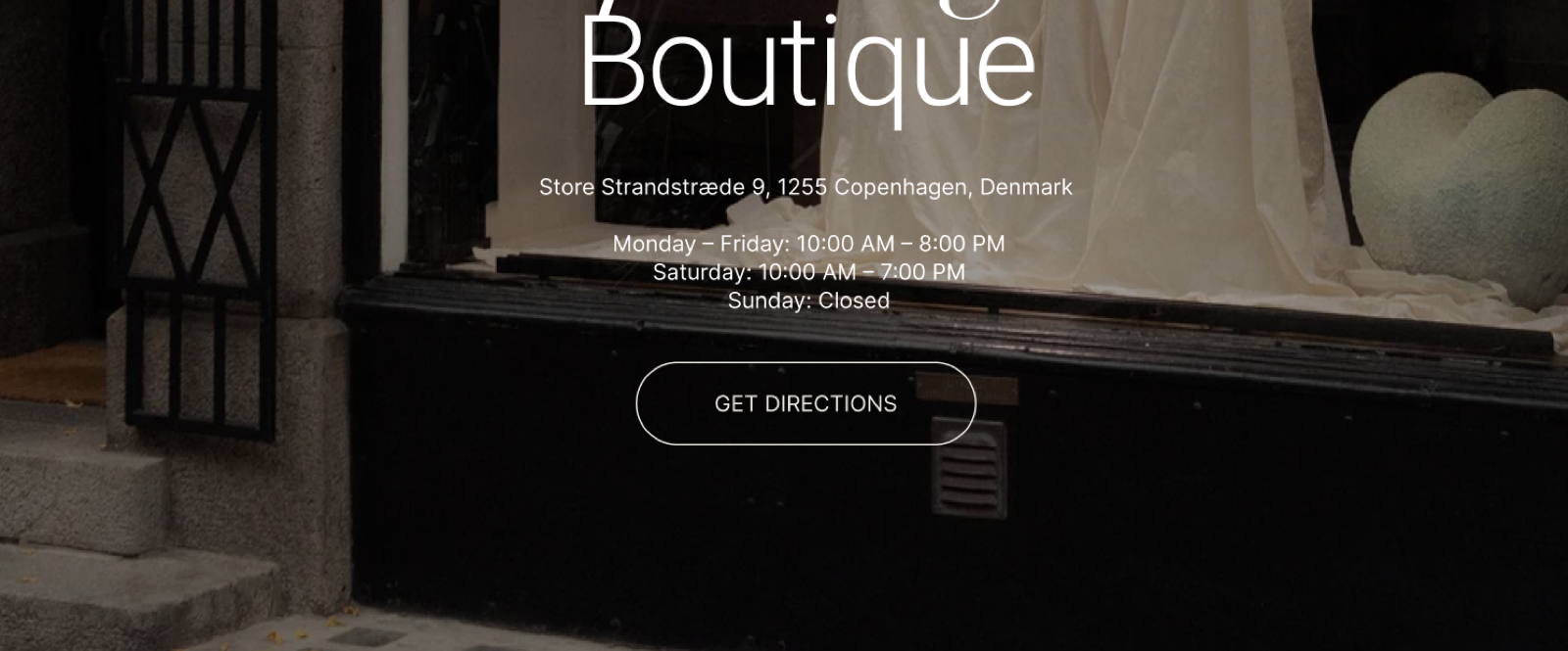
- Call-to-action buttons: the Solid style and a Large or XLarge Size, with a link to a product or collection. They suit homepage hero sections.
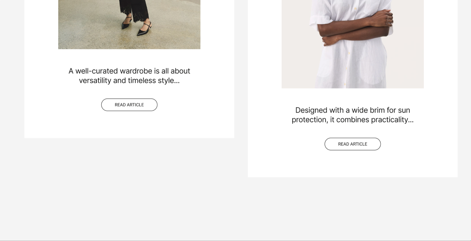
- Navigation buttons: the Outline style and the Medium size, linking to pages.
- Icon buttons: pick an icon in Select an icon, or upload your own in Custom icon (72 x 72 px transparent PNG). A custom icon replaces the selected one, and icons scale with the button size.
- Full-width buttons: turn on Fit container. The button then takes the full width of the card, column or Content group that holds it. Good for mobile layouts and forms.
Tips for success
- Use Solid for primary actions and Outline for secondary ones.
- Match the size to the importance: larger means more important.
- Write short, clear, action-oriented labels, such as "Shop now".
- For links to another website, turn on Open link in a new window.
How do I change the color of one button?
Turn on Use custom colors, then set Primary and Secondary. On a Solid button, Primary is the background and Secondary is the label. On an Outline button, Primary is the border and the label. Without custom colors, the button uses the button colors of the color scheme.
The shape, the hover effect and the default colors of every button come from Buttons & forms theme settings and from the color scheme of the section or card. The Button block sets only this one button.
Why does my button not link anywhere?
Because Link is empty. Select a product, collection or page in Link, or paste a full web address that starts with https:// for another website. Open link in a new window appears only after a link is set.
Why are my custom button colors not showing?
Because Use custom colors is off. Primary and Secondary are used only when Use custom colors is on. Also check which part each color sets: on an Outline button, Primary colors the border and the label, and there is no background.
All Button settings
Every setting in this group, with its type and default.
Label (text field, default: "Button label"): Sets the text on the button.
Link (link): Sets where the button goes: a product, collection, page or a full web address.
Open link in a new window (checkbox, default: off). Shown only when Link is set.
Button block: Button style
Where to find it: Button → Button style
Style (dropdown, default: Solid): Sets the button look. Solid fills the button with color; Outline shows only a border. Options: Outline, Solid.
Size (dropdown, default: Small). Options: XSmall, Small, Medium, Large, XLarge.
Fit container (checkbox, default: off): Makes the button take the full width of the card, column or Content group that holds it.
Use custom colors (checkbox, default: off): Uses the Primary and Secondary colors below instead of the button colors of the color scheme.
Primary (color, default: #000000): Sets the background of a Solid button, or the border and label of an Outline button. Shown only when Use custom colors is on.
Secondary (color, default: #ffffff): Sets the label color of a Solid button. Shown only when Use custom colors is on.
Button block: Icon
Where to find it: Button → Icon
Select an icon (dropdown): Shows an icon from the theme icon set on the button. To see all icons, visit the Krown icon library. Options: None, Business: Earth globe, Business: Flag, Business: Helpline, Business: Like hand, Business: Map marker, Business: Security shield, Business: Star, Commerce: Appointment, Commerce: Archive box, Commerce: Box, Commerce: Checkout cart, Commerce: Currency, Commerce: Delivery, Commerce: Delivery time, Commerce: Giftbox, Commerce: Label, Commerce: Open 24 hours, Commerce: Open box, Commerce: Paper bag, Commerce: Shipping truck, Commerce: Store, Commerce: Time, Commerce: Time limit, Commerce: Wallet.
Custom icon (image): Shows your own image as the button icon, in place of the selected icon. Use a 72 x 72 px transparent PNG.
Related pages
- Buttons & forms theme settings: the shape and hover effect of all buttons.
- Colors theme settings: the color schemes that give buttons their default colors.
- Popup button block: a button that opens a modal instead of a link.