Product item block
The Product item block in Seventh shows one product as a mini product block, with image, title and price, inside a section or card.
Applies to: Seventh 4.0.0 and later. Added in: Seventh 1.0.0. Last checked: 2026-10-12 against Seventh 4.0.0.
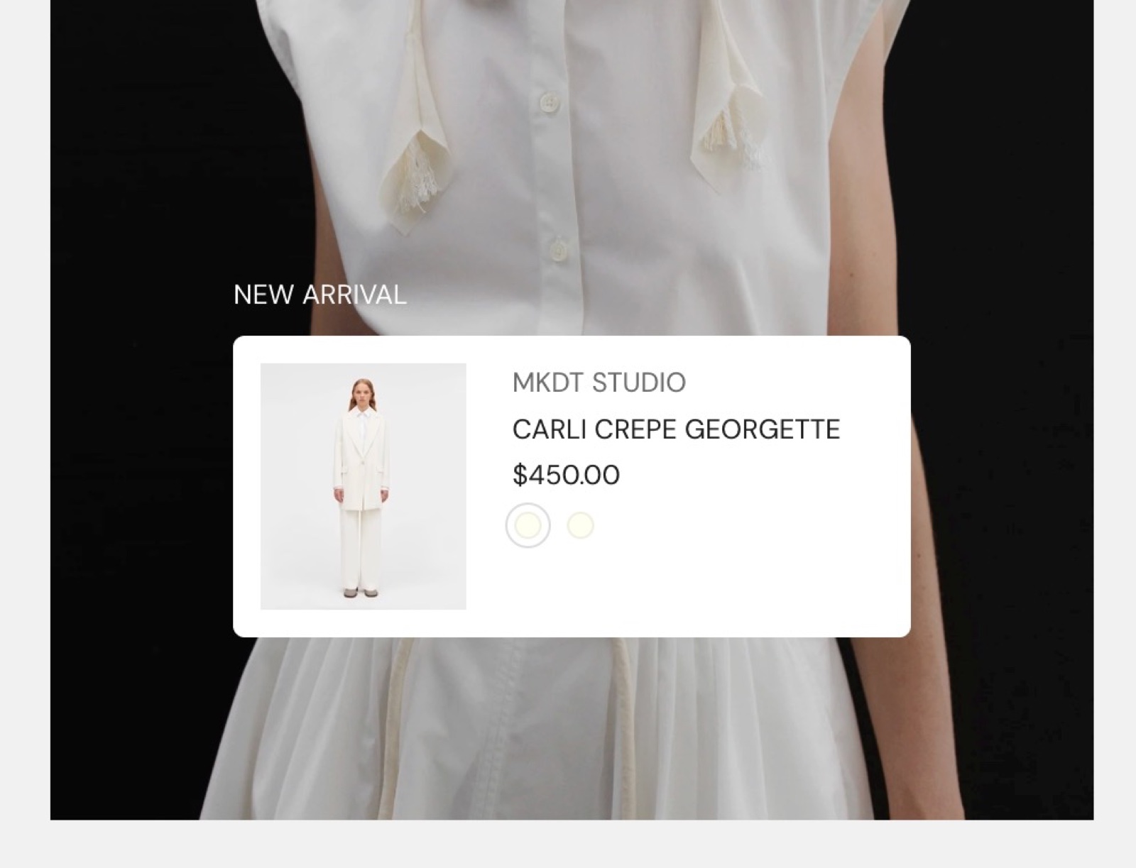
The Product item block shows one product as a compact row: a small image, the title, the price and swatches, linked to the product. Use it to make a card, slide or image shoppable without a product grid.
Where to find it: select Add block inside a section or card in the theme editor, then choose Product item. The Shoppable media card preset of the Card block already contains one.
Product content
Select the product in Product. The block shows its image, title, price and color swatches, and links to the product.
The content of the product item is defined inside Theme settings → Mini product block.
Common use cases
- Shoppable editorial content: products inside lookbooks, campaigns or brand stories.
- Promotional cards: new arrivals or key products, without a full product grid.
- Image overlays: a product over an image or media background, often with Remove background on.
- Cross-sells and recommendations: related products on product pages or in content sections.
How do I place a product over an image?
Use a Card with Show media background on and set a Background image. Add a Product item block inside the card and set Vertical alignment to Bottom. Turn on Remove background if the item should sit directly on the image. Or keep the background and pick a Color scheme that contrasts with the image.
What does Fit container change?
Fit container (on by default) makes the item take the full width of the card or column. Turn it off to size the item to its content. It then follows the Text alignment of the card (left, center or right).
All Product item settings
Every setting in this group, with its type and default.
Product (product picker): Selects the product to show. The vendor, price, swatches and Quick buy come from Theme settings → Mini product block.
Product item block: Style
Where to find it: Product item → Style
Remove background (checkbox, default: off): Removes the background color of the item, so it sits directly on the card or image.
Hide border (checkbox, default: off): Removes the border around the item.
Fit container (checkbox, default: on): Makes the item take the full width of its card or column. Off sizes the item to its content and aligns it with the card text alignment.
Corner radius (dropdown, default: None): Sets the corner rounding of the item. Hidden when both the background and the border are removed. Options: None, Slighty rounded, Rounded. Shown only when Remove background is off, or Hide border is off.
Color scheme (color scheme, default: Scheme 1).
Related pages
- Mini product block theme settings: the content of every Product item.
- Blank card: the Shoppable media card preset.
- Shop the look card: shows products as hotspots on an image.