Mini product block theme settings
The Mini product block theme settings control the small product display in the Seventh search drawer, cart recommendations, hotspots and Product item block.
Applies to: Seventh 4.0.0 and later. Added in: Seventh 1.0.0. Last checked: 2026-10-12 against Seventh 4.0.0.
The Mini product block is the compact product display that Seventh reuses in many places: search drawer results, cart drawer recommendations, Shop the look hotspots and the Product item block. These settings change all of them at once.
Where to find it: Theme settings → Mini product block
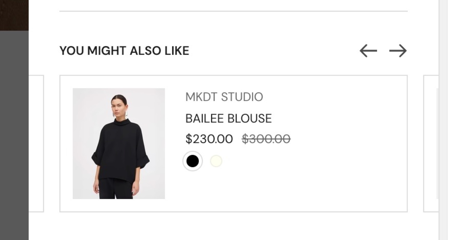
Content
- Show vendor shows the vendor above the title.
- Show price shows the price, with unit pricing when the product has it.
- Show swatches shows swatches below the price. Display swatches as picks Color options (Shopify's color swatches) or Product siblings (read from a metafield, see below).
- Show size options adds the sizes, as set up in Color swatches & size options.
- Enable quick buy adds an Add to cart button.
The image shape comes from Theme settings → Cart → Media aspect ratio, not from this group. The group shows a "Media aspect ratio" heading with no settings under it.
Product siblings metafield reference
To show product siblings, type the reference to your siblings metafield. The mini product block is not inside a product card or grid, so the theme does not know the metafield and you cannot connect it as a dynamic source.
Open the metafield definitions
Open Shopify admin → Settings → Metafields and metaobjects → Products.
Find the siblings metafield
Find the product list metafield you use for product siblings.
Copy the namespace and key
Copy the value in the form namespace.key, for example custom.product_siblings.
Paste it into the theme
Paste it into Product siblings metafield reference in Theme settings → Mini product block → Content, then select Save.
The design (style) of the display swatches is set under Theme settings → Color swatches & size options. The size of the swatches will always be small.
To create the product siblings metafield, see Product variants and buy buttons blocks.
Typography
Case sets all mini product block text to normal case or uppercase (the default). Seventh has no other typography settings for the mini product block.
How does quick buy work in the mini product block?
Since Seventh 2.0.0, Enable quick buy adds an outline "Add to cart" button to each mini product block.
- A product with one variant goes straight to the cart.
- A product with several variants opens the Quick view popup.
- Sold out products show no button.
The quick buy setting in Theme settings → Product card does not affect the mini product block.
Can I change the swatch size in the mini product block?
No. Its swatches are always small. The swatch shape and the siblings display mode come from Theme settings → Color swatches & size options.
All Mini product settings
Every setting in this group, with its type and default.
Changes the design of mini product blocks in multiple areas, such as product item blocks, search drawer, etc.
Mini product block theme settings: Content
Where to find it: Theme settings → Mini product block → Content
Show vendor (checkbox, default: on): Shows the product vendor above the title.
Show price (checkbox, default: on): Shows the product price, including unit pricing when the product has it.
Show swatches (checkbox, default: on): Shows color swatches or product siblings below the price.
Display swatches as (dropdown, default: Color options): Sets what the swatches show: the color swatches of each product (Color options) or its linked products (Product siblings, read from the metafield in Product siblings metafield reference). Options: Color options, Product siblings. Shown only when Show swatches is on.
Product siblings metafield reference (text field): The namespace.key of the product list metafield that holds the siblings, for example custom.product_siblings. Used when Display swatches as is Product siblings. Shown only when Display swatches as is Product siblings.
Show size options (checkbox, default: off): Shows the size options of each product. The size option names are set in Theme settings → Color swatches & size options.
Enable quick buy (checkbox, default: off): Adds an Add to cart button to each mini product block. Products with several variants open the Quick view popup; sold out products show no button.
Mini product block theme settings: Typography
Where to find it: Theme settings → Mini product block → Typography
Case (dropdown, default: Uppercase): Sets all mini product block text to normal case (Default) or capital letters (Uppercase). Options: Default, Uppercase.
Related pages
- Color swatches & size options theme settings: swatch style, siblings display mode and size option names.
- Cart theme settings: the media aspect ratio that the mini product block uses.
- Product item block: places one mini product block in a section or card.
- Search drawer section: uses the mini product block for results.
- Shop the look card: hotspots that open a mini product block.
Cart theme settings
The Cart theme settings choose the cart type and set up the free shipping bar, gift wrapping, cart notes, terms checkbox and discount text in Seventh.
Sliders navigation theme settings
The Sliders navigation theme settings choose whether sliders in Seventh show arrows and which pagination they use: dots, numbers, a bar or none.