Product badges theme settings
The Product badges theme settings set where Seventh shows sale, sold out and custom badges on product cards, and their colors.
Applies to: Seventh 4.0.0 and later. Added in: Seventh 1.0.0. Last checked: 2026-10-12 against Seventh 4.0.0.
Badges are the small labels on product images: Sold out, a discount, or your own custom text. Seventh shows the first two automatically; the custom badge needs a metafield.
Where to find it: Theme settings → Product badges
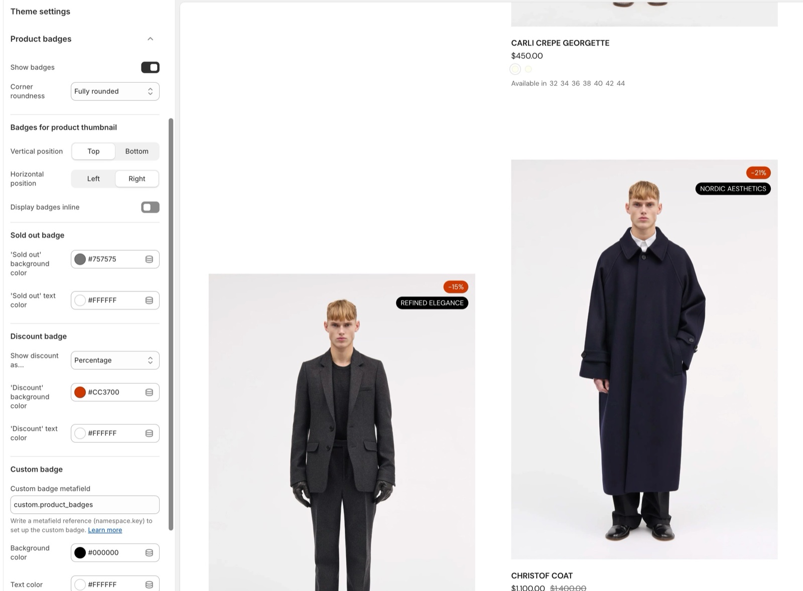
Badge shape and position
- Corner roundness sets the shape of every badge, from square to fully rounded.
The Badges for product thumbnail settings only change the badges over product images in product cards:
- Show badges turns these badges on or off.
- Vertical position puts them at the top or the bottom of the image.
- Horizontal position puts them on the left or the right.
- Display badges inline shows them side by side instead of one under the other, when there is room.
- Stretch badges horizontally (inline only) pushes two badges into opposite corners. Works best with two badges or fewer.
Turned the badges off here? You can still show them with the Product badges block inside the product card.
Sold out badge
- Set its background and text color.
This badge appears automatically when a product (all its variants) are sold out.
Discount badge
- Set its background and text color.
- Show discount as... chooses what the badge says:
- Text: "On Sale".
- Percentage: the saving in percent, for example "-20%".
- Amount saved: "Save" and the amount.
The saving amount or percentage shows only when all product options share the same price. If the product includes options with different prices, product cards show the generic "On Sale" badge instead.
The texts "Sold Out", "On Sale" and "Save" are theme texts. Change them in Shopify admin → Online Store → Themes → … → Edit default theme content.
Setting up the custom badge
The custom badge shows text from a product metafield, for example "New" or "Limited".
- A list metafield shows one badge per entry.
- All custom badges share the same Background color and Text color.
Create the metafield
In Shopify admin, open Settings → Metafields and metaobjects → Products. Select Add definition and choose the type Single line text (or a list of single line text, for several badges).
Copy the namespace and key
Copy them in the form namespace.key, for example custom.badge.
Paste it in the theme
Open Theme settings → Product badges → Custom badge and paste it into Custom badge metafield.
Fill the metafield on your products
Open each product and type the badge text in the new metafield. Products with an empty metafield show no custom badge.
Don't try to connect the metafield in this text setting! Because we are outside the product page or grid, we cannot connect metafields in the traditional way, that is why you need to copy & paste the namespace.key value of your metafield manually.
Why does my discount badge say "On Sale" instead of a percentage?
The product's variants have different prices or compare-at prices. Product cards then show "On Sale" instead of a saving per variant, which keeps collection pages fast. On the product page, the Product badges block shows the exact saving of the selected variant.
Can I hide badges on product images but show them elsewhere?
Yes. Turn off Show badges, then add the Product badges block inside a product card or on the product page. See Product information blocks.
All Product badges settings
Every setting in this group, with its type and default.
Corner roundness (dropdown, default: Fully rounded): Sets the corner shape of all product badges, on product media and in the Product badges block. Options: None, Slighty rounded, Rounded, Fully rounded.
Product badges theme settings: Badges for product thumbnail
Where to find it: Theme settings → Product badges → Badges for product thumbnail
Show badges (checkbox, default: on): Shows badges over the product media in product cards. The Product badges block is not affected.
Vertical position (dropdown, default: Top): Sets whether badges sit at the top or the bottom of the product media. Options: Top, Bottom.
Horizontal position (dropdown, default: Right): Sets whether badges sit on the left or the right of the product media. Options: Left, Right.
Display badges inline (checkbox, default: off): Shows several badges next to each other on one line instead of one under the other, when there is room.
Stretch badges horizontally (checkbox, default: off): Spreads inline badges across the full width of the media, so with two badges one sits in each corner. Shown only when Display badges inline is on.
Product badges theme settings: Sold out badge
Where to find it: Theme settings → Product badges → Sold out badge
'Sold out' background color (color with transparency, default: #757575).
'Sold out' text color (color, default: #ffffff).
Product badges theme settings: Discount badge
Where to find it: Theme settings → Product badges → Discount badge
Show discount as... (dropdown, default: Percentage): Sets the discount badge text: Text shows "On Sale", Percentage shows the saving in percent, Amount saved shows the saved amount. Products whose variants have different prices always show "On Sale" in product cards. Options: Text, Percentage, Amount saved.
Products with varying prices across variants will show a generic 'Sale' badge. Shown only when Show discount as... is not Text.
'Discount' background color (color with transparency, default: #eb3535).
'Discount' text color (color, default: #FFFFFF).
Product badges theme settings: Custom badge
Where to find it: Theme settings → Product badges → Custom badge
Custom badge metafield (text field): The product metafield that holds the custom badge text, written as namespace.key (for example custom.badge). A list metafield shows one badge per entry.
Background color (color with transparency, default: #212121).
Text color (color, default: #DBDBDB).
Related pages
- Product card theme settings: the media and quick buy settings of product cards.
- Product card: where to add the Product badges block in a product card.
- Product information blocks: the Product badges block on the product page.
Product card theme settings
The Product card theme settings control how product cards look in every grid in Seventh: card style, media, quick buy and the Quick view popup.
Color swatches & size options theme settings
The Color swatches & size options theme settings control color swatches, product siblings and size options on product cards in Seventh.