Product information blocks
The Product information blocks in Seventh: product title, vendor, price, rating, badges, SKU, tax info, description and share on the product page.
Applies to: Seventh 4.0.0 and later. Added in: Seventh 1.0.0. Last checked: 2026-10-12 against Seventh 4.0.0.
The Product information blocks show the product's title, vendor, price, rating, badges, SKU or barcode, tax and shipping note, description and a share link. They sit inside the Product information block of the Product page section.
Where to find it: Products → Default product → Product page → Product information, then select Add block.
How these blocks work
- Each block reads its content from the product. You edit the text in Shopify admin → Products, not in the theme editor.
- The blocks only set where the content appears and how it looks.
- The default product template (Products → Default product) uses this order: Product vendor, Product title, a Content group with Product price and Product rating, a Content group with Product tax info and Product SKU / barcode, then the variant, buy and availability blocks, and Product share at the end.
- Drag the blocks in the theme editor to change the order.
The same Product title, Product vendor, Product price, Product rating and Product badges blocks are also used inside the Product card and the Featured product card of the Featured products list section. This page is the one place that lists their settings. Product SKU / barcode and Product tax info are also available in the Featured product card; Product description and Product share in the Featured product card only.
Product title
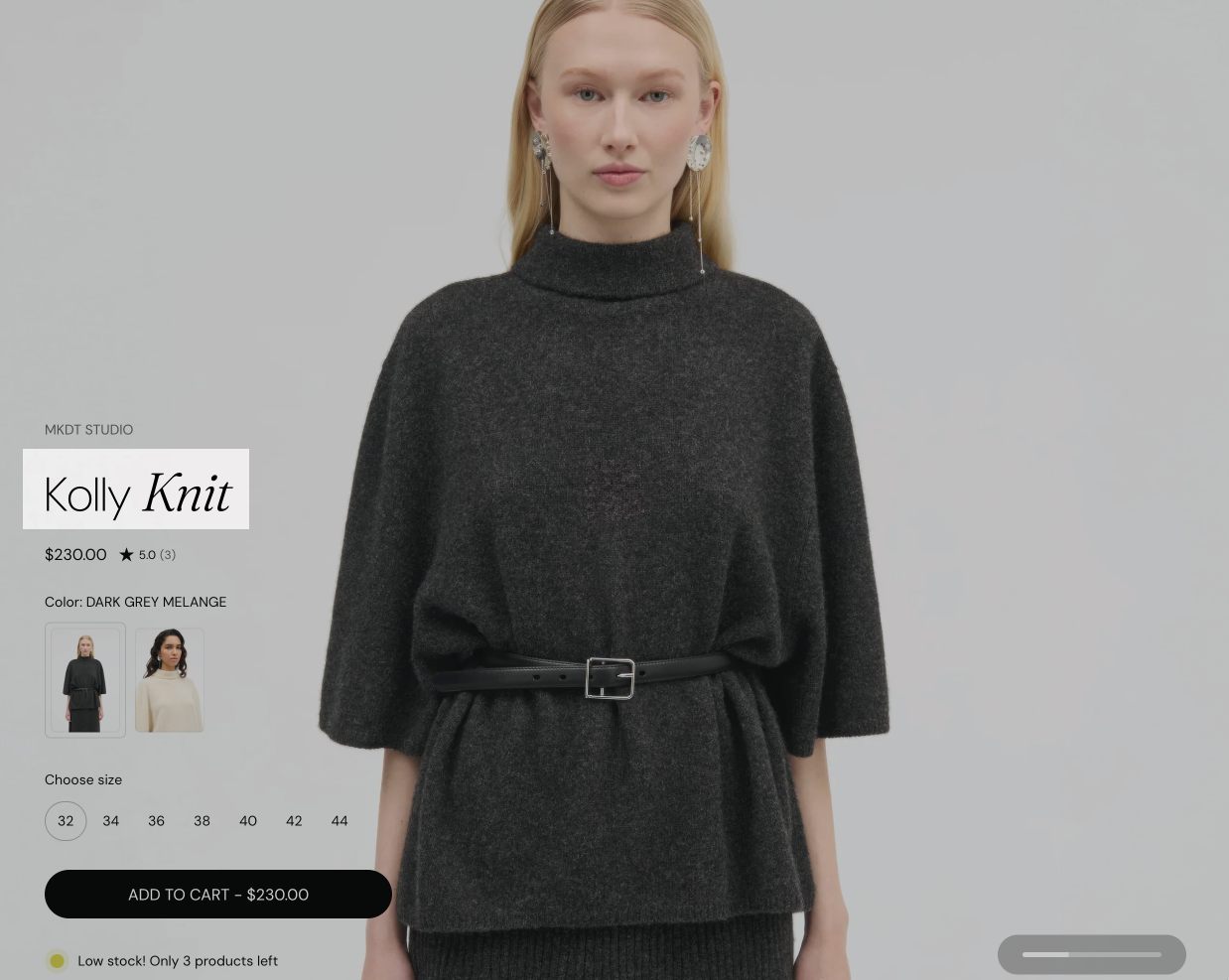
- In the default product template, the block uses HTML tag Heading 1, so the product name is the page's main heading for search engines.
- Keep one Heading 1 per product page. If you add a Heading block with Heading 1, set one of the two to a lower level.
A clear, well-styled title improves scannability and helps anchor pricing, badges, and ratings around it for faster decision-making.
Product price
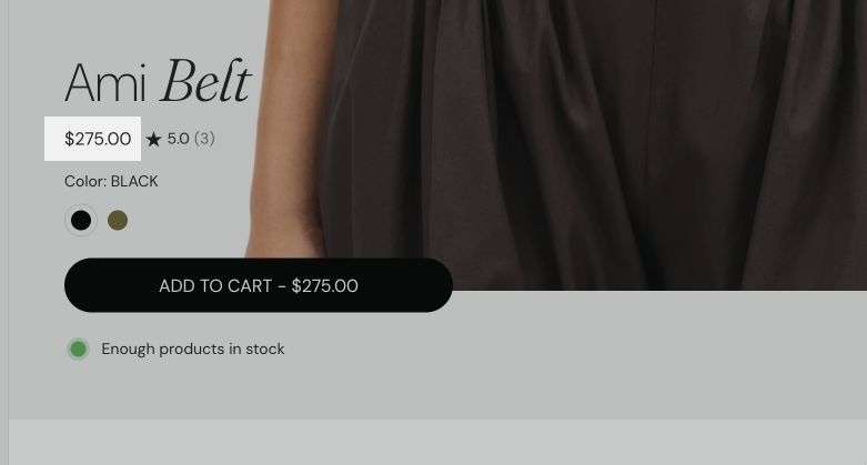
- The compare-at price shows next to the price when the variant is on sale.
- When variant prices differ and no variant is selected yet, the block shows "From" and the lowest price ("On Sale from" when a variant is on sale).
- Show installment terms shows the Shop Pay Installments message under the price.
- Free products show the free label, and prices show currency codes, according to Price theme settings.
The installments message comes from Shopify. It appears only when Shop Pay Installments is available for your store and the price. Shopify controls this message and its eligibility rules, not Seventh. See Shopify Help Center: Shop Pay Installments.
When styled well, it supports both clarity and conversion.
Product description
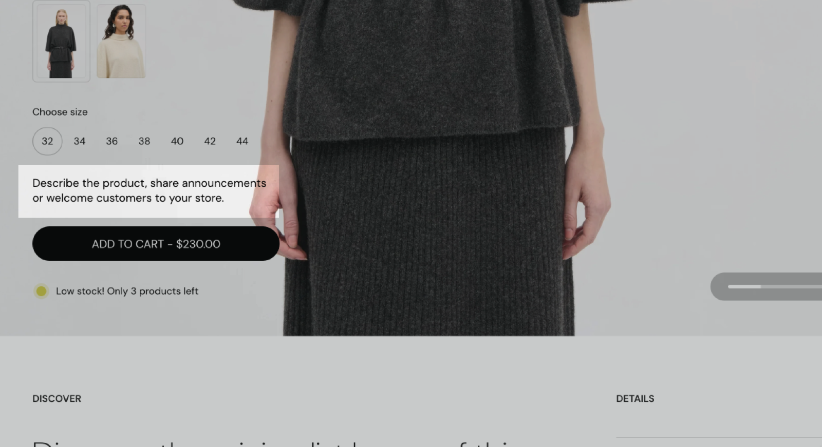
- Truncate description shortens a long description to the Number of words. The customer can then expand it to read the full text. Added in Seventh 3.0.0.
Longer descriptions can also help with organic search performance.
Product rating
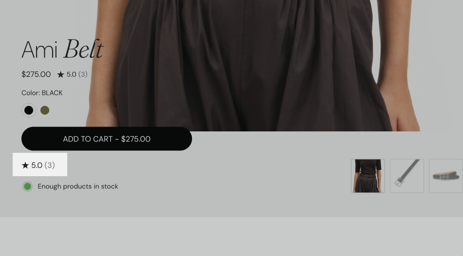
The Product rating block shows the product's stars and review count. It reads reviews.rating and reviews.rating_count, the standard Shopify review metafields that product review apps write for each reviewed product.
Product badges
The Product badges block has no settings of its own.
- It shows the sale, sold out, new and custom badges of the product.
- All of them are set in Product badges theme settings.
- On the product page, the sale badge shows the exact discount of the selected variant.
Badges help communicate status at a glance and are effective when combined with pricing and imagery.
Product vendor
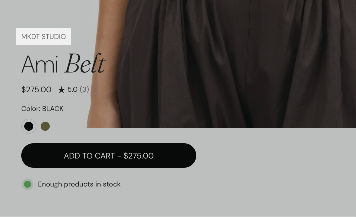
The Product vendor block shows the vendor or brand name of the product.
Product SKU / barcode
- The block shows the SKU and the barcode of the selected variant, and updates when the customer selects another variant.
- A value that is empty in Shopify admin is not shown.
- The block appears only after a variant is selected. With Select the first available variant by default turned off in the Product page section, it stays hidden until the customer selects a variant.
Product tax info
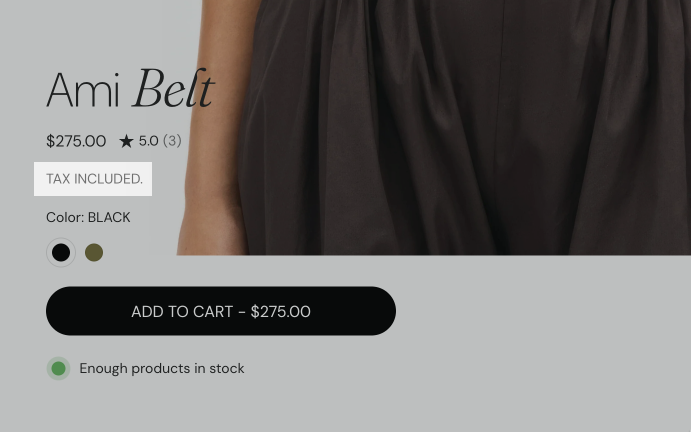
The Product tax info block shows up to two lines:
- "Tax included.", when your prices include taxes. Shopify controls this in Shopify admin → Settings → Taxes and duties.
- "Shipping calculated at checkout.", with "Shipping" linking to your shipping policy, when the store has one. The policy text is in Shopify admin → Settings → Policies.
When neither applies, the block shows nothing.
Open links in sets how the shipping policy opens:
- Popup shows the policy text in a modal on the product page. Available since Seventh 2.0.0.
- Same window and New window open the policy page.
Product share
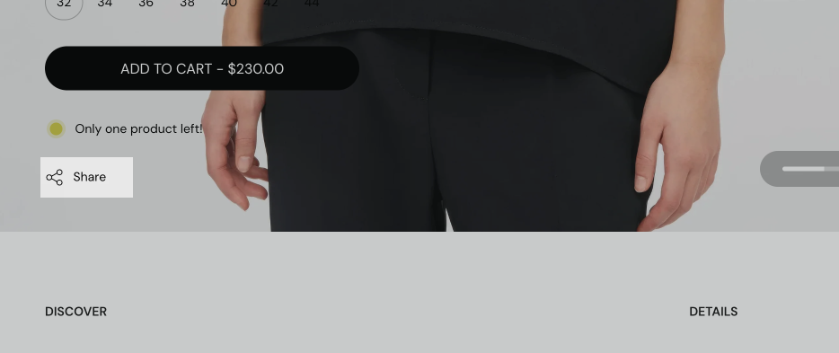
The Product share block shows one share link with the product URL, including the selected variant.
- On devices with a system share menu (most phones and tablets), the link opens that menu.
- On other browsers, it copies the URL to the clipboard and shows a "copied" message.
- Seventh does not show separate buttons per social network in this block.
Why is the Product rating block not showing?
Because the product has no rating in the standard Shopify review metafields. With no rating value, the block shows nothing, also in the theme editor.
- Install a product reviews app that writes ratings to Shopify metafields. See Recommended product reviews apps.
- Make sure the product has at least one published review in the app.
Seventh does not show ratings from apps that do not use Shopify metafields. Use the app's own app block on the product page instead.
Why is my product description inside an accordion?
Because the default product template shows the description inside an Accordion block (a Text block connected to the product description), not with a Product description block. To show the description without an accordion, add the Product description block and remove the accordion.
How do I place two blocks on one line?
Put them in a Content group block. The default template does this for the price and rating, and for the tax info and SKU.
All Product information blocks settings
Every setting on this page, one list per section or block, with its type and default.
Where to find it: Products → Default product → Product page → Product information → Product title. It is also available in: Featured product card, Product card, Content group.
Displays title from parent product.
Product title block: Typography
Where to find it: Products → Default product → Product page → Product information → Product title → Typography
Font (dropdown, default: Headings). Options: Body, Headings, Accent.
Text size (dropdown, default: Heading 3). Options: Heading 1, Heading 2, Heading 3, Heading 4, Heading 5, Heading 6. Shown only when Font is not Body.
Text size (dropdown, default: Medium). Options: XXSmall, XSmall, Small, Medium, Large, XLarge, XXLarge. Shown only when Font is Body.
Line height (dropdown, default: Default). Options: Default, Smallest, Smaller, Larger, Largest.
Apply accent font to (dropdown, default: None): Sets which part of the title uses the Accent font: the first word, the first letter or the last word. Options: None, First word, First letter, Last word. Shown only when Font is Headings.
Text weight (dropdown, default: Normal). Options: Normal, Bold.
Case (dropdown, default: Default). Options: Default, Uppercase.
Reduced text opacity (checkbox, default: off): Shows the text at 62 percent opacity (69 percent on dark color schemes), for secondary text such as captions or notes.
Custom text color (color, default: transparent).
Product title block: SEO
Where to find it: Products → Default product → Product page → Product information → Product title → SEO
HTML tag (dropdown, default: Heading 3): Sets the HTML heading level of the title for search engines. The default product template uses Heading 1. Options: Heading 1, Heading 2, Heading 3, Heading 4, Paragraph.
Where to find it: Products → Default product → Product page → Product information → Product vendor. It is also available in: Featured product card, Product card, Content group.
Displays vendor from parent product.
Product vendor block: Typography
Where to find it: Products → Default product → Product page → Product information → Product vendor → Typography
Text size (dropdown, default: Medium). Options: XXSmall, XSmall, Small, Medium, Large, XLarge.
Line height (dropdown, default: Small). Options: Default, Smallest, Smaller, Small, Larger, Largest.
Text weight (dropdown, default: Normal). Options: Normal, Bold.
Case (dropdown, default: Default). Options: Default, Uppercase.
Reduced text opacity (checkbox, default: off): Shows the text at 62 percent opacity (69 percent on dark color schemes), for secondary text such as captions or notes.
Custom text color (color, default: transparent).
Where to find it: Products → Default product → Product page → Product information → Product price. It is also available in: Featured product card, Product card, Content group.
Displays price from parent products.
Show tax info (checkbox, default: off): Adds "Tax included." or "Tax excluded." after the price, depending on your Shopify tax settings.
Show installment terms (checkbox, default: off): Shows Shopify's Shop Pay Installments message under the price when the product is eligible. Shopify controls the message and eligibility.
Product price block: Typography
Where to find it: Products → Default product → Product page → Product information → Product price → Typography
Text size (dropdown, default: Medium). Options: XXSmall, XSmall, Small, Medium, Large, XLarge.
Line height (dropdown, default: Small). Options: Default, Smallest, Smaller, Small, Larger, Largest.
Text weight (dropdown, default: Normal). Options: Normal, Bold.
Case (dropdown, default: Default). Options: Default, Uppercase.
Reduced text opacity (checkbox, default: off): Shows the text at 62 percent opacity (69 percent on dark color schemes), for secondary text such as captions or notes.
Custom text color (color, default: transparent).
Where to find it: Products → Default product → Product page → Product information → Product rating. It is also available in: Featured product card, Product card, Content group.
Displays rating from parent product.
Requires a compatible product reviews app to be installed.
Only apps that use Shopify metafields are supported.
Product rating block: Typography
Where to find it: Products → Default product → Product page → Product information → Product rating → Typography
Text size (dropdown, default: XSmall). Options: XXSmall, XSmall, Small, Medium.
Where to find it: Products → Default product → Product page → Product information → Product badges. It is also available in: Featured product card, Product card, Content group.
Displays badges from parent product.
Where to find it: Products → Default product → Product page → Product information → Product SKU / barcode. It is also available in: Featured product card, Content group.
Displays sku and barcode from parent product.
Product SKU / barcode block: Typography
Where to find it: Products → Default product → Product page → Product information → Product SKU / barcode → Typography
Text size (dropdown, default: Medium). Options: XXSmall, XSmall, Small, Medium, Large, XLarge.
Line height (dropdown, default: Small). Options: Default, Smallest, Smaller, Small, Larger, Largest.
Text weight (dropdown, default: Normal). Options: Normal, Bold.
Case (dropdown, default: Default). Options: Default, Uppercase.
Reduced text opacity (checkbox, default: off): Shows the text at 62 percent opacity (69 percent on dark color schemes), for secondary text such as captions or notes.
Custom text color (color, default: transparent).
Where to find it: Products → Default product → Product page → Product information → Product tax info. It is also available in: Featured product card, Content group.
Open links in (dropdown, default: Popup): Sets how the shipping policy link opens: Popup shows the policy in a modal on the product page, Same window and New window open the policy page. Options: Popup, Same window, New window.
Product tax info block: Typography
Where to find it: Products → Default product → Product page → Product information → Product tax info → Typography
Text size (dropdown, default: Medium). Options: XXSmall, XSmall, Small, Medium, Large, XLarge.
Case (dropdown, default: Default). Options: Default, Uppercase.
Reduced text opacity (checkbox, default: off): Shows the text at 62 percent opacity (69 percent on dark color schemes), for secondary text such as captions or notes.
Where to find it: Products → Default product → Product page → Product information → Product description. It is also available in: Featured product card.
Displays description from parent product.
Truncate description (checkbox, default: off): Shortens the description and adds a toggle that expands the full text.
Number of words (slider 10 to 50, default: 40): Sets how many words show before the toggle, from 10 to 50. Shown only when Truncate description is on.
Product description block: Typography
Where to find it: Products → Default product → Product page → Product information → Product description → Typography
Text size (dropdown, default: Medium). Options: XXSmall, XSmall, Small, Medium, Large, XLarge, XXLarge.
Line height (dropdown, default: Default). Options: Default, Smallest, Smaller, Larger, Largest.
Text weight (dropdown, default: Normal). Options: Normal, Bold.
Case (dropdown, default: Default). Options: Default, Uppercase.
Reduced text opacity (checkbox, default: off): Shows the text at 62 percent opacity (69 percent on dark color schemes), for secondary text such as captions or notes.
Custom text color (color, default: transparent).
Where to find it: Products → Default product → Product page → Product information → Product share. It is also available in: Featured product card.
Displays share links for parent product.
Product share block: Typography
Where to find it: Products → Default product → Product page → Product information → Product share → Typography
Text size (dropdown, default: Medium). Options: XXSmall, XSmall, Small, Medium, Large, XLarge.
Line height (dropdown, default: Small). Options: Default, Smallest, Smaller, Small, Larger, Largest.
Text weight (dropdown, default: Normal). Options: Normal, Bold.
Case (dropdown, default: Default). Options: Default, Uppercase.
Reduced text opacity (checkbox, default: off): Shows the text at 62 percent opacity (69 percent on dark color schemes), for secondary text such as captions or notes.
Custom text color (color, default: transparent).
Related pages
- Product page: the Product page section, its gallery and the Product information block that holds these blocks.
- Product variants and buy buttons blocks: variant picker, product siblings, buy buttons and custom property.
- Product badges theme settings: the badges that the Product badges block shows.
- Product card theme settings: store-wide settings for product cards in grids.
- Featured products list section: uses the same blocks in its Featured product card.
Product page
The Product page in Seventh: gallery styles, layout, mobile media, sticky add to cart and the Product information blocks of the product template.
Product variants and buy buttons blocks
The Product variants and buy buttons blocks in Seventh: Product variants, Product siblings, Buy buttons and Custom property on the product page.