Product variants and buy buttons blocks
The Product variants and buy buttons blocks in Seventh: Product variants, Product siblings, Buy buttons and Custom property on the product page.
Applies to: Seventh 4.0.0 and later. Added in: Seventh 1.0.0. Last checked: 2026-10-12 against Seventh 4.0.0.
The Product variants and buy buttons blocks let customers choose a variant or a linked product and add it to the cart: Product variants, Buy buttons, Product siblings and Custom property. They sit inside the Product information block of the Product page section.
Where to find it: Products → Default product → Product page → Product information, then select Add block.
Product variants
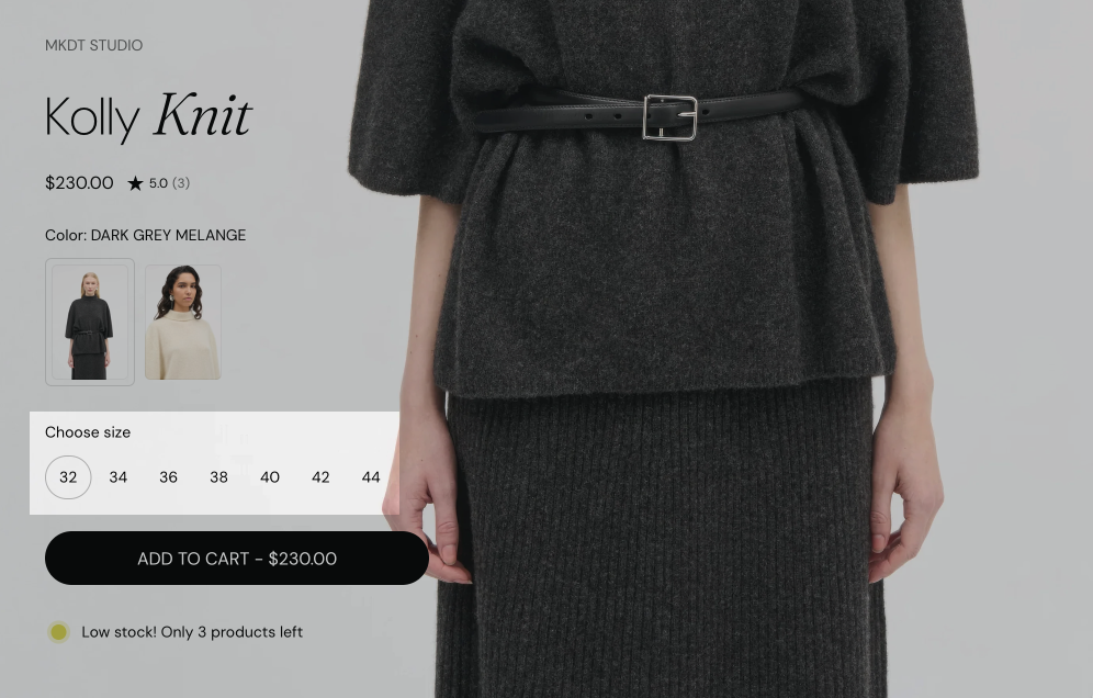
The Product variants block shows one picker per product option, for example Color and Size.
- Variants selector type set to Blocks shows each value as a button. Dropdown shows each option as a select list.
- Handle unavailable variants sets what happens to sold out values:
- Hide removes them from the picker.
- Disable shows them, but customers cannot select them.
- Show keeps them selectable, and the buy button then says the variant is sold out.
Color options show as swatches only when Theme settings → Color swatches & size options → Show color swatches is on. Display mode sets what the swatches show:
- Color swatch uses the colors and images of Shopify's category metafields.
- Variant image uses each variant's image. A variant without an image shows an empty swatch.
See Color swatches & size options theme settings.
Size guide
The Product variants block can show a size guide link next to the size option. The content of the size guide is a regular Shopify page.
Create the size guide page
Open Shopify admin → Online Store → Pages and select Add page. Add the size chart as the page content, for example as a table, and save.
Select the page in the Product variants block
In the theme editor, open Products → Default product → Product page → Product information → Product variants → Size guide. Select the page in Size guide page.
Check the option name
Make sure the name of your size option, in lower case, is in Size guide option names. The default list covers size, format, größe, talla, taille, dimension, mărime, dimensione, tamanho and 寸法. Add your option name, separated by a comma, if it is missing.
Set how the guide opens
Set Open options: Popup shows the page content in a modal on the product page, Same window and New window open the page. Turn Show icon on or off. Since Seventh 2.0.0, the size guide link can show an icon.
The link appears only when a Size guide page is selected and the product has an option whose name is in Size guide option names.
Buy buttons
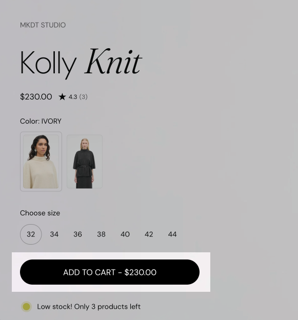
- Show "pre-order" button label changes the button text of available variants from "Add to cart" to "Pre-Order". It only changes the label.
- Show dynamic checkout buttons shows Shopify's accelerated checkout buttons, such as Shop Pay, PayPal or Apple Pay, under the add to cart button.
- When Select the first available variant by default is off in the Product page section, the button says "Select options" until the customer selects a variant.
Shopify controls which accelerated checkout buttons appear, based on the payment methods of your store and the customer's device, not Seventh. See Accelerated checkout buttons.
This block handles pre-order states and gift-card recipient fields when applicable.
Product siblings
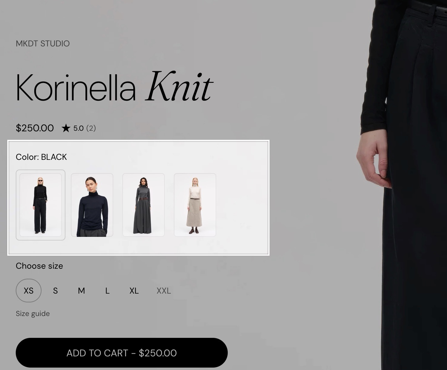
Product siblings are separate products that you link together and show as swatches, for example one product per color.
- The Product siblings block lists the products in its Products setting.
- To give each product its own list, connect Products to a product list metafield.
Create the metafield
Create a "product list" type metafield under your store's Settings → Metafields and metaobjects → Products: select Add definition and choose the type Product, with the option List of products.
Fill in the siblings
For each product that needs to have "siblings", select all the products that are connected or considered variants of the main product, including the product you are on.
Connect the block
In the theme editor, add the Product siblings block to the product page (inside Product information) and to the product card. Select the dynamic source icon next to Products and choose the metafield you've created, which contains all the adjacent products.
Tip: Put the sibling products in the same order for all products, for a true "variants" feel.
Display mode sets what each swatch shows:
- Product thumbnail shows the featured image of the sibling.
- Custom color shows a color from a color metafield on each sibling product. The metafield is entered in Theme settings → Color swatches & size options. See Color swatches & size options theme settings.
Hide when product has only one sibling (default: on) hides the swatches when the list has one product or none. The heading still shows while Show heading when product has only one sibling is on. Turn that off to hide the whole block on products without siblings.
In product cards, the swatch look, Display mode and Hide when product has only one sibling come from Color swatches & size options theme settings instead. For mini product blocks (search drawer, cart recommendations, hotspots), type the same metafield reference in Mini product block theme settings → Product siblings metafield reference.
Custom property
The Custom property block collects input from the customer, such as an engraving text. The input is saved as a line item property on the cart item and the order. It was added in Seventh 1.1.0.
- In Products → Default product → Product page → Product information, select Add block and choose Custom property.
- Set Type: Text for free input, Checkbox for a yes or no choice (for example gift wrapping a single item), Dropdown for a fixed list of values.
- Set Label, for example "Engraving text", turn on Required if the field must be filled, and set Maximum characters if needed.
- Add one Custom property block per field.
- Hide at checkout keeps the property on the order but hides it from the order summary.
Can I take pre-orders with Seventh?
Only as a label. Seventh does not support taking pre-orders with special payment terms. Use a pre-order app for deposits or delayed charges, and assign a separate product template with Show "pre-order" button label turned on to the pre-order products.
Can I use a different size guide for some products?
Yes. Create a second product template with its own Product variants block and assign it to those products.
Can I add a price to a custom property?
No. Seventh does not support adding a price to a custom property. Use a product options app for paid personalization.
All Product variants and buy buttons blocks settings
Every setting on this page, one list per section or block, with its type and default.
Where to find it: Products → Default product → Product page → Product information → Product variants. It is also available in: Featured product card, Content group.
Displays product variants from parent product.
Variants selector type (dropdown, default: Blocks): Sets how option values are picked: Blocks shows each value as a button, Dropdown shows a select list per option. Options: Blocks, Dropdown.
Handle unavailable variants (dropdown, default: Disable): Sets how sold out values show: Hide removes them, Disable shows them but they cannot be selected, Show keeps them selectable. Options: Hide, Disable, Show.
Product variants block: Color swatches
Where to find it: Products → Default product → Product page → Product information → Product variants → Color swatches
Size (dropdown, default: Square: Regular): Sets the swatch size. The Thumbnail sizes show a large preview that uses the image aspect ratio from Theme settings → Color swatches & size options. Options: Square: Small, Square: Regular, Square: Large, Thumbnail: XLarge, Thumbnail: XXLarge.
Display mode (dropdown, default: Variant image): Sets what color swatches show: Variant image uses each variant's image, Color swatch uses the colors from Shopify's category metafields. Swatches need Show color swatches turned on in Theme settings → Color swatches & size options. Options: Variant image, Color swatch.
Show variant image on hover (checkbox, default: off): Shows the variant image in a small tooltip when the customer hovers a color swatch. Shown only when Display mode is Color swatch.
Product variants block: Size guide
Where to find it: Products → Default product → Product page → Product information → Product variants → Size guide
Size guide option names (text field, default: "size,format,größe,talla,taille,dimension,mărime,dimensione,tamanho,寸法"): Sets the option names, in lower case and separated by commas, next to which the size guide link appears.
Size guide label (text field, default: "SIZE GUIDE").
Show icon (checkbox, default: on).
Size guide page (page picker): Sets the Shopify page whose content is the size guide. The link shows only when a page is selected.
Open options (dropdown, default: Popup): Sets how the size guide opens: Popup shows the page content in a modal, Same window and New window open the page. Options: Popup, Same window, New window.
Product variants block: Typography
Where to find it: Products → Default product → Product page → Product information → Product variants → Typography
Text size (dropdown, default: Small). Options: XXSmall, XSmall, Small, Medium, Large, XLarge.
Text weight (dropdown, default: Bold). Options: Normal, Bold.
Case (dropdown, default: Default). Options: Default, Uppercase.
Reduced text opacity (checkbox, default: off): Shows the text at 62 percent opacity (69 percent on dark color schemes), for secondary text such as captions or notes.
Where to find it: Products → Default product → Product page → Product information → Product siblings. It is also available in: Featured product card, Content group.
To assign a different list to each product, use a product reference list metafield as a dynamic source.
Heading (text field, default: "Sibling products").
Products (products picker): Sets the linked products shown as swatches. Connect it to a product list metafield to give each product its own siblings.
Swatch size (dropdown, default: Square: Regular). Options: Square: Small, Square: Regular, Square: Large, Thumbnail: XLarge, Thumbnail: XXLarge.
Display mode (dropdown, default: Product thumbnail): Sets what each sibling swatch shows: the sibling's featured image, or a color from the custom color metafield set in Theme settings → Color swatches & size options. Options: Product thumbnail, Custom color.
The custom color requires a metafield which needs to be set up in Theme Settings. See Color swatches & size options theme settings. Shown only when Display mode is Custom color.
Show featured image on hover (checkbox, default: off): Shows the sibling's featured image in a tooltip when the customer hovers a color swatch, on desktop. Shown only when Display mode is Custom color.
Hide when product has only one sibling (checkbox, default: on): Hides the swatches when the product has one sibling or none.
Show heading when product has only one sibling (checkbox, default: on): Keeps the heading visible when the swatches are hidden because there is only one sibling. Turn it off to hide the whole block. Shown only when Hide when product has only one sibling is on.
Product siblings block: Typography
Where to find it: Products → Default product → Product page → Product information → Product siblings → Typography
Text size (dropdown, default: Small). Options: XXSmall, XSmall, Small, Medium, Large, XLarge.
Text weight (dropdown, default: Bold). Options: Normal, Bold.
Case (dropdown, default: Default). Options: Default, Uppercase.
Reduced text opacity (checkbox, default: off): Shows the text at 62 percent opacity (69 percent on dark color schemes), for secondary text such as captions or notes.
Where to find it: Products → Default product → Product page → Product information → Buy buttons. It is also available in: Featured product card.
Show quantity selector (checkbox, default: on).
Show price (checkbox, default: on): Shows the price inside the add to cart button.
Update price based on quantity (checkbox, default: off): Multiplies the price in the button by the selected quantity. Shown only when Show price is on and Show quantity selector is on.
Show "pre-order" button label (checkbox, default: off): Changes the button label of available variants to "Pre-Order". It changes only the label, not how the order is paid or shipped.
Show dynamic checkout buttons (checkbox, default: on): Using the payment methods available on your store, customers see their preferred option, like PayPal or Apple Pay. Shopify Help Center.
Show recipient information form for gift card products (checkbox, default: off): Gift card products can optionally be sent direct to a recipient along with a personal message.
Where to find it: Products → Default product → Product page → Product information → Custom property. It is also available in: Featured product card.
Line item properties allow you to gather customization details for a product added to the cart.
Label (text field, default: "Custom property").
Type (dropdown, default: Text): Sets the input type: a text field, a checkbox or a dropdown list. Options: Text, Checkbox, Dropdown.
Required (checkbox, default: off): Customers must fill out this field to add the product to the cart.
Hide at checkout (checkbox, default: off): If checked, the line item property will not be shown in the order summary.
Custom property block: Text property settings
Where to find it: Products → Default product → Product page → Product information → Custom property → Text property settings
Allow long text (checkbox, default: off): Shows a multi-line text area instead of a one-line field. Shown only when Type is Text.
Maximum characters (number): Limits how many characters the customer can enter. Leave empty for no limit. Shown only when Type is Text.
Custom property block: Checkbox property settings
Where to find it: Products → Default product → Product page → Product information → Custom property → Checkbox property settings
Value (text field, default: "Yes"): Appears on the order summary. Shown only when Type is Checkbox.
Custom property block: Dropdown property settings
Where to find it: Products → Default product → Product page → Product information → Custom property → Dropdown property settings
Values (text field, default: "Value 1,Value 2,Value 3"): Separate values by a comma. Shown only when Type is Dropdown.
Default value (checkbox, default: on): When on, no value is selected when the page opens, so the customer must choose one.
Related pages
- Product page: the Product page section and the Select the first available variant by default setting.
- Product information blocks: title, price, vendor and the other content blocks.
- Product availability blocks: stock messages, pickup availability and back in stock alerts.
- Color swatches & size options theme settings: swatch style, product siblings colors and size option names.
- Product card: product siblings and swatches in product grids.
- Using variant metafields in product pages: show variant-specific details.
Product information blocks
The Product information blocks in Seventh: product title, vendor, price, rating, badges, SKU, tax info, description and share on the product page.
Product availability blocks
The Product availability blocks in Seventh: Inventory availability, Pickup availability and Back in stock alert on the product page.