Product card
The Product card in Seventh shows a product with image, title, price, swatches and badges inside grids, sliders and mega menus.
Applies to: Seventh 4.0.0 and later. Added in: Seventh 1.0.0. Last checked: 2026-10-12 against Seventh 4.0.0.
The Product card shows one product with blocks that read their content from that product: its image, title, price, swatches, badges and more. A card is a block that holds other blocks. Product grids, collection pages and search results use one Product card for every product they show.
Where to find it: select the Product card inside a Featured collection section, the collection page Collection grid or the search results, or select Add block inside a Custom grid section and choose Product card to show a single product.
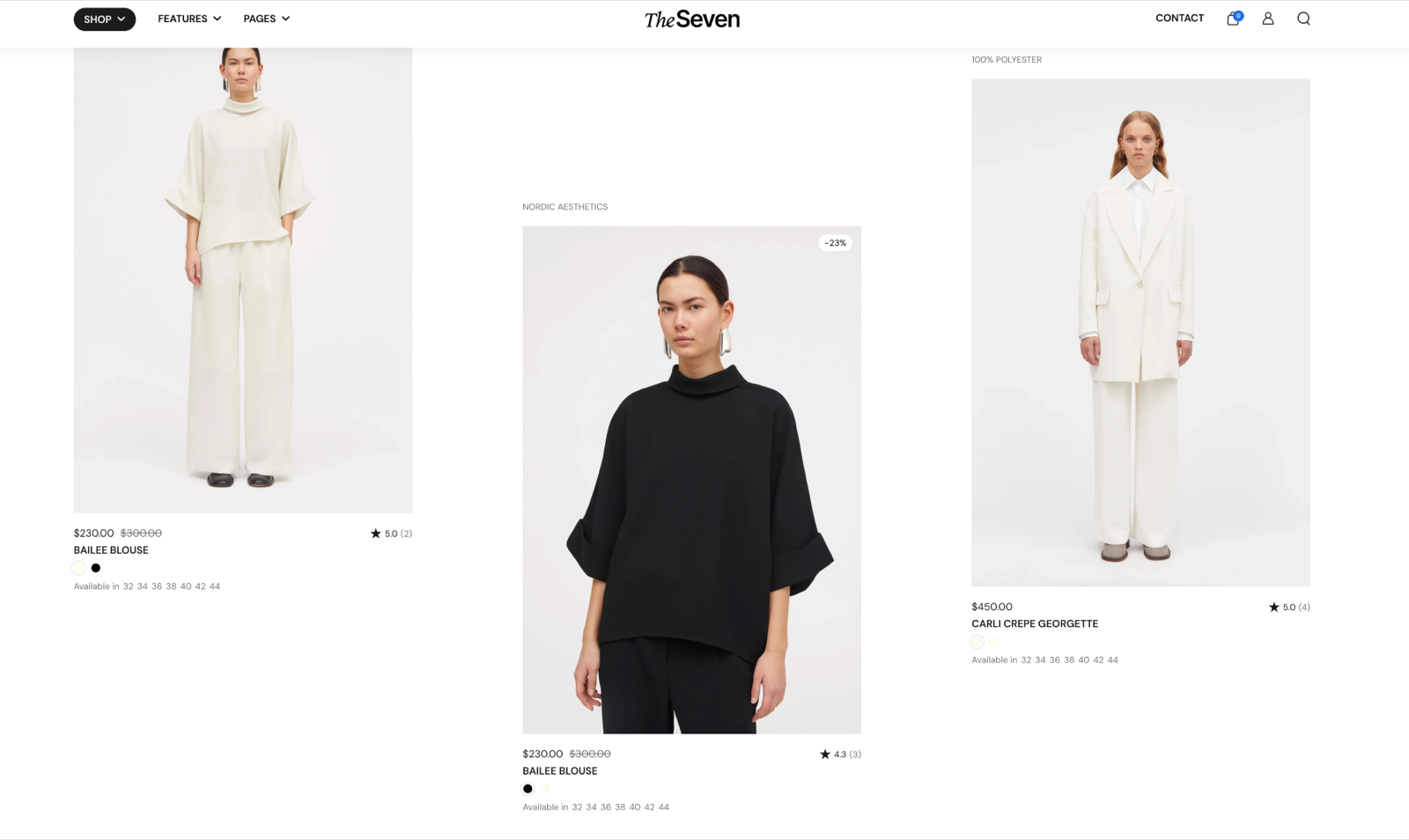
Where you can use it
- In product lists: Featured collection and Featured collection: tabs sections, the Collection grid of the collection page, the search results, Product recommendations and Shop the look sections. You style one card, and it repeats for every product. The products come from the section, so leave Product empty.
- For a single product: Custom grid section, Promotions cards in the Navigation drawer section and Mega menu in the Header section. Select the product in Product.
Card style
Card style sets where the card's look comes from:
- Default uses the card style from Theme settings → Product card → Card style, so all product cards set to Default look the same.
- Custom (the default value) uses this card's own Text alignment, Inner blocks spacing, Padding, Add padding to media elements, Remove card background, Corner radius and Color scheme.
In order to have a consistent design across your store, we've grouped generic product card settings, such as quick buy options, thumbnail related style and more, under Theme settings → product card.
Blocks you can add
A Product card accepts these product blocks, plus any theme block and app blocks:
- Product thumbnail: the product image, with badges and the Quick buy button on top. Its look (aspect ratio, second image on hover, product video) is set in Theme settings → Product card → Media thumbnail.
- Product title, Product price, Product vendor, Product rating and Product badges: see Product information blocks for their settings.
- Color swatches & size: the color swatches and size options of the product. It has no settings of its own; the swatch style comes from Color swatches & size options theme settings.
- Product siblings: swatches that link to other products, see the next section.
- Content group: groups product blocks in a row or column. Inside a Content group you can also add Product SKU / barcode and Product tax info.
Setting up product siblings
Product siblings are separate products shown as swatches, for example one product per color. You list each product's siblings in a product list metafield and connect the Product siblings block's Products setting to it; in cards, the swatch look and Hide when product has only one sibling are in Color swatches & size options theme settings.
The steps are on Product variants and buy buttons blocks.
Why does the Product rating block show nothing?
The product has no rating metafield. The block reads the standard Shopify reviews.rating and reviews.rating_count metafields that review apps write, so use a review app that writes them.
You can add ratings from other apps that have their custom widgets as app blocks as well, however, we can't offer support or a specific design for these.
All Product card settings
Every setting on this page, one list per section or block, with its type and default.
Accepts these blocks: Product title, Product thumbnail, Product price, Product vendor, Product rating, Color swatches & size, Product siblings, Product badges, Content group, any theme block and app blocks.
Product (product picker): Selects the product the card shows. Leave it empty in product grids, collection pages and search results, where the section sets the product of each card.
Product card: Card style
Where to find it: Custom grid → Product card → Card style
Card style (dropdown, default: Custom): Sets where the card look comes from. Default uses Theme settings → Product card → Card style; Custom uses the settings below for this card only. Options: Default, Custom.
Text alignment (alignment, default: Left). Shown only when Card style is Custom.
Inner blocks spacing (dropdown, default: Small). Options: XXSmall, XSmall, Small, Regular, Large, XLarge. Shown only when Card style is Custom.
Padding (dropdown, default: Regular). Options: XSmall, Small, Regular, Large, XLarge, XXLarge. Shown only when Card style is Custom and Remove card background is off.
Add padding to media elements (checkbox, default: on): Adds the card padding around the Product thumbnail and other media blocks inside the card. Shown only when Card style is Custom and Remove card background is off.
Remove card background (checkbox, default: off): Removes the card background color and the padding around the card content. Shown only when Card style is Custom.
Corner radius (dropdown, default: None): Sets the corner rounding of the card itself, not of the blocks inside it. Options: None, Slighty rounded, Rounded, Fully rounded. Shown only when Card style is Custom and Remove card background is off.
Color scheme (color scheme, default: Scheme 2). Shown only when Card style is Custom.
Where to find it: Custom grid → Product card → Product thumbnail.
Displays thumbnail from parent product.
Corner radius (dropdown, default: None): Sets the corner rounding of the product image. The aspect ratio, second image on hover and Quick buy are set in Theme settings → Product card. Options: None, Slighty rounded, Rounded, Fully rounded.
Where to find it: Custom grid → Product card → Product siblings. It is also available in: Content group.
To assign a different list to each product, use a product reference list metafield as a dynamic source. See Product variants and buy buttons blocks.
Products (products picker): Selects the sibling products. Connect it to a product list metafield as a dynamic source to give each product its own list.
Where to find it: Custom grid → Product card → Color swatches & size. It is also available in: Content group.
Displays color swatches and size variant from parent product.
Related pages
- Product card theme settings: the media thumbnail, Quick buy and default card style of all product cards.
- Product badges theme settings: the badges on the thumbnail and in the Product badges block.
- Featured collection section: a product grid that uses this card.
- Collection page: the collection grid that uses this card.
- Search page: shows product results with this card.
- Shop the look: product slider section: shows products next to hotspots with this card.
- Seventh video guides: a video about product cards and collection grids.
Cards
Cards in Seventh: the styled containers inside sections that hold blocks, such as the Product card or the Promo card, and the page that documents each one.
Collection card
The Collection card in Seventh shows a collection with its image, title, product count and description in grids, lists and mega menus.