Rich text card
The Rich text card in Seventh holds headings, text, buttons and optional media inside the Rich text grid section.
Applies to: Seventh 4.0.0 and later. Added in: Seventh 1.0.0. Last checked: 2026-10-12 against Seventh 4.0.0.
The Rich text card places an image or video next to a column of text blocks, inside the Rich text grid section. A card is a block that holds other blocks: the text side is built from blocks such as Heading, Text, Caption and Button.
Where to find it: select Add block inside a Rich text grid section, then choose Rich text card or Rich text card: complex.
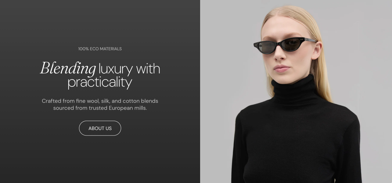
Presets
- Rich text card: a Heading and a Text block, centered, with the media on the left.
- Rich text card: complex: three Content groups (two Captions, a Heading with Text, two more Captions), with the media on the right. Inner content alignment (for desktop) is set to Stretch, so the groups spread over the full card height.
Both presets are the same block, with the settings listed on this page.
Media and text layout
- Media position puts the media on the left or right on desktop. Media position on mobile puts it above or below the text. Don't show media hides the media and turns the card into a text-only card.
- Media width sets how much of the card width the media takes: 25%, 33%, 50% or 75%.
- Minimum media aspect ratio sets the smallest shape of the media area. When the text needs more height, the card grows and the media is cropped to fill it.
- Text container width narrows the text column inside the card. Small and Medium are wider on mobile.
Common use cases
- Brand storytelling: an image or video with text about your brand, values or mission. Works well on about pages and the homepage.
- Product education: features, materials or care instructions next to supporting visuals.
- Marketing messages: headings, text and buttons for promotions, announcements or seasonal messages.
- Text-only content: hide the media and use the card as a text container for policies, FAQs or other information.
Can the Rich text card use different alignment on mobile?
Yes. Turn on Custom mobile style in Rich text card → Mobile style, then set the mobile Text alignment and Inner blocks spacing. Since Seventh 3.0.0.
How do I make the whole Rich text card clickable?
Set Link in Rich text card → Card link. The whole card becomes a link, and that link takes priority over the links of the blocks inside the card. Since Seventh 3.0.0.
All Rich text card settings
Every setting in this group, with its type and default.
Accepts these blocks: Content group, any theme block and app blocks.
Image (image).
Video (video): Shows a video in the media area. When both are set, the video replaces the image.
Minimum media aspect ratio (dropdown, default: Short (4:3)): Sets the smallest shape of the media area. When the text needs more height, the card grows and the media is cropped to fill it. Options: Wide (2:1), Landscape (16:9), Standard (3:2), Short (4:3), Square (1:1), Tall (5:6), Taller (2:3).
Media position (dropdown, default: On the right). Options: On the left, On the right, No media: Don't show media.
Media position on mobile (dropdown, default: Above the text). Options: Above the text, Below the text, No media: Don't show media. Shown only when Media position is not No media: Don't show media.
Media width (dropdown, default: 50%): Sets the share of the card width that the media takes on desktop. Options: 25%, 33%, 50%, 75%.
Rich text card: Text content
Where to find it: Rich text grid → Rich text card → Text content
Text container width (dropdown, default: Large): Sets the width of the text column inside the card. Small and Medium are wider on mobile. Options: Small, Medium, Large.
Inner content alignment (for desktop) (dropdown, default: Center): Sets the vertical position of the text blocks on desktop. Stretch spreads them over the full card height. Options: Top, Center, Bottom, Stretch.
Stretch type (dropdown, default: Space between): Sets how the text blocks are spread when Inner content alignment is Stretch: with the space between them, or also around them. Options: Space between, Space around. Shown only when Inner content alignment (for desktop) is Stretch.
Rich text card: Card link
Where to find it: Rich text grid → Rich text card → Card link
Link (link): Makes the whole card a link. This link takes priority over links inside the card.
Open link in a new window (checkbox, default: off). Shown only when Link is set.
Link text (text field): Hidden on the storefront. Used for screen readers and SEO. Shown only when Link is set.
Rich text card: Card style
Where to find it: Rich text grid → Rich text card → Card style
Text alignment (alignment, default: Left).
Inner blocks spacing (dropdown, default: Small). Options: XXSmall, XSmall, Small, Regular, Large, XLarge.
Padding (dropdown, default: Regular). Options: XSmall, Small, Regular, Large, XLarge, XXLarge. Shown only when Remove card background is off.
Add padding to media elements (checkbox, default: on): Adds the card padding around the media area. Shown only when Remove card background is off.
Remove card background (checkbox, default: off): Removes the card background color and the padding around the card content.
Corner radius (dropdown, default: None): Sets the corner rounding of the card itself, not of the blocks inside it. Options: None, Slighty rounded, Rounded, Fully rounded. Shown only when Remove card background is off.
Color scheme (color scheme, default: Scheme 2).
Rich text card: Mobile style
Where to find it: Rich text grid → Rich text card → Mobile style
Custom mobile style (checkbox, default: off): Uses a separate Text alignment and Inner blocks spacing on mobile.
Text alignment (alignment, default: Left). Shown only when Custom mobile style is on.
Inner blocks spacing (dropdown, default: Small). Options: XXSmall, XSmall, Small, Regular, Large, XLarge. Shown only when Custom mobile style is on.
Related pages
- Rich text grid section: the only section that uses the Rich text card.
- Content group block: groups blocks inside the card.
- Heading block: the main text block of the card.