Shop the look card
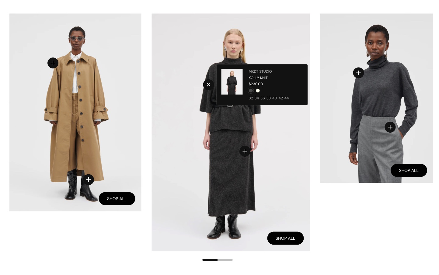
The Shop the look card in Seventh shows an image with product and text hotspots that customers tap to see and buy the products.
Applies to: Seventh 4.0.0 and later. Added in: Seventh 1.0.0. Last checked: 2026-10-12 against Seventh 4.0.0.
The Shop the look card shows an image or video with hotspots on it: each hotspot opens a tooltip with a product or with your own text. A card is a block that holds other blocks; this card holds Product hotspot and Text hotspot blocks.
Where to find it: select Add block inside a Custom grid section, then choose Shop the look card. The Shop the look section is a Custom grid preset that already contains this card.
Card button
The card button is an optional button on a corner of the media, for example "Shop the collection".
- It appears when you type a Label in Shop the look card → Card button.
- Position chooses the corner, and Link the destination.
Hotspots
The card holds two kinds of hotspot. Both show a plus icon on the media, and each hotspot's Color scheme colors the icon and its tooltip.
Product hotspot
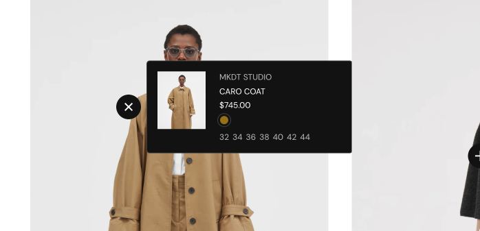
Selecting it opens a tooltip with the product, shown as a mini product block (image, title, price and swatches). Its look comes from Mini product block theme settings.
Text hotspot
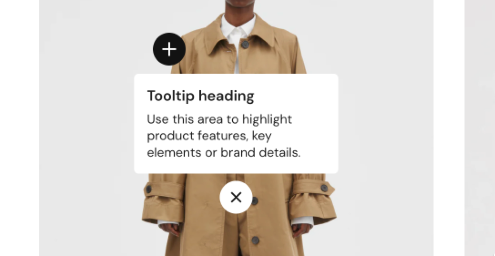
It opens a tooltip with your own Text, Button and Icon blocks, for example to explain a material or a detail.
Adding a product hotspot
Set the media
Select the Shop the look card and choose an Image or Video.
Add the hotspot
Select Add block inside the card, choose Product hotspot, then select the Product.
Place the hotspot
Set Vertical position and Horizontal position in percent of the media, from the top-left corner. 50 and 50 is the center.
Choose the tooltip side
Set Tooltip position so the tooltip opens toward the inside of the card. A tooltip that opens toward the edge can overflow the screen on mobile.
Common use cases
- Outfits and bundles: a styled image that links several products from the same visual.
- Editorial product stories: lifestyle images with product hotspots, for a magazine-style layout.
- Room or scene inspiration: interiors, desks or other scenes with clickable products.
- Feature callouts: text hotspots that explain details, materials or design choices on the image.
All Shop the look card settings
Every setting on this page, one list per section or block, with its type and default.
Accepts these blocks: Product hotspot and Text hotspot.
Image (image).
Video (video): Plays a muted, looping video as the card media. When both are set, the video replaces the image.
Media overlay (dropdown, default: Color). Options: Color, Gradient.
Overlay color (color with transparency, default: rgba(0,0,0,0.03)). Shown only when Media overlay is Color.
Overlay gradient (gradient, default: linear-gradient(0deg, rgba(0,0,0,0.5) 0%, rgba(0,0,0,0) 100%)). Shown only when Media overlay is Gradient.
Media aspect ratio (dropdown, default: Uncropped: Natural): Sets the shape of the media. Natural keeps the original shape of the image or video. Options: Uncropped: Natural, Cropped: Short (4:3), Cropped: Square (1:1), Cropped: Tall (5:6), Cropped: Taller (2:3).
Shop the look card: Card button
Where to find it: Custom grid → Shop the look card → Card button
Label (text field): Sets the text of an optional button on a corner of the media. The button appears only when this field has text.
Position (dropdown, default: Top left): Sets the corner of the media where the card button sits. Options: Top left, Top right, Bottom left, Bottom right. Shown only when Label is set.
Link (link). Shown only when Label is set.
Open link in a new window (checkbox, default: off). Shown only when Label is set and Link is set.
Shop the look card: Card style
Where to find it: Custom grid → Shop the look card → Card style
Padding (dropdown, default: Regular): Sets the padding between the card edge and the media. Options: XSmall, Small, Regular, Large, XLarge, XXLarge. Shown only when Add padding to media elements is on.
Add padding to media elements (checkbox, default: on): Adds padding between the card edge and the media.
Corner radius (dropdown, default: None). Options: None, Slighty rounded, Rounded, Fully rounded.
Color scheme (color scheme, default: Scheme 2).
Where to find it: Custom grid → Shop the look card → Product hotspot.
Product (product picker): Selects the product shown in the tooltip, as a mini product block.
Product hotspot block: Position
Where to find it: Custom grid → Shop the look card → Product hotspot → Position
Vertical position (slider 0 to 100 %, default: 50 %): Sets the hotspot position from the top edge of the media, in percent.
Horizontal position (slider 0 to 100 %, default: 50 %): Sets the hotspot position from the left edge of the media, in percent.
Tooltip position (dropdown, default: Top): Sets the side of the hotspot where the tooltip opens. Choose a side that points toward the inside of the card, so the tooltip does not overflow on mobile. Options: Top, Bottom, Left, Right, Bottom left, Bottom right, Top left, Top right.
Product hotspot block: Colors
Where to find it: Custom grid → Shop the look card → Product hotspot → Colors
Color scheme (color scheme, default: Scheme 1): Sets the color scheme of the hotspot icon and of its tooltip.
Where to find it: Custom grid → Shop the look card → Text hotspot.
Accepts these blocks: Text, Button and Icon.
Text alignment (alignment, default: Left).
Text hotspot block: Position
Where to find it: Custom grid → Shop the look card → Text hotspot → Position
Vertical position (slider 0 to 100 %, default: 50 %): Sets the hotspot position from the top edge of the media, in percent.
Horizontal position (slider 0 to 100 %, default: 50 %): Sets the hotspot position from the left edge of the media, in percent.
Tooltip position (dropdown, default: Top): Sets the side of the hotspot where the tooltip opens. Choose a side that points toward the inside of the card, so the tooltip does not overflow on mobile. Options: Top, Bottom, Left, Right, Bottom left, Bottom right, Top left, Top right.
Text hotspot block: Colors
Where to find it: Custom grid → Shop the look card → Text hotspot → Colors
Color scheme (color scheme, default: Scheme 1): Sets the color scheme of the hotspot icon and of its tooltip.
Related pages
- Shop the look section: the Custom grid preset that uses this card.
- Shop the look: product slider section: a separate section with hotspots next to a product slider.
- Mini product block theme settings: sets the product shown in a product hotspot tooltip.
- Custom grid section: the section that accepts the Shop the look card.