Promo card
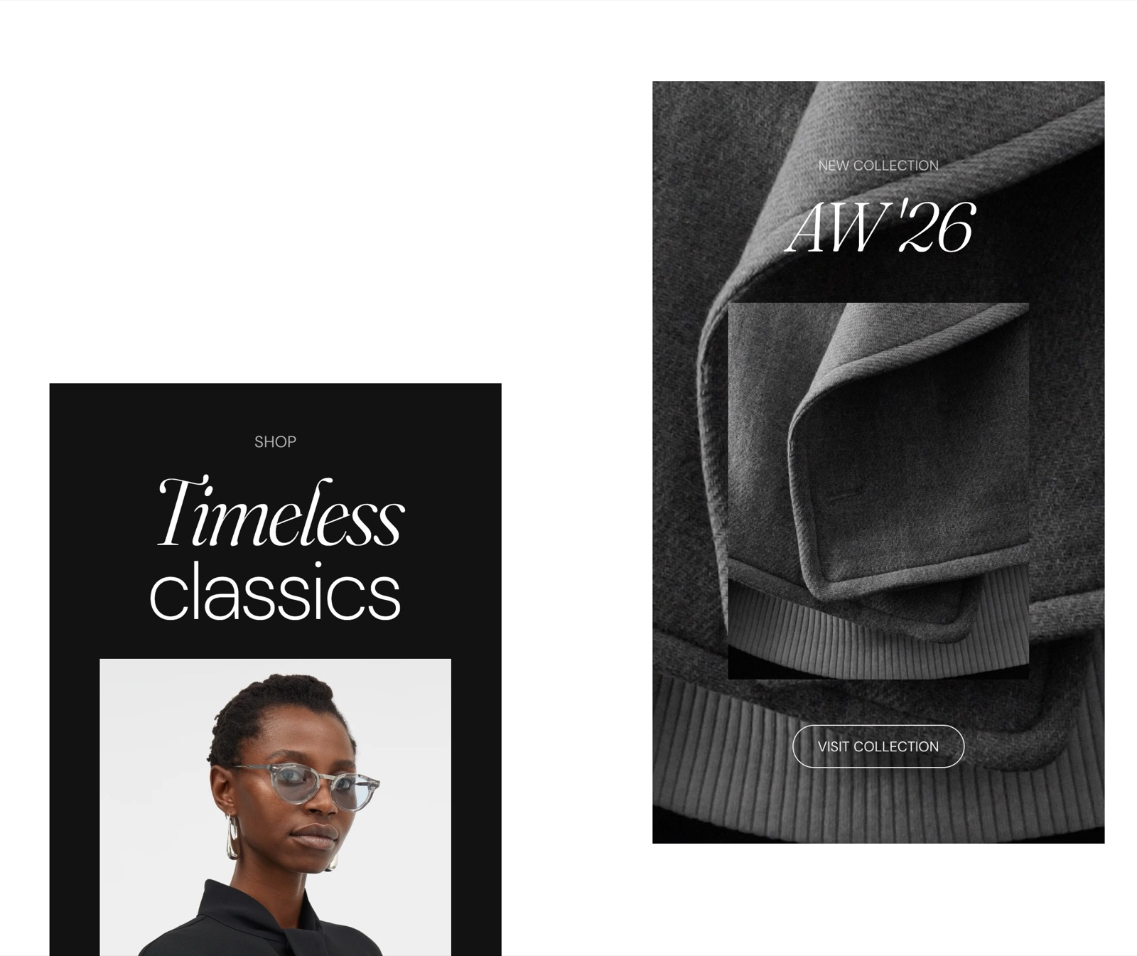
The Promo card in Seventh adds a promotion card with media, text and a link at a chosen position inside collection and product grids.
Applies to: Seventh 4.0.0 and later. Added in: Seventh 1.0.0. Last checked: 2026-10-12 against Seventh 4.0.0.
The Promo card is a card that you place between the products or collections of a grid, to show a promotion, a message or a link. A card is a block that holds other blocks: you build the content of a Promo card from blocks such as Heading, Text, Button and Image.
Where to find it: select Add block inside a Featured collection, Featured collection: tabs, Collections list, Collection grid or Collections list grid section, then choose Promo card.
What it does
The card shows:
- your own blocks for the content;
- an optional link on the whole card;
- an optional background image or video;
- layout and spacing controls;
- an optional position in the grid, in list sections.
Seventh includes several presets of the promo card to help you get started, but essentially, all of these are variations of the same component.
Where you can add it
- Featured collection and Featured collection: tabs, on any page.
- Collections list, on any page.
- Collection grid, on the collection page (Collections → Default collection).
- Collections list grid, on the collections list page.
Inside the card you can add a Content group, any theme block and app blocks.
Card style and height
The Card style and Card height settings set the card's alignment, spacing, padding, corners and color scheme. Minimum height keeps the card at least that tall, however little content it holds.
Making the whole card clickable
- Set Link in Promo card → Card link. The whole card becomes a link, and it takes priority over the links of the blocks inside the card.
- Fill in Link text so screen readers can announce where the card goes. The text is not shown on the storefront.
Background media
- Turn on Show media background (available while Remove card background is off), then set a Background image, a Background video or both.
- The video autoplays muted and in a loop, and it replaces the image when both are set.
- Media overlay adds a color or a gradient over the media.
Custom placement in the grid
Custom placement is an option that cards have inside a few sections:
- Collection grid
- Collection list
- Featured collection
Set Custom placement in the grid to the position you want. Seventh inserts the card after the item at that position:
- 1 puts the card in the second slot, after the first product.
- 4 puts it after the fourth product.
- 0 (the default) puts the card at the end of the grid.
The setting shows only when the section shows products or collections: its Products per page is more than 0, or Collections is set.
On the collection page, the Collection grid is paginated:
- Seventh 4.0.0 counts the position from the first product of each page, not across the whole collection.
- The Promo card shows on every page, at the same position. 0 puts it after the last product of each page.
- A position higher than the number of products on a page shows no card on that page. With Products per page at 12, a card set to 13 never shows.
- You cannot show a Promo card on one page of the collection only. Keep the position no higher than Products per page.
Common use cases
- Sales and promotions: discounts, limited-time offers or special campaigns.
- Announcements: new launches, restocks or upcoming events.
- Value propositions: shipping benefits, guarantees or sustainability messages.
- Calls to action: send customers to specific collections, products or signup pages.
Why is the Promo card height setting not working?
The section's Cards alignment is set to Stretch. With Stretch, every card takes the height of the row, and the card's Minimum height and Vertical alignment are hidden. Change Cards alignment in the section to use them.
Why does the background video not play on mobile?
The phone is in low power mode. Mobile browsers block autoplaying video in low power mode, so the card shows the Background image instead, when you set one. This is a browser limit, not a Seventh setting.
How do I show a Promo card full width on mobile?
Set Card size on mobile to Large. The card then spans both columns when the grid shows 2 columns on mobile. The setting shows only when the section's Layout is Grid, Cards size on mobile is Small and Cards size is not XLarge. Since Seventh 3.0.0.
Is the Promo card in the Custom grid section the same block?
No. The Promo card block on this page goes inside product and collection grids, and has Custom placement in the grid and Card size on mobile. In the Custom grid section (and its Promotions preset), "Promo card" is a preset of the Card block, with no placement setting. Its settings are on Blank card.
What can the Promo card not do?
- Seventh does not support Promo cards in the Search results grid, the Blog grid or the Product recommendations section. Use a Featured collection section with a Promo card on the same page instead.
- In the Featured collection: tabs section, Promo cards show only among the products of the first tab, not in the later tabs. See Featured collection: tabs section.
All Promo card settings
Every setting in this group, with its type and default.
Accepts these blocks: Content group, any theme block and app blocks.
Promo card: Custom placement
Where to find it: Collections list → Promo card → Custom placement
You can insert cards for promotional purposes at specific positions in the grid. Shown only when the section's Products per page is more than 0, or the section's Collections is set.
Custom placement in the grid (slider 0 to 50, default: 0): Sets the position of the card in the grid: the card is inserted after the item at that position. 0 places it at the end of the grid. Shown only when the section's Products per page is more than 0, or the section's Collections is set.
Promo card: Card style
Where to find it: Collections list → Promo card → Card style
Text alignment (alignment, default: Left).
Inner blocks spacing (dropdown, default: Small). Options: XXSmall, XSmall, Small, Regular, Large, XLarge.
Padding (dropdown, default: Regular). Options: XSmall, Small, Regular, Large, XLarge, XXLarge. Shown only when Remove card background is off.
Add padding to media elements (checkbox, default: on): Adds the card padding around Image and Video blocks inside the card. It does not affect the card background media. Shown only when Remove card background is off.
Remove card background (checkbox, default: off): Removes the card background color and the padding around the card content.
Corner radius (dropdown, default: None): Sets the corner rounding of the card itself, not of the blocks inside it. Options: None, Slighty rounded, Rounded, Fully rounded. Shown only when Remove card background is off.
Color scheme (color scheme, default: Scheme 2).
Card size on mobile (dropdown, default: Small): Sets the card width on mobile. Large makes the card span the full width when the grid shows 2 columns on mobile. Options: Small, Large. Shown only when the section's Cards size is not XLarge and the section's Cards size on mobile is Small and the section's Layout is Grid.
Promo card: Card height
Where to find it: Collections list → Promo card → Card height
Individual card height settings don't apply if the vertical alignment is set to stretch. Shown only when the section's Cards alignment is Stretch.
Minimum height (dropdown, default: None): Sets a minimum height for the card, however little content it holds. Options: None, XSmall, Small, Medium, Large, XLarge, XXLarge. Shown only when the section's Cards alignment is not Stretch.
Vertical alignment (dropdown, default: Top): Sets where the content sits inside the card when the card is taller than its content. Options: Top, Center, Bottom, Space between, Space around. Shown only when the section's Cards alignment is not Stretch and Minimum height is not None.
Promo card: Card link
Where to find it: Collections list → Promo card → Card link
Link (link): Makes the whole card a link. This link takes priority over links inside the card.
Open link in a new window (checkbox, default: off). Shown only when Link is set.
Link text (text field): Hidden on the storefront. Used for screen readers and SEO. Shown only when Link is set.
Promo card: Background
Where to find it: Collections list → Promo card → Background
Show media background (checkbox, default: off): Shows an image or video behind the card content. Shown only when Remove card background is off.
Background image (image). Shown only when Show media background is on and Remove card background is off.
Background video (video): Plays a muted, looping video behind the card content. When both are set, the video replaces the image, and the image shows while the video loads. Shown only when Show media background is on and Remove card background is off.
Media overlay (dropdown, default: Color). Options: Color, Gradient. Shown only when Show media background is on and Remove card background is off.
Overlay color (color with transparency, default: rgba(0,0,0,0.1)). Shown only when Show media background is on and Remove card background is off and Media overlay is Color.
Overlay gradient (gradient, default: linear-gradient(0deg, rgba(0,0,0,0.5) 0%, rgba(0,0,0,0) 100%)). Shown only when Show media background is on and Remove card background is off and Media overlay is Gradient.
Related pages
- Blank card: the Card block and its "Promo card" preset for the Custom grid section.
- Promotions section: a Custom grid preset made of promotional cards.
- Featured collection section: accepts Promo cards between its products.
- Featured collection: tabs section: accepts Promo cards in the first tab.
- Collections list section: accepts Promo cards between its collections.
- Collection page: its Collection grid section accepts Promo cards.
- Collections list page: its Collections list grid section accepts Promo cards.