Featured collection section
The Featured collection section shows products from one collection as product cards in a grid, editorial layout or slider in Seventh.
Applies to: Seventh 4.0.0 and later. Added in: Seventh 1.0.0. Last checked: 2026-10-12 against Seventh 4.0.0.
The Featured collection section shows products from one collection, or a list of products you pick, as product cards in a grid or a slider on any page.
Where to find it: select Add section in the theme editor, then choose one of the four Featured collection presets: Featured collection: classic, Featured collection: editorial, Featured collection: editorial split or Featured collection: slider.
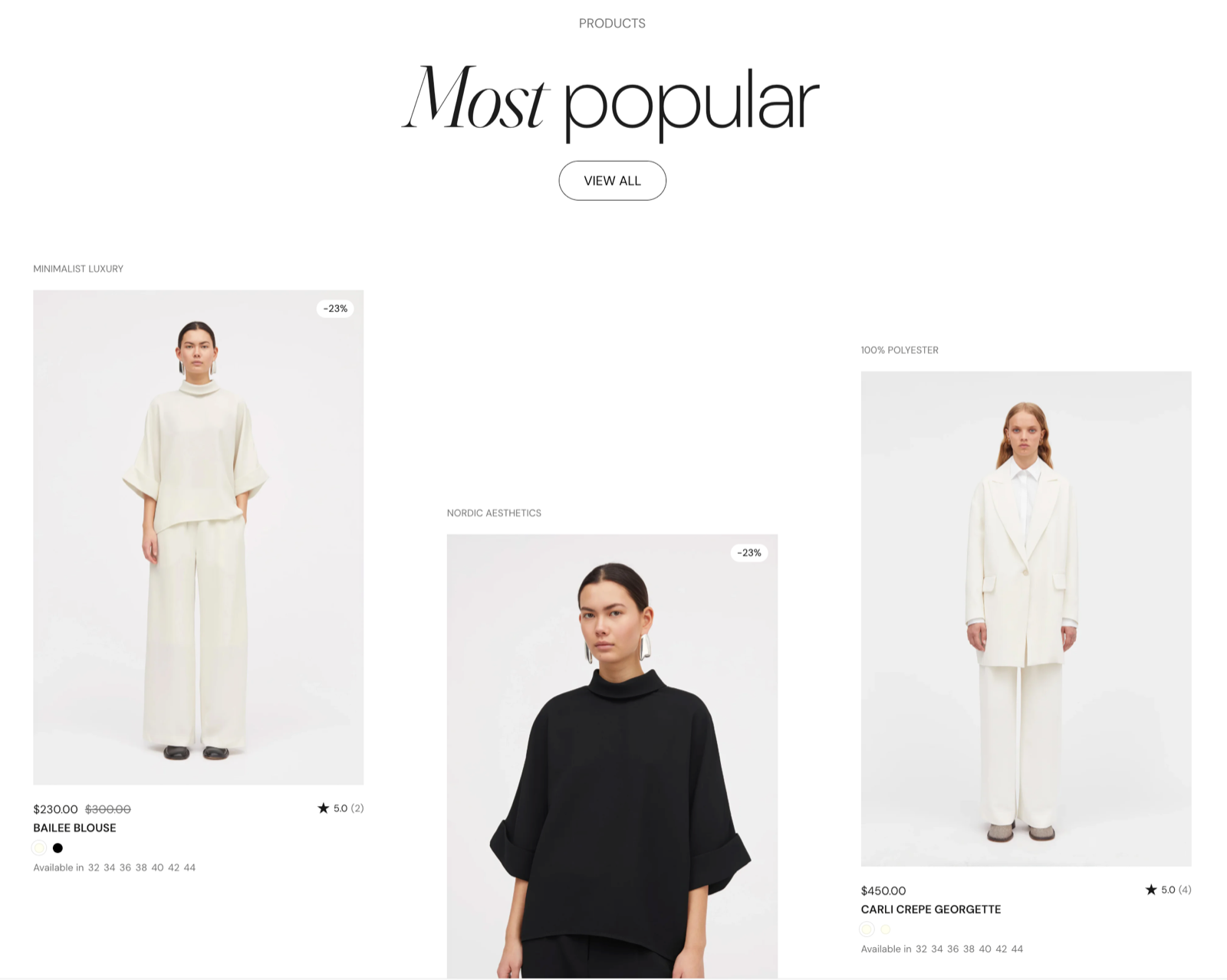
What the section contains
- Product cards: one for each product, built from Product card blocks (thumbnail, vendor, title, price, compact variants). You edit one product card and Seventh repeats it for every product. See Product card.
- Promo cards (optional), placed between the products. See Promo card.
- A section header (optional), for a heading, text and a "View all" button. See General section styling.
The four presets are the same section with different starting settings:
- Featured collection: classic: a regular grid of 4 cards per row.
- Featured collection: editorial: turns on Scatter cards.
- Featured collection: editorial split: also scatters the cards and puts a sticky section header on the left.
- Featured collection: slider: sets Layout to Slider with Randomize card sizes on.
You can change any preset into another by changing those settings.
Choosing the products
Use one of two sources:
- Collection: Seventh shows the products of that collection in the collection's sort order, up to Products per page. To change the order, change the collection's sort order in Shopify admin → Products → Collections.
- Products: Seventh shows the products you pick, in the order you pick them. When Products has products, it replaces Collection.
Products per page also limits a hand-picked Products list, but the setting is shown only when Collection is set.
If you pick more than 6 products and only some appear:
Select a collection for a moment
Set Collection to any collection, so that Products per page is shown.
Raise Products per page
Raise Products per page so that it covers the products you picked.
Remove the collection again
Remove the collection again.
With neither Collection nor Products set, the section shows placeholder product cards, so you can design it before the products exist.
Adding a promo card between the products
Add the promo card
Select the Featured collection section, then select Add block and choose Promo card.
Place the promo card
In the promo card settings, set Custom placement in the grid to the position you want. With the value 0, the card goes after the last product.
Fill the promo card
Add Heading, Text, Image or Button blocks inside the promo card, and set a card link if the whole card should be clickable.
Changing what each product card shows
- Select the product card inside the section and add, remove or reorder its blocks (for example Product vendor, Product price or Product badges).
- The change applies to every product in this section only.
- Store-wide card options, such as Quick buy and the second image on hover, are in Product card theme settings.
Why do the product links go to a collection URL?
Improve product breadcrumb navigation is on in Theme settings → SEO & Other settings and the section uses a Collection. Product links then include the collection, so the product page breadcrumbs can show it. See SEO and other theme settings.
Can the Featured collection section show several collections in tabs?
Not this section. Use the Featured collection: tabs section, which shows one collection per tab.
All Featured collection settings
Every setting in this group, with its type and default.
Accepts these blocks: Promo card.
Collection (collection picker): Sets the collection whose products the section shows, in the collection sort order.
Products per page (slider 1 to 50, default: 6): Sets the maximum number of products shown, from 1 to 50. The limit also applies to a hand-picked Products list. Shown only when Collection is set.
Products (products picker): Sets a hand-picked list of products, shown in the order you pick them. When it has products, it replaces Collection.
Featured collection section: Layout
Where to find it: Featured collection → Layout
Layout (dropdown, default: Grid): Sets how the cards are arranged: Grid shows rows of cards, Slider shows one row that customers swipe or scroll sideways. Options: Slider, Grid.
Cards size (dropdown, default: Medium): Sets how many cards fit in one row on desktop: XSmall 5, Small 4, Medium 3, Large 2, XLarge 1. Seventh shows fewer cards per row on smaller screens. Options: XSmall, Small, Medium, Large, XLarge. Shown only when Position is Top.
Cards size (dropdown, default: Medium): Sets how many cards fit in one row on desktop when the section header is on the left: Small 4, Medium 3, Large 2, XLarge 1. Seventh shows fewer cards per row on smaller screens. Options: Small, Medium, Large, XLarge. Shown only when Position is Left.
Cards size on mobile (dropdown, default: Small): Sets the card size on mobile: Small shows 2 cards per row, Large shows 1. On screens narrower than 375 px, cards always show one per row. Options: Small, Large. Shown only when Cards size is not XLarge.
Cards alignment (dropdown, default: Top): Sets how cards of different heights line up in a row. Stretch makes every card in a row as tall as the tallest one. Options: Top, Center, Bottom, Stretch.
Stretch alignment type (dropdown, default: Space between): Sets where the blocks sit inside each stretched card. Space between pins the first block to the top and the last block to the bottom. Options: Top, Center, Bottom, Space between, Space around. Shown only when Cards alignment is Stretch.
Grid gap (dropdown, default: Default): Sets the space between cards. None places the cards edge to edge. Options: None, Default, XXSmall, XSmall, Small, Regular, Large, XLarge, XXLarge. Shown only when Scatter cards is off, or Layout is Slider.
Featured collection section: Cards arrangement
Where to find it: Featured collection → Cards arrangement
The Featured collection section uses the standard Cards arrangement settings, listed in General section styling.
Scatter cards (checkbox, default: off): Turns on the scattered (editorial) layout: each card moves up or down by a different amount, so the cards no longer sit in straight rows. Shown only when Layout is Grid.
Scatter cards on mobile devices (checkbox, default: off): Keeps the scattered layout on mobile, with half the desktop offset. When off, cards line up in regular rows on mobile. Shown only when Layout is Grid and Scatter cards is on.
Horizontal spacing (dropdown, default: Medium): A larger value will make the cards smaller. Options: XSmall, Small, Medium, Large, XLarge. Shown only when Scatter cards is on and Layout is not Slider.
Vertical scattering (dropdown, default: XSmall): Sets how far each scattered card moves up or down. Options: XSmall, Small, Medium, Large, XLarge. Shown only when Scatter cards is on and Layout is not Slider.
Gap between rows (dropdown, default: XSmall): Sets the vertical space between rows of scattered cards. Options: XSmall, Small, Medium, Large, XLarge. Shown only when Scatter cards is on and Layout is not Slider.
Randomize card sizes (checkbox, default: off). Shown only when Layout is Slider.
Randomize card sizes on mobile devices (checkbox, default: on). Shown only when Layout is Slider and Randomize card sizes is on.
Featured collection section: Section header
Where to find it: Featured collection → Section header
Position (dropdown, default: Top): Sets where the section header sits: Top places it above the cards, Left places it in a column beside them. Options: Top, Left.
Stick to top (checkbox, default: off): Keeps the section header in view while customers scroll through the section, on screens 1024 px wide and larger.
Featured collection section: Section design
Where to find it: Featured collection → Section design
The Featured collection section uses the standard Section design settings, listed in General section styling.
Color scheme (color scheme, default: Scheme 1).
Top padding (dropdown, default: Default). Options: Default, None, Smaller, Larger, Largest.
Bottom padding (dropdown, default: Default). Options: Default, None, Smaller, Larger, Largest.
Extend section width to the edges of the screen (checkbox, default: off). Shown only when Position is Top.
Show media background (checkbox, default: off): Shows a background image or video behind the section content.
Background image (image). Shown only when Show media background is on.
Background image (mobile) (image): Replaces the background image on screens narrower than 768 px. Shown only when Show media background is on and Background image is set.
Background video (video): Plays a muted, looping video behind the section content. When both a video and an image are set, the video is shown. Shown only when Show media background is on.
Media overlay (dropdown, default: Color): Sets the layer over the background media: a flat color or a gradient. Options: Color, Gradient. Shown only when Show media background is on.
Overlay color (color with transparency). Shown only when Show media background is on and Media overlay is Color.
Overlay gradient (gradient, default: linear-gradient(0deg, rgba(0,0,0,0.5) 0%, rgba(0,0,0,0) 100%)). Shown only when Show media background is on and Media overlay is Gradient.
Parallax effect (dropdown, default: Medium): Moves the background media at a different speed than the page while customers scroll. Subtle, Medium and Strong move it by up to 5, 10 and 20 percent. Options: None, Subtle, Medium, Strong. Shown only when Show media background is on.
Push content down (checkbox, default: off): Replaces Top padding with a larger top space, so more of the background media shows above the content. Shown only when Show media background is on.
Make section full height (checkbox, default: off): Makes the section at least as tall as the screen and centers the content vertically.
Related pages
- General section styling: the Section design and Cards arrangement settings this section shares with others.
- Product card: the blocks inside each product card.
- Promo card: the Promo card this section can hold.
- Featured collection: tabs section: several collections in one section, one per tab.
- Featured products list section: one or more products with full product details.