Animated heading section
The Animated heading section shows a large heading whose words reveal or change color as customers scroll in Seventh. This page lists its settings.
Applies to: Seventh 4.0.0 and later. Added in: Seventh 1.0.0. Last checked: 2026-10-12 against Seventh 4.0.0.
The Animated heading section shows a large line of text, with optional inline images, whose color fills in as customers scroll. Use it for a brand statement or a hero message on any page.
Where to find it: select Add section in the theme editor, then choose Animated heading (Add section category Storytelling).
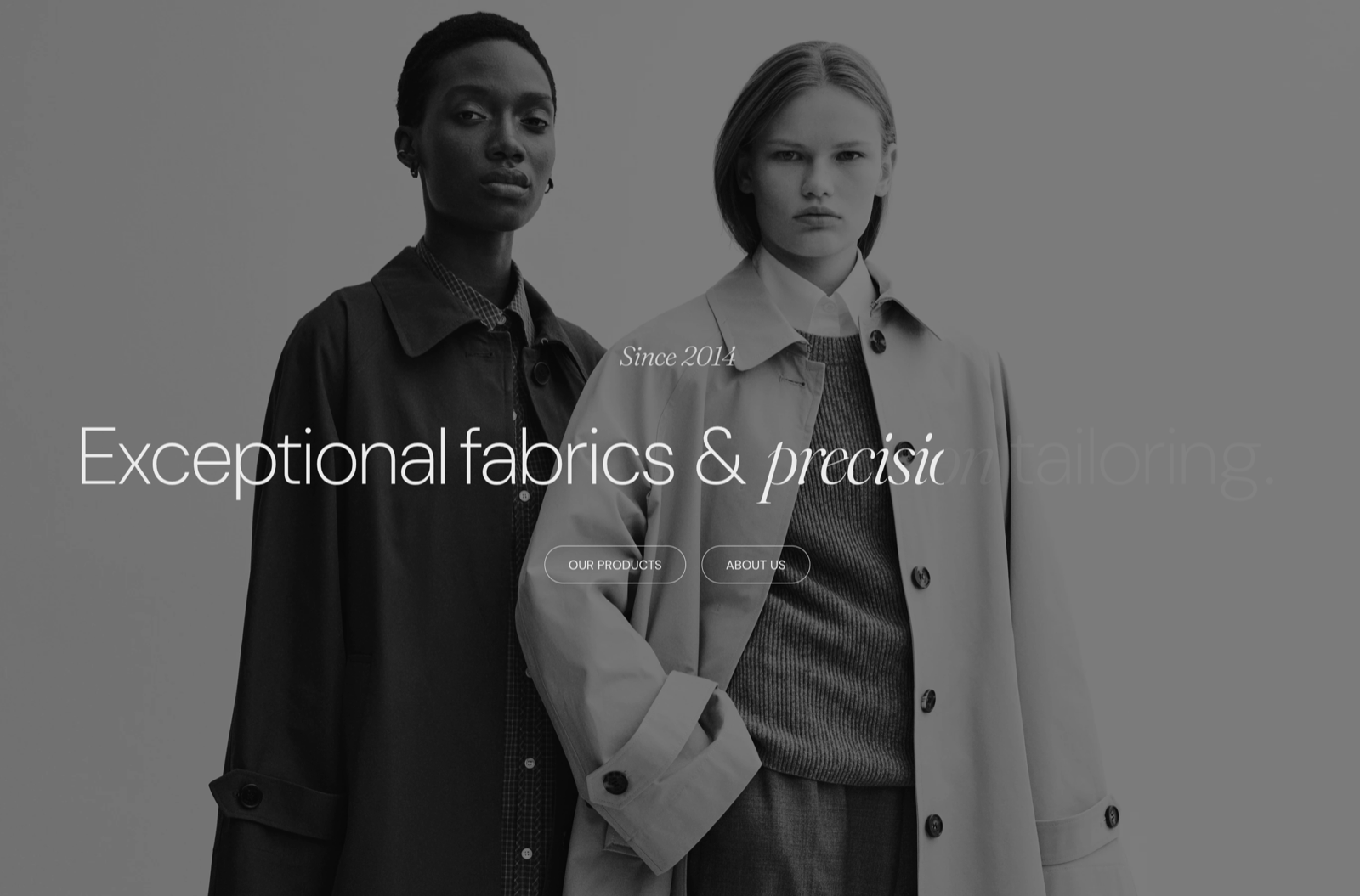
What the section contains
The section has three fixed parts, in this order:
- A section header above the text. The preset puts a Heading block in it.
- The Animated heading block, which holds the animated text.
- A second section header below the text. The preset puts a Button block in it.
Both section headers use the standard section header settings, listed in General section styling. You can add any theme block to them, or leave them empty.
Reveal animation
- Reveal text when scrolling fills the text from Initial color to Final color (or Final gradient), from start to end, as customers scroll. When off, the text shows in its normal color and the color settings of the Animated heading block are hidden.
- Revealing mode sets when the fill happens:
With Revealing mode set to Fixed (the default), the section stays pinned to the screen for one screen height of scrolling while the text fills in, then the page continues. The section is always full screen in this mode, so Top padding, Bottom padding and Make section full height are hidden.
Typography
- Text size sets the size of the text, as one of the theme's heading sizes (Heading 3 by default). Images inside the text scale with it.
- Line height sets the space between the lines (Largest by default).
Animated heading block
- Text alignment aligns the animated text.
- Text container width sets how wide the text area is.
- Text color type, Initial color and Final color (or Final gradient) set the reveal colors.
Inside the block you add Text blocks (lines of text) and Image blocks (small images inside the text). Their settings are the same as in the Scrolling text section; see Scrolling text section.
A Custom text color set on a Text block inside the Animated heading turns off the reveal animation for that Text block.
Why is part of my animated heading cut off?
The content is taller than the screen. In Fixed mode the section is exactly one screen high, and content that does not fit is clipped. Shorten the text, choose a smaller Text size or Line height, or set Revealing mode to Natural.
Can the Animated heading section be full width?
No. Seventh does not support Extend section width to the edges of the screen in the Animated heading section. Use Text container width to make the text area wider.
All Animated heading settings
Every setting on this page, one list per section or block, with its type and default.
Accepts these blocks: Animated heading and Section header.
Reveal text when scrolling (checkbox, default: on): Fills the text with its final color, from start to end, as customers scroll. When off, the text shows in its normal color.
Revealing mode (dropdown, default: Fixed): Sets how the reveal runs. Fixed pins the full-screen section while the text fills in during one screen of scrolling. Natural scrolls the section normally and fills the text while it moves up the screen. Options: Natural, Fixed. Shown only when Reveal text when scrolling is on.
This section is always fullscreen.
If the inner content is larger than the section's height, the content will be clipped.
Animated heading section: Typography
Where to find it: Animated heading → Typography
Text size (dropdown, default: Heading 3): Sets the size of the animated text, as one of the theme's heading sizes. Images inside the text scale with it. Options: Heading 1, Heading 2, Heading 3, Heading 4, Heading 5, Heading 6.
Line height (dropdown, default: Largest): Sets the space between the lines of the animated text. Options: Default, Smallest, Smaller, Larger, Largest.
Animated heading section: Section design
Where to find it: Animated heading → Section design
The Animated heading section uses the standard Section design settings, listed in General section styling. Not available in this section: Extend section width to the edges of the screen, Background image (mobile) and Push content down.
Color scheme (color scheme, default: Scheme 2).
Top padding (dropdown, default: Default). Options: Default, None, Smaller, Larger, Largest. Shown only when Reveal text when scrolling is off, or Reveal text when scrolling is on and Revealing mode is Natural.
Bottom padding (dropdown, default: Default). Options: Default, None, Smaller, Larger, Largest. Shown only when Reveal text when scrolling is off, or Reveal text when scrolling is on and Revealing mode is Natural.
Show media background (checkbox, default: off): Shows a background image or video behind the section content.
Background image (image). Shown only when Show media background is on.
Background video (video): Plays a muted, looping video behind the section content. When both a video and an image are set, the video is shown. Shown only when Show media background is on.
Media overlay (dropdown, default: Color): Sets the layer over the background media: a flat color or a gradient. Options: Color, Gradient. Shown only when Show media background is on.
Overlay color (color with transparency). Shown only when Show media background is on and Media overlay is Color.
Overlay gradient (gradient, default: linear-gradient(0deg, rgba(0,0,0,0.5) 0%, rgba(0,0,0,0) 100%)). Shown only when Show media background is on and Media overlay is Gradient.
Parallax effect (dropdown, default: Medium): Moves the background media at a different speed than the page while customers scroll. Subtle, Medium and Strong move it by up to 5, 10 and 20 percent. Options: None, Subtle, Medium, Strong. Shown only when Show media background is on.
Make section full height (checkbox, default: off): Makes the section at least as tall as the screen and centers the content vertically. Shown only when Reveal text when scrolling is off, or Reveal text when scrolling is on and Revealing mode is Natural.
These settings differ from the standard ones or exist only here:
Color scheme (color scheme, default: Scheme 2).
Where to find it: Animated heading → Animated heading.
Accepts these blocks: Text and Image.
Text alignment (alignment, default: Left): Sets the alignment of the animated text: left, center or right.
Text container width (dropdown, default: Large): Sets the maximum width of the animated text: Small 50, Medium 70 and Large 100 percent of the section width. Options: Small, Medium, Large.
Text color type (dropdown, default: Color): Sets whether the text fills with a single color or a gradient. Options: Color, Gradient. Shown only when the section's Reveal text when scrolling is on.
Initial color (color, default: #999999): Sets the text color before the reveal starts. Shown only when the section's Reveal text when scrolling is on.
Final color (color, default: #000000): Sets the text color after the reveal. Shown only when the section's Reveal text when scrolling is on and Text color type is Color.
Final gradient (gradient, default: linear-gradient(90deg,#ED1D50, #000000 100%)): Sets the gradient the text fills with during the reveal. Shown only when the section's Reveal text when scrolling is on and Text color type is Gradient.
Related pages
- Scrolling text section: the Text and Image block settings used inside the Animated heading block.
- General section styling: the Section design settings and the section header.
- Typography theme settings: the heading sizes that Text size uses.